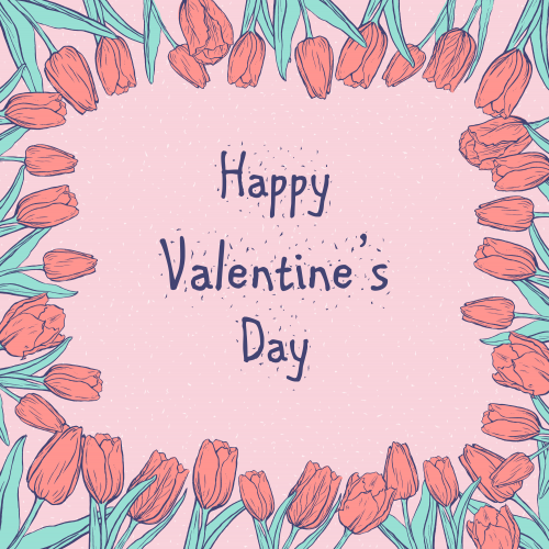
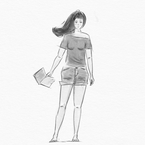
I don't selebrate this one, but I make images for this day)) And all this mood and insta feed made me go to the store to buy my favourite box of candies... Yep, marketing... :D
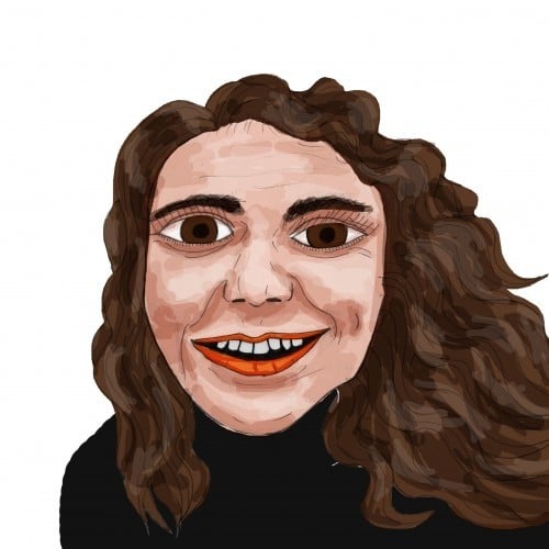
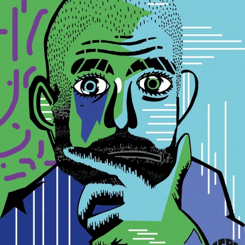
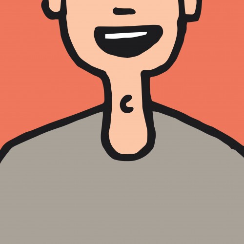
One of a Series of Manager Portraits that was used by the Zero Forty Brewery to promote the events on their social media that focused on the Premier League.
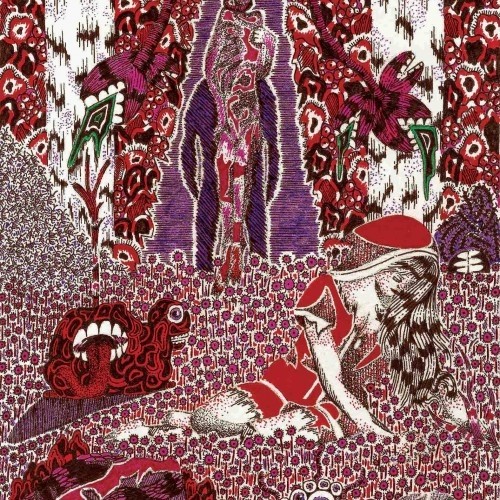
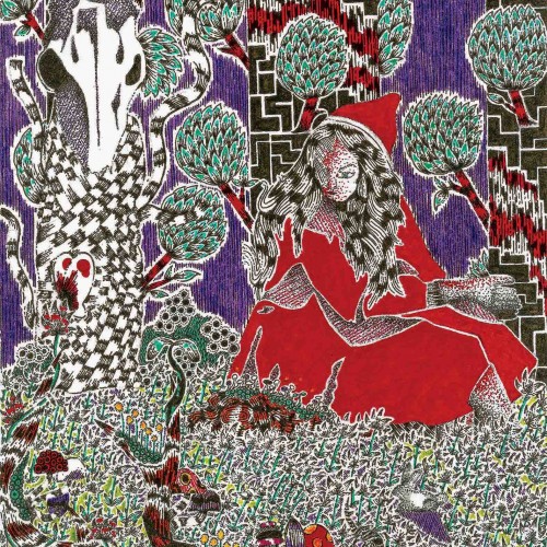
I’m fascinated in how something may make you feel. For instance, I’m deeply moved by images of outer space from the Hubble space telescope, but I do not try to recreate those photographs in my work. What does not exist in those photos, is how they may make us feel. This is why you won’t see any “realism” in my art. When we send astronauts to space, they can discuss factually what is happening, but what truly moves human beings is when astronauts describe how they felt while they were there. So, I choose to express how I feel, as opposed to illustrate what I see.
I’m fascinated in how something may make you feel. For instance, I’m deeply moved by images of outer space from the Hubble space telescope, but I do not try to recreate those photographs in my work. What does not exist in those photos, is how they may make us feel. This is why you won’t see any “realism” in my art. When we send astronauts to space, they can discuss factually what is happening, but what truly moves human beings is when astronauts describe how they felt while they were there. So, I choose to express how I feel, as opposed to illustrate what I see.
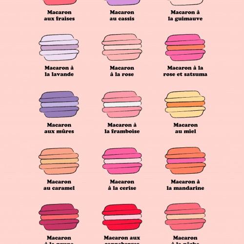
A poster I made based on an Inktober sketch (day 8) where I made a small pattern of macarons. I had a lot of fun thinking of flavour combinations for the macarons! I'm selling the poster (and other products, such as mugs and t-shirts) on my Society6 and Red Bubble stores.
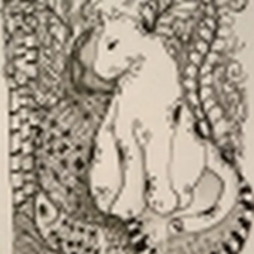
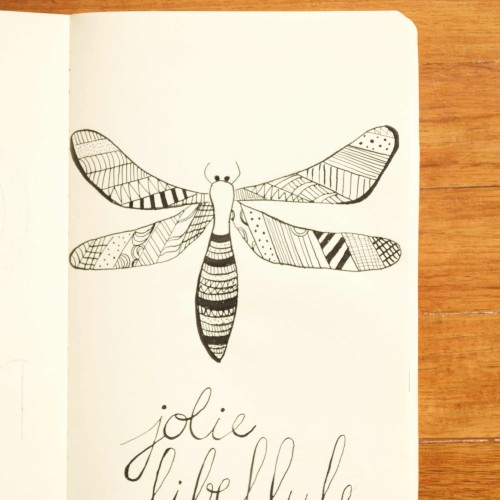
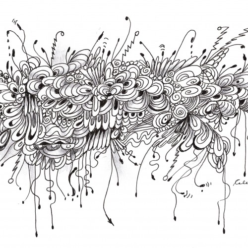
India ink on tissue paper. I had never used ink on this kind of paper before; I really liked the results! There are some folds and wrinkles on the paper that give the pattern some interesting details. The paper is also super absorbing, which plays nicely with the quantities of ink. Since it's very thin, there can easily be overlays between textures. And finally, when trying to use less ink (so that it wouldn't seep through and cause a big dot - the absorbing quality is nice, but it was also somewhat of a challenge!) I used very little ink on the lettering, causing a scratchy, dry look.
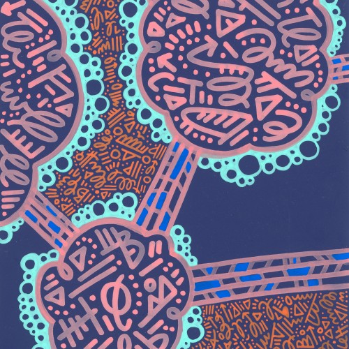
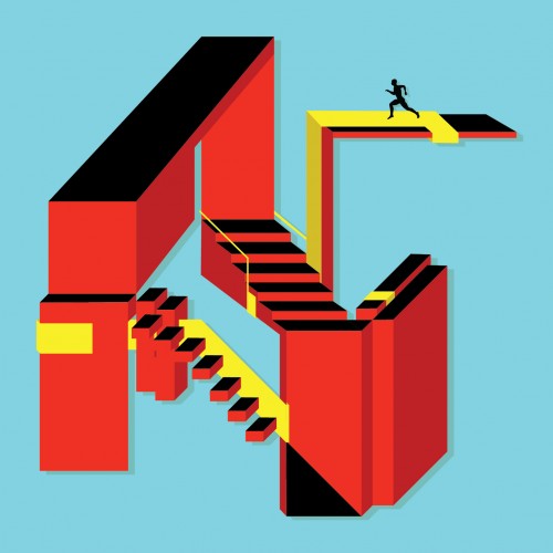
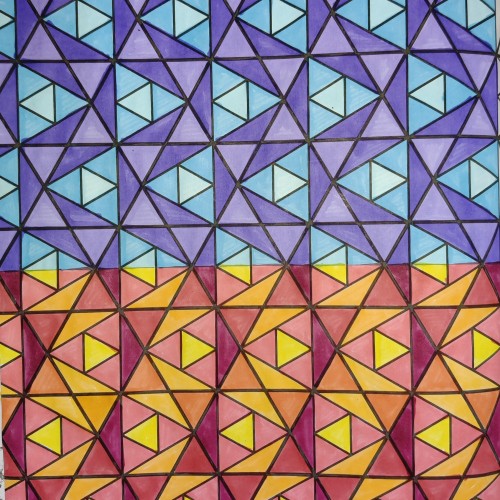
"Ups & Downs" explores the nature of basic shapes/colors and how they interact to tell a story. This piece focuses on an infinite recycled energy, meaning there is no end point to its structure. The aim was to keep it simple yet structurally complex to the eye.
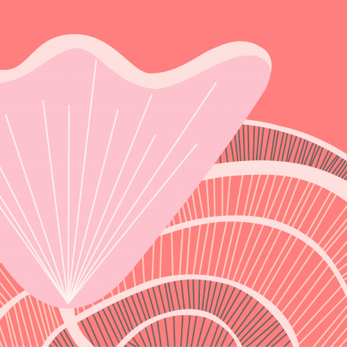
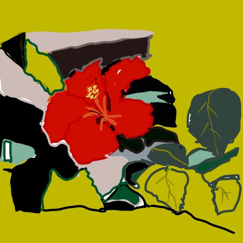
Based on a photograph of a hibiscus flower enjoying its last day in the garden before being brought back home before the Canadian fall and winter. I imported the photo in Procreate and the rest is history.
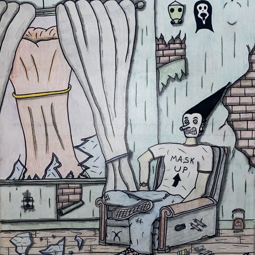
"Mask Up" by Ty Tatmore (2024) is a powerful and unsettling piece of contemporary social commentary. This work throws the viewer into a scene of post-apocalyptic anxiety where an individual, wearing a striking conical hairdo and a defiant "MASK UP" t-shirt, sits amidst the wreckage of a dilapidated room.
The artist uses dark humor and surreal imagery to explore the cultural tensions surrounding public health mandates and personal responsibility. The sign "CHOOSE WISELY!!" acts as a stark warning, while symbols like the gas mask and the Scream mask and also wearing a mask suggest a spectrum of survival and fear. The massive explosion breaking through the window is a haunting, almost surreal symbol of the unstoppable outside forces impacting daily life.
With its raw, graphic style and intense atmosphere, this painting is a memorable and thought-provoking statement that captures the isolation, uncertainty, and dark irony of living through a moment of global crisis.
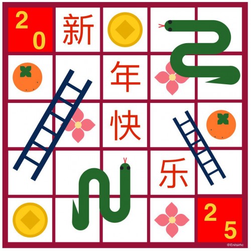
In celebration of the Lunar New Year, hoping this year will be as fun as a game of snakes and ladder! Symbolism: ladder (progression), coin (prosperity), flower (unfolding/bloom of new adventures), oranges (a fruitful year).