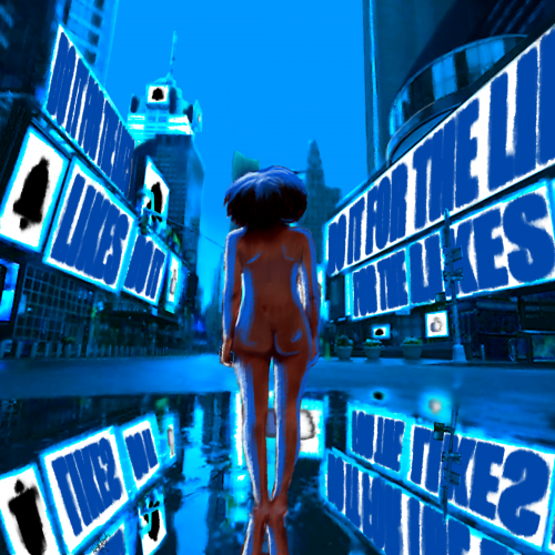
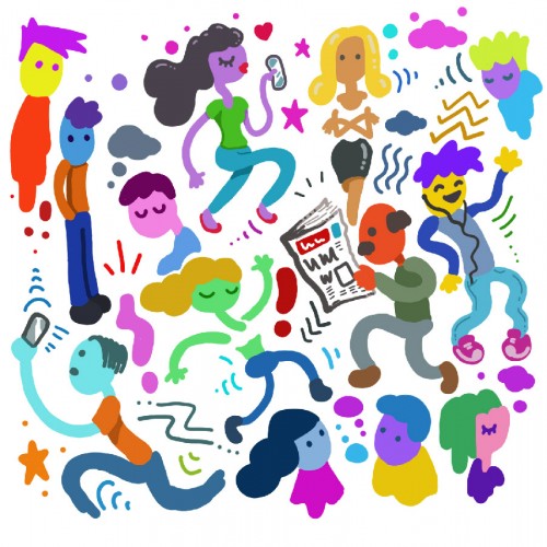
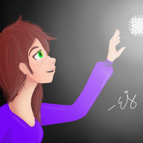
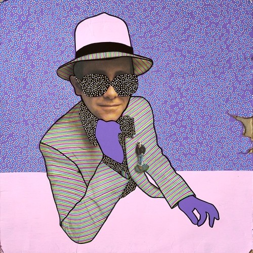
Take it how you want. You either give everything to social media, or it takes everything from you. In the end, you are left naked and hollow. I wanted to make this a simple composition at its core. The image is more about the message.
Times Square took forever to put together, I think the perspective is off just a bit. Overall, I think I did well with shading and depth. I am also improving on drawing/painting the human form. I wish I could trust in shapes and form and go a bit more abstract, but I think that will come with experience.
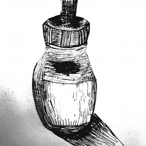
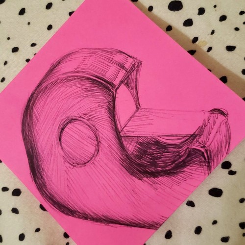
Some more practice with crosshatch shading and the proportions are a bit off. I also somehow made the left side of the bottle fat and it drives me nuts. ヘ(。□°)ヘ Other than that I think it came out ok.
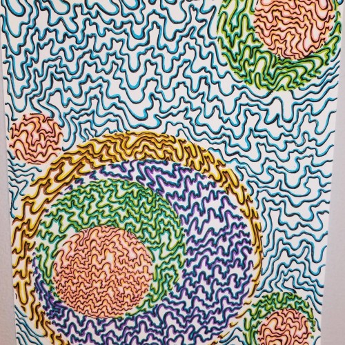
Finding your own art style is a loooong process...
But I've made the first steps, I think. I found my colors.
What was your beginning in this process?
--
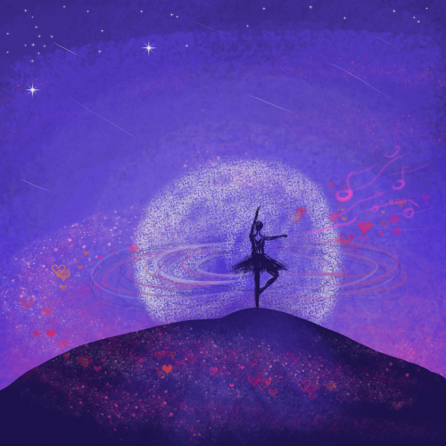
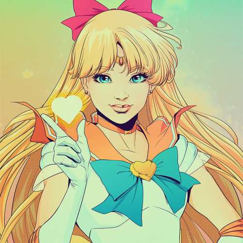
Digital painting created in Krita.
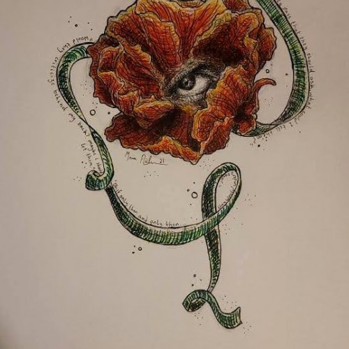
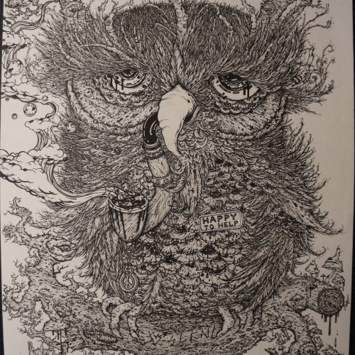
(I had gotten some new fine-point pens last week, and I figured this was a good way to test them out.) Two very different things have been on my mind lately, maybe there's a connection? I think it's interesting how it's taken me 4 years to figure something out, become comfortable enough to open up to others about it, and then embrace it. Yet it's like living a double life, being authentic to some and keeping secrets from others. On the other hand, to the person receiving this drawing, I know I can't do anything to change the situation even though I wish I could. All I can say is I'm forever grateful for all you do, and I truly hope you decide to take advantage of all the opportunities coming your way.
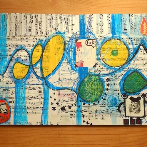
I think I kind of cheated by adding a bit of yellow and gray, but I do like how it turned out. I usually don't make many pieces like this, and there wasn't much of a plan going into this. It was a bit refreshing to do this.
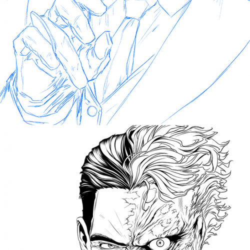
I've been getting questions about how I create my art here, so I figured I would upload some progress pieces. Here's the first one! I was listening to the Westworld season 2 soundtrack which always makes me want to draw Harvey (for some reason). I wasn't really practicing anything in particular, just doodling. It was fun to just let my hand wander, though I think the sketch was much better than the inking I did.
A true doodle? Messing around with some markers. I think this character was originally supposed to be a HH OC, but wound up looking more like some reject from an 80's cartoon (which is acceptable to me lol).
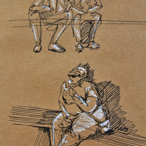
These are some gesture drawing sketches I did in ink with white pen highlights on brown paper. I was in Europe and sitting around a fountain watching people go about their lives. This was a really fun figure study and I think people make for great works of art.
My pen sensitivity has gone on my pen tablet. I think I need to get a new one. In the meantime though, it has been interesting experimenting with the different types of art I can create without the sensitivity, such as these flat characters.
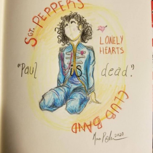
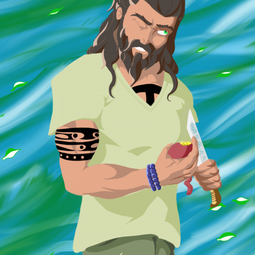
Remember when Billy Shears showed up to replace him? Nah, me neither. I wasn't going to wreck my record to hear them say it either. I know the prompt was warm colors, sadly if I did the jacket in pink or red it would've been George or Ringo. Anyway, a quick but fun sketch. "See the worst thing about doing this, doing something like this, is I think that at first people sort of are a bit suspicious. 'You know, come on, what are you up to?'"
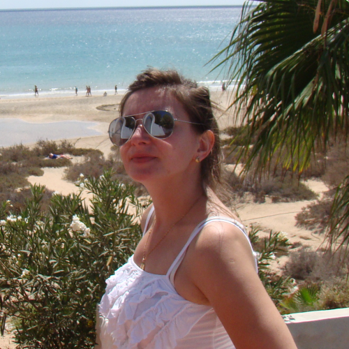
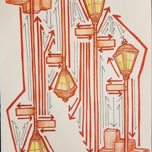
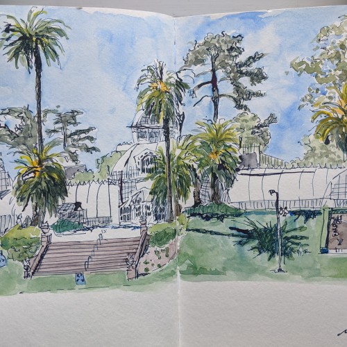
We took the Tuesday after Memorial Day off and rode bikes into GG Park. We found a mostly empty patch of green to picnic and play across from the Conservatory of Flowers. Our social distancing signs are blue with four white arrows pushing four people apart. Every time I look at them, I think, what if people think the length of those arrows is actually 6 feet? What do yours look like?
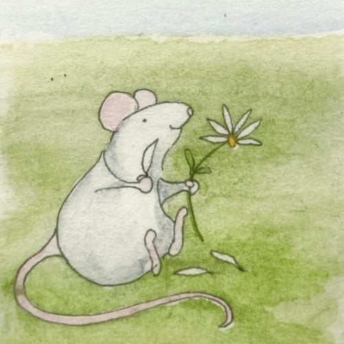
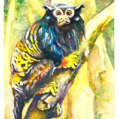
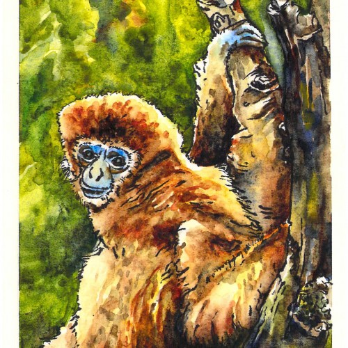
I used brush pen and watercolors. The most challenging part was holding back on excessive pen lines to render the fur, using patches of paint instead. Although I think the background is a bit dark and there a few mistakes, I feel that learned from this.
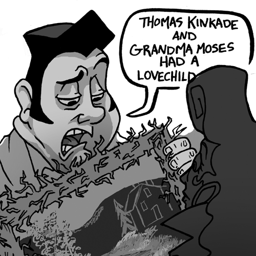
my first ever piece of art i sold was this piece, i think around 2012 when i started going into more illustrative based work. its great to look back and see the progression and level i have progressed. i remember thinking this was the best i could do but now if i did something on the same level i wouldnt be so happy. i got a lot of good feedback off this piece and do plan on recreating it one day :))...
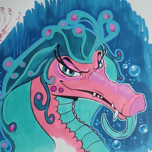
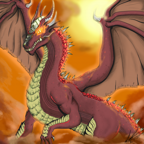
This one was for a friend of mine from highschool. She wanted me to change the dragon to black and white. I complied with her request, but I'm posting the original here. I think the classic red is best for the legendary creature.