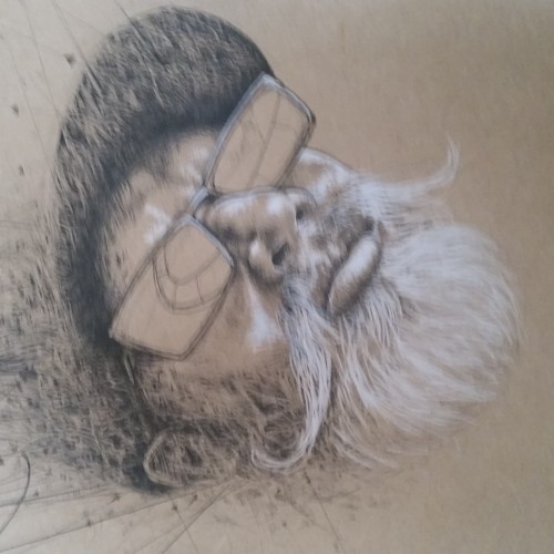
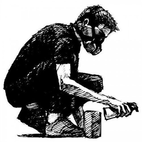
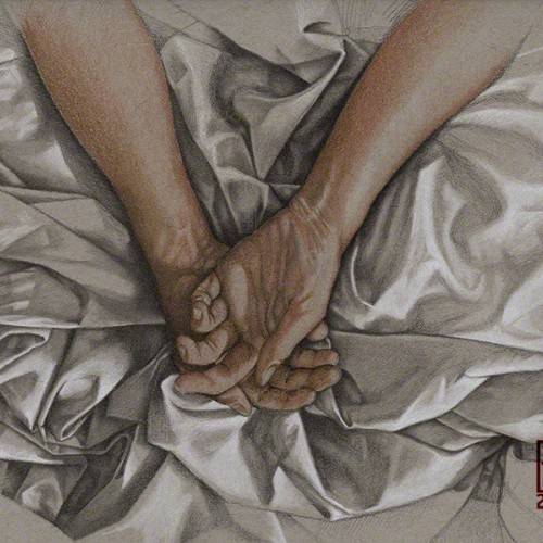
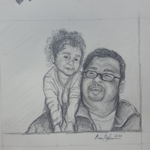
There are many reference photos for iguanas on the internet. This drawing relies on three difference reference images. The drawing was done with a micron .005 pen and then coloring added with pencils. He was a lot of fun....I think there may be more iguanas or other lizards and reptiles in my future!
My first venture into artist grade colouring pencils - and I'm smitten! I never thought I could achieve such boldness and blendability with them! I'm still getting used to them and will think about choosing smoother paper with less tooth next time. The texture and weight was more for the water-based gouache along with alcohol inks (which are very unforgiving to even primed heavy paper!). Apologies for the unevenness of lighting between the 2 sides of paper; will correct that when I'm making proper image files.
Crosshatching was used to build up the shadows. It's probably my favourite drawing technique. Works best with pen and ink. This is the cover image for one of my children's picture books.
My first ballpoint pen person. This was a lot more time consuming than I expected, but I'm glad I hung in there and finally finished it. The reference for the drawing was a Getty Image.
White and sanguine conte pencils on toned paper. These ruins captured my drawing itch with the quality of the light filtering brilliantly through the tangled growth outside, and the open shade within. At a metaphorical level, the image is about the sense of having a laborious path set in stone for me by custom, convention, and culture, while way is wide open to the chaotic fertility of nature, should I choose to follow my own feet and heart.
A Bob Ross inspired painting, for the Digital Painting Studio challenge, I know composition is a bit off, but I'm still pretty satisfied with the end result, and sometimes, you just have to let go of the image and work on something else...
The source reference image was from an impromptu photo shoot I did several years ago. The available light in the room was magical and the model was just sitting there meditating.
Pencil, Charcoal Pencil, Pastel Pencils on 9” x 12” Strathmore Archival Sketchbook Paper.
Poppies are among my favorite flowers---vibrant AND delicate. Great swaths of "bread poppies" garnish our garden. We harvest seeds for lemon-seed cake and poppy-seed rolls. (No, we don't harvest that other stuff.) They reseed generously and we have beautiful crops of red and purple flowers each year. I've been working on this colored pencil drawing for the past week. Enclosed are some images of the progress over that time.
This started as a pencil drawing (see the 2nd image) that I scanned and put into Photoshop. I tried various filters including: Smudge, Ink Outline, some Splatter, changed the Exposure and added a Sepia Photo Filter. After a couple of hours of playing (I’m not very knowledgeable about digital possibilities and just use trial and error) I ended up with a dramatic image with which I am quite happy. The reference was a magazine advertisement.