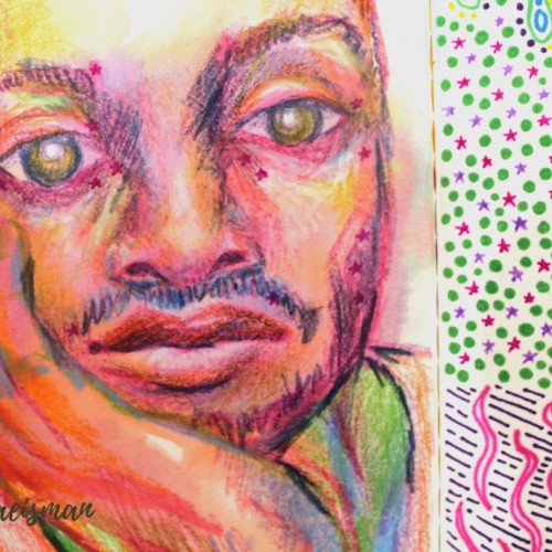
This portrait was created using mixed media like colored pencils, markers, and ink. The portrait features the face of a man resting in his hand, and staring dead-eyed at the viewer. I used non local color techniques to create depth and form using colors not typically found in the human face, like blues and violets for shadows and yellows and oranges or highlights. Parts of his face include small pink stars which originally faded from the previous page, but I really like the look it gives, they almost look like celestial freckles.
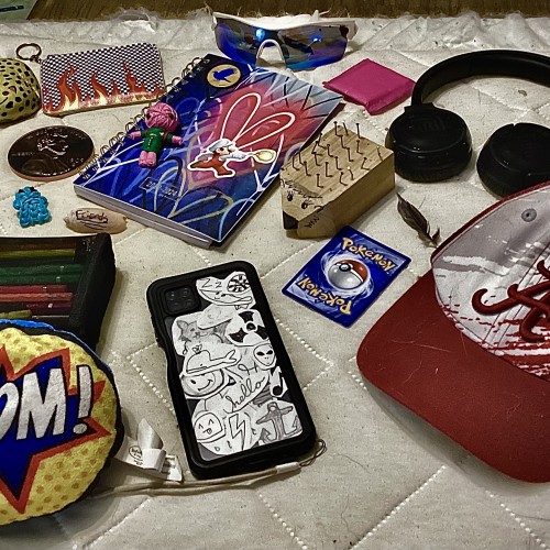
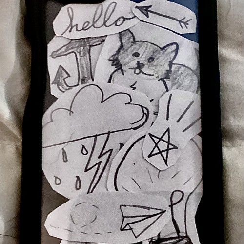
I was having some creator’s block, so instead of a collage of drawing (you know, besides my phone case being a collage of doodles), I made a collage of objects from my room that I thought described my personality. Comment what kind of personality I have and what object(s) makes you think that!
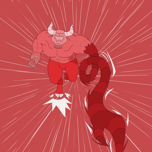
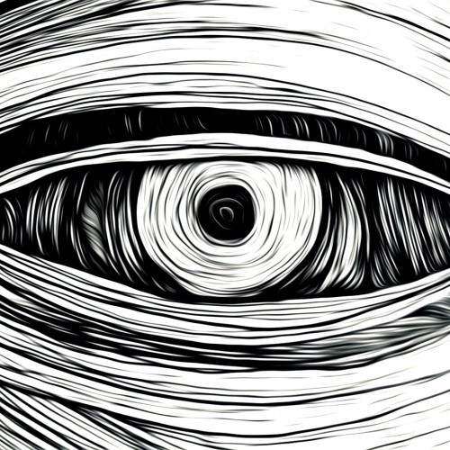
I wanted to try a drawing that uses a monochromatic color palette. I found the process to be very enjoyable. It can feel limiting at times, working with only one color of varying shades. Specifically when choosing the amount of shades you're working with. It's also a nice alternative when I can't think of a color scheme that uses different colors.
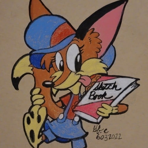
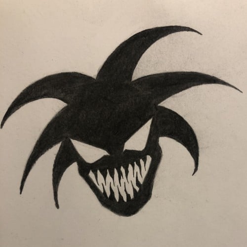
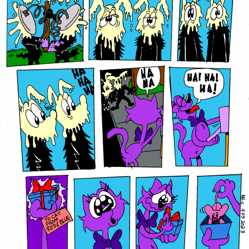
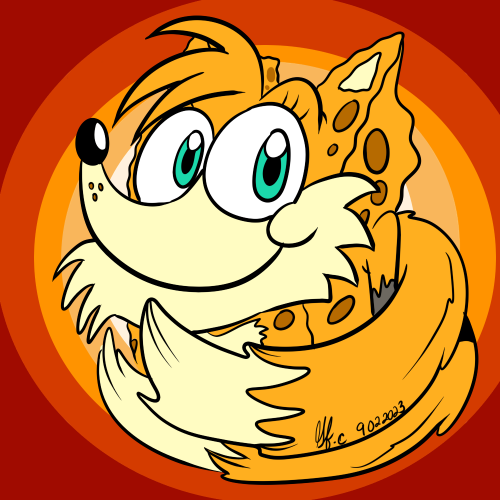
One of my oldest mascots/toonsonas, a combination of "Spongebob Squarepants" and Miles "Tails" Prower. As a bonus, here's a link to the drawing video. https://www.youtube.com/watch?v=2YVxpfnwCEA&t=237s
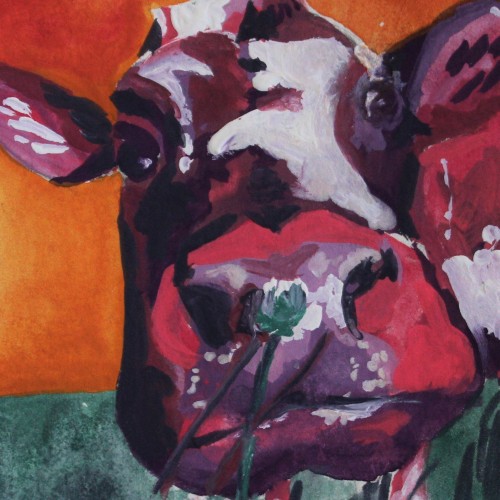
This colorful painting was created using gouache paint to give an illustrative design feel. The subject is a cow painted using non-local colors like pink and violet, contrasting the orange sky background. I love the small clover flower the cow appears to be smelling in the foreground of this piece. For more in my gallery, please visit ArtsyDrawings.com!