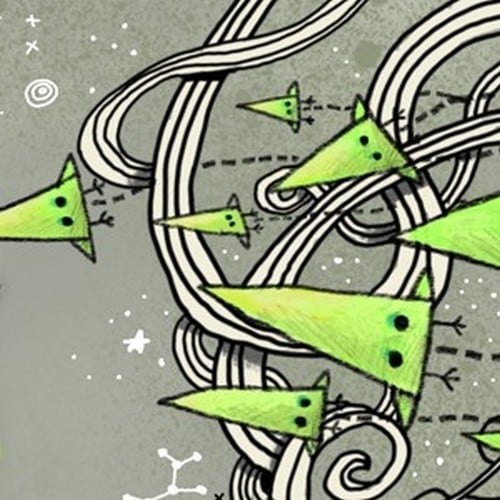
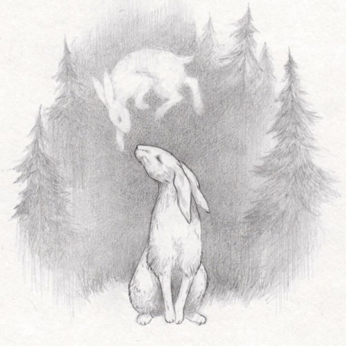
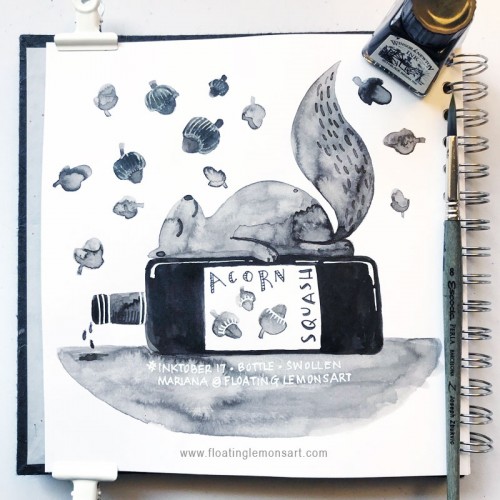
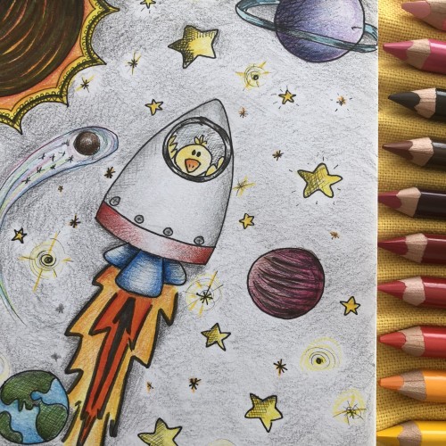
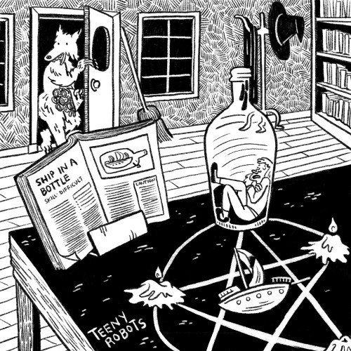
I intended to do quick little spot illustrations for Inktober this year, but nooooooo! Now Jimmy is drowning in digital ink and lots of doodle details. This was way too much fun to go simple. I also included the original sketch this time.
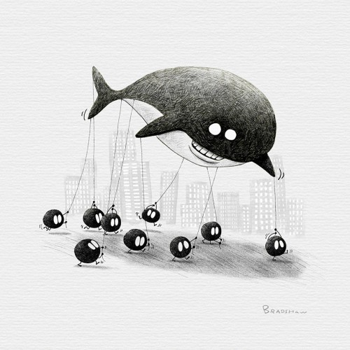
Inktober2018day12-Whale. I’m using inktober to explore and improve my techniques. This time I wanted to try using more crosshatching. I’m happy with the result. Also, at first I had nothing for the whale prompt but it’s rewarding when you push through the dead space and a concept or idea comes to my head that I can be excited with.
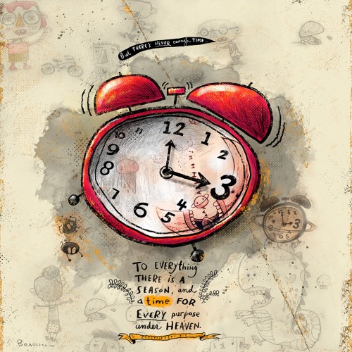
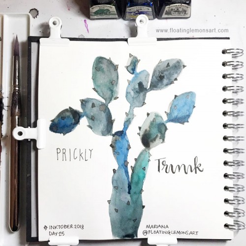
Inktober2018day14. Clock. I love time. I hate time. It goes too fast and there’s never enough of it. If I had more of it, I would be able to post every day for inktober. I wasn't going to participate this year, but after 4 or 5 days in, I figured if I did a very simple line drawing, like I started doing with the little box chicken character I could make every remaining day, but I just couldn't stop myself from going all out on some pieces. It's like I always want to add more. So maybe it’s going to be quality not quantity for me this year. Please enjoy.
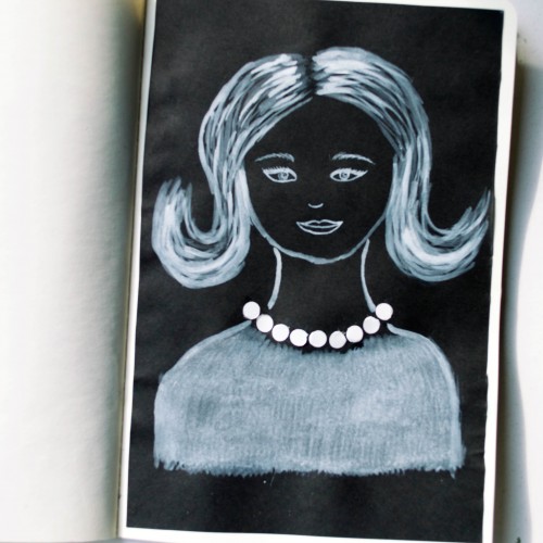
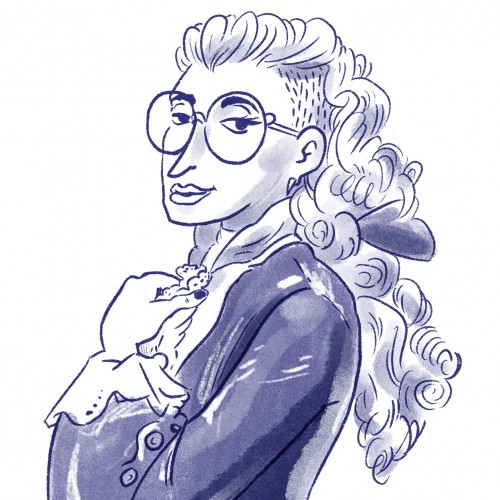
The idea for this portrait came to me when I was looking at a packaging of soap - it was very glossy and it looked like it could look like pearls. As well as the soap packaging, I used white ink mixed with acrylic paint (for opacity) on black paper.
India ink on tissue paper. I had never used ink on this kind of paper before; I really liked the results! There are some folds and wrinkles on the paper that give the pattern some interesting details. The paper is also super absorbing, which plays nicely with the quantities of ink. Since it's very thin, there can easily be overlays between textures. And finally, when trying to use less ink (so that it wouldn't seep through and cause a big dot - the absorbing quality is nice, but it was also somewhat of a challenge!) I used very little ink on the lettering, causing a scratchy, dry look.