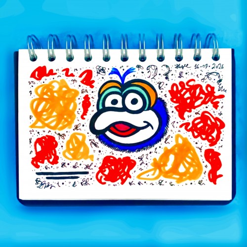
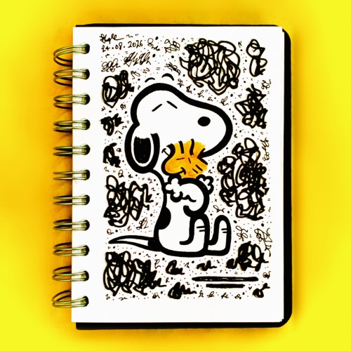
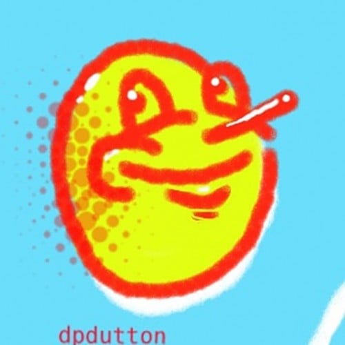
Muppet fan art no. 2 today! I adored the Muppet Babies growing up and this video tape, well, how the hell it never wore out is beyond me.
If only the rest of the tv series was an easy find…
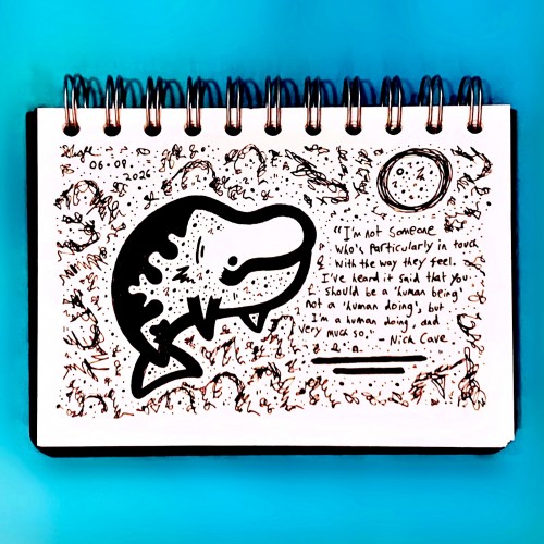
“I'm not someone who's particularly in touch with the way they feel. I've heard it said that you should be a 'human being' not a 'human doing', but I'm a human doing, very much so.” - Nick Cave.
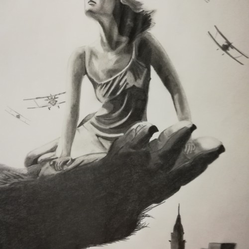
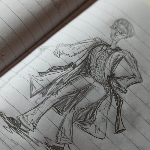
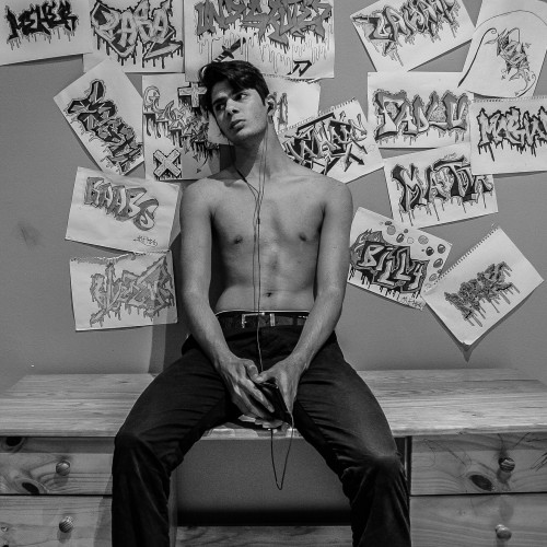
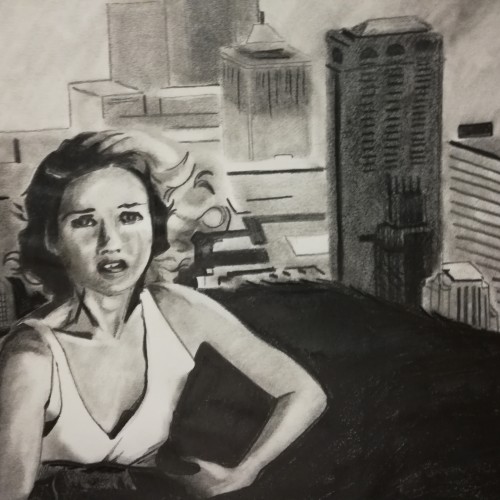
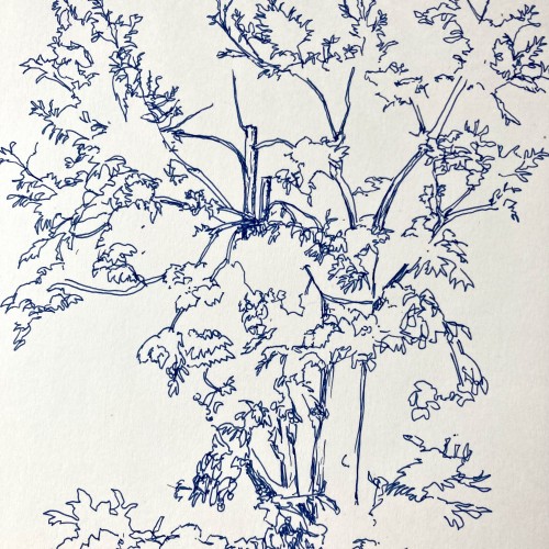
A random sketch that became a drawing practice. Even tried to sketch the outlines of some coat. What happens when one draws without a proper plan or skeleton, ending up with a "lifelike perspective".
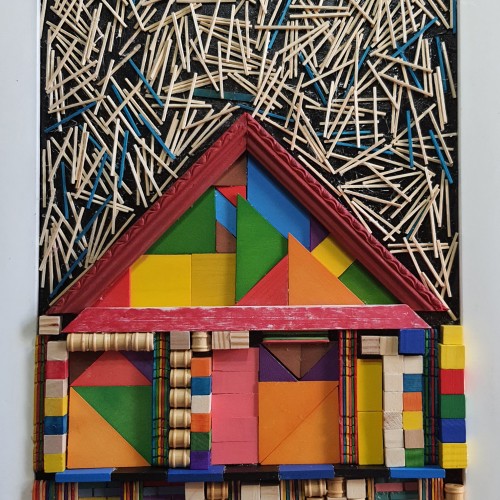
The materials that Meir uses in her works are not of the refined and so she is called an “arte povere” artist. At times she describes her work as someone dealing in alchemy - work develops as in a trial laboratory with different techniques and materials. She says, “ at times the artistic work process is a sort of puzzle demanding the filling in of all the empty squares “.
Some of her work focuses on women, and they incorporate criticism and cultural protest.
Meir has strong opinions about recycling and environmental protection that is represented in her works by use of materials and shapes. In her work she reacts to contemporary art that communicates with the eco system, waste, and she also searches for different worlds. Her works are made up of layers upon colorful layers that when we look at them it becomes clear that the mound of waste she chose is not coincidental. It actually becomes a colorful kaleidoscope of utopia.
Jaffa Meir is a multifaceted, autodidact artist working in painting, sculpture, photography, product design, carpets and furniture, painting on textile, and computer graphics.
The structural composition of some of the works is influenced also by her many years of working in the architects’ office.
Meir also worked in the developing of ideas within the field of ecosystems and recycling for factories such as Coca Cola, and during this process came up with ideas for designing parks and public game spaces using industrial waste products.
Farmalytica is a brand-new company in the field of agriculture which aims for utilizing technology in the field to achieve the sustainability of land resources. Here is the lOGO design for this brand, I hope you like it...
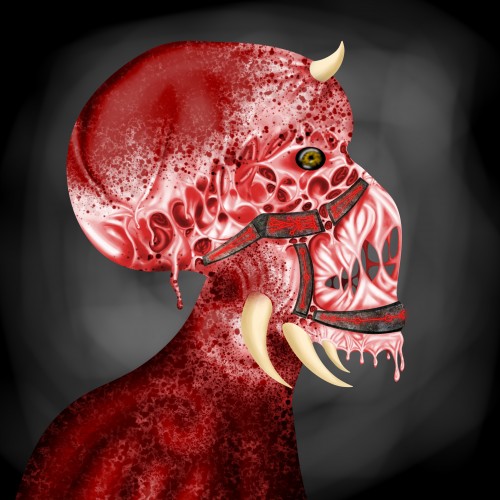
I spent 4 days working on this drawing using nothing but my laptops trackpad. I took inspiration from drips of paint and then stretched them apart to span between where bones should be.
The eye contour area was designed that way in order for it to stretch and collapse almost the same as how muscles contract and relax.
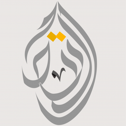
This time I designed a logo using a special style of Arabic calligraphy called "Al-Diwani". This style is distinguished by its flexibility and beauty. Besides its capability to represent and any shape that I want using any words; so I can illustrate and draw anything using this style.
A very random doodle I did for warm-up while working on commissions. I don't think it helped much other than working with little line work and stark lighting.
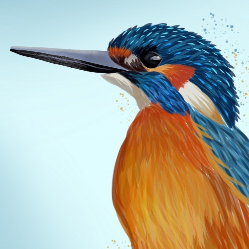
Kingfisher is a digital drawing completed on the iPhone 7+ (im looking at getting the ipad pro next month!) This is 1 of a current 6 pieces with the collective title 'Birds Of A Feather' leave any suggestions for birds