This painting was done with the Tuscan style in mind. The Tuscan style favors a rustic look. To me this never goes out of style because it’s as if the new and the old have found a common medium and have agreed to blend so well. There’s plenty of green, beautiful grass. The windows are complimented by the various colors of flowers that are perfectly placed below them. I love how there’s a table set outside of the building with a string of lights (even more beautiful at night) for people to enjoy the scenery as they eat some tasty, authentic Italian cuisines. There’s a group of people walking past the wall of yellow flowers and vines on the way to the inside of the building. In this scene, the ladies are wearing some long, beautiful dresses with gentlemen by their side to accompany them. This gives the impression that this group is out to have a good time. The white birds tops it off in this painting by giving it an inviting feel...”a moment to remember” feeling.
About once a year I set aside a page in my sketchbook, or bullet journal, to do a marker test. I go through every pen I own including Sharpies, highlighters, Bic Permanent Markers, Crayola markers, Stabilo pens, Expo dry erase markers and everything in between. I document the quality and determine whether to keep or toss the utensil. I find it’s easy to collect art materials, especially when you’re like me and switch mediums regularly. It’s important to know that when I reach for a certain pen or marker, it’s going to work the way I want it to. I do keep a page at the back of my sketchbook open for testing mediums, but it’s an important part of the process of creating art to go with the flow and just draw.
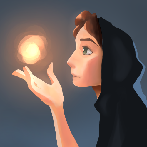
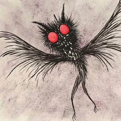
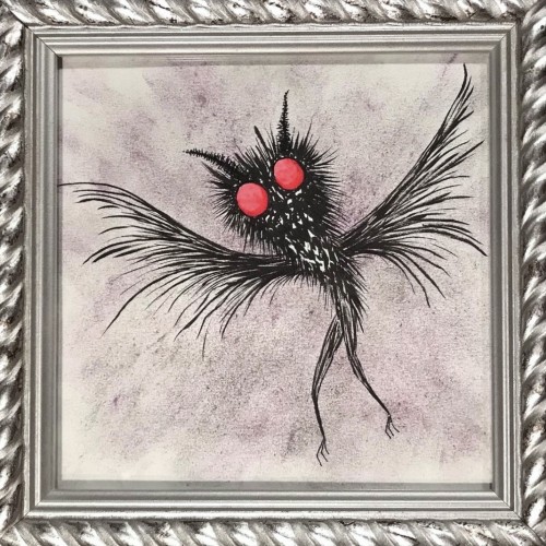
A painting I just finished to work on lighting, inspired by a painting done by SamDoesArts. This one was especially fun because I haven’t worked with layer effects for lighting in a little while and liked the way this turned out.
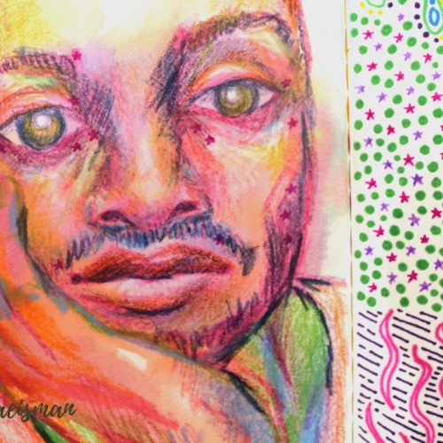
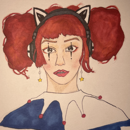
This portrait was created using mixed media like colored pencils, markers, and ink. The portrait features the face of a man resting in his hand, and staring dead-eyed at the viewer. I used non local color techniques to create depth and form using colors not typically found in the human face, like blues and violets for shadows and yellows and oranges or highlights. Parts of his face include small pink stars which originally faded from the previous page, but I really like the look it gives, they almost look like celestial freckles.
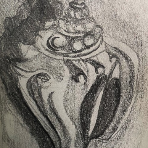
This is a graphite pencil drawing of a conch shell I found on the beach in Florida. I used this sketch as a base for a intaglio print I made. The sketch features the cool textures and forms of the shell in a harsh contrasting light.
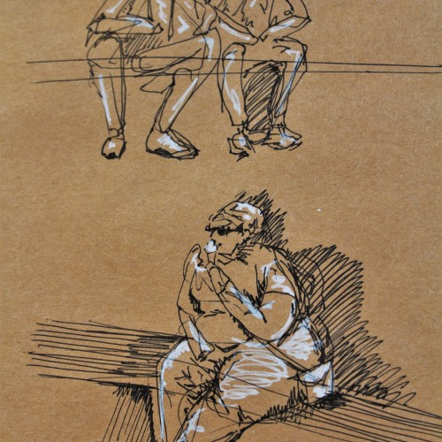
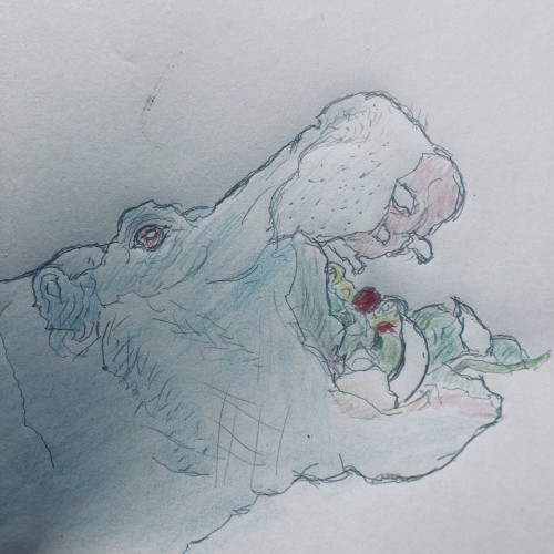
These are some gesture drawing sketches I did in ink with white pen highlights on brown paper. I was in Europe and sitting around a fountain watching people go about their lives. This was a really fun figure study and I think people make for great works of art.
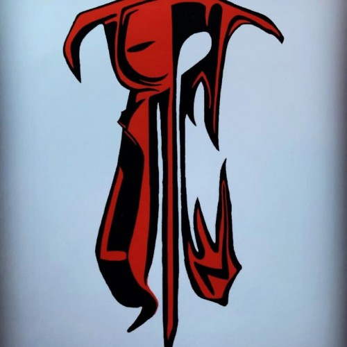
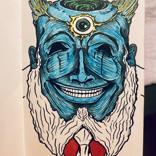
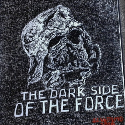
This is my study of the destroyed Darth Vader mask.from the movie Star Wars, "The Force Awakens. This ink rendering was my design for the pumpkin carving contest held every year at The Chadds Ford Pa Historical Society headquarter.
I chose to do this mask because it illustrates what is the ultimate destination for all who chose to live in the darkness of sin,in stead of living in the the light of righteousness.
The mask belong to the villain Darth Vader , who die while trying to force his son to join the dark side of the force. So I thought the destroyed mask over the letters "The Dark Side Of The Force." reflect the Biblical principle " Sin gives birth to death."
Written by Stephen J.Vattimo
Oct 24,2016
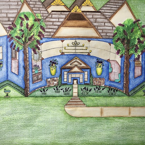
I designed this house. It has a really pretty blue exterior, and it has a slight curve to it that gives it a more warm and inviting feel. I like how the walkway kind of curves into the stairs and transitions back into the walkway before arriving at the front door. I like that there’s plenty of yard space with some really nice landscaping. The birds can even come and get a birdbath. I thought that was really cute. I used the multicolored stones to add detail for a more distinguished look. The hedges are neatly cut in a square and follows along side of the house. Looking through those gorgeous windows you can see the house is fully furnished. There are some really pretty chandeliers in there that adds character. There’s a stairway that leads to another level of the house as well. I love how there’s a touch of yellow that highlights the points on the rooftop. Furthermore, the swing in the backyard adds an inviting feel to the scenery. Also, it’s a nice place to sit and enjoy the view.
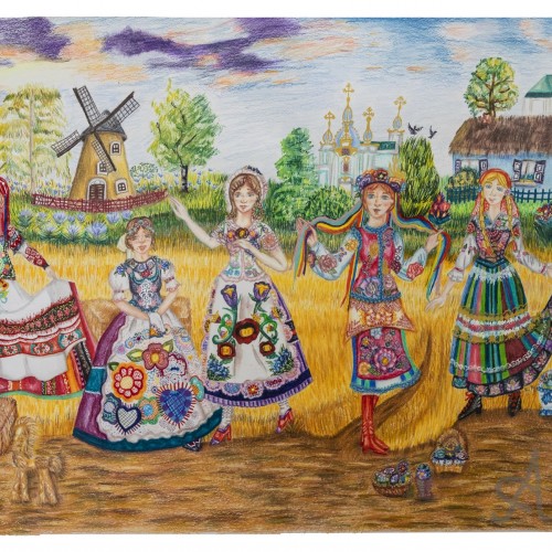
From left to right (countries and their names):
Belarus- Alena Sokolova
Czech Republic-Iveta Cerna
Hungary-Maida Valko
Ukraine- Olena Karpenko
Poland- Albinka Debski
Markers and Pens
-Sailor Shikiori Dual Tip Brush Pens
-Micron Pens
-Copic Markers
-Posca Markers
-Staedtler Double Ended Permanent Pens
-Faber Castell Pitt Artist Pens
-Gelly Roll Pens
-Uni Ball Signo Pens
-Marvy Artist Double Sided Permanent Pens
-Mark’s Tous Le Jours Ballpoint Pen
etc…
Colored Pencils
-Caran d’ache luminance
-Holbein Artist colored pencils
-Tombow Irojiten
-Derwent Lightfast
-Faber Castell Polychromos
-Caran d’ache Pablo
Etc…
Additionally I used Supracolor watercolor pencils, Staedtler Mars Lumograph EE Pencil, and various types of Zebra Pens.
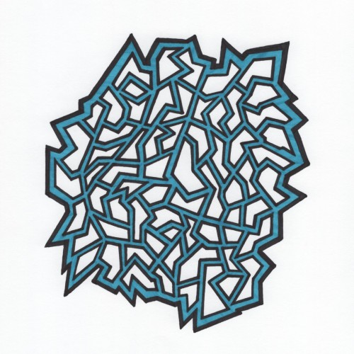
Ink on ultra white background highlighted in blue. Inspired by the challenges in life and compartmentalization of each challenge to better manage them all.
The Edge of Night
We are living in the days on the edge of night
You can see the darkness swallowing up the light
As the world of man accepts wrong for right
Time is short, and it is foolish to waste it
By debating with skeptics that faith in God is intellectually
bright
We are living in the days on the edge of night
The enemy’s delusion is thick
So, walk by faith and not by sight
Don’t lie around sunbathing in the light
We must pick up the banner of Christ
And work as long as there is light!
(January 23, 1994)
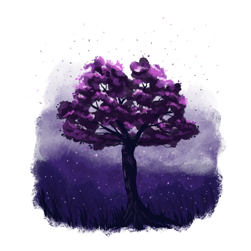
Somehow the tree trunk looks like a female figure to me.
I'm not sure if I really like this illustration, but my imagination plays here a lot.
I could draw a bit lighter background to make more contrast for the tree trunk. What do you think?
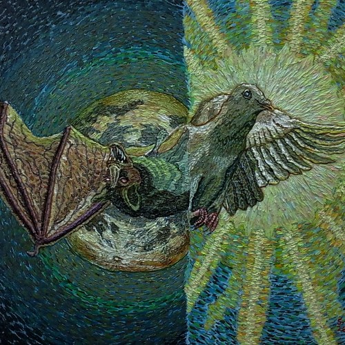
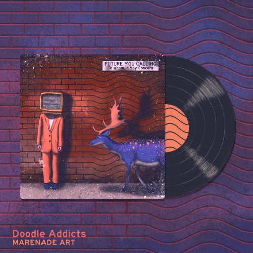
My submission for the Doodle Addicts album cover challenge. Thank you so much for the votes, I appreciate them all! Here's the original description for the submission: Future you calling is a group that mixes electronic pop and rock with some vintage and retro vibes thrown in the mix. To Whom It May Concern is their newest album. It's like that strange record that you once found on the slightly shady flea market that closed down after one month. You wish you had bought it back then, so now is your chance to repair the damage and get this album instead. It's almost the same. We promise. (Future you calling is an invented band. I'm not musically skilled enough to make the band reality but I can always imagine how their albums would look like if existed. This illustration was painted in Photoshop using reference photos found on Pexels.)
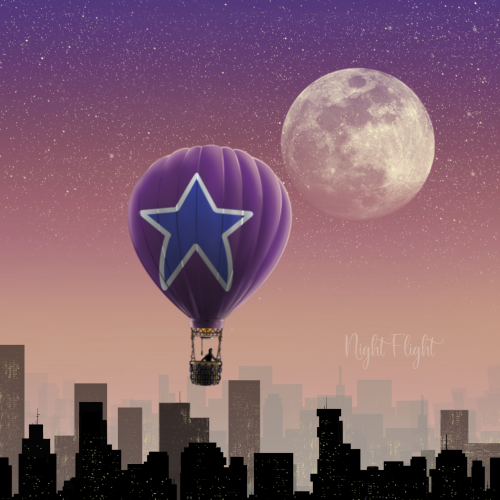
Woke up in the middle of the night the other week and saw the moon shining bright through the branches outside. It looked pretty neat so I got a picture and recreated it.