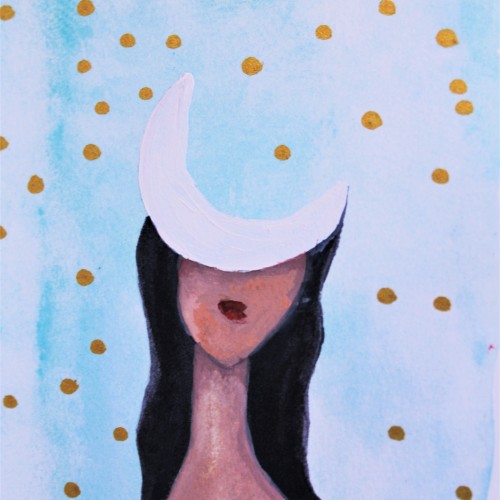
Daughter of the Moon: An Artsy Drawing by Brianna Eisman is an ink drawing with painting overlay of a woman with the face of a moon. This surreal portrait has an ethereal feeling of loneliness and mystery.
Created using pen and ink, this drawing mimics a fine art painting I saw in a museum. I loved the figures and their fluid movements, so I doodled it down in my sketchbook and later inked it in for a refined black and white artwork. Check out more on my website ArtsyDrawings.com!
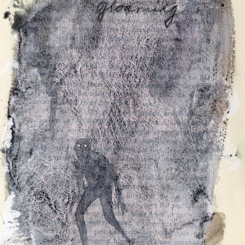
Favorite words.
Gloaming.
Dusk.
For some reason, makes me think of the opening to Jabberwocky by Lewis Carroll
’Twas brillig, and the slithy toves
Did gyre and gimble in the wabe:
All mimsy were the borogoves,
And the mome raths outgrabe.
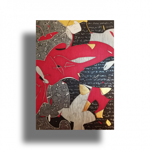
The idea is to show a figure crossing over two ` scripts’ with a bilingual suggestion. By standing in between worlds, we see opposing viewpoints.
Many artists have incorporated typography as symbols in their paintings since the 60s, but no one has attempted to approach lines in this `written’ manner. How different it is are the two writing styles of the East and the West; one with angular lines while the other in a smooth flow! This work juxtaposes the symbolism of cultures – script. At the same time, it questions the need to grasp the full meaning of the script to appreciate the aesthetic flow of calligraphic lines.
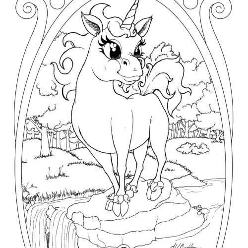
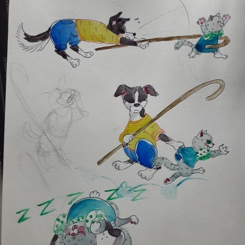
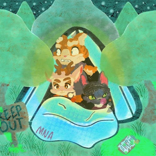
Having younger siblings is 50% about having spoiled rotten playmates and 50% about making sure those little morons dont accidentaly kill themselves. Border collies are so hard to draw antropomorph! Ever noticed how they most of the time keep their head lover than the bum?
Since the dawn of l’automatisme, the floating shapes of Miro and Klee were praised as musical suggestions. Unlike the Masters, my groundwork of flowing lines speaks melody and rhythm from a musical score perspective. The flow of lines ties the art elements into a composition. It also reflects a concept from Chinese paintings, which says, ` as a line moves into the invisible, the idea continues.’
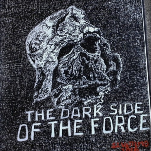
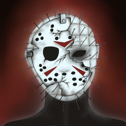
This is my study of the destroyed Darth Vader mask.from the movie Star Wars, "The Force Awakens. This ink rendering was my design for the pumpkin carving contest held every year at The Chadds Ford Pa Historical Society headquarter.
I chose to do this mask because it illustrates what is the ultimate destination for all who chose to live in the darkness of sin,in stead of living in the the light of righteousness.
The mask belong to the villain Darth Vader , who die while trying to force his son to join the dark side of the force. So I thought the destroyed mask over the letters "The Dark Side Of The Force." reflect the Biblical principle " Sin gives birth to death."
Written by Stephen J.Vattimo
Oct 24,2016
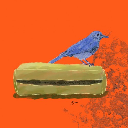
The little bluebird, restless artist,
Flew over the orange horizon without restraint.
With his box full of colored pencils,
He thought he could paint the sky in an instant, of course!
But too many pencils and too few wings,
Unbalanced the poor little bird.
So many colors, no coordination,
His creative disaster fell to the ground!
Orange, yellow and red pencils shattered,
While the little blue bird fell in tears.
His celestial dream turned into a nightmare...
Until he saw - a rainbow formed!
From sadness, joy overflowed,
In that magical moment he understood:
It doesn't matter the skill or the tools,
Art comes from the heart, even if messy!
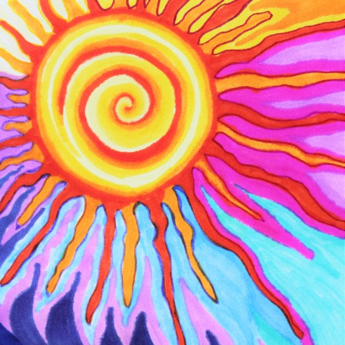
This doodle is a marker and ink drawing of a hyper stylized sun with a middle spiral and squiggles extruding from the center like a wild galactic heliocentric power hold. The sky is orange and hot Barbie pink and deep blue and very fun and colorful to look at. Check out more of my art at ArtsyDrawings.com
This mixed media piece is what I call a Monday to Monday piece. At the start of each week while working on other pieces I often times have left over paint or want to see how something works out before I put it on the main piece I’m working on so I use a piece of heavy weight paper to test all that on and just keep adding to it through out the week. It also gives me a space to just make whatever I want if I need a break from the main pieces I’m working on.
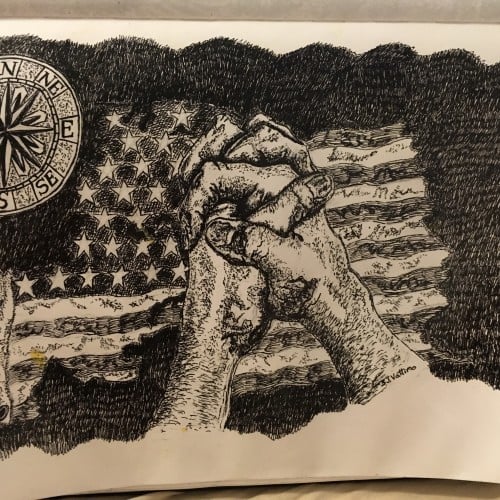
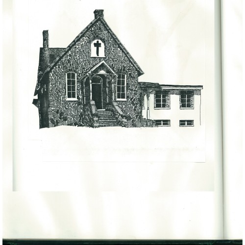
This pen-and-ink illustration was done for the cover of a church statement of faith.
I named this illustration Foundation of America because I believe this country was
founded by Christians who had strong faith in the God of the Bible, and through
faith, prayer, and sacrifice, the patriots overcame the mighty British military. By the
hand of God, a new nation was born: the United States of America. When the United
States was filled with God-fearing people, God raised the country to be a super power,
and the world envied the United States and flocked to her shores, the land of freedom
and opportunity.
Now this country has forgotten the God who gave birth to her and now is setting
up new idols to worship: idols of wood, stone, metals that do not hear or see or
care. Because the United States has forgotten God, it has been plagued with storms,
tornadoes, floods, droughts and her enemies are waging war with her, waiting to
celebrate her fall.
It is my hope and prayer that people who love this country will return to honoring God
and return to giving Him thanks for all the great works He has done for this nation
and turn from our sins and follow God by obeying His Word: the Holy Bible. That
God will remove His hand of judgment and His blessing may return to our country.
This church was fist built in 1890 and is still being used as a church. It is in Norristown,
Pennsylvania. This was the first Bible-believing church I attended when I became a
Christian.
(October 28, 2017)
"Picasso upside down drawing exercise" Drawing, from reference that Is turned upside down. This piece ended up having a pretty funny and "unfortunate" accident. Also I want to mention that I have an asd-diagnose which can lead to me overdo/overwork things. This Is a perfect example of just that ;)
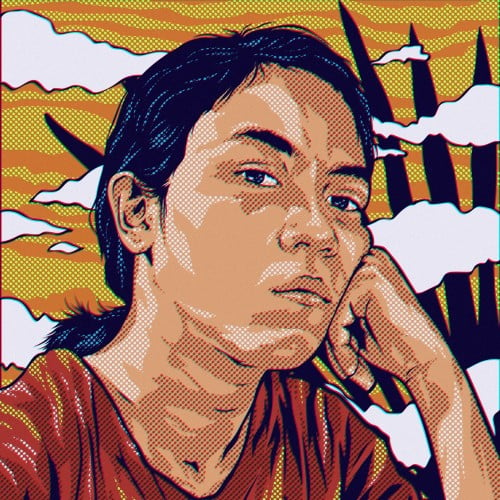
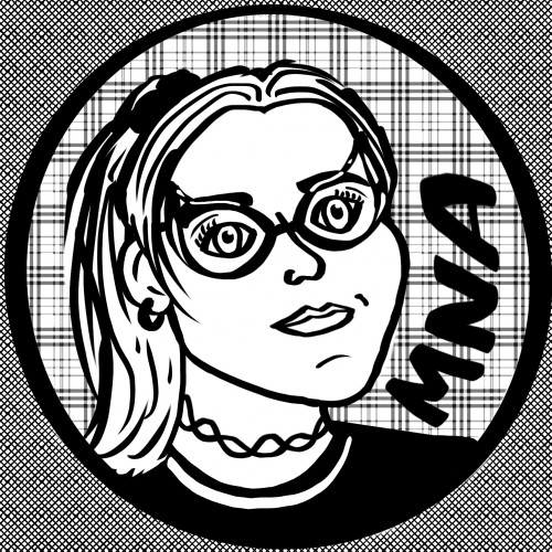
The above anime portrait is of my mentor from the ADPList Design community. I illustrated this to show my sign of respect as she is dedicated towards her mentee's well-being.
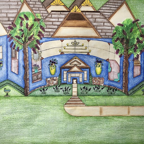
I designed this house. It has a really pretty blue exterior, and it has a slight curve to it that gives it a more warm and inviting feel. I like how the walkway kind of curves into the stairs and transitions back into the walkway before arriving at the front door. I like that there’s plenty of yard space with some really nice landscaping. The birds can even come and get a birdbath. I thought that was really cute. I used the multicolored stones to add detail for a more distinguished look. The hedges are neatly cut in a square and follows along side of the house. Looking through those gorgeous windows you can see the house is fully furnished. There are some really pretty chandeliers in there that adds character. There’s a stairway that leads to another level of the house as well. I love how there’s a touch of yellow that highlights the points on the rooftop. Furthermore, the swing in the backyard adds an inviting feel to the scenery. Also, it’s a nice place to sit and enjoy the view.