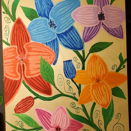
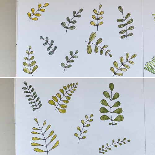
For some reason I tried some floral drawings, of different shapes, and I also used mixtures of different colors to produce hues of green. The first page - it’s a mix of the cobalt blue (PB 28) and cadmium yellow medium (PY 35). On the second one there is ultramarine (PB 29) for the blue color and the same yellow paint. To me, it seems the difference is very little but I’ve got the color closest to the ‘normal’ green using Cobalt rather than ultramarines. The latter gave either to yellowish to olive hues or too blueysh
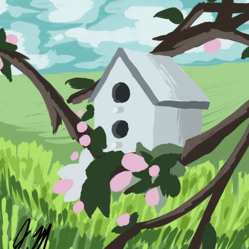
A 35-minute study of a birdhouse. This is available on Redbubble: https://www.redbubble.com/people/thedoodlinggirl/works/38643819-bird-house?asc=u&c=1054361-30-minute-studies
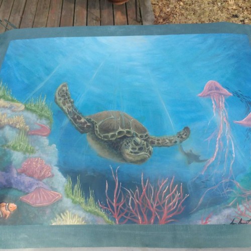
This piece was commissioned by a coworker. It was a very large piece at 24"by26" on green leather. I used an acrylic base and then completely covered that with oils. It becomes very dusty when dried so I added many layers of a spray varnish for oils on top. The color remained nice and vibrant.
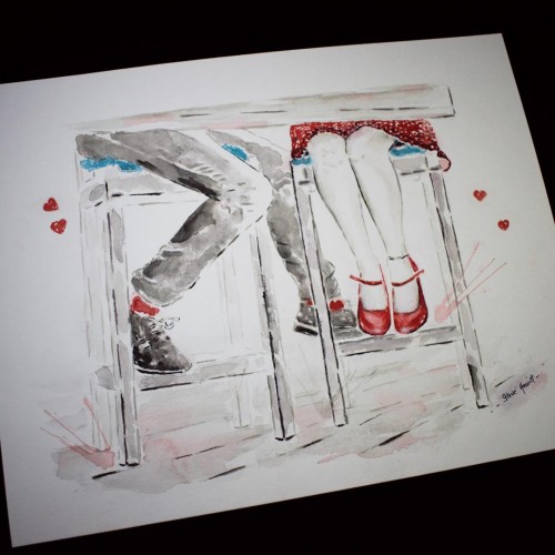
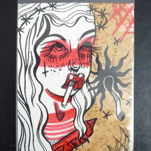
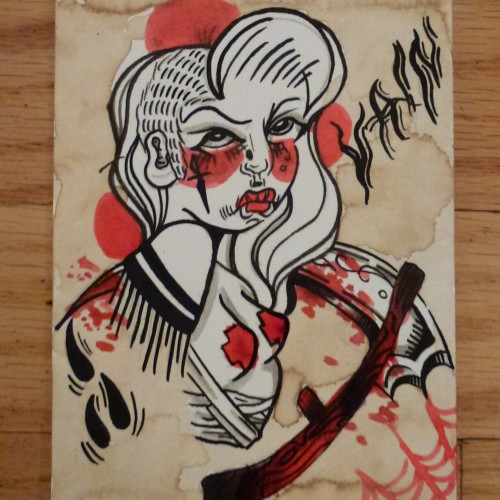
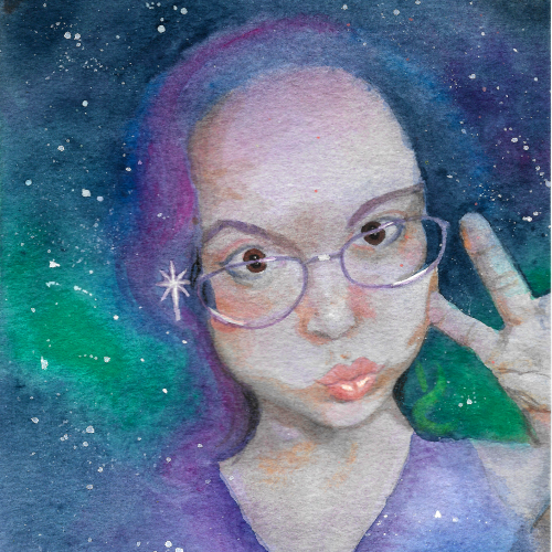
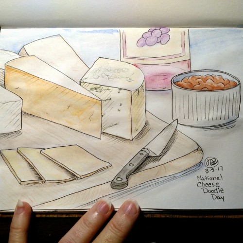
Drawn in my sketchbook in 2017, lined with Pigma Micron marker, colored with Kohinoor watercolors and Derwent Inktense Blocks, with a little colored pencil.