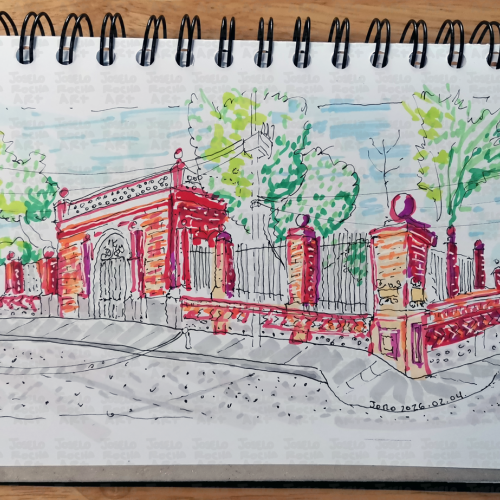
A stylized architectural illustration capturing the intricate beauty of a classic brick gateway and decorative ironwork. This design blends traditional sketching techniques with a modern, vibrant color palette, making it a perfect statement piece for those who appreciate urban history and fine masonry details.
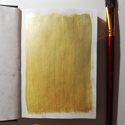
I loved and love just putting down color. This is from November 2019. That is one way to use the acrylic paint when you poured to much onto your palette.
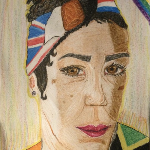
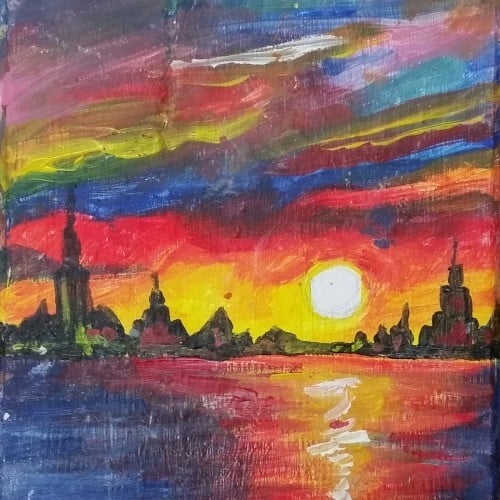
While watching "Alexandra Ehle" a new French series released on MHz Choice I noticed the character was using the app Tayasui Sketches on her iPad. Since I hadn't used the app for awhile today felt like the right time to dive into it again. This speedy painting is the result. Using a background I had created some time ago suggested a limited palette which helped the flow of the piece onto the screen.
The series stars Julie Depardieu.
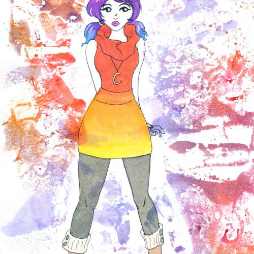
I tried coming up with a color palette from a color wheel. Trying to learn more about color theory. I'm actually 100% self taught, if you don't count the plethora of YouTube videos I've watched over the years. Drawn with FireAlpaca.
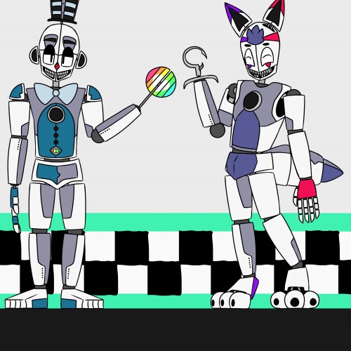
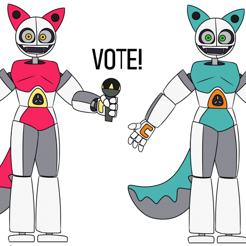
Here are the two tall animatronics. Jester (the one on the left) and Dellusion (the one on the right). They run a pizzaria. Jester and Dellusion are both sentient, but the others aren't. I'm still working on a final version of the shorter animatronics. But for now, have these two! I'm still trying to find a satisfying color palette for Dellusion, so if you have any ideas, let me know! Tomorrow, if I haven't finished the shorter animatronics, I'll post the piskel sprites I've made for them. This picture was drawn with FireAlpaca.
Hello! A long time without seeing each other, right? So, I'm back with some digital drawings, I hope you like it! ;D This piece was done for a challenge of using only the MSPaint color palette.
I wanted to try and do a digital piece of a ferret and incorporate winter clothes while using a limited palette I found on Adobe Draw. This was a lot of fun!
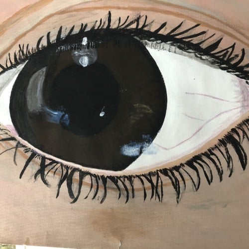
This one was fun. I was using drawing ink on palette paper to paint this one. Then I dropped my palette paper ON my drawing. Instead of deciding I messed it up, I used the palette paper to 'finish' the background. :)
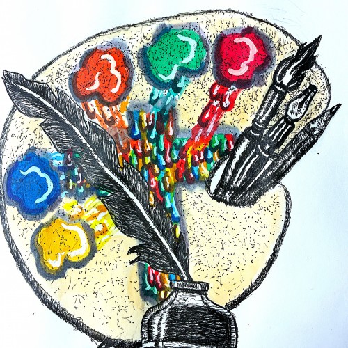
Well friends just got done creating my new logo to represent my ministry. The design incorporates symbols that represent both writing poetry, commentaries, short humorous stories. This is represented by the quill pen. My fine art, commercial art represented by the painter's palette, and illustrative tools.
The colors running to the center of the palette to from the cross, represent my Christian ministry. Going to FedExs to have business cards made. Planning to use this logo for my art fair booth
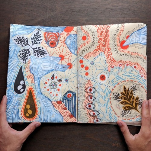
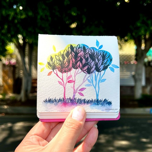
This sketch shall be turned into a print someday. Dip pen and ink in my A5 watercolour sketchbook. The background wash is the result of a palette cleaning.
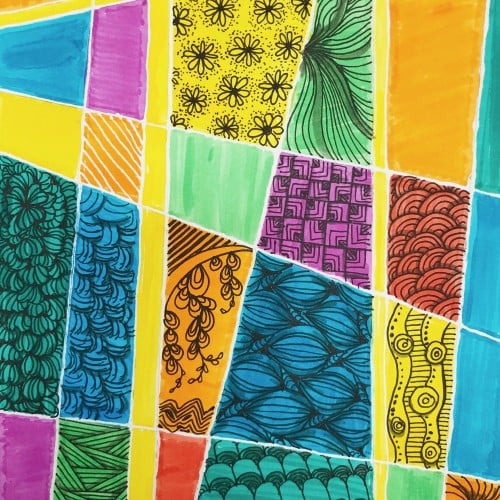
I wanted to try a drawing that uses a monochromatic color palette. I found the process to be very enjoyable. It can feel limiting at times, working with only one color of varying shades. Specifically when choosing the amount of shades you're working with. It's also a nice alternative when I can't think of a color scheme that uses different colors.
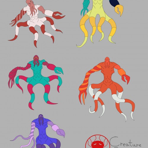
I was trying out different color palettes to see which one I preferred. The top palettes are based off the mimic octopus and the blue-ringed octopus, respectively. The rest aren't inspired by anything, I just thought the colors looked nice.
A staggering three votes were recieved, all of which voting for the blue color palette for Elizabeth! It has been decided; Elizabeth will now be blue and orange in all future variations! Thank you all so much for participating! Drawn With FireAlpaca.
I can't decide which color palette to pick for my character. Can you guys help out? Comment on which color palette you like more, and why! Drawn with FireAlpaca.
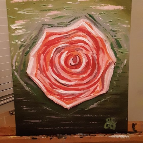
Golden acrylic on canvas. This is the second abstract I've attempted. It's not fully finished but it's looking pretty cool so far. I used the palette knife to create texture and metallic paints in my color mixes
I kept imagining her instead of drawing her down. Seraphina Belphoebe Harbinger has a loving big family and friends but they are not essential to the story I plan to use her in, Originally her design was similar to a Summer palette of Princess Peach but after multiple changes to my art style, this is her current look. Rose was originally the name I gave her and then I renamed her as Cossette but given the story I planned for her to be in she'll be nicknamed "Sera". I wanted for a look to be close to being an ideal homemaker like her mother. She's very friendly, innocent and naive. She's meant to be a character that doesn't belong in an environment she's forced to survive in
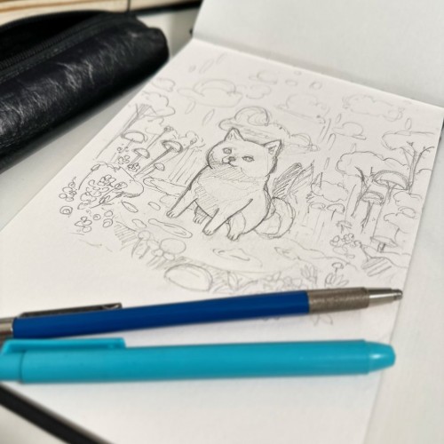
With our adorable Shiba, Kaiju, as my inspiration, I've started working on initial sketches.
The next step is to determine the perfect color palette before beginning the actual painting.
Though I typically prefer to work with oil paints, it's been a considerable time since I last indulged in painting.
So, I've decided to use acrylics this time around. I'm thrilled to start this new painting!
We take things in and digest them before regurgitating them or expelling them again through our being. This is true of many aspects of our reality, not just of caloric intake.
We take things in through the senses, through the person. We digest with our intellect and with our perception. Then we are able to share that back out through the senses, through our behaviours, and through our being.
Food builds our body even as our experiences build our character. The real mark of a mature human being is developing deeper levels of discretion and recognizing more intimate forms of subtlety.
Not everyone likes grapes, but to condemn grapes as evil is not prosperous to our species. Some like cherries, but not all enjoy their flavour. Grapes and cherries are still nutritious even though some have allergies to them. And not all cherries and grapes are ripe and nutritious at all times in all places.
We must carry this knowledge into the development of our judgement. If it is important and worth while to discuss food and material nutrition, then it is much more essential that we evolve a greater sense of discretion for experience and for the holistic palette of our physical, emotional, intellectual, social, and spiritual tongues.
We do that through consumption and digestion. But be aware that a human being can not live on grapes and cherries alone.
We should also do our best to not condemn the taste buds or stomachs of ourselves or others. Namaste.