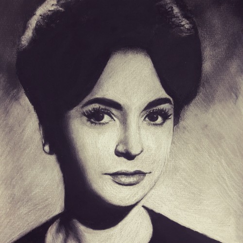
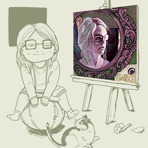
The sketchbook doodle that turned into something special. To this day, it’s still one of my favourite drawings.
Pencil, Charcoal Pencil, Pastel Pencils on 9” x 12” Strathmore Archival Sketchbook Paper.
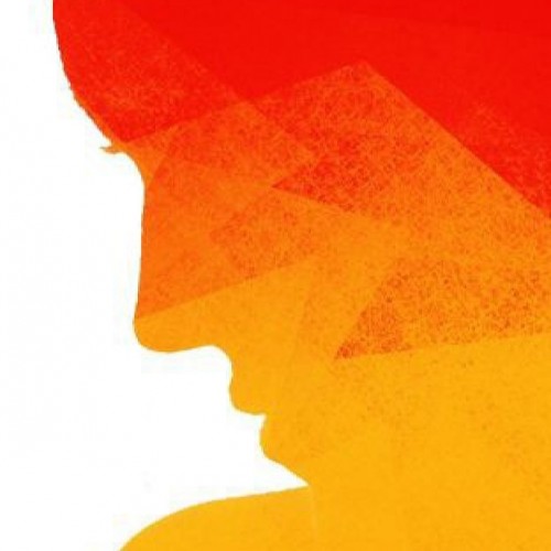
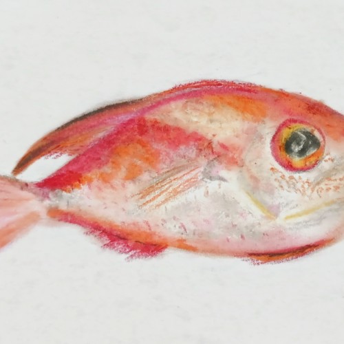
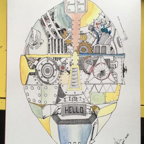
Hey boos! This is a random drawing I made because I was bored. Also, my history teacher is making pork in our class and I decided ya'll needed to know that. (it smells good and Im a hungry big back)
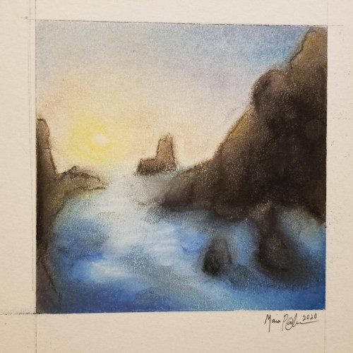
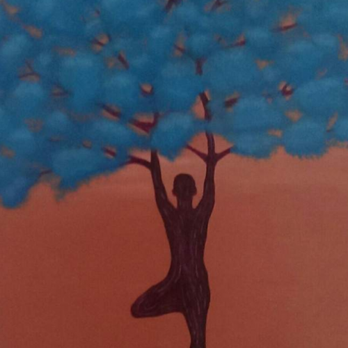
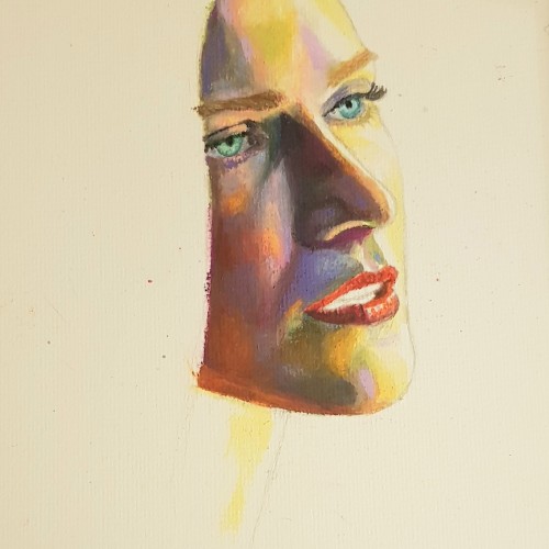
Pastels...I've never been a huge fan of working with them, mainly because I can never seem to get them to blend or move the way I want. I think this turned out okay; it's not the worst it could've been...not the best. It was fun to try, considering the fact that I rarely try new mediums, and it got my mind off everything I've been worrying about. Anyway, enjoy.
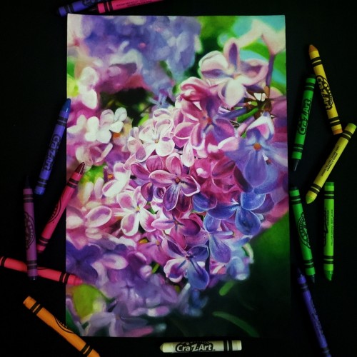
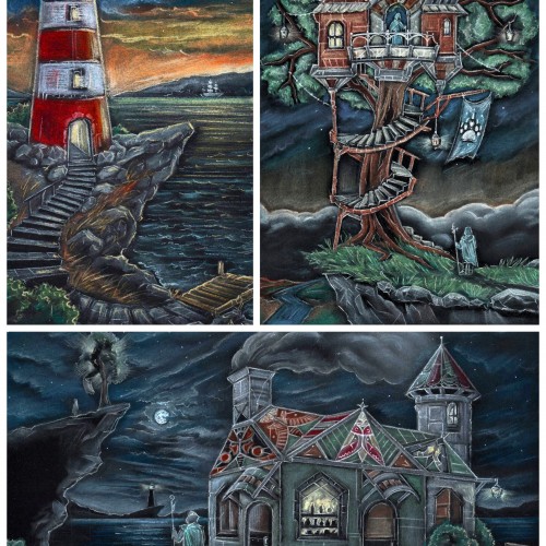
Really enjoying experimenting with soft pastels. This piece was the first time I used Pastelmat. It's an amazing surface to use with pastels as it takes loads of pastel, the colour stays vibrant, and there's minimal dust
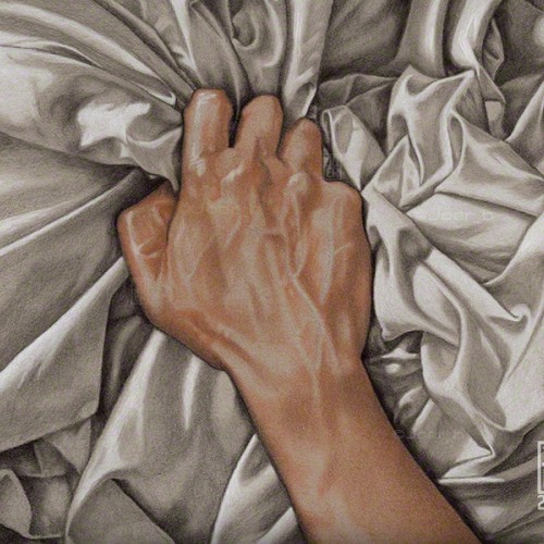
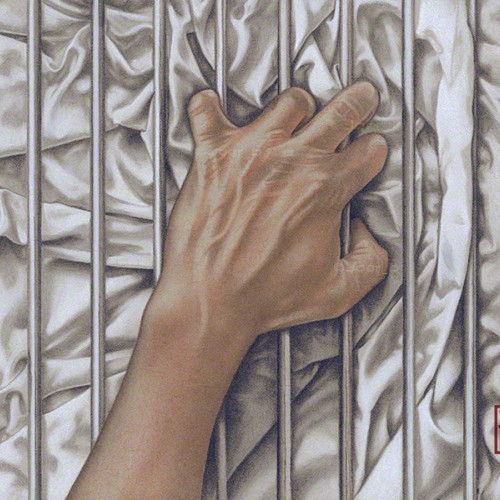
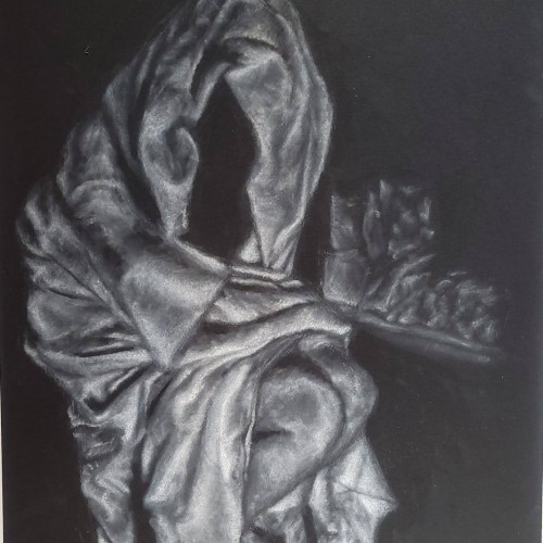
Some LGBTQ+ members of the community can’t openly love who they want to love, so the bars represent that barrier. The fabric, with all its complex folds and creases represents sensuality, desire and love. Love, in all its forms is a complex thing of beauty.-------------
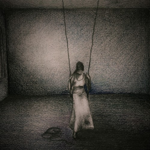
The companion piece to my previous post ‘Ecstasy.’ Agony and Ecstasy were always meant to be a diptych. The issue for me is that there is a two-year gap between the completion of the two - there is a noticeable difference in the the way both were drawn.
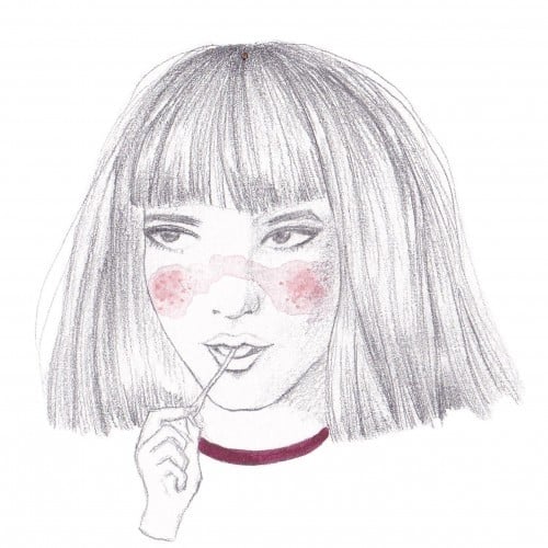
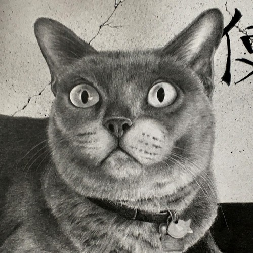
Faber Castell pastel pencils, Black and White Generals charcoal pencils on 9” x 12” Strathmore Toned Grey sketchbook paper.
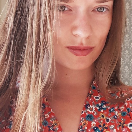
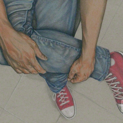
From a snap of me sitting in the waiting room. Pencil, Charcoal Pencil, Pastel Pencils and white Prismacolor pencil on 9” x 12” Strathmore Toned Grey sketchbook paper.
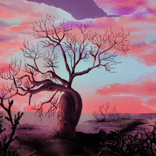
I gravitated towards the fony baobab, a real type of baobab. Sadly, all baobabs are in decline, which informed my composition. I used pastel earth tones and a lot of blacks. Digitally hand-drawn in Rebelle 6
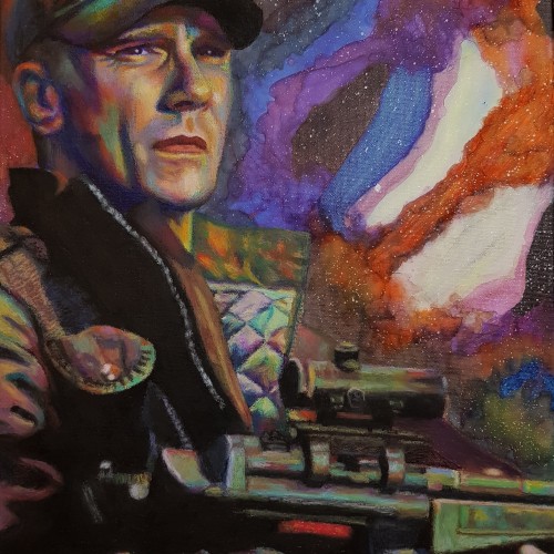
Newest work! Alcohol inks for the sky, oil pastels for O'Neill himself :). A2 canvas - biggest I've done in a while! This was a present for the boyf, who is a massive Stargate fanboy!
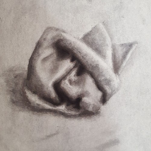
I suppose this was just a tester/practice piece? My first actual still life from observation and my first time actually using charcoal (yes, I've never truly used charcoal before. Charcoal and pastels are two things I avoid. Their looseness and freeness scare me, considering how rigid I can be). Not sure how to feel about this one. I'm my worst critic, and I've known that for a long time now. There's a lot of practice and progress to be made, but it turned out half-way decent.
I have always liked drawing with wild pastel colors and finish with a black pastel on top. Then use a needle to put put the image. Off course it is even more easy on a devise, when you don't get all the mess.
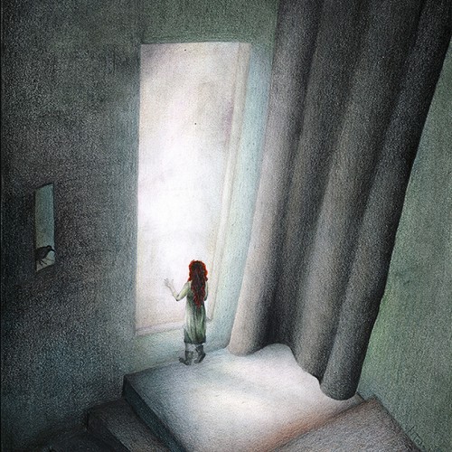
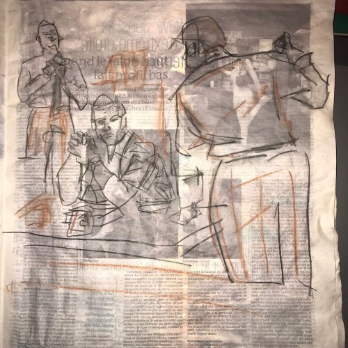
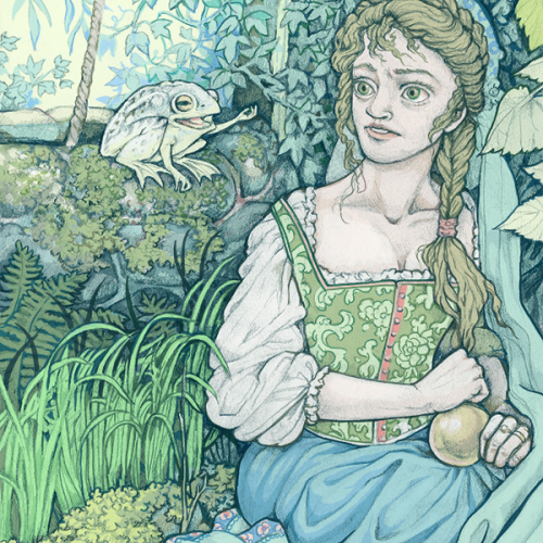
Graphite drawing in a Moleskine notebook - illustration for Grimm's fairy tale. I'm posting both the raw graphite version and the one I painted in Photoshop b/c I never know which I end up liking better!