This painting was done with the Tuscan style in mind. The Tuscan style favors a rustic look. To me this never goes out of style because it’s as if the new and the old have found a common medium and have agreed to blend so well. There’s plenty of green, beautiful grass. The windows are complimented by the various colors of flowers that are perfectly placed below them. I love how there’s a table set outside of the building with a string of lights (even more beautiful at night) for people to enjoy the scenery as they eat some tasty, authentic Italian cuisines. There’s a group of people walking past the wall of yellow flowers and vines on the way to the inside of the building. In this scene, the ladies are wearing some long, beautiful dresses with gentlemen by their side to accompany them. This gives the impression that this group is out to have a good time. The white birds tops it off in this painting by giving it an inviting feel...”a moment to remember” feeling.
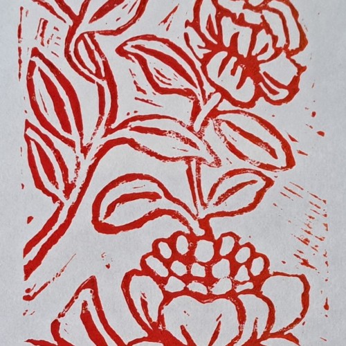
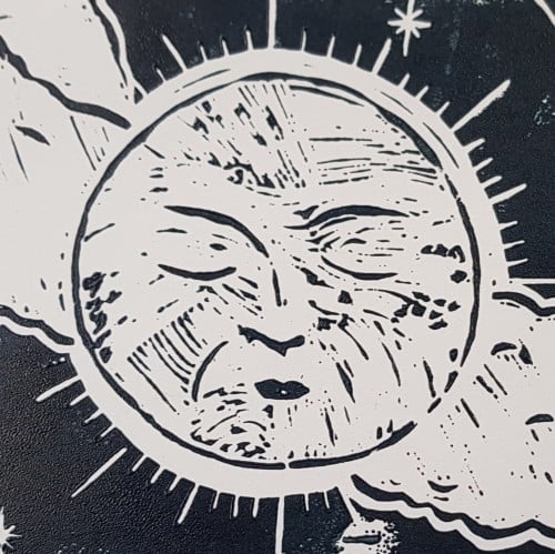
This is the second lino cut print I made using motifs from my surroundings here in Vienna, Austria. I enjoyed learning this when I was in Art College in Australia back in the day and my passion is now re emerging for it.
This is based on a couple of lino cut prints, acrylic paint and gold ink. I have rediscovered my love of lino cut printing after many years and hope to do much more of it.
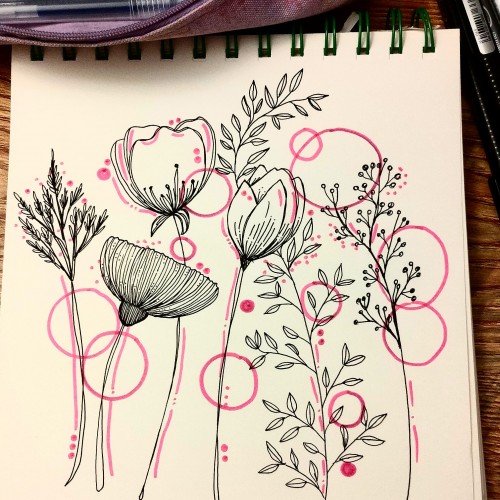
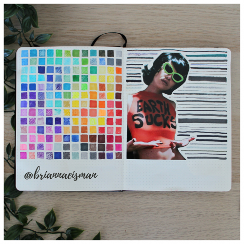
About once a year I set aside a page in my sketchbook, or bullet journal, to do a marker test. I go through every pen I own including Sharpies, highlighters, Bic Permanent Markers, Crayola markers, Stabilo pens, Expo dry erase markers and everything in between. I document the quality and determine whether to keep or toss the utensil. I find it’s easy to collect art materials, especially when you’re like me and switch mediums regularly. It’s important to know that when I reach for a certain pen or marker, it’s going to work the way I want it to. I do keep a page at the back of my sketchbook open for testing mediums, but it’s an important part of the process of creating art to go with the flow and just draw.
A painting I just finished to work on lighting, inspired by a painting done by SamDoesArts. This one was especially fun because I haven’t worked with layer effects for lighting in a little while and liked the way this turned out.
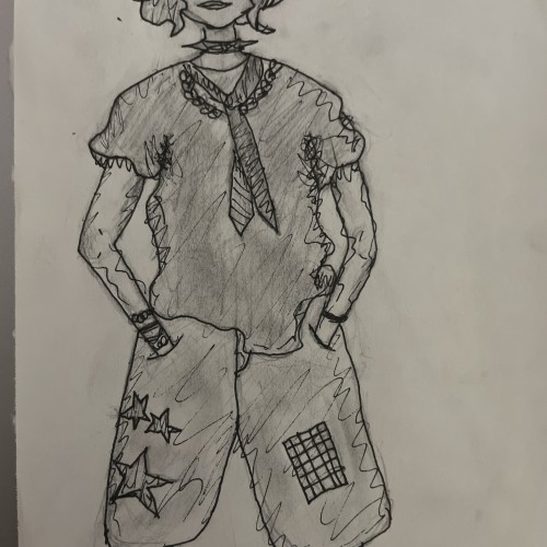
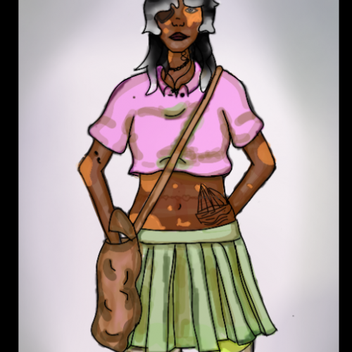
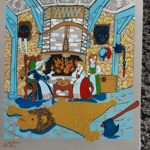
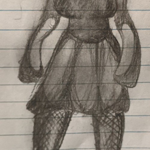
"My possibly late husband never learned to appreciate modesty and humbleness, im afraid." Being married to a pirate in the kings service comes with a lot of material perks, but makes it difficult to host a fine ladies party. im just glad to have finnished, i sat for three days painting patterns.
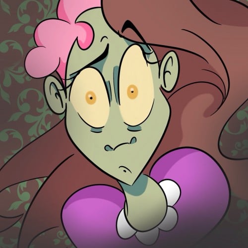
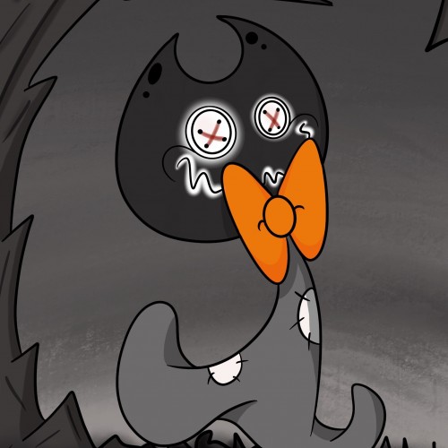
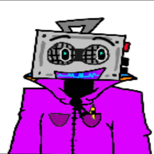
This is a new character I have created, his name is Creep Face.
Species: Spirit
Personality: Prankster
Home: Mausoleum
Likes: Wanders Cemeteries, Pumpkin, Hot Chocolate and scaring Scribble
Dislikes: The Sun (Its too optimistic & bright!)
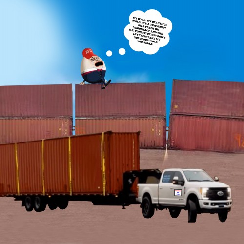
Trumpty Dumpty sits on the last few shipping containers weeping and wailing as a towing company, called We Remove The Wall, tows the shipping containers away.
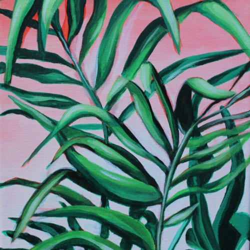
I love the versatility of acrylic paint. You can change the consistency by adding water or acrylic mediums. These additions enable artists to create transparent glazes or thick impasto textures. The fast-drying nature of acrylics makes it easier to correct mistakes or make alterations during the painting process. This painting is part of a three piece set featuring my favorite plants painted on a soft gradient background.
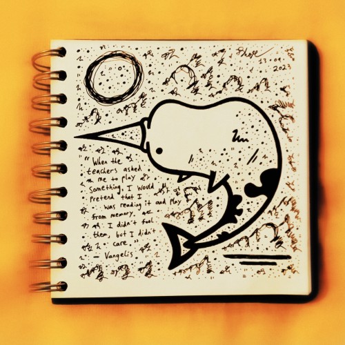
"When the teachers asked me to play something, I would pretend that I was reading it and play from memory. I didn't fool them, but I didn't care."
- Vangelis (1943 - 2022).
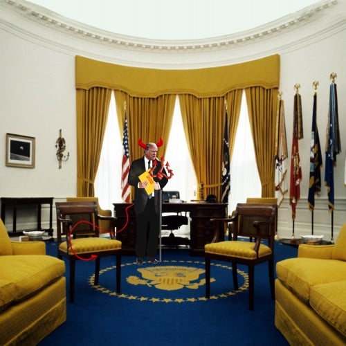
The devil, Donald Trump, stealing Top Secret documents from the Oval Office.
Available at Fine ArtAmerica https://fineartamerica.com/featured/the-devil-stealing-top-secret-documents-from-the-oval-office-karen-sullivan.html
This is a little Sketch Test I've just done. I'm trying to improve how to shade color digitally without creating a huge mess, like on my "Birb" sketch. I getting there. God bless yall's day!
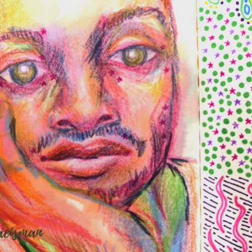
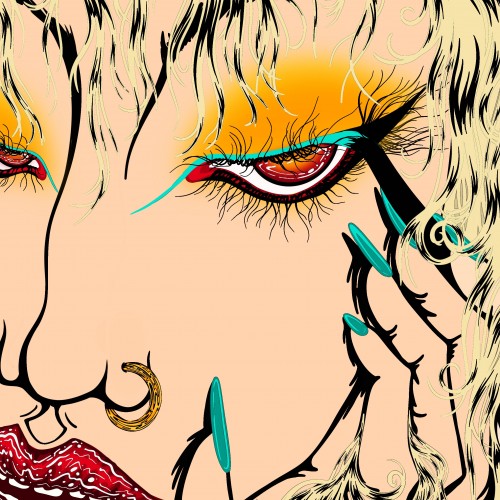
This portrait was created using mixed media like colored pencils, markers, and ink. The portrait features the face of a man resting in his hand, and staring dead-eyed at the viewer. I used non local color techniques to create depth and form using colors not typically found in the human face, like blues and violets for shadows and yellows and oranges or highlights. Parts of his face include small pink stars which originally faded from the previous page, but I really like the look it gives, they almost look like celestial freckles.