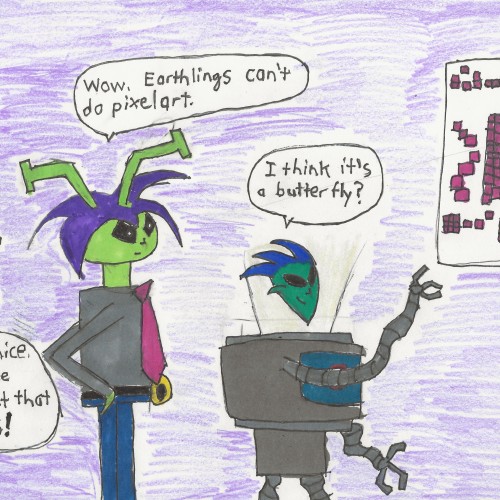
It may be a surprise, but I am only now reading 1st book on UFOs ( I have been mostly interested in aliens as fiction or in ttRPGs). I just learned about the Arecibo Message.
Frank Drake sent a message of 1679 bits to his fellow UFO friends and said that this was a mathematical message he wanted to send to the aliens. While not all cultures share language, we all share math.
To test if it was decode-able, he asked them to figure out what it meant with no other context. They failed.
So he sent it to more UFO friends. They failed, too.
So he put it in a decoder magazine and got exactly one correct answer from an electrician. 1679 is the product of two semi-prime numbers, which should get you to realize it’s a 23 *73 picture.
Bu needless to say if the interpretation rate was that low amongst earthlings, the hopes for alien communication seemed dim. Especially since the message will take 25K years to arrive.
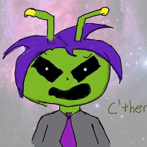
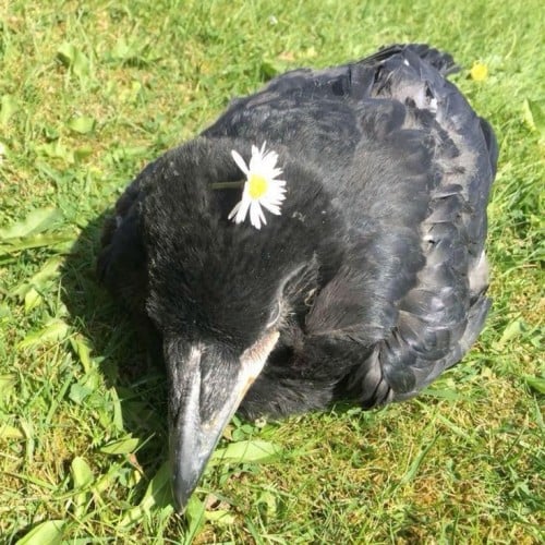
But we do have C’therax and Friends’ take above – admittedly the DNA double helix (blue) does look like a butterflyish thing.
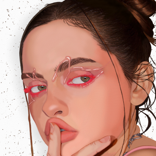
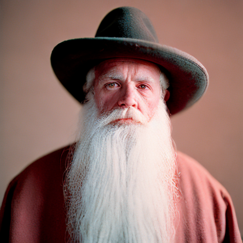
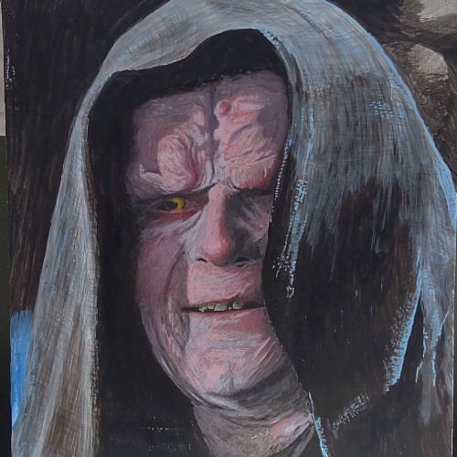
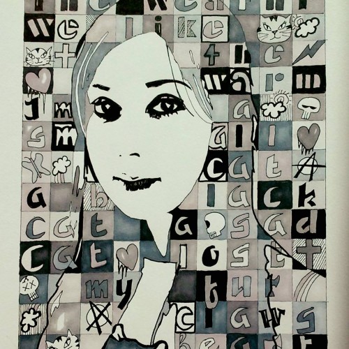
Face Paint Model Portrait Fanart by Oz Galeano
Instagram:
https://www.instagram.com/arte_ozgaleano/
Buy your custom Portrait:
https://www.fiverr.com/s/6WzyVL
Donations:
https://www.paypal.com/paypalme/ozgaleano
Youtube:
https://www.youtube.com/@OzGaleano/videos
Patreon:
https://www.patreon.com/Ozgaleano
Shop:
https://www.inprnt.com/gallery/ozgaleano/
TIK TOK:
https://www.tiktok.com/@oz_galeano
Behance:
https://www.behance.net/ozgaleano
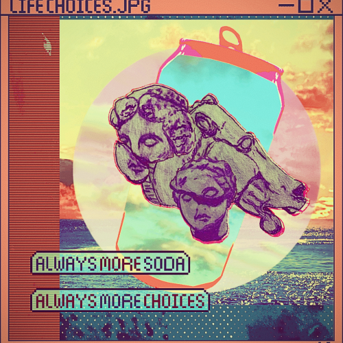
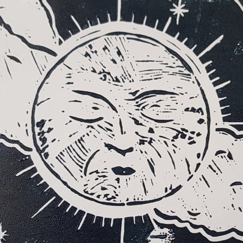
Elias Rosenshaw 11/16/2023
Filtered digital collage of photography, digital patterns, pixel art, and pen & pencil on paper.
Text paraphrased from my friend Lydia.
Drawings are studies of statues I photographed:
Horse's Head, The Parthenon Sculptures, The British Museum, London, UK
The Bassai Sculptures, The British Museum, London, UK
Because of the texture the sketchbook's paper, I couldn't use my regular mediums of choice. I decided to give crayons another go. It's a rather old piece (older than the other ones I've posted here) so not giving this a watermark.
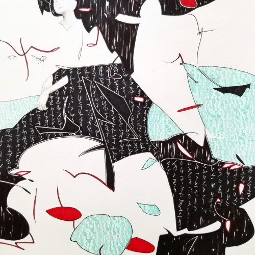
Whether the script in the background is an actual sutra is not the concern, even if it is, would it be readable to most? I question the use of lines in Calligraphy. Without the recognition of the exact words or meaning, can we still appreciate the quality and skills involved? Armed with a Chinese writing foundation, I adapted the use of the eight strokes (the basis of construction to Chinese character). The `writings’ resembles Chinese/Japanese writings but in fact, they are not. I needed a texture. With language as a symbol of culture, by visually adapting these kind of lines endears us to the image.
The materials that Meir uses in her works are not of the refined and so she is called an “arte povere” artist. At times she describes her work as someone dealing in alchemy - work develops as in a trial laboratory with different techniques and materials. She says, “ at times the artistic work process is a sort of puzzle demanding the filling in of all the empty squares “.
Some of her work focuses on women, and they incorporate criticism and cultural protest.
Meir has strong opinions about recycling and environmental protection that is represented in her works by use of materials and shapes. In her work she reacts to contemporary art that communicates with the eco system, waste, and she also searches for different worlds. Her works are made up of layers upon colorful layers that when we look at them it becomes clear that the mound of waste she chose is not coincidental. It actually becomes a colorful kaleidoscope of utopia.
Jaffa Meir is a multifaceted, autodidact artist working in painting, sculpture, photography, product design, carpets and furniture, painting on textile, and computer graphics.
The structural composition of some of the works is influenced also by her many years of working in the architects’ office.
Meir also worked in the developing of ideas within the field of ecosystems and recycling for factories such as Coca Cola, and during this process came up with ideas for designing parks and public game spaces using industrial waste products.
The image title was the instruction for a text to image generator (playgroundai). Is this now my doodle or you are not allowed to upload something like that here?
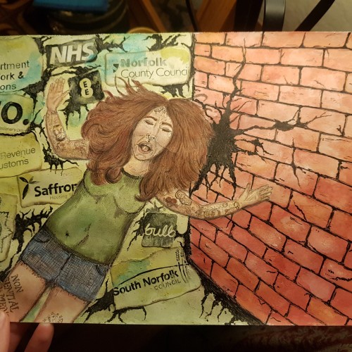
I created this piece in response to the ongoing mistakes and let downs from the organisations who should be protecting and taking care of people. I still have a couple of tweaks to do, but it is basically finished. I used flour and water paste to add texture to the brickwork and to attach the logos.
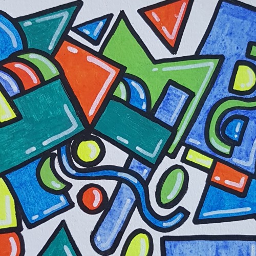
This was my first try using paint pens. Played around with shapes to get used to the texture of the paint and how it feels to use the pens. Done in a watercolour sketchbook.
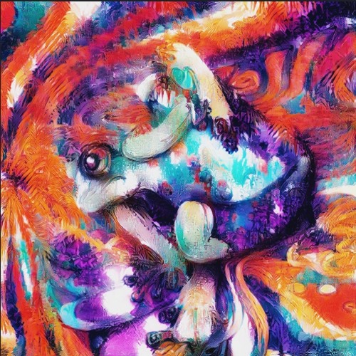
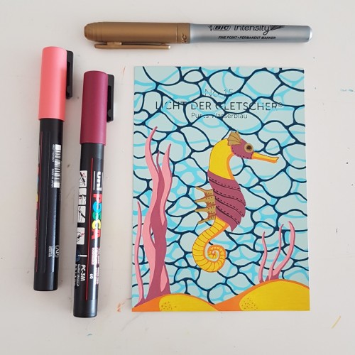
I did the water texture according to a tutorial by James Chapman, found on Instagram. The steampunk seahorse was an idea from a lady I am following on Instagram as well (look for @carrieisartsy) This piece is done on a paint chip card with poscapens, a gold marker and fineliners.
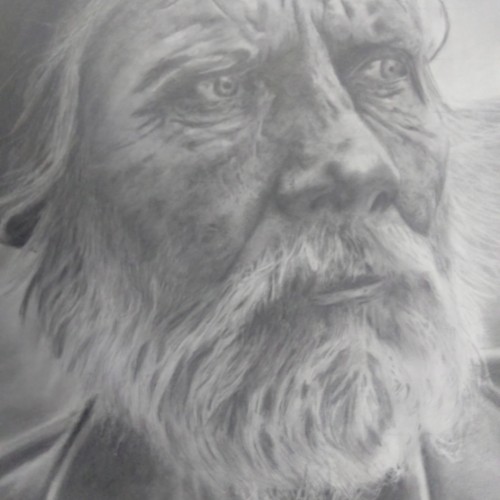
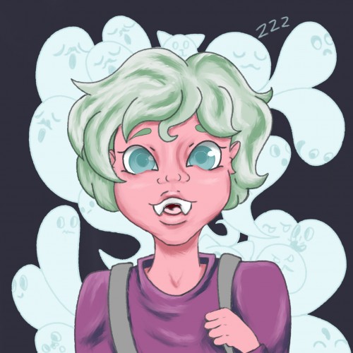
I really enjoyed drawing this. This is where I really explored using my kneadable eraser to create texture in the skin. I still learning how to draw hair.
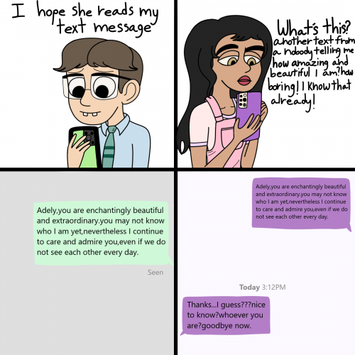
I uploaded one with Sidney a week ago but made a few adjustments.The two lads aren't having the best of luck with their crushes especially Servino since he Morrison threatens him frequently and with Mevlon being labeled another nobody by Adely herself.would they happily persist or become hopeless and alone?I could have put more effort in drawing the text bubbles at least :[ I had a cramp on my hand,ow!
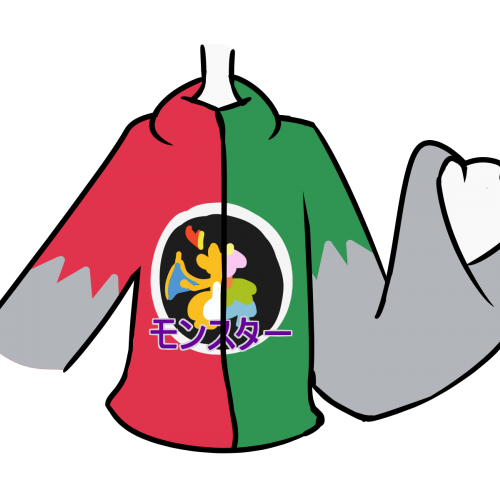
A Pokémon sweater I drew a while ago. It represents Japanese Pokémon Red and Green. I drew a static-head wearing a smiliar sweater, which is inspired from this. The Japanese text translates to "Monster". Drawn with FireAlpaca.
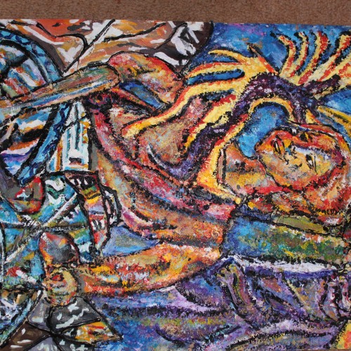
Golden acrylic on canvas. This is the second abstract I've attempted. It's not fully finished but it's looking pretty cool so far. I used the palette knife to create texture and metallic paints in my color mixes
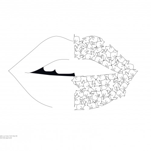
Animaux origamiques répétés et rapprochés pour former de manière subjective un vêtement ou un accessoire. Un animal seul est représenté par illustration. L’animal donne une indication sur l’apparence du vêtement en suggérant une texture, une nuance, une odeur. Dans la série, « lipstickrabbit » fait référence au testing des rouges à lèvres sur les lapins.
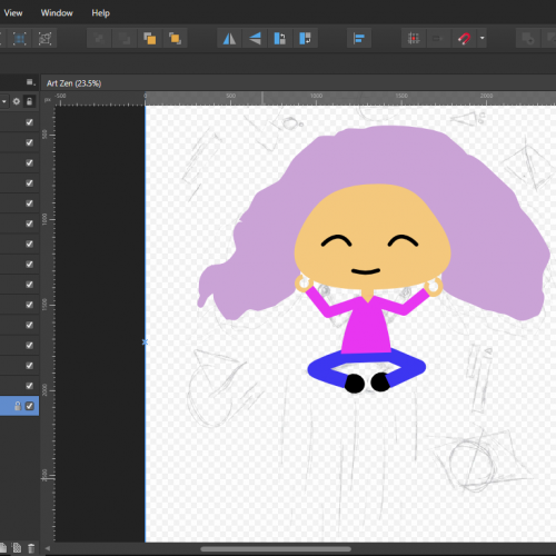
Went off a different prompt list today because I really wanted to draw something chill. Also I wanted to do some reference pose practice. PIntrest is a god send for trying to figure out how body's move. XD. This one is much more simple since I wasn't too focused on finishing the full color. Instead I played around with a few of my drawing programs tools. Tried to use its coloring mask, patterns, and texture brushes to get a simple yet readable mood.
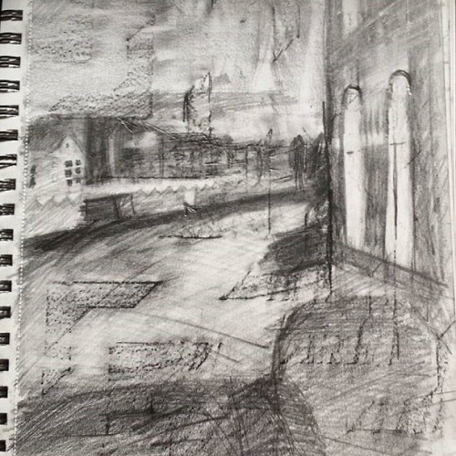
This is a piece of work of a canal in Amsterdam. i made a rubbing with pencil of a interesting patterned wall to create a base tone and then worked into it. This helped focus on tone and create interesting textures.