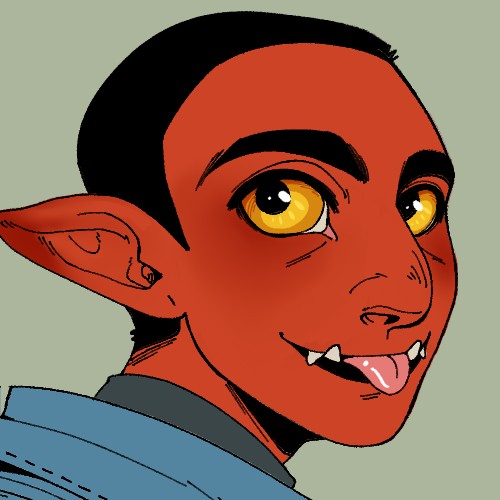
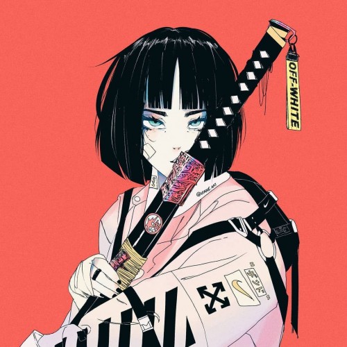
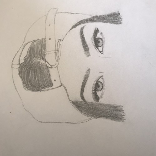
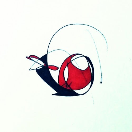
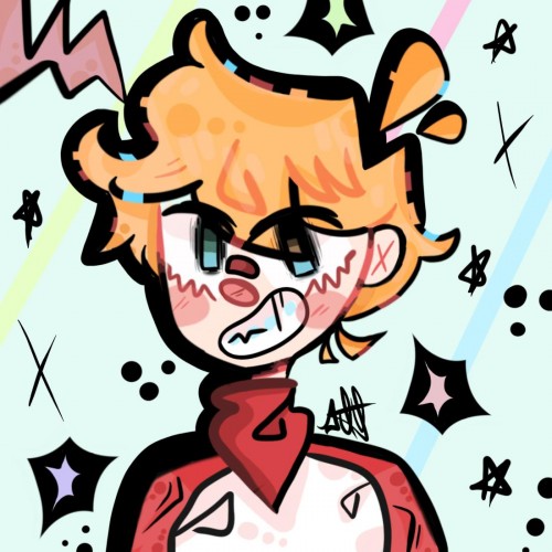
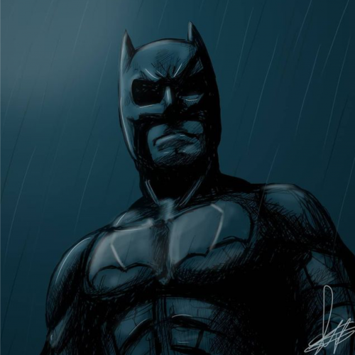
A sketchy batman. This is a bit old but i still love it because it was my attempt at drawing a superhero type character. My anatomy at that time was not how i wanted it to be and still to this day but now i have a slight hang of it.
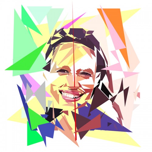
Réalisation du portrait de @Nathanaël de Rincquesen dans le cadre de la préparation de l’exposition : « Les chroniqueurs de #Télématin sur #France 2 et la dissipation et vapeur de la mémoire télévisuelle.
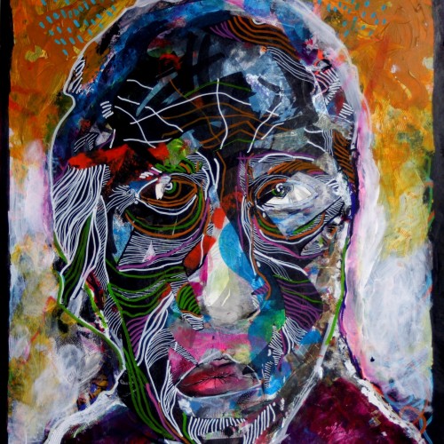
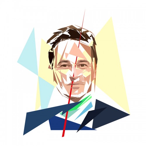
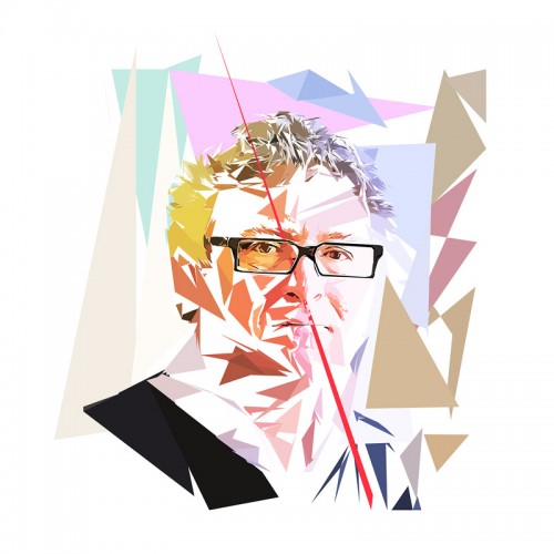
Digital painting on canvas of "Michel Onfray" in the manner of the praise of the approximation of the exhibition. This graphic and stylistic style is borrowed from the concept elaborated in the Praise of Approximation ": a painting to be reconstructed using the structure to which the perceptions are subordinated, highlighting the perceptual disturbances of perception. whose memory has been recorded in the brain of each individual.
Peinture numérique sur toile de « Michel Onfray » à la manière de l’éloge de l’approximation de l’exposition. Ce style graphique et stylistique sont emprunt au concept élaboré dans l’Éloge de l’approximation » : une peinture à reconstruire à l’aide de la structure à laquelle sont subordonnées les perceptions qui met en évidence les troubles de la perception liés à la manière dont le souvenir a été enregistré dans le cerveau de chaque individu.
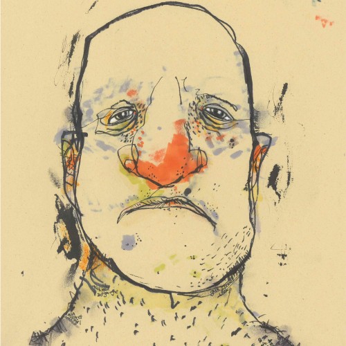
So I'm a little behind the curve, but here's my day 1 for Inktober. This was my first time using my fountain pen for drawing, so I can't complain too much. There's definitely some room to grow. Lined with a TWSBI Eco: fine nib with Organics Studio Walden ink on Tomoe River paper. I'm a sucker for sheen, what can I say. The sad attempt at shading was done with a wet paper towel, so I'm guessing I could try upgrading my technique there ;D
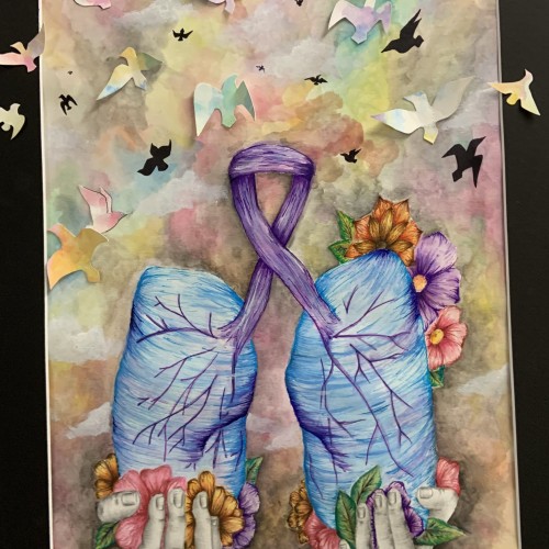
A pair of lungs being given in hands that represents my donors hands. The lungs are surrounded in flowers to symbolize the beautiful gift of organ donations. The lungs are also being represented with birds flying to symbolize life. This painting goes from dark at the bottom to lighter colors at the top to symbolize the darkness of someone’s death being transferred to saving of someone else’s life from their selfless act. I’m a lung recipient, and this is the story of my selfless donor!
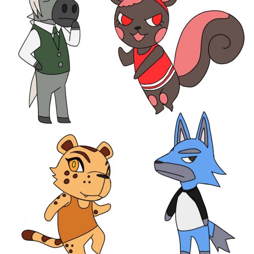
My hubby loves Animal crossing and they asked me to draw the triple AAAS as animal crossing characters. Top is Amar and Aska, Bottom is Augustine and Sayeed.
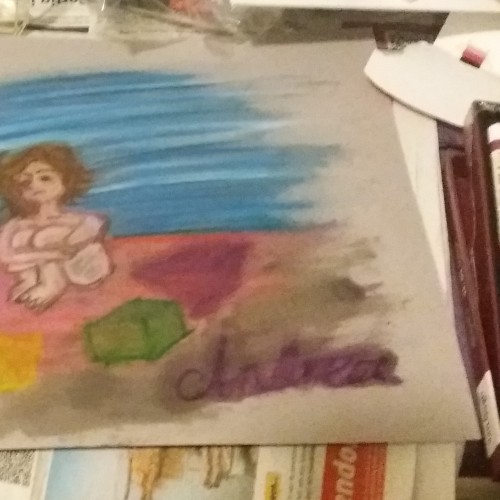
First time oil pastel. Concepts and Hope: as a woman struggling with autism spectrum disorder I grew up not understanding basic concepts in the world around me. Maybe this is universal. I didn't understand why we had to go out to play in school for example, or I didn't understand other people might not be as honest as I always had been. A lot of concepts have a different meaning for someone like me. So here I am naked between the concepts, misunderstood but hopefully looking up. Maybe one day the world will be more like my ideals are, maybe I will create a circle around me of likeminded people, maybe the world will never change enough but I will find peace with myself. One day I will get peace, one way or another. Hope. Oh and yeah, it's a mess with the oil at the bottom. Does anyone have some ideas to improve my technique?
Français : L’Appropriationnisme ou le « Remake » est un concept simple. En effet, il suffit de reprendre le travail d’un artiste et signer la nouvelle production de son nom. Il ne s’agit, en aucun cas, de copier l’œuvre comme pourrait le faire un faussaire. Il ne s’agit pas non plus de plagier l’œuvre.
En ce qui me concerne, j’utilise l’œuvre célèbre d’un artiste reconnu. En réutilisant une œuvre originale préexistante et célèbre, condition sine qua non, je propose de rendre un hommage. Il ne s’agit en aucun cas d’un manque d’inspiration surtout lorsque l’on sait maintenant que : « l’art naît de l’art et non de la nature » : Ernst Gombrich.
Dans cette série, j’ai voulu revisiter des œuvres célèbres en utilisant ma technique graphique de l’éloge de l’approximation mettant en évidence la problématique de la défaillance et de la mémoire vaporeuse.
English: Appropriationism or Remake is a simple concept. Indeed, it is enough to take again the work of an artist and to sign the new production of his name. It is not a question of copying the work as a forger could do. It is not a question of plagiarizing the work.
As far as I'm concerned, I use the famous work of a recognized artist. By reusing a pre-existing and famous original work, condition sine qua non, I propose to pay tribute. It is by no means a lack of inspiration especially when we now know that: "art is born of art and not of nature": Ernst Gombrich.
In this series, I wanted to revisit famous works using my graphic technique of praising the approximation highlighting the problem of failure and vaporous memory
English : Realization of the portrait of @Nathalie Schraen Guirma as part of the preparation of the exhibition: "The chroniclers of # Télématin on #France 2 and the dissipation and vapor of television memory. French :Réalisation du portrait de @Nathalie Schraen Guirma dans le cadre de la préparation de l’exposition : « Les chroniqueurs de #Télématin sur #France 2 et la dissipation et vapeur de la mémoire télévisuelle.
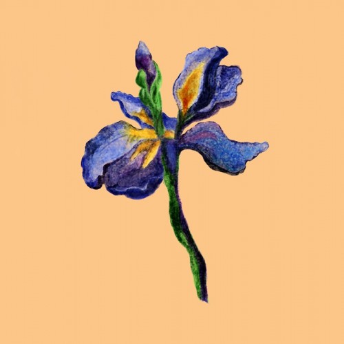
I got my first client for logo design and they asked for a custom watercolor illustration of Iris flower. So I researched about iris flower and did a rough sketch. From there, I started rendering color using a special brush from GrutBrushes.
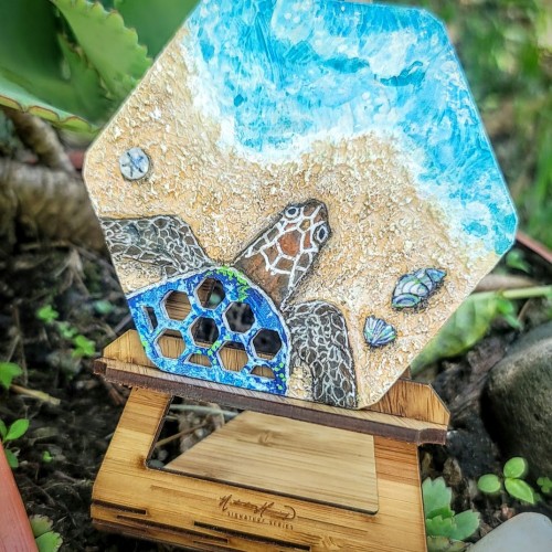
The tiny hex cutouts of this canvas were the inspiration for the turtle, and I chose to put it on a beach as the perfect excuse to have more fun with texture medium! Acrylic on custom 4" x 3.5" hexagon canvas.
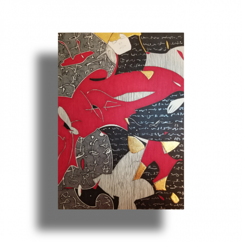
The idea is to show a figure crossing over two ` scripts’ with a bilingual suggestion. By standing in between worlds, we see opposing viewpoints.
Many artists have incorporated typography as symbols in their paintings since the 60s, but no one has attempted to approach lines in this `written’ manner. How different it is are the two writing styles of the East and the West; one with angular lines while the other in a smooth flow! This work juxtaposes the symbolism of cultures – script. At the same time, it questions the need to grasp the full meaning of the script to appreciate the aesthetic flow of calligraphic lines.
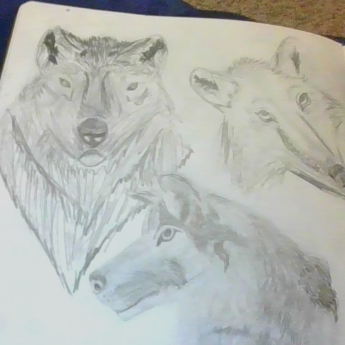
So the one on the bottom was the first one that I did (sorry it is so blurry), the one on the left was the second one, and the third one I did was on the right. I am sorry about the camera quality. The first two were from references then the third was without a reference and I started to get lazy xD.
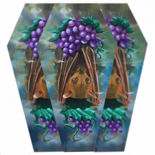
"Foxed Fruits" is a 36cm x 10cm x 19.5cm x 7.5cm oil painting on custom cut plyboard with acrylic Venetian gold embellishments. This piece is available for sale.






![Venn [it/its]](/images/users/avatar/55477_vennisweird_714578.jpg)