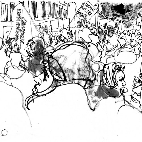
On Tuesday evening some 1000 people gather in front of the German chancellery to demonstrate. To ‘Open the borders! Safe lives! Fight Fascism!’ were called for by ‘Seebrücke Berlin’ and others. We marched along Reichstag (seat of german parliament), offices of members of parliament, Russian embassy to Friedrichstr, where a final rally was hold (this is where the sketch emerged). Seebrücke appealed to the parliament to allow at least these refugees in most urgent need to come from the inadequate camps on the greece islands to their german member municipalities, that have space and are willing to host them. German parliament yesterday refused to do so, presumably due to their fear of further rise of right wing parties. This influence was another topic, that was adressed by the demonstration, that marched against any influence of right wing and fascist parties in Europe and for an international spirit of humanity.
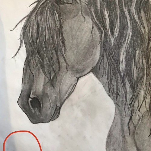
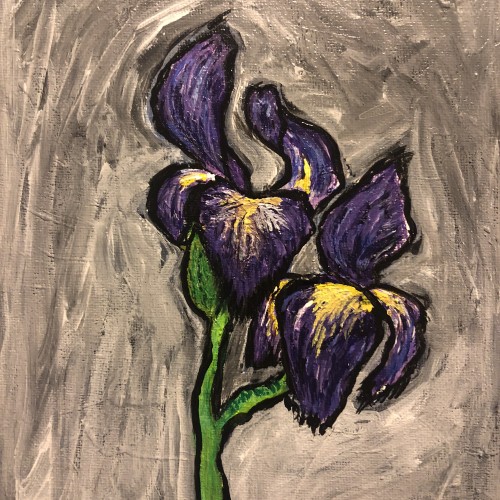
I would like to place a red rose somewhere in the vicinity of the red circle. Should I make the background darker than the Friesian, lighter (grey-ish) than the Friesian, or keep it how it is? Any opinions/comments would be very helpful.
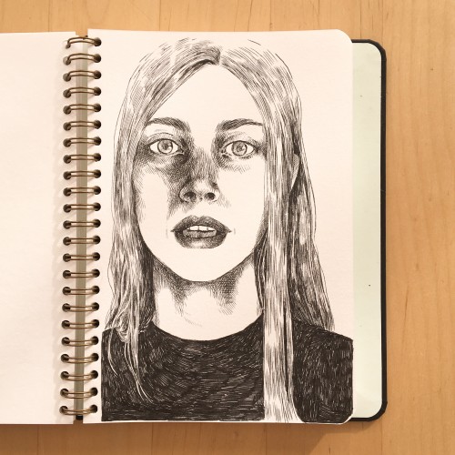
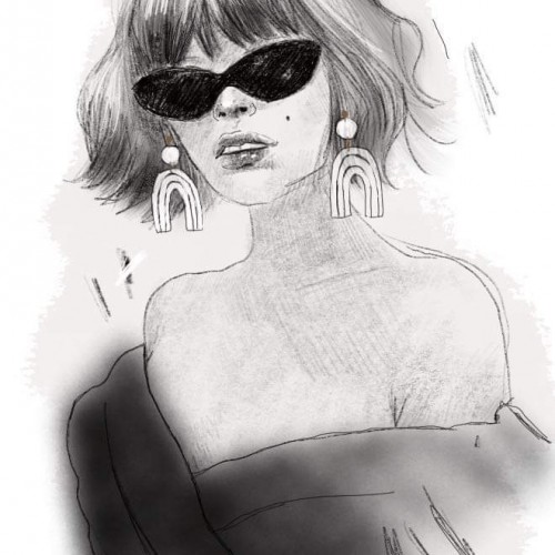
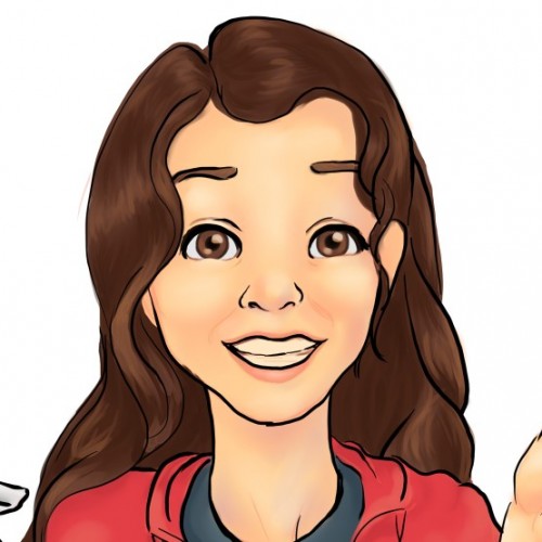
I realized lately that I need to practice more instead of focussing too much on new ideas. So I started with face-practicing since I enjoy that the most. Thank you very much for looking at my drawing!
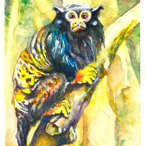
My next monkey watercolor -well, mostly - there is a touch of acrylic paint on the eyes. I do not know why they are called red-handed - since they seem to have yellow hands.
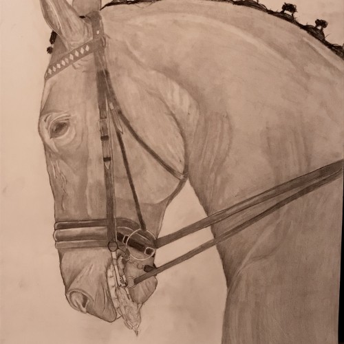
I decided to do this piece because one of my friends argued that bits aren’t invasive and horses enjoy the clear commands. I ride in a bit so if you are a rider and you use bits I’m in no way attacking you. I merely wanted to express that bits are painful and invasive to horses and how important it is to keep light hands and only pull on the reins when necessary.
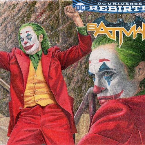
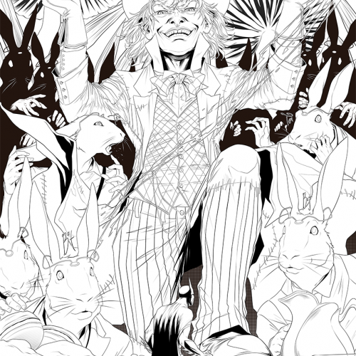
This is a traditional art illustration produced with Copic markers and Prismacolor colored pencils, on a blanks sketch cover for a Batman rebirth #01 It featuring Joaquin Phoenix from the Joker movie. see more at Sketchcardsandcovers.com
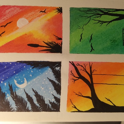
I feel like my landscapes have very traditional colors so i tried to make these look bright and exaggerated but still hold the same base color. Let me know what you think.
I uploaded a version of this that I felt was kind of a throwaway. Just dinking around and trying to get a feel for techniques. In the end, while I was happy with what I learned, I didn't think much of it as far as a completed work goes. But I couldn't leave it alone so I took about another hour and fixed what I felt could be fixed short of starting from scratch. Because it's a process, right?
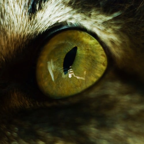
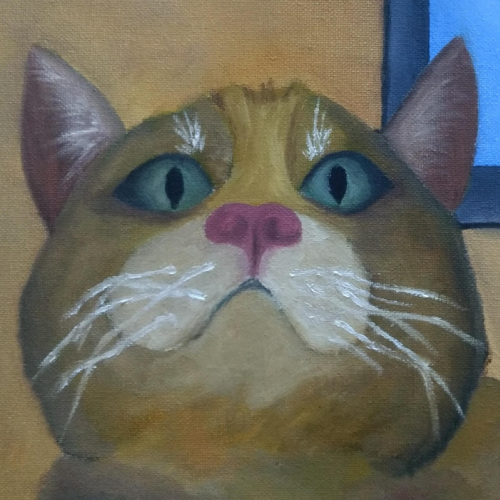
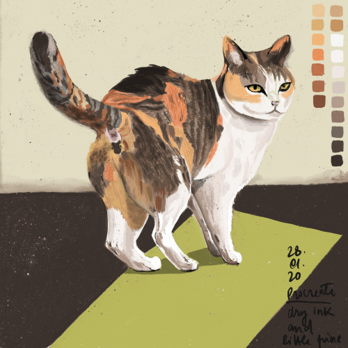
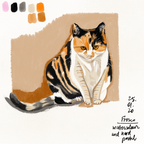
Practicing with reference: https://www.independent.co.uk/news/science/a-cats-level-of-aggressiveness-could-depend-on-its-colour-say-scientists-a6707731.html
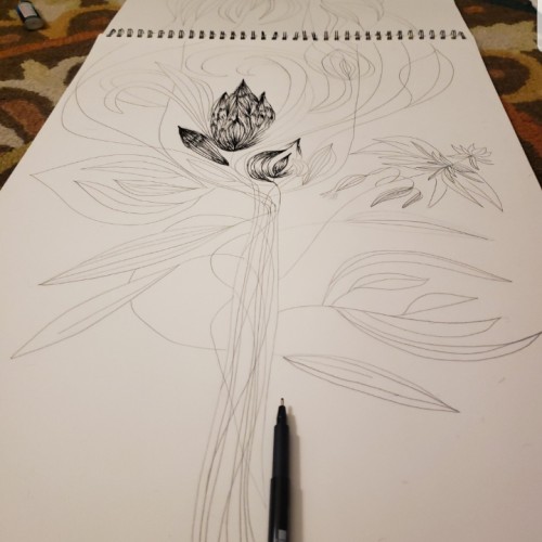
I've been really busy lately. I took a break that was supposed to be a 10 minute doodle break, and this was the result. Well, its the inks of the sketch result. I have no idea if the colors will work the way I intend, but I'll post those after they're finished.
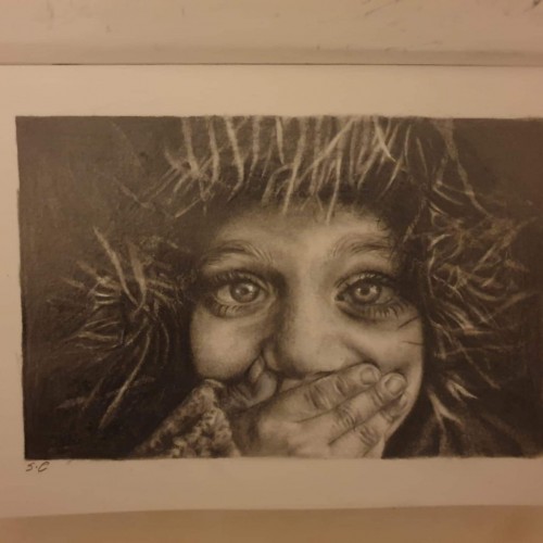
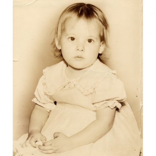
Graphite portrait of a child covering her mouth. My first post here, I hope you enjoy ! ● Carand'ache pencils, kneaded rubber, white pencil, sketchbook.
Hello guys. I just found this website and its seems really cool. I paint now and then and this is one of my paintings. I received a school assignment for my art class to do an artwork based on the society. Without doubting i chose my theme which is "body type". A very close friend of mine belongs to the not so "accepted" body types and it has been a really though time for her even though she doesn't really show her emotions. I painted a girl vs another girl with an atmosphere around them, based on their looks. U can see the difference on how they bring themselves to the society just by looking at their body position. So how the society influence their mental state.(I can only post 1 pic so the next post will be of the another girl) I got a B+ \(^O^)/
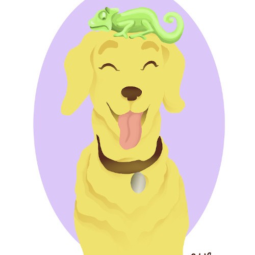
Inspired by a drawing challenge to draw two objects based on the first letters of your first and last name. I thought a chameleon and labrador would be fun to draw together, because it reminds me of the friendship that forms when an extrovert adopts an introvert ^_^ This is my first digital drawing that I tried without using line art. It was challenging to get the hang of, but I like the bright and simple effect of it.
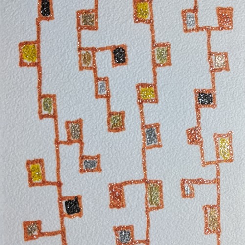
I saw someone else on Doodle Addicts doing really great bookmarks and I remembered that last winter, when I couldn't seem to do anything else creative, I made a bunch of bookmarks. It's a way of trying out things, and using fun media like these glitter pens I inherited.