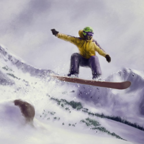
This piece is in a style that, I think, is very different from how I usually drawn or paint. I had bought myself a set of acrylic gouache paints, and I wanted to do something to test them out since I'd never used them before. (I'm definitely not the type of person who sees something new and buys it for the heck of it, but here we are..) I will say, I'm happy I bought them. If anyone has these paints and can share any tips on using them, it would be greatly appreciated!
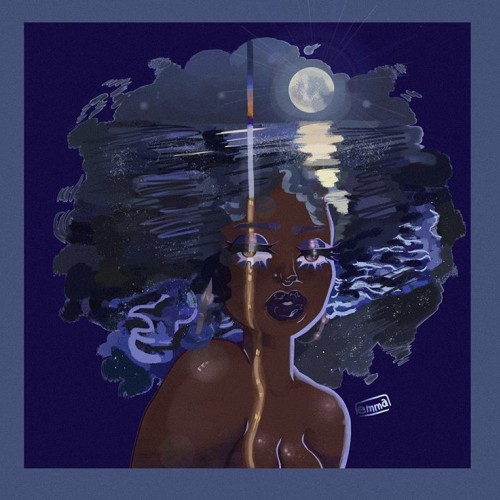
Digital illustration that took 14 hours to complete. I wanted to create almost an illusion type piece. I like showing diversity in my art so more to come!!!
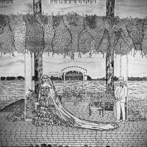
I used a reference to draw this scenery. In the reference there was so many details that I really wanted to capture it. I even wanted to capture the details in the bride’s wedding dress. I think the groom looks quite handsome in blue (it’s HIS color as some people might say). I incorporated the long, beaded line under the bushels of flowers (just another element to add to an already beautiful scene). Also, as you can see, I added an audience watching the couple as they have their picture taken. The flowers spread along the table with the view of the wavy waters right behind them looks so refreshing. Every element served its purpose for the ultimate “moment to remember” feeling. One of my favorite things about this drawing is the string lights. It’s one of the smallest items to have, but they add character and charm to the scenery. The string lights give a romantic feel and is even more gorgeous at night. I enjoyed doing this drawing so much that I anticipated the second I’d be finished with it.
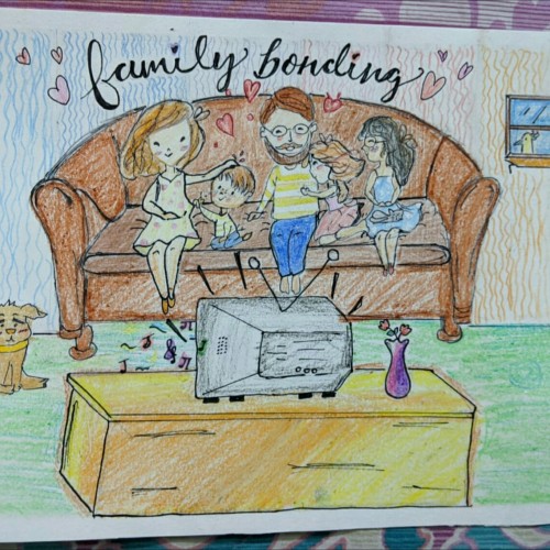
Hi there, I wanted to uploade this art work as the quarantine quarter submission.. But due to my harsh luck the time was out...and I was late by 2-3mins...I was extremely sad about it but then thought to upload it on my profile only...so this is basically a drawing of me and my family enjoying time in this quarantine period :) and please please please tell any kind of lack in my this drawing... Hope you like it ;)
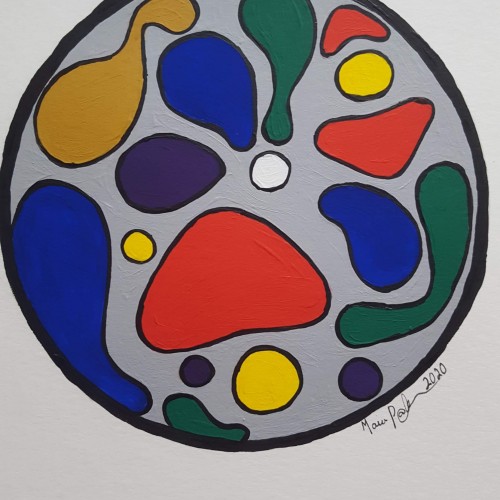
In this series called Identity (Identity), inspired by the people and the diversity of New York, I wanted to capture this diversity, the statics, the glamor, the fashion, the ethnicities, the culture and the splendor of this magnificent city. Mauricio Paz Viola
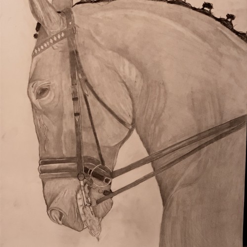
I decided to do this piece because one of my friends argued that bits aren’t invasive and horses enjoy the clear commands. I ride in a bit so if you are a rider and you use bits I’m in no way attacking you. I merely wanted to express that bits are painful and invasive to horses and how important it is to keep light hands and only pull on the reins when necessary.
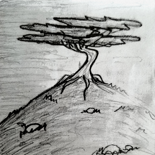
I'm really enjoying this site so far. This was just a little practice tree; i wanted to try out a different design style....i think it turned out interesting. Tell me what you think! I would greatly appreciate any feedback on my art, comments, tips, etc.
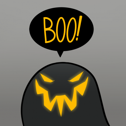
Something I drew for Halloween upon request from followers on social media. I really wanted to mimic that uneasy otherworldly tone the film had, but I don't think I pulled it off very well.
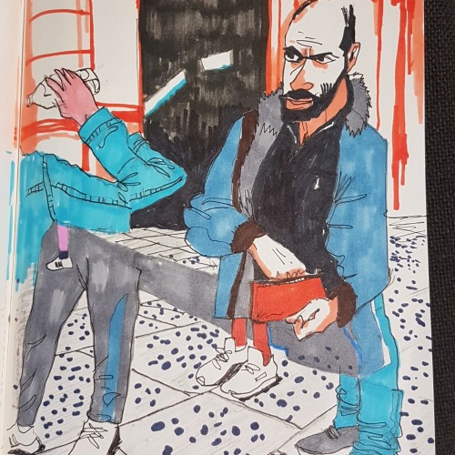
I've tried to bring the feeling of motion into my sketch. I like capturing street scenes and wanted to convey the gritty street alogwith the activity of the tourists and Londoners.
The amount of erasing I've had to do in this digital sketch would have turned real paper into dust. I had so much trouble nailing down what I wanted, but I've got the beginning framework and I'm so relieved to have it out of my head.
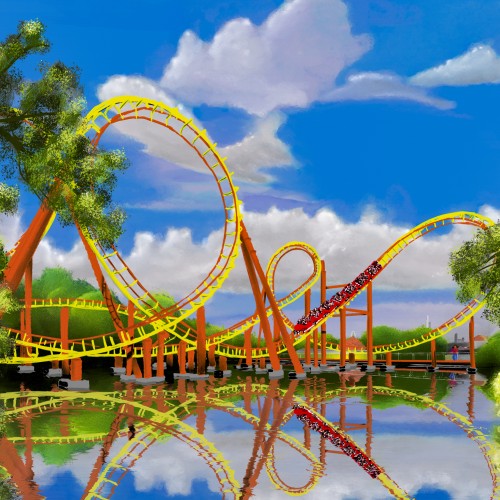
Ive always thought Goudrix is an aesthetically pleasing roller coaster, regardless of how it might feel when you ride it. I love roller coasters and design layouts in No Limits 2, but I've never composed one. This is my attempt using oil brushes in Rebelle. I wanted it to have a traditional vibe. This is not AI, nor is any part of this AI.
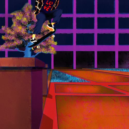
Yet another senseless lynching that has me here with a broken heart. Like my other paintings on this subject, I wanted to focus on life. Tyre was dynamic and energetic, so I wanted to paint him soring. I also wanted to paint him defiant in the face of his oppressors. He was a skater, and they are no strangers to defiance. Thankfully, I found some excellent references to help me with the composition. Aesthetically, I wanted the comp to be modern, colorful, and hopefully impactful. I went for a pop art, illustration, and false-color vibe and minimized blending and refining layer edges. I painted this in Rebelle 6 and Photoshop. Much respect.
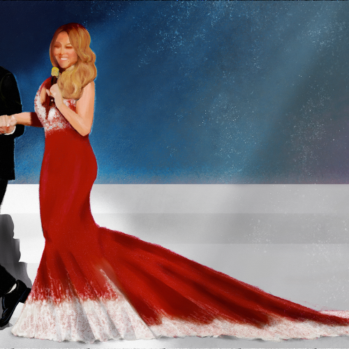
Shes served her best Christmas with an enormous train led by Brain Tanaka. I used charcoal and pastel brushes in Rebelle 6. I wanted a really simple composition so I could focus on her dress and their pose together. Happy Holidays everyone.
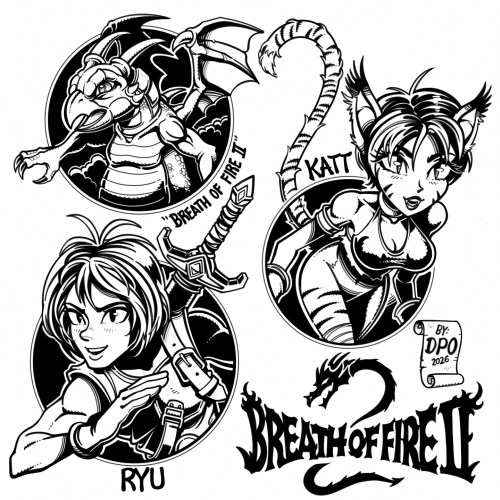
#29 Breath of Fire 2 - My fanart drawn in ibis paint on iPad pro. I recently discovered this game on the Super Nintendo. I really like the artist’s concept artwork for BoF2. I wanted to draw a few of the characters and the logo in my style. Ryu is the main character, and I like Catwoman type characters, so I thought Katt looked fun to draw. Also, I drew the logo slightly different from the original. I don't like to draw every detail exact. As usual: [No Tracing] [No Ai] [No free form line tools for inking except for the perfect circles]
#Golgaaryol
Injured into symbols
The wounded Shadow
The ink flows and carries nonverbal oddities
[April, 2023]
Danielle East - Broken Butterfly
https://youtu.be/4WiMDebAnzo?si=k2yO1ALrmwyysOt4
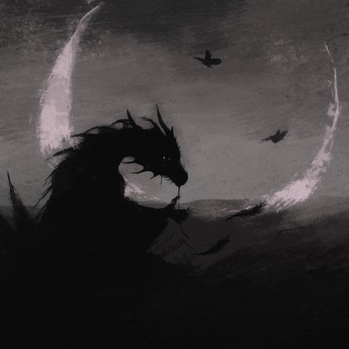
I wanted a picture of a sad dragon - finally I turned ordinary doodles [from 2023] with brushes into something like this, blur and softening effects were also added.
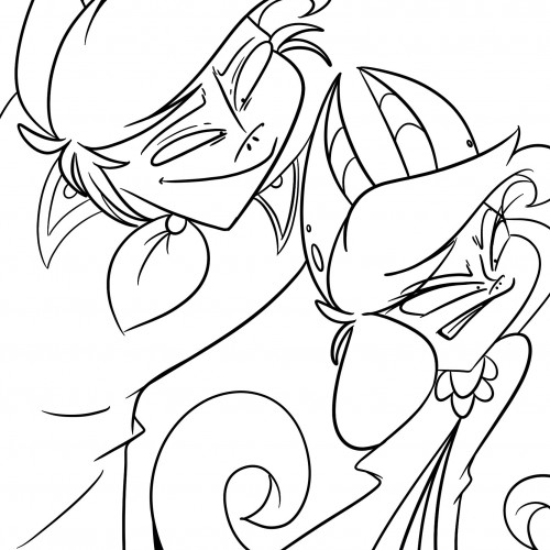
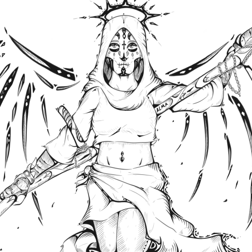
I wanted to try out death. Or at least a version of her. I think she turned out pretty well.
This is just the outline. Right now, I'm working on coloring her. Hopefully she'll turn out great.
What do you guys think?
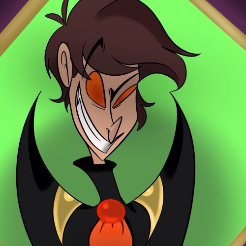
I wanted to draw Ash but without his bat features. Ash takes on bat like features in his orignal concept. I will be keeping those features, because I like how it looks. Every color I used in this picture was used for a reason. I had to do some research, so the colors would reflect is personality and his role he plays within the world in which I created him in.
Colors with purpose:
-Purple
-Green
-Red
-Orange
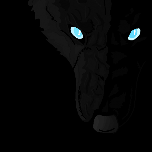
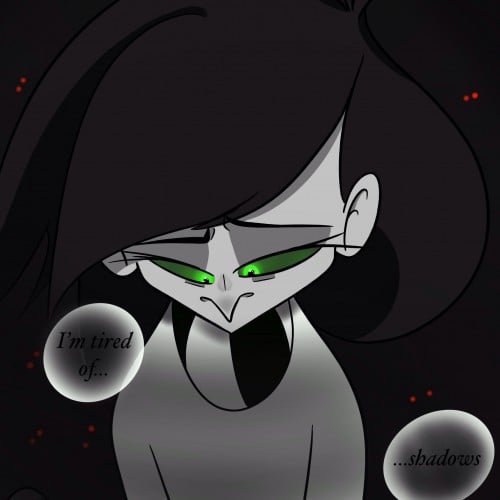
When I had originally created Chump she was born from a part of me that was fed up living in the dark. Chump was created from the oppressed part of me that wanted joy. But I felt like a creature of the dark that wasn't allowed to have such things. My art is not just some fun form geometry with colors, its my vent.