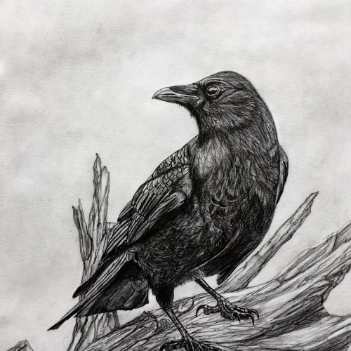
This was a bird study for a painting. The customer loved it so much that they wanted the drawing instead. That suits me fine. In the end it is what the customer wants that really counts.
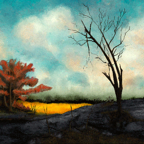
A foggy morning opens up to a burnt landscape. I wanted to paint a couple of different environments in one painting but still aim to be refined. I used fall colors and smaller lines.
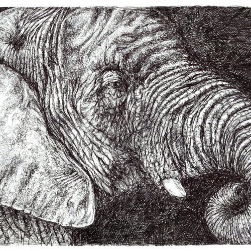
BIC ballpoint stick pen drawing on Richeson bulk drawing paper. This started as a contour drawing and just got squiggly (not the original intent). This was clipped to my board for weeks and I would add a few squiggles from time to time when I wanted to make marks, but didn't have inspiration. It's just a bit under 15 inches (12x18 inch paper) and is probably about 25 hours of making little lines and squiggles. The reference was a Dreamstime royalty-free photo.
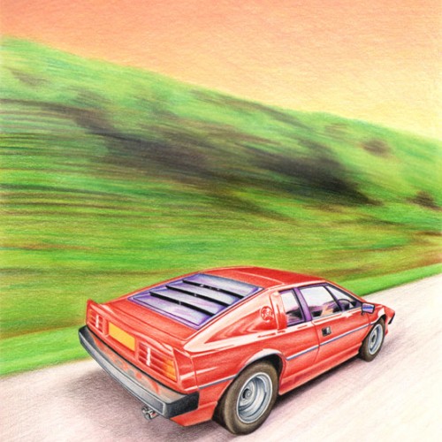
A colour pencil drawing using Derwent Artists pencils on thick cartridge paper. I wanted to show the car speeding down the highway, and so tried to make the tress appear as though they are a blur - Many thanks for looking !
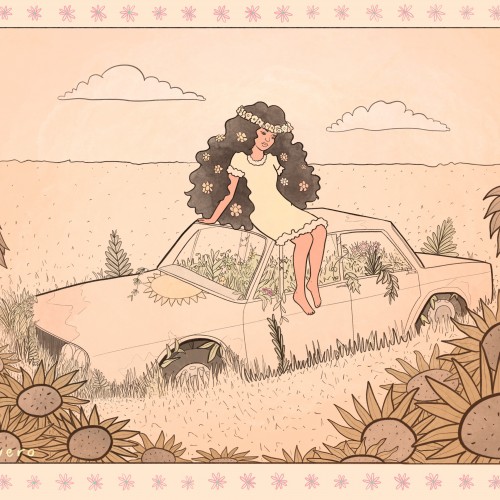
hello☺️✨ one day my mum and i drove around and we found a place with some old cars, busses and caravans. absolutly fell in love with them. we took some photos there and when i came home, i really wanted to draw them. so, i started drawing and it was so much fun. this drawing was inspired of one of those lovely cars we saw then. wish you a wonderful day!
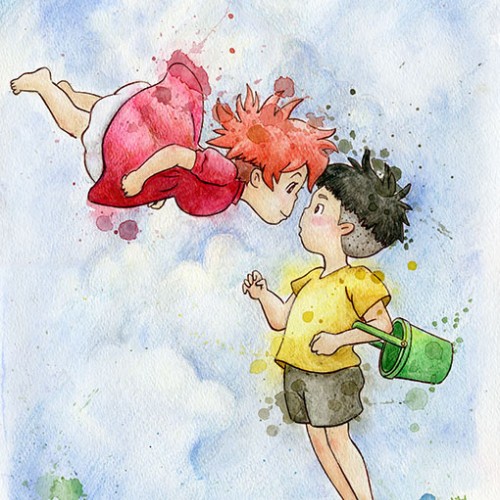
First real art of the year. It took longer than I wanted but I love how it came out. Guess that's what happens when you put time into your projects - go figure. Just a little Copy Cat art from a beautiful, innocent, charming film - Ponyo. What's your favorite Studio Ghibli Film?
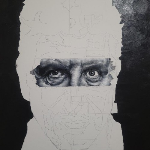
Over a year ago, I finished my Robin Williams portrait, and I decided I wanted to create a series of different black and white portraits. So far, this is the happiest I've been with a piece in a while. There's no expectation, there's no real pressure on this, it's me falling in love with painting again. I've only been working on this for a week, so there isn't a ton of progress. I suppose I'll reveal who the person is later once more progress is made but for now, enjoy.
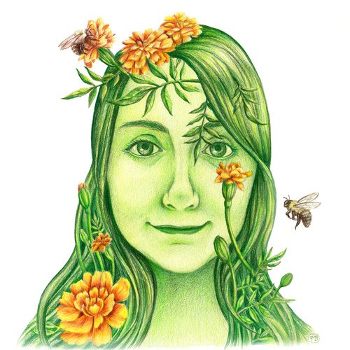
Created in colored pencil, I just wanted to show my love of the bees and all things green. We rely so much on Mother Earth and it's our connection to her that will continue to sustain us.
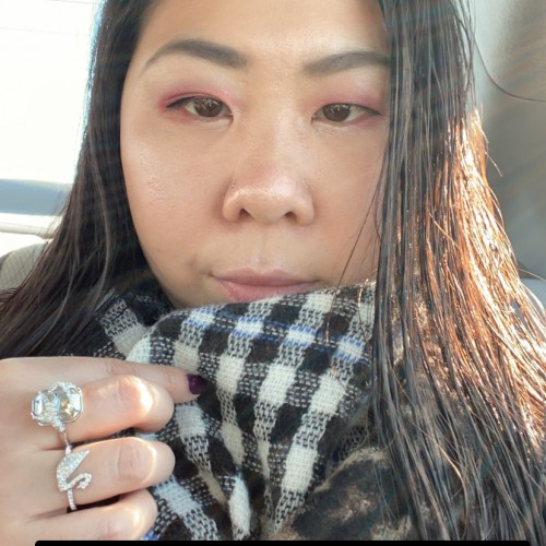
Nat checking her email. The polar fleece blanket colour and texture didn't turn out the way I wanted it to.
Bic4 Ballpoint Pen, Sanrio Novelty 10 Colour Ballpoint Pen on Archival 8.5" x 11" paper
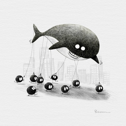
Inktober2018day12-Whale. I’m using inktober to explore and improve my techniques. This time I wanted to try using more crosshatching. I’m happy with the result. Also, at first I had nothing for the whale prompt but it’s rewarding when you push through the dead space and a concept or idea comes to my head that I can be excited with.
Here is one of 3 illustrations I made for customizable postcards, available for purchase at @cava.galeria
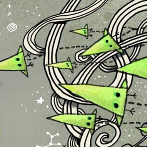
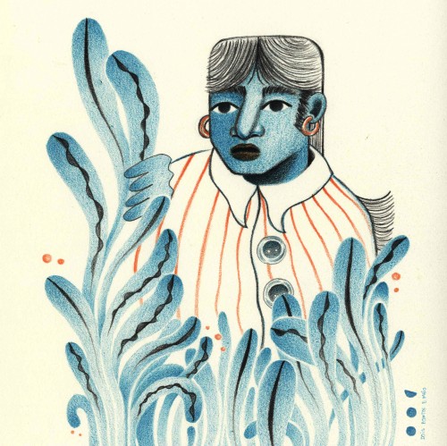
I wanted to use this green/bluish colour, plants, and a very curious human in this case.
What do you think the person is saying?
*The size is 15,5 cm by 11 cm
Limited number of postcards
A very closeup drawing in 4B, 6B, 8B pencil on Fabiano hotpress Studio paper. I bought some Pitt Graphite Matt pencils and wanted to give them a maiden voyage. They are much lighter on the scale of deep blacks than I expected. More like rarified F pencils. But I like them.
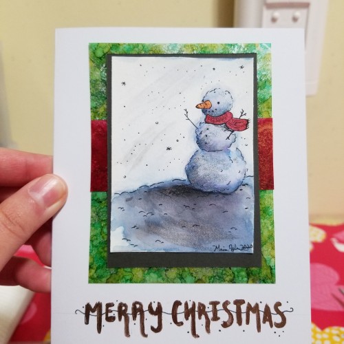
I know this isn't an elaborate piece and I know I've posted different cards before, but I just wanted to wish everyone a merry Christmas and happy holidays! I hope everyone is doing well and can enjoy the time left in 2020. Thank you for being so supportive of my art, and for sharing some of the most incredible art I've ever seen!
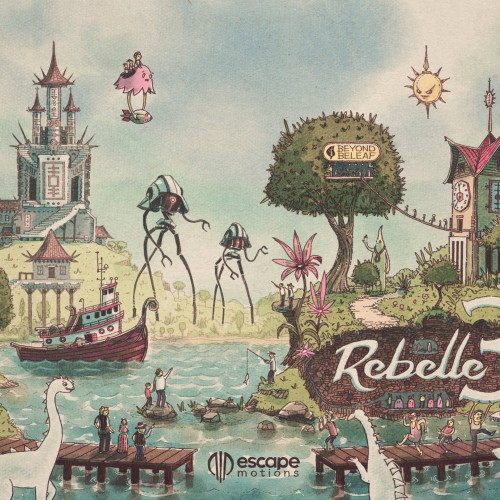
When Rebelle 3 by Escape Motions came out I wanted to create something that really shows off its power. I normally draw in fountain pen first, but this was created entirely from scratch in Rebelle 3.
Digital art tends to be cold and impersonal, but Rebelle's watercolor simulation looks & feels like real paint... and you can undo! That's critical for illustration work, as clients often request changes... But even for personal work- it means an artist can achieve a watercolor look without being at the mercy of the medium. So the result is more true to his or her vision.
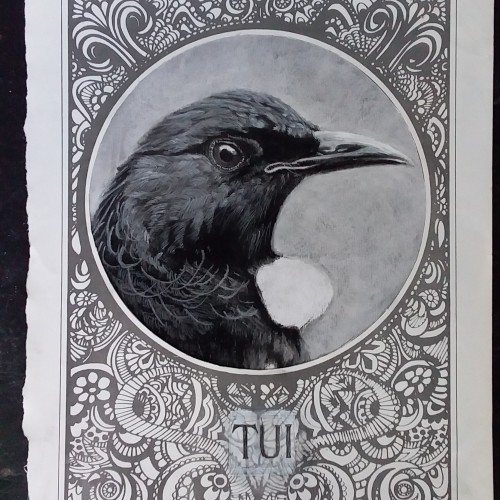
Wanted to practice with some charcoal but couldn't resist collaging it up a bit! A great way to hide mistakes (or laziness!) Tui's are NZ's most successful native bird.
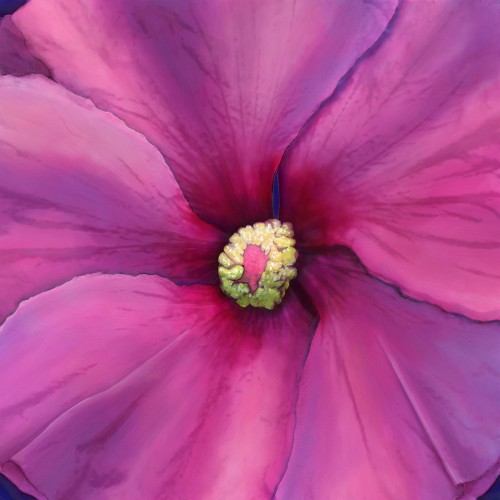
To many I know a hibiscus flower might represent endless tropical summers. Up north where I live, hibiscus is the often the last flower to bloom while fall is setting in. While vibrant, I wanted it to feel lonely as seasonal changes are very introspective times in my life.
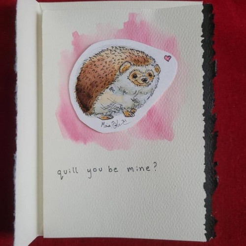
Happy Valentine's Day everyone! This year I got around to making various cards and simply sending them out to various family members and friends. (It was also an excuse for me to use as many puns as I wanted.)
Here is one of 3 illustrations I made for customizable postcards, available for purchase at @cava.galeria
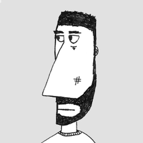
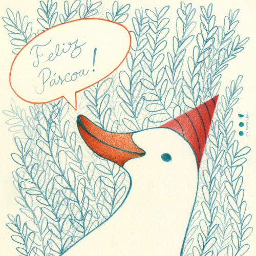
I wanted to make another silly #goose with a fun #hat
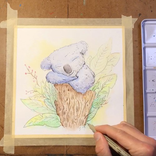
Wanted to paint something soft - something my kids might like. What is more gentle and peaceful-looking than a sleeping koala? Check out the full timelapse painting here https://youtu.be/IxmUol8dsBs
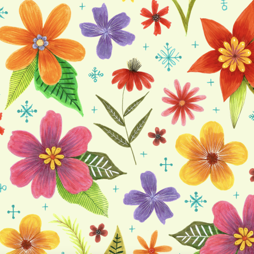
When I was planning this pattern I really wanted it to have a dark background. I built it in photoshop using hand drawn marker flowers but when I try to place them on a dark background it looks ridiculous!
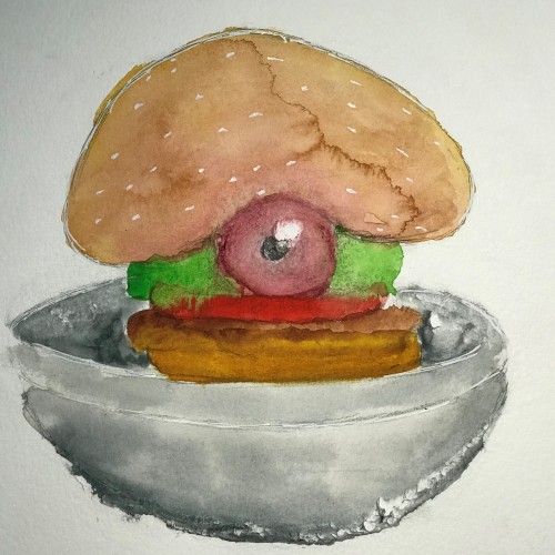
I wanted to challenge myself with a different type of drawing without spending too much time on it. I am pretty satisfied with the results. It came out looking a lot more disgusting than I intended but it still works. lol Done in Graphite and Watercolor.
This started as some scribbling with Inktense pencils on large plain drawing paper. Then I was done, I wanted to wet the the drawing to release the "ink," but I found that the paper would not take water without drastic buckling. So, it remains a drawing rather than becoming a painting.