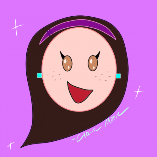
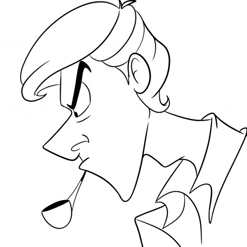
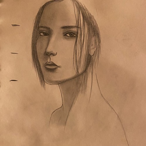
Really wanted to erase mistakes but I think it’s interesting to leave em there to see if you’ve improved or not. Anyways, this is just practice ^_^ references were used
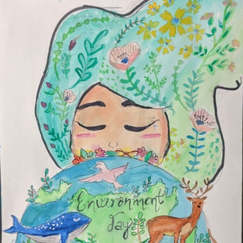
I made this drawing on environment day and wanted to upload it on that day itself....but forgot it :-P.....But doesn't matters...each day one should cherish the nature ^_^
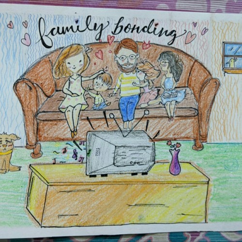
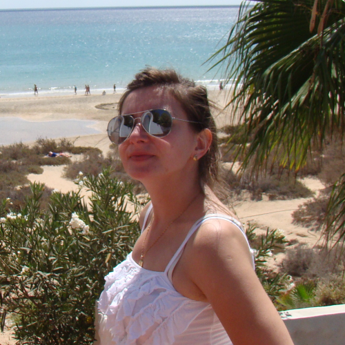
Hi there, I wanted to uploade this art work as the quarantine quarter submission.. But due to my harsh luck the time was out...and I was late by 2-3mins...I was extremely sad about it but then thought to upload it on my profile only...so this is basically a drawing of me and my family enjoying time in this quarantine period :) and please please please tell any kind of lack in my this drawing... Hope you like it ;)
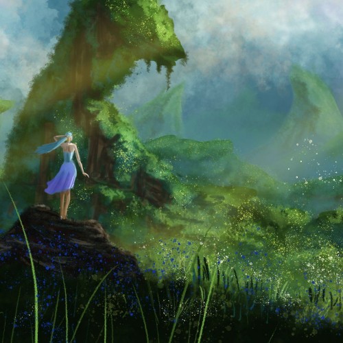
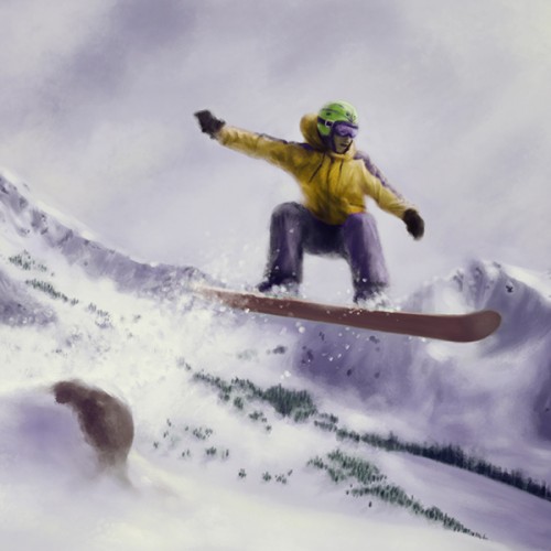
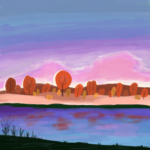
One of my first landscape experiments in Photoshop. Whereas I previously was working in GIMP. I just wanted to experiment with values and distance and fog and mist, etc. The female figure adds some story to the scene.
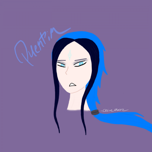
This is a digital drawing I drew on the night of April 26th, 2020. Quentin was inspired by the animated television series Teen Titans -- which I was obsessed with growing up. In creating him, I wanted him to resemble the Teen Titans character, Raven. Like Raven, he wields magic and isn't one for noisy environments like parties and concerts.
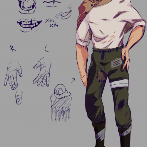
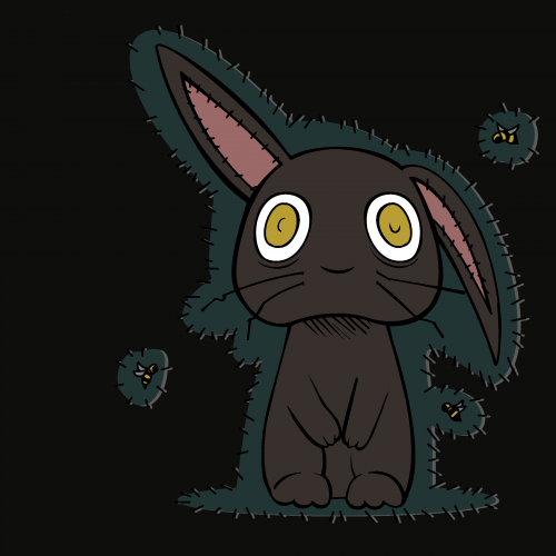
I tried to make him look like he lived in the wasteland by the skin of his teeth, I wanted to keep him faceless but changed my mind due to the old design being harder to draw. Hair Black/Brownish, Brown eyes. The opposite of Sera and will often butt heads with her as well
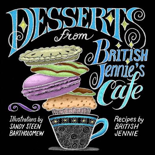
I wanted it to look like the chalkboard menus in quirky cafes. I drew the image with a Blackwing pencil, scanned it into Photoshop, inverted, then applied the colors.
#Golgaaryol
Injured into symbols
The wounded Shadow
The ink flows and carries nonverbal oddities
[April, 2023]
Danielle East - Broken Butterfly
https://youtu.be/4WiMDebAnzo?si=k2yO1ALrmwyysOt4
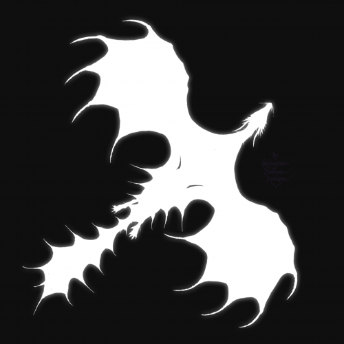
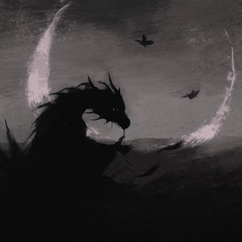
I wanted a picture of a sad dragon - finally I turned ordinary doodles [from 2023] with brushes into something like this, blur and softening effects were also added.
Recently re-watched.....a....certain...movie.....and felt persuaded to do this. I really liked the art style (not that i could do it myself) and wanted to try it in my own way. If you know what movie i'm talking about then feel free to comment it; i'm interested to see how many there are. Also, i would love some feedback on my art, this is the first one i've done with words in it sooo hopefully it "works".
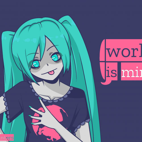
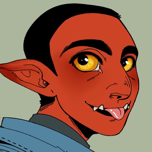
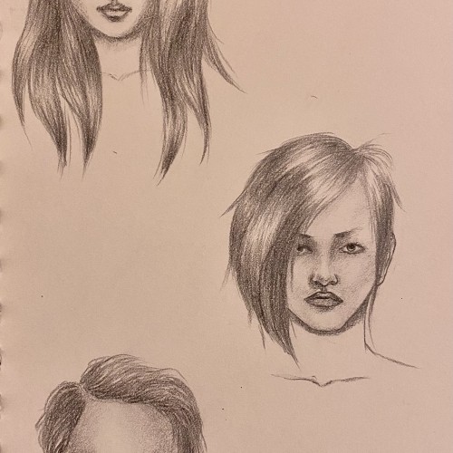
I just wanted to have a bit of fun, experimenting with different features and hair. I’ve still got a lot to learn though, but let me know what you think (:
Anyone is welcome to post their own version of this expressing their unique identity, in fact i highly encourage it
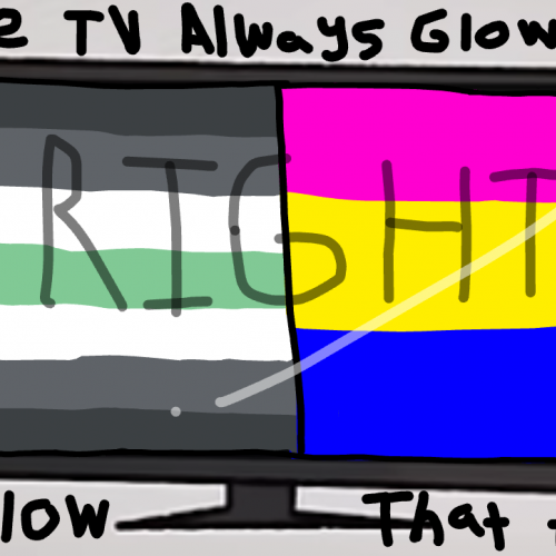
I saw a lot of people posting this on other platforms and wanted to post my own version
This "trend" I guess you could call it, came from the movie "I saw the TV glow". Which is a movie that's a metaphor for trans identities and other queer identities.
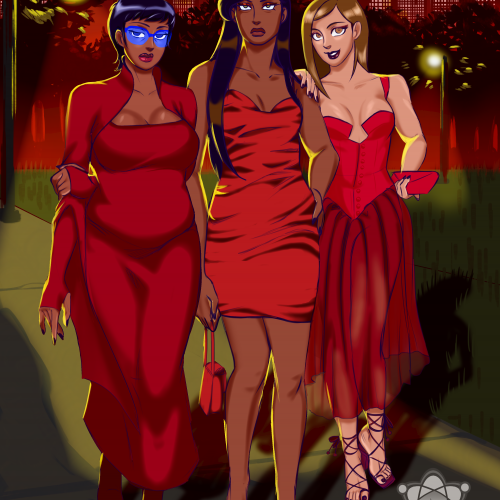
Primrose is the oldest, Daphne is the middle, and Dalena is the youngest. The outfits were found on Pinterest/Instagram. The background was hard to come up with. I referenced Martin Ivanov's Gotham City for the background. Their story is still in the works but I wanted to draw them anyway.
Lois's last book: "The style of Loish. Finding an artistic voice." is just AMAZING! It's:
- inspiring,
- full of tips on how to start searching own style,
- full of Lois's thoughts and experiences on her way to finding the artistic voice.
So I wanted to try something new in my digital art journey. I experimented with new techniques. I tried to use a brush type that gives a transparency effect.
I chose one picture from Loish's book as a reference.
And here it is - a colorful landscape.
Thank you, Lois, for creating and sharing your phenomenal and inspiring art!
I love Inquisitormaster. Her channel is awesome. I wanted to draw a famous person and my friends gave me this. Its a little sketchy but i hope u guys like it. Also im still a beginner so please give me some tips in the comments.
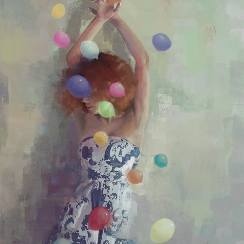
Lightness 4: when a levity hurls us away.
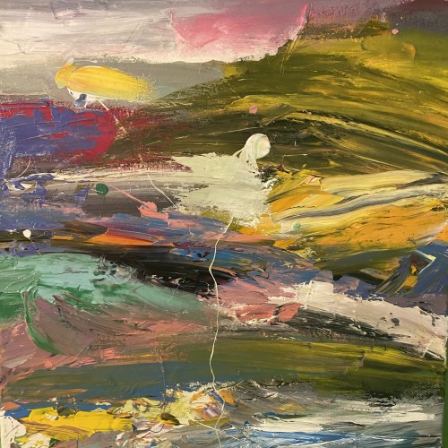
This serie started with the purpose of paining people literary threw away from small ordinary objects like flowers of balloons. I wanted to depict the strength and the power that trifles have on us. Eventually ithey paintings became more and more “stable”, with just a touch of surrealism in them.
I kindly thank Ale for posing for me with patient. Thanks to her hair style, I am pretty sure you can recognize her in my last paintings ;)