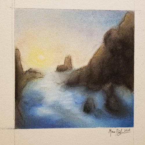
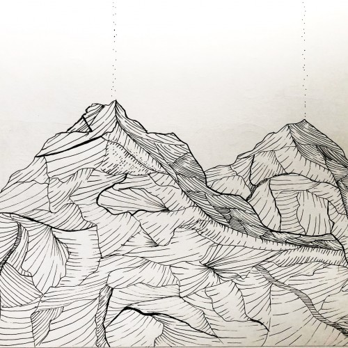
Pastels...I've never been a huge fan of working with them, mainly because I can never seem to get them to blend or move the way I want. I think this turned out okay; it's not the worst it could've been...not the best. It was fun to try, considering the fact that I rarely try new mediums, and it got my mind off everything I've been worrying about. Anyway, enjoy.
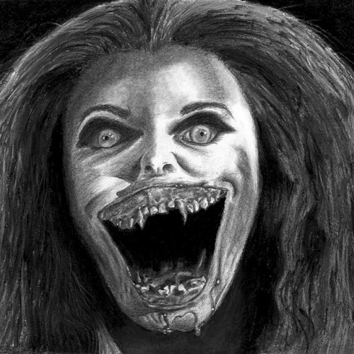
One of the scariest characters I've ever seen. The most frightening of the vampires from the movie "Fright Night" (1985). I had to draw her as a form of therapy. Thumbs-up for the art department on that movie! If she had had white eyes instead of the red eyes in the movie, I would've been irreparably damaged! :) (Pencil on paper, size A4).
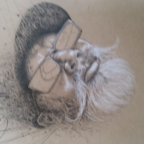
More ballpoint pen experiments. This was trying to "blend" colors, using ball point pens in a similar way to colored pencils. I found Layering evenly to be pretty difficult, esp with the pens blotching and very very limited burnishing. The interesting thing is that the paper doesn't seem to get "tired" the way it does with pencils. This is just cheap printer card stock.
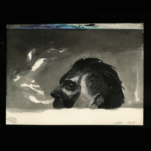
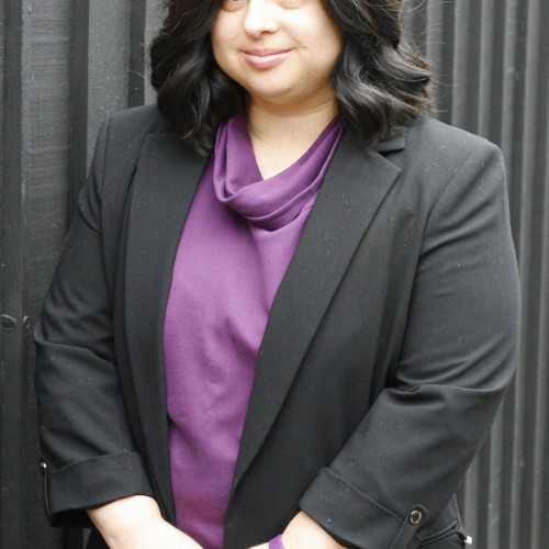
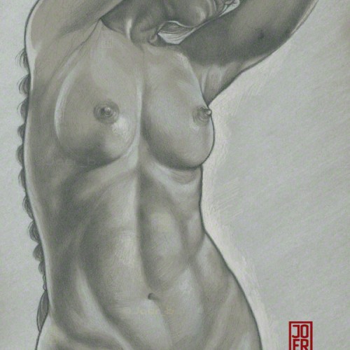
Classical lighting setup. Finished piece derived from an initial sketch. Model: Meadhbh (Maeve).
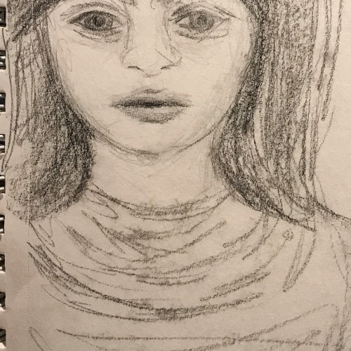
H, 4B pencils and white Prismacolor pencil on 9” x 12” Strathmore Toned Grey sketchbook paper.
Most evenings, I watch a couple of news programs streaming on my computer. During that time, I also make it a point to draw a person (usually from an on-line reference photo) with a No.2 yellow pencil (generally Ticonderoga) on whatever paper is handy on my desk. It's good practice and keeps my hands busy. These are some "News Doodles" done this past week.