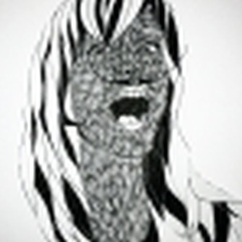
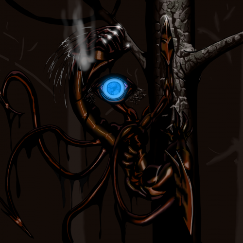
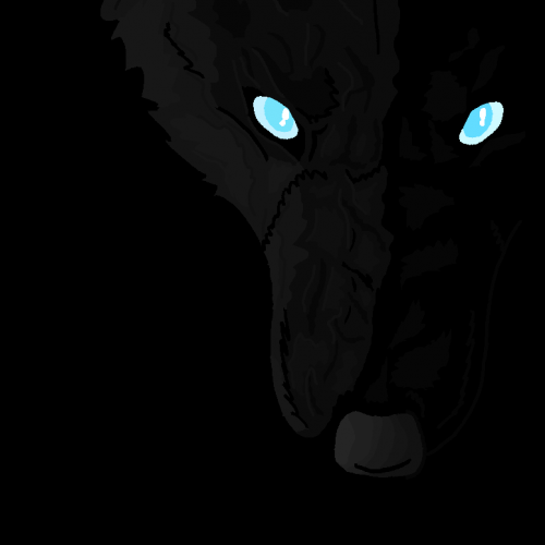
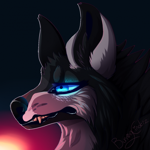
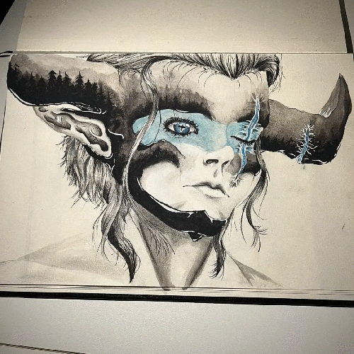
My half of the art trade with OptimisticJerk (https://www.deviantart.com/optimisticjerk). The trade was to draw a monster as made up by your counterpart without seeing a reference image, based only on the description. Here is her half (which is awesome): www.deviantart.com/optimisticj…
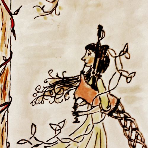
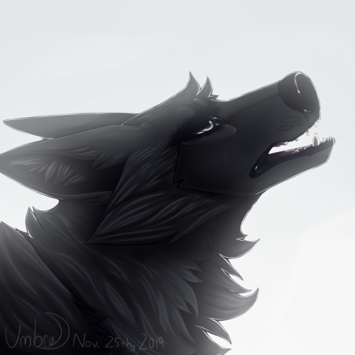
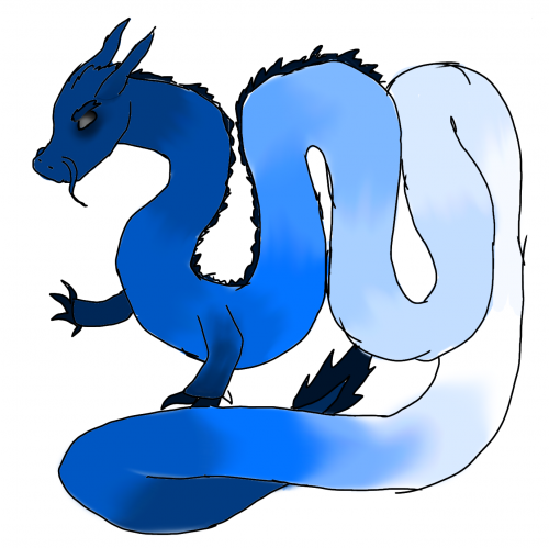
For mine, I had to draw a monster called a "niter" based off of his description:
"Niters communicate in whispers. Nocturnal. Shy away from light. They’re black and oily and emanate a bluish glow. Large, looming 6 foot shadow things with massive hind legs, clawed for climbing trees and they have ‘maws’ instead of arms, claw-like appendages they stab people with and only one gaping blue eye. Their mouths open up and they swallow their victims whole."
What's funny is that I didn't see the fact that they emanate a bluish glow until now. So, the glow from the eye is purely by coincidence. Figuring out the hind legs of this creature was difficult, and so I sought reference images, and of all things, the koala turned out to be a pretty good reference.
For a while, there, it was looking like Carnage from Spiderman, but I toned down the reddish-hue a bit. The intention was to give the appearance of motor oil.
So, now to find out how badly I failed at drawing this...
This art trade was fun, though, and I would do a similar one, again. But I am le tired.
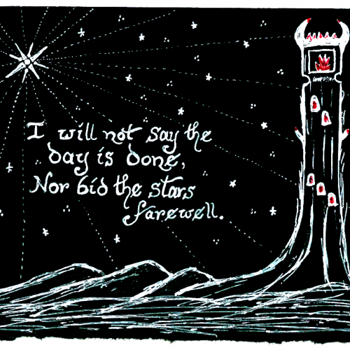
Inktober prompt: Hope. White and red ink on black paper. (For some reason the scan makes the white look a little blue, but I only used the two colours.)
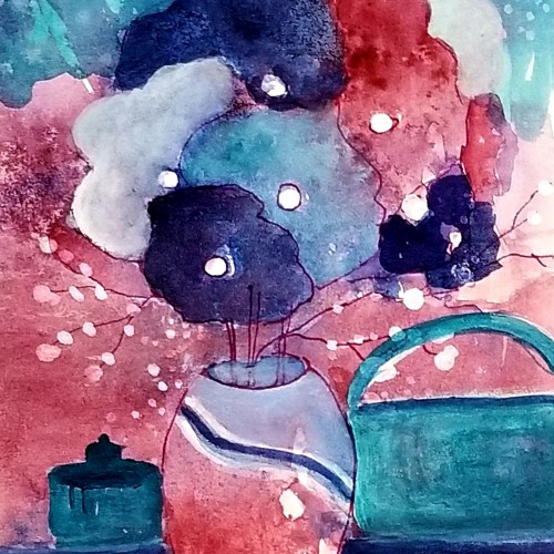
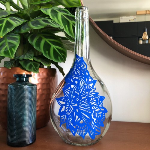
I worked on a Portuguese wine bottle with Posca markers. This is an original and unique artwork. This bottle can now be used as a small vase or a pretty carafe
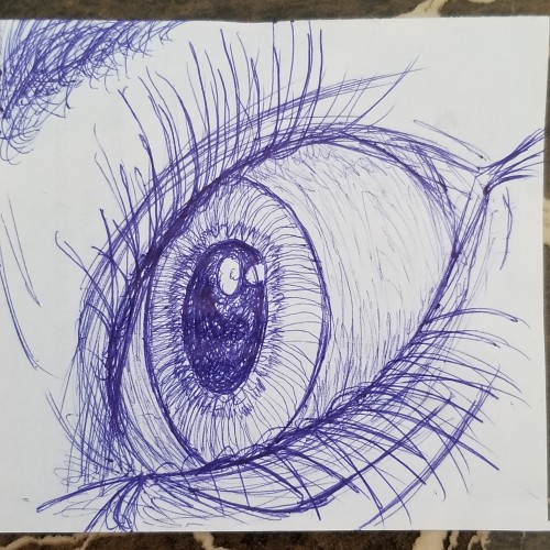
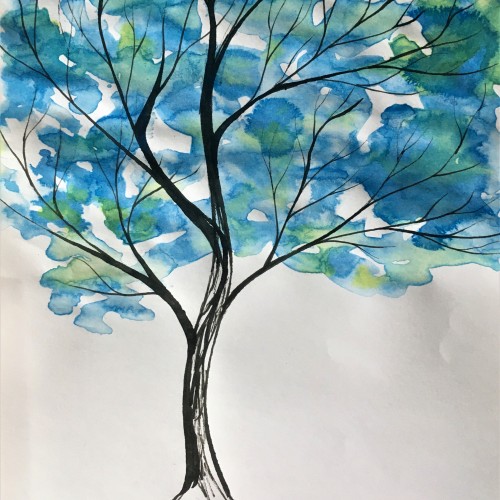
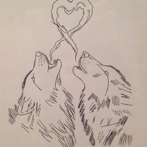
I tried using blue again, i like it better when it comes to these types of drawings (eyes, trees, buildings) but i will definitely be using black for creature and animal drawings. Let me know what you think, comment any tips for improvements, or even just to say what you do like about it; feedback is welcome on all my art.
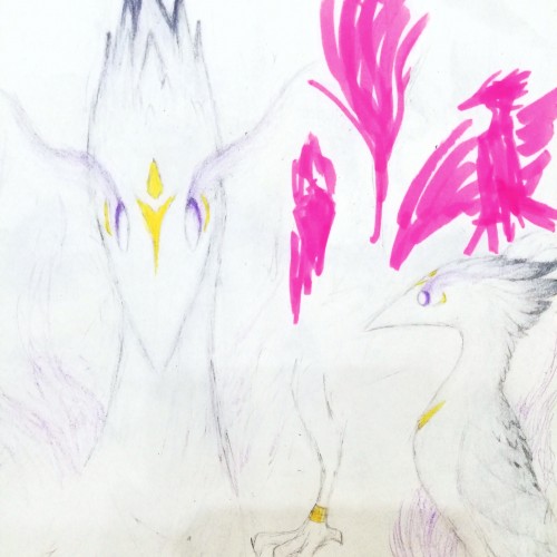
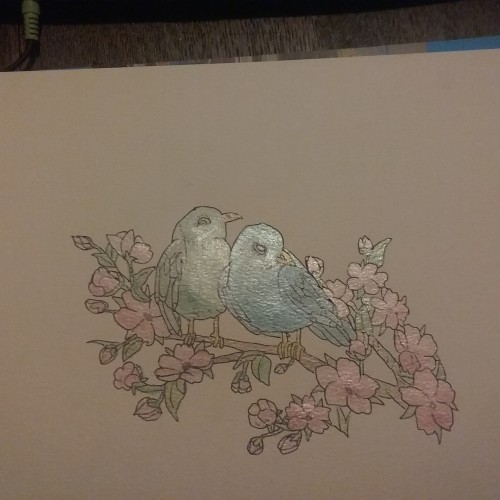
Continuing to consolidate the colour profile of the White Bird. Even if the photo fails to capture it, those pale shades are actually a sophisticated mixture of grey, sky blue, pink, and purple shades, managed with eraser and finished with white.
Have been working on my ability to manage lighting, softening the shades and contrasts. Colouring white things are actually not easy, because you will notice all the minute colouring differences much more easily.
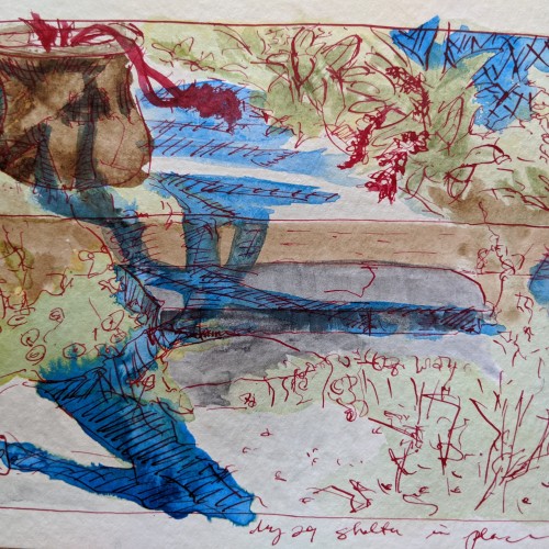
My friend Steve from the art studio suggested we do studies in blue in honor of the #lightitblue campaign. Just when I was needing some inspiration! These are the late afternoon tree shadows at the foot of my garden.