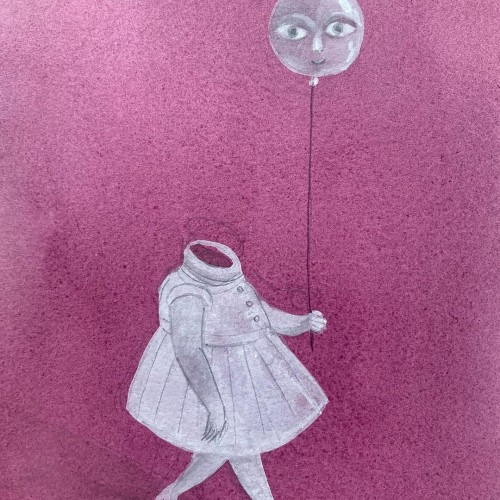
THE LITTLE GIRL AND THE BALLOON by Ben Loory.
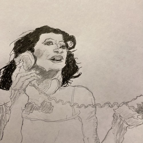
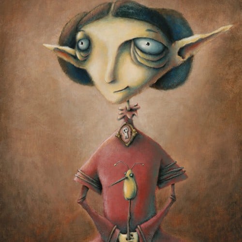
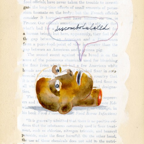
"That night the mother had a terrible dream. In the dream, Annie was a balloon. She floated up out of her bed and through the open window and away across the sky toward the moon."
https://www.instagram.com/p/CgzLv_COUat/?utm_source=ig_web_copy_link
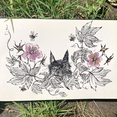
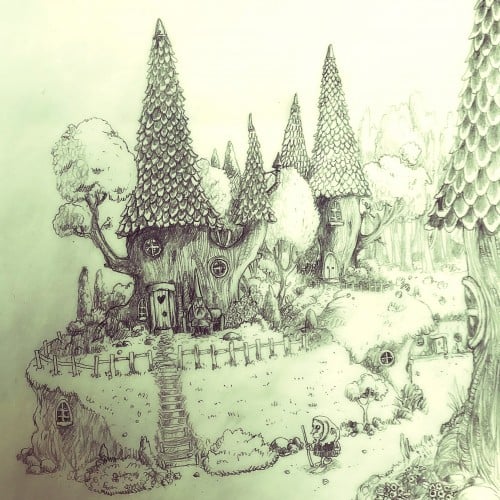
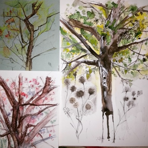
Brambles are lovely to sit in amongst the bees. And also they make a good shelter from the rain.
https://www.instagram.com/p/CSpMKfXr00y/?utm_source=ig_web_copy_link
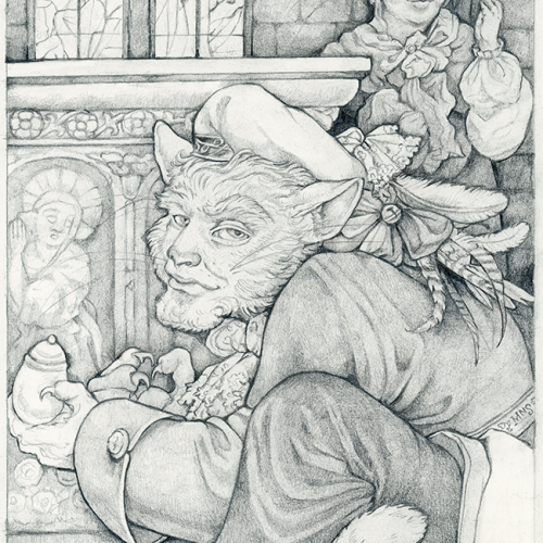
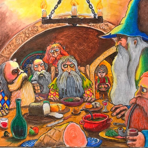
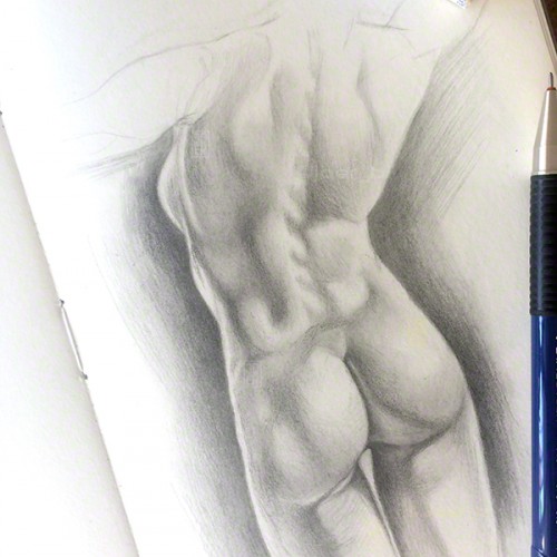
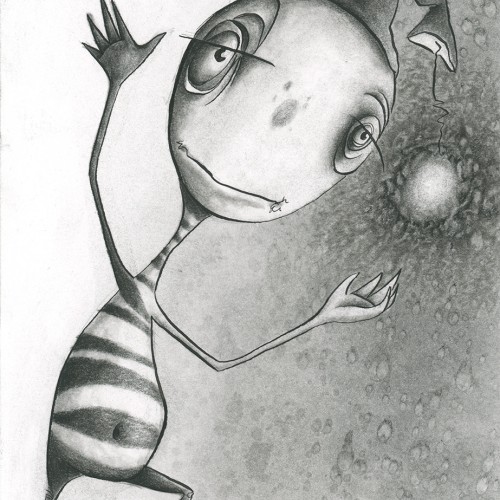
An illustration for a Grimm's Fairy Tale in a Moleskine notebook. This one is for a kind of obscure story called The Companionship of the Cat and the Mouse. Just graphite.
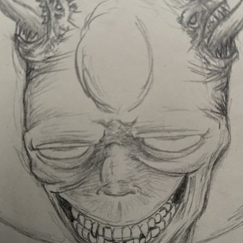
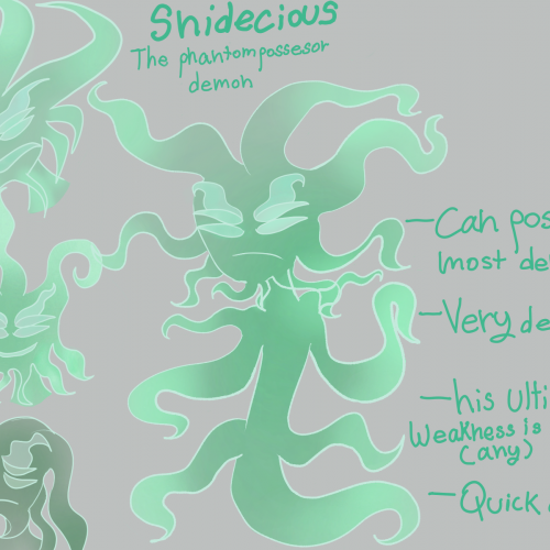
I finally drew Prince Fendren's ectoplasmic yet wicked companion,Snideacious.last time I drew him was last year and I didn't name him at all but he was still my OC.He is a low ranking phantom demon who's only purpose is to possess,kill and destroy.due to this,the rest of his kind has been wiped out entirely,making him the only possessor demon in hell,he travels throughout locations in hell.he was almost killed by many demons he tried to take control of.Fedren and him have a mutual relationship,Fedren had no desire to kill him considering snides weakness is magick he can be controlled but not mind controlled (no brain)Snide hates Fedren,often insulting him and even enjoying seeing him in pain when he is fighting a foe.Snide has possessed Fedren before,which was not only agonizing to Fedren but embarassing (being half naked inside the kingdom) since then he only posesses him for a good reason,they both go on adventures (although dangerous) in hell together,meeting new demons(usually evil) and discovering realms.(ignore my terrible handwriting)
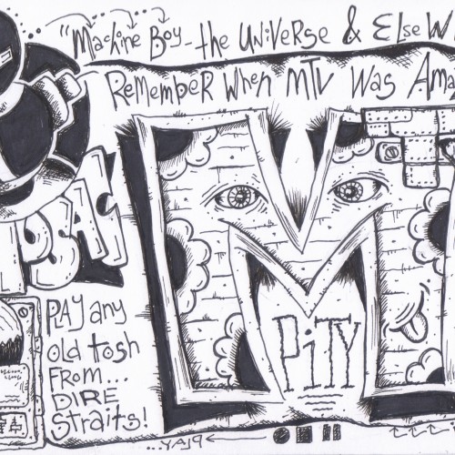
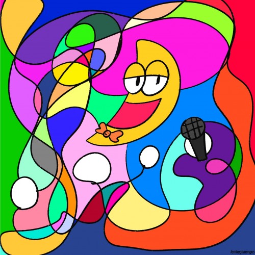
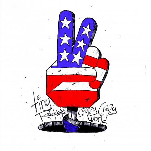
a little bit o art i did for my ACE! band Tiny Rockets...if you wanna listen to em take a search on Spotify...or itunes or somewhere like that...tis a wild rockety ride! ;-)
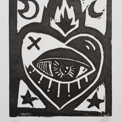
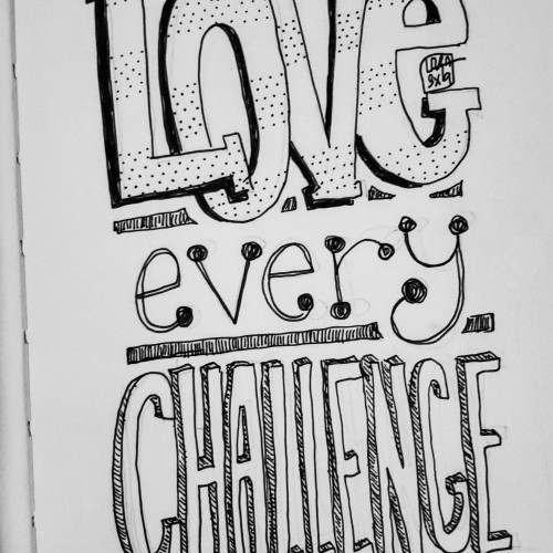
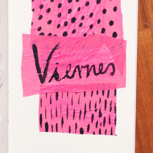
India ink on tissue paper. I had never used ink on this kind of paper before; I really liked the results! There are some folds and wrinkles on the paper that give the pattern some interesting details. The paper is also super absorbing, which plays nicely with the quantities of ink. Since it's very thin, there can easily be overlays between textures. And finally, when trying to use less ink (so that it wouldn't seep through and cause a big dot - the absorbing quality is nice, but it was also somewhat of a challenge!) I used very little ink on the lettering, causing a scratchy, dry look.