The materials that Meir uses in her works are not of the refined and so she is called an “arte povere” artist. At times she describes her work as someone dealing in alchemy - work develops as in a trial laboratory with different techniques and materials. She says, “ at times the artistic work process is a sort of puzzle demanding the filling in of all the empty squares “.
Some of her work focuses on women, and they incorporate criticism and cultural protest.
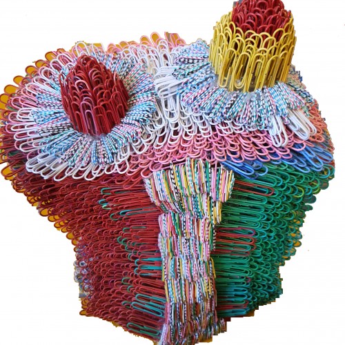
Meir has strong opinions about recycling and environmental protection that is represented in her works by use of materials and shapes. In her work she reacts to contemporary art that communicates with the eco system, waste, and she also searches for different worlds. Her works are made up of layers upon colorful layers that when we look at them it becomes clear that the mound of waste she chose is not coincidental. It actually becomes a colorful kaleidoscope of utopia.
Jaffa Meir is a multifaceted, autodidact artist working in painting, sculpture, photography, product design, carpets and furniture, painting on textile, and computer graphics.
The structural composition of some of the works is influenced also by her many years of working in the architects’ office.
Meir also worked in the developing of ideas within the field of ecosystems and recycling for factories such as Coca Cola, and during this process came up with ideas for designing parks and public game spaces using industrial waste products.
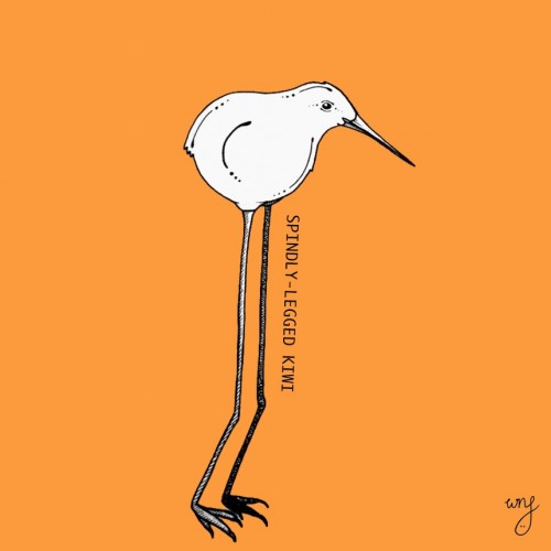
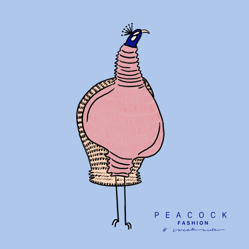
After a difficult childhood being bullied for her unusual height, Janet embraced her spindly legs and now earns a respectable salary fetching things from high shelves. She also moonlights a shin model for up and coming kiwi fashion emporium, Ki|.
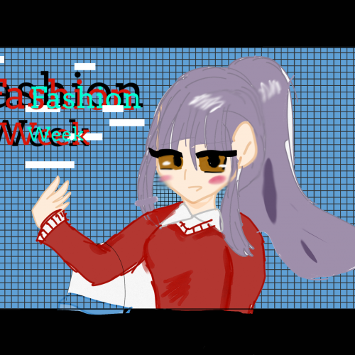
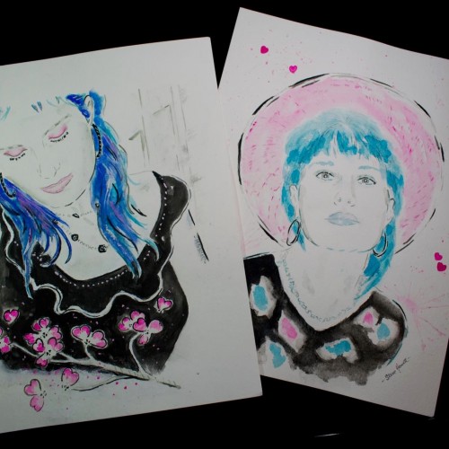
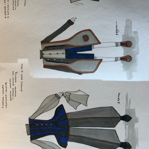
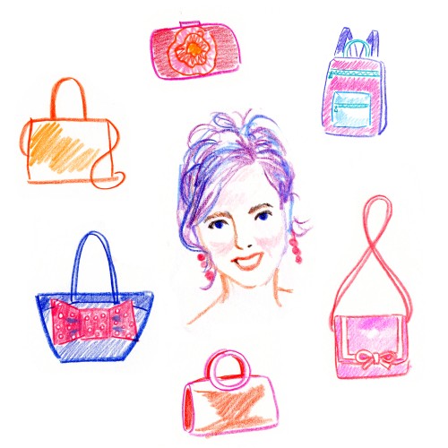
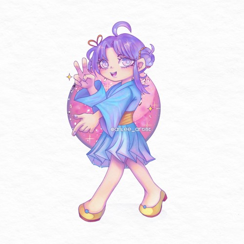
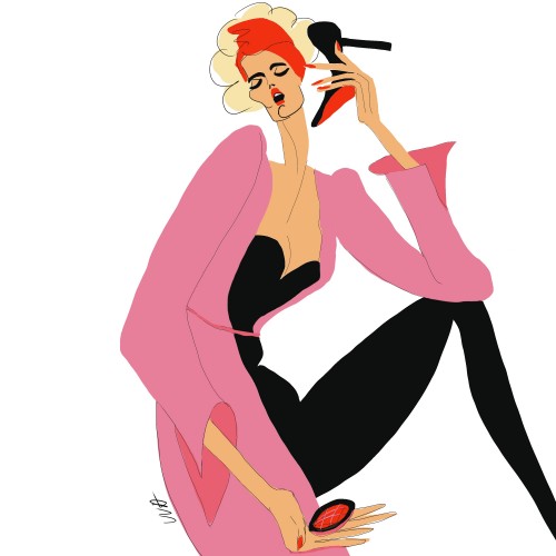
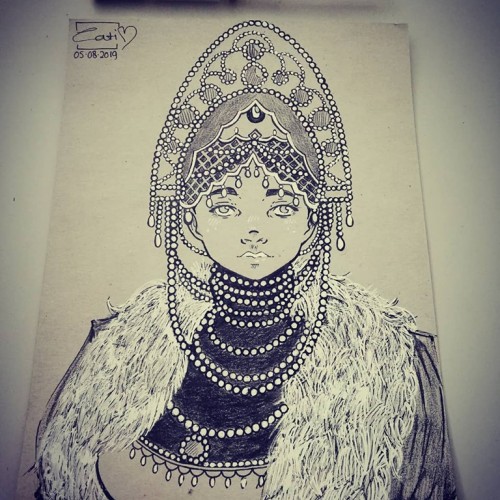
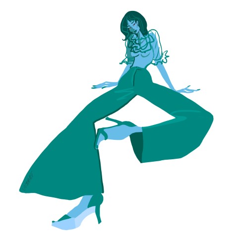
Some fashion Sketches today - they go as a pair together, so that’s why they’re are edited into the same pic ( cos i don’t have doodleaddicts pro lmaoo). If you are interested, I used winter and newton Promarkers, and a waterproof permanent 0.5 black pen to outline! leave a comment to let me know if you like it!!
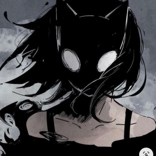
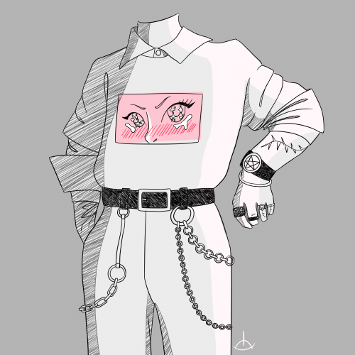
This piece critiques the modern tendency to hide identity behind brands and consumerism.
* Visual Focus: The mask is partially obscured by a fitted baseball cap, with the bill pulled down to cover one eye. The cap itself is a symbol of brand identity and fast-fashion culture. The uncovered eye retains an unsettling, almost mechanical gaze.
* Symbolism:
* The Cap: Represents the societal practice of hiding behind brands and allowing consumerism to dictate self-worth and block out unwanted truths. The act of seeing is deliberately curtailed.
* The Mask: Emphasizes that the consumer identity is often a façade-a manufactured mask that prevents others from truly
"seeing" the individual, while simultaneously restricting the individual's full sight of the world.
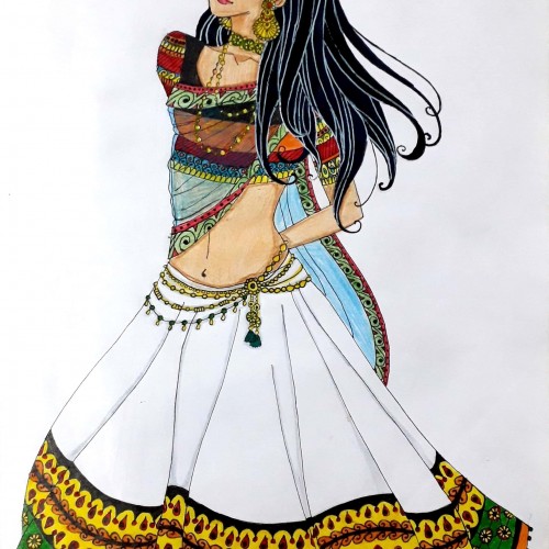
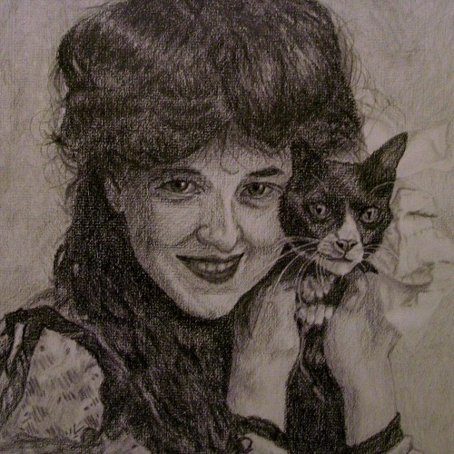
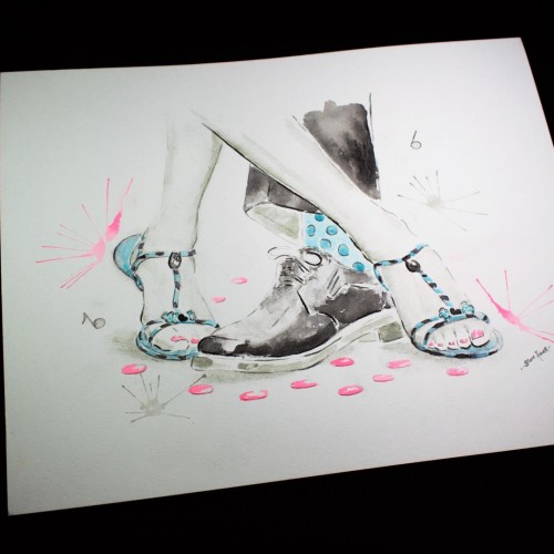
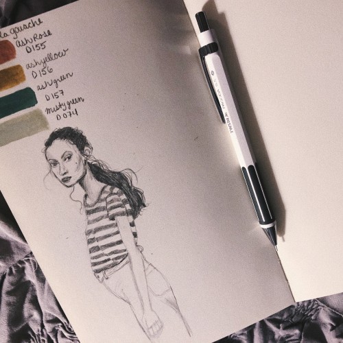
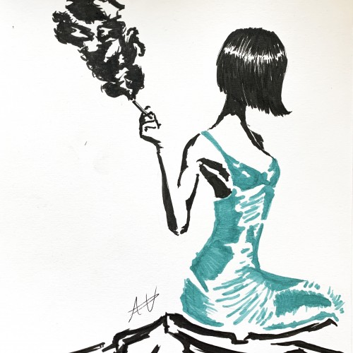
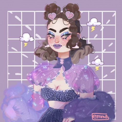
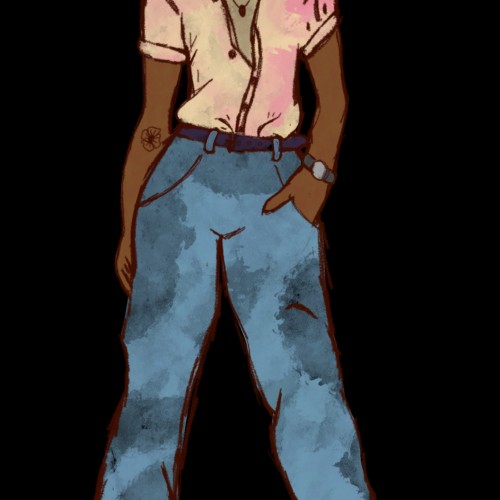
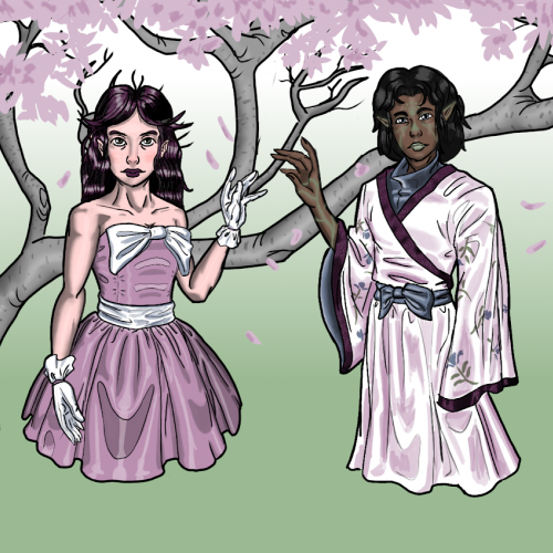
I drew this simple sketch because I wanted to have that outfit, but I didn't have the pieces for it in my closet, so I drew it instead! Close enough, I guess. :)
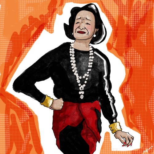
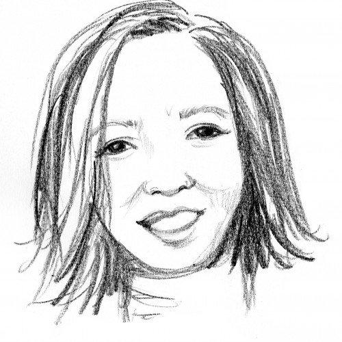
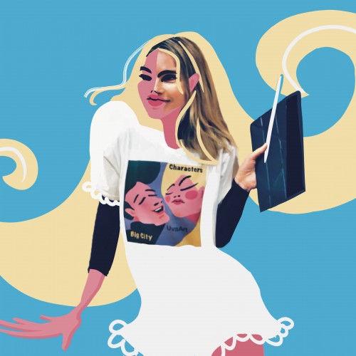
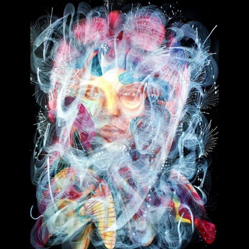
In this series called Identity (Identity), inspired by the people and the diversity of New York, I wanted to capture this diversity, the statics, the glamor, the fashion, the ethnicities, the culture and the splendor of this magnificent city. Mauricio Paz Viola