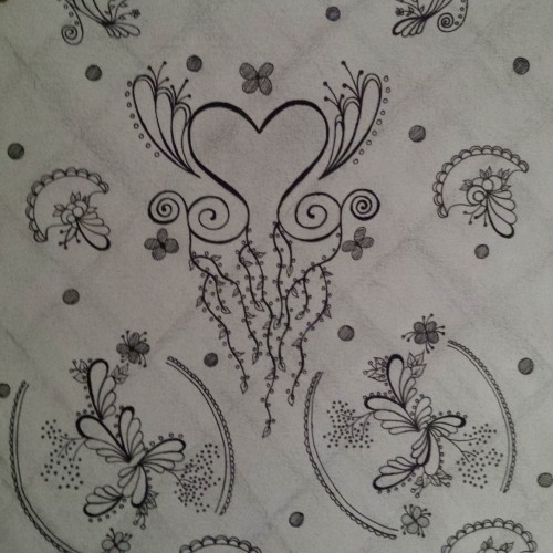
My idea was to make a textile pattern for fabric printing. Drawn on paper with a micron pen .005, colored with pens then put into Photoshop for some color manipulation, blurring of lines and pattern arrangement.
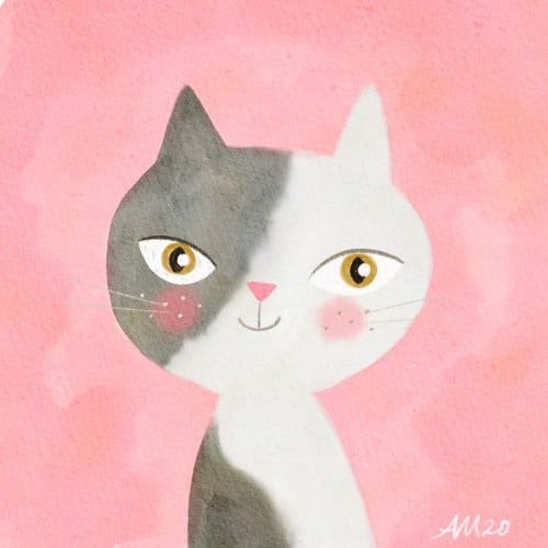
The challenging thing with just using pen is that I can't paint over a mistake. I usually redo a face more than once. I didn't mean to make their face so stoic, it makes them look like a statue.
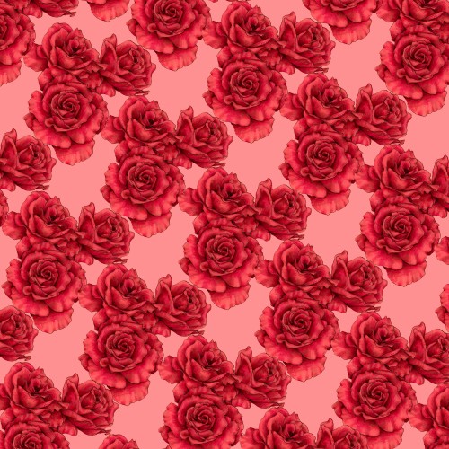
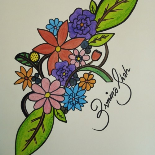
I love this design pattern. It gives a feminine touch...a fresh and clean feel. It’s uniform and repetitive pattern gives it a functional flow as well as an elegant look. I used familiar shapes in a way to make a statement of agreement. I love the background as well. It’s white and lightly smeared to give it a more stylish look. Also, the background is a subtle lattice style to add more sophistication.
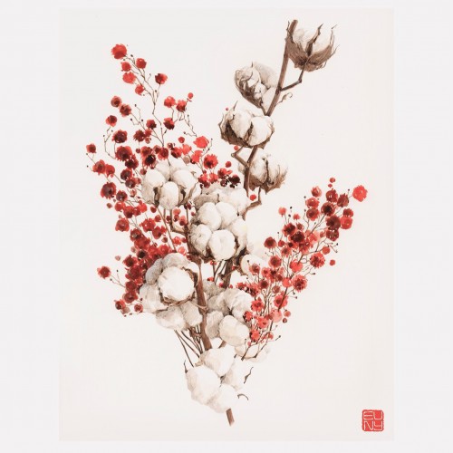
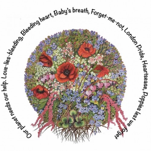
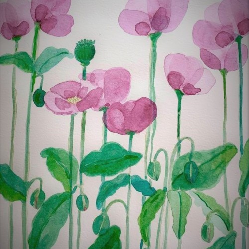
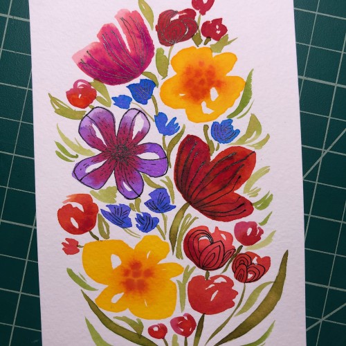
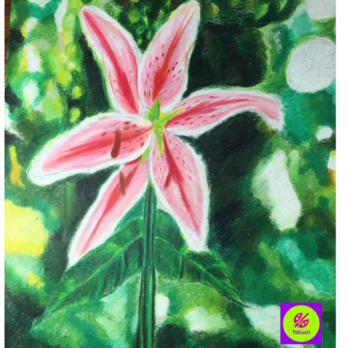
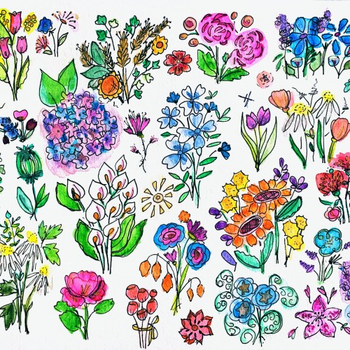
Our beautiful planet needs our help. We must not take it for granted. I painted this with Inktense pencils, choosing flowers with poignant names to make us stop and think about conservation. It can be bought as a canvas, art print, poster, tee-shirt, throw cushion, greeting card. etc.etc.etc. Visit
https://heather-easley.pixels.com
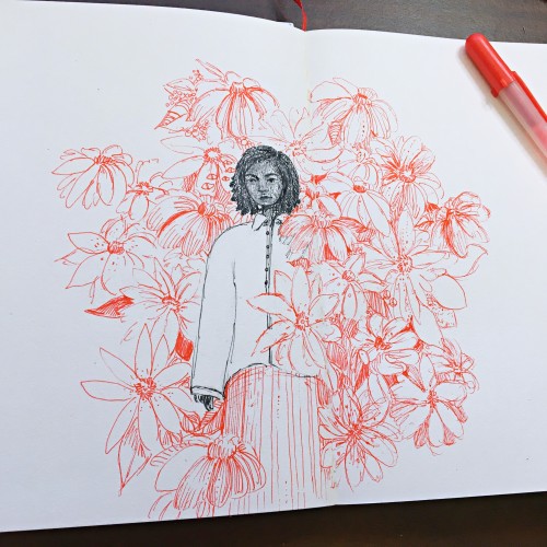
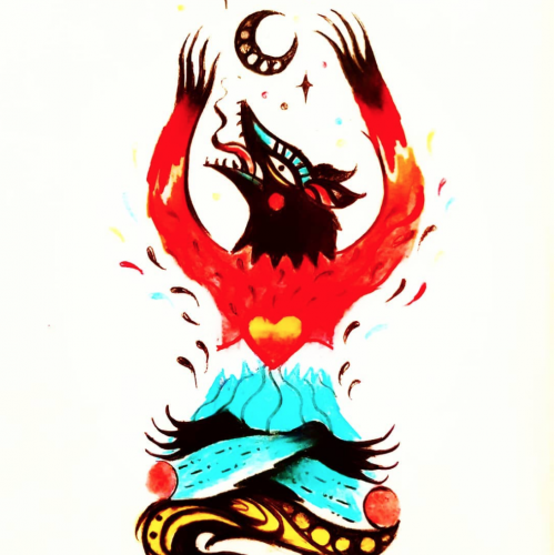
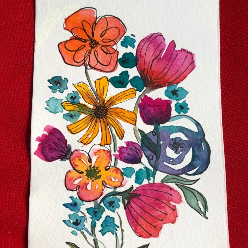
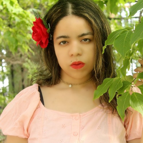
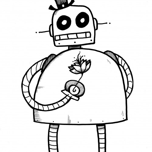
I'm on a quest to stay positive despite current events and crazy unrest. To this end I'm meditating and seeking out positive influences every day for a week and capturing what I find in my sketchbook.
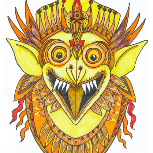
Oh boy, markers (NOT a go-to), least favorite color, and a subject that isn’t on my radar. This was a hard one what with 3 negatives going for it. But, hey, it’s a challenge, right?
Choosing a subject came first….we have a house full of Indonesian masks and sculptures. (My husband studied gamelon music in Indonesia.) Garuda, the “mount” of Vishnu and popular with Balinese artists seemed a good choice, esp. since he can be green, red, yellow or orange.
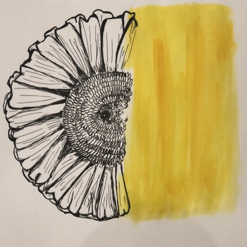
I rarely choose yellow/orange for anything---artwork, décor, clothing...though I do have a soft spot for sunflowers.
First I drew a bunch of images based on one of our wooden Garuda sculptures and then made a simplified marking pen outline and colored it with markers.
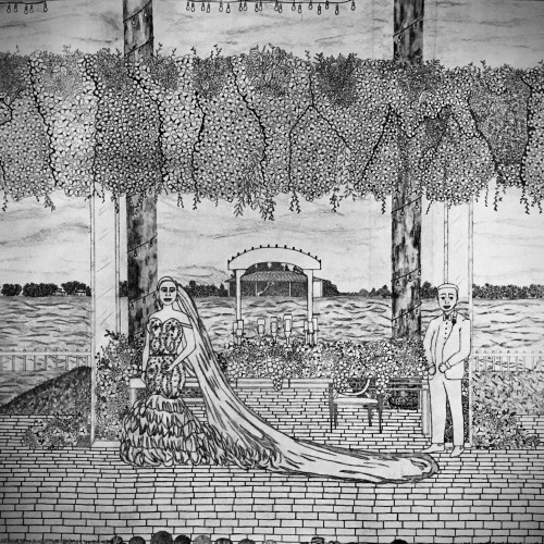
I used a reference to draw this scenery. In the reference there was so many details that I really wanted to capture it. I even wanted to capture the details in the bride’s wedding dress. I think the groom looks quite handsome in blue (it’s HIS color as some people might say). I incorporated the long, beaded line under the bushels of flowers (just another element to add to an already beautiful scene). Also, as you can see, I added an audience watching the couple as they have their picture taken. The flowers spread along the table with the view of the wavy waters right behind them looks so refreshing. Every element served its purpose for the ultimate “moment to remember” feeling. One of my favorite things about this drawing is the string lights. It’s one of the smallest items to have, but they add character and charm to the scenery. The string lights give a romantic feel and is even more gorgeous at night. I enjoyed doing this drawing so much that I anticipated the second I’d be finished with it.