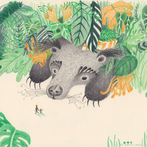
Binturong, a fluffy animal with even fluffier ears. Really mysterious if you ask me. I made a small comic of this, you can see more on Instagram.
On a more serious note, binturongs are fascinating and also a vulnerable species, with a decreasing population (acording to the IUCN redlist).
You can learn more about them through @abconservation.
:.
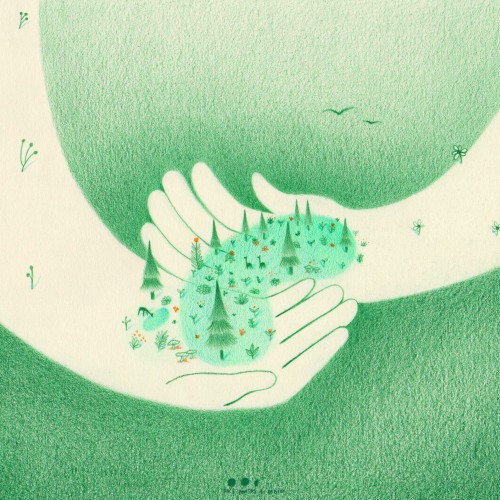
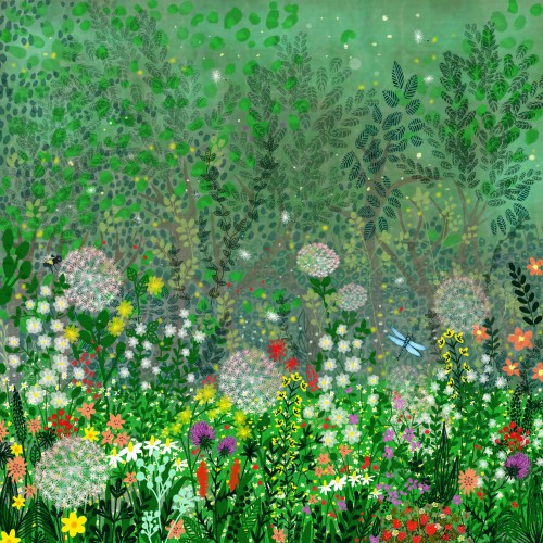
When we help someone there is always something that blooms and grows beyond us. It is an increasingly necessary action in a world that unfortunately is increasingly divided.
@givingtuesdaypt challenged me to illustrate its movement inspired by this year's motto "Together we change the world"!
This day is celebrated on the first tuesday after BlackFriday, calling on anyone to choose a cause that ressonates with them and give back to them however you can. Thus, a wave of massive generosity is created, which can (and should) extend beyond today! Are there any organizations you want to support?
: .
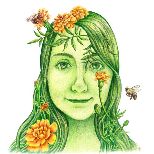
Created in colored pencil, I just wanted to show my love of the bees and all things green. We rely so much on Mother Earth and it's our connection to her that will continue to sustain us.
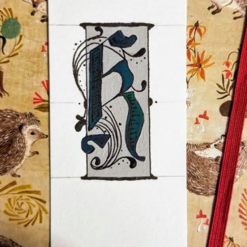
My attempt at fancy lettering. Despite the fact that 'k' isn't in any part of my name, it is one of the more interesting letters, in my opinion. Just a simple and quick piece...
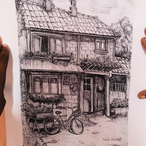
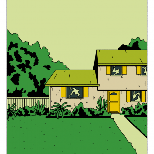
This piece captures the essence of country life. The detailed lines and shading bring out the rustic charm of the countryside, with a cozy home nestled amidst lush greenery.
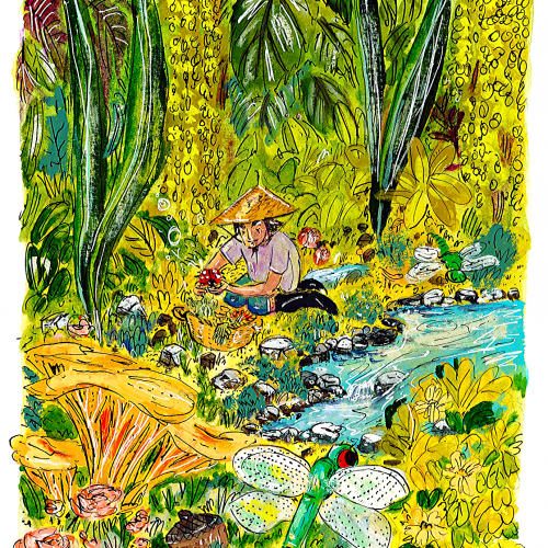
Here is one of 3 illustrations I made for customizable postcards, available for purchase at @cava.galeria
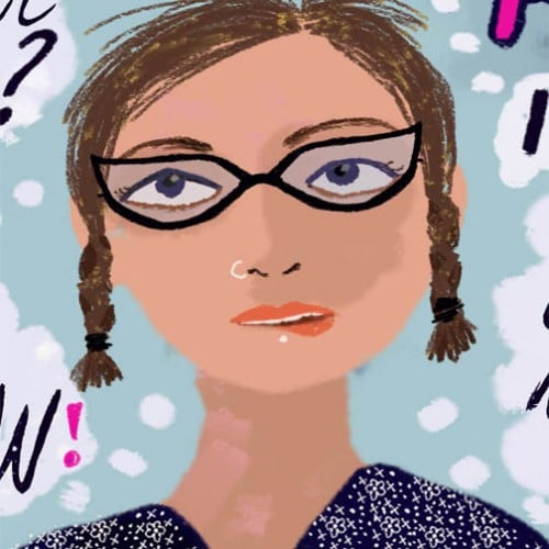
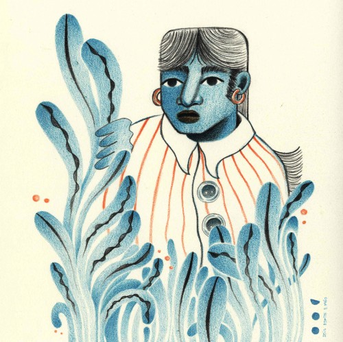
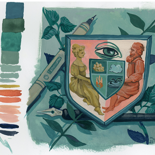
I wanted to use this green/bluish colour, plants, and a very curious human in this case.
What do you think the person is saying?
*The size is 15,5 cm by 11 cm
Limited number of postcards
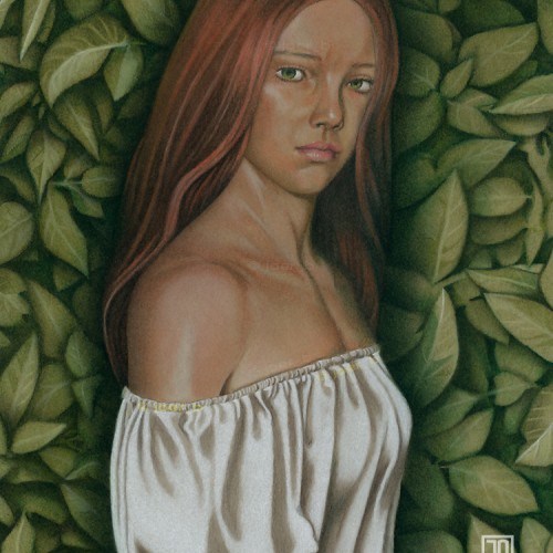
Meadhbh standing in front of a green wall. Simplified her hair and the leaves in the background a bit. Charcoal and pastel pencils on 9” x 12” Strathmore archival sketchbook paper, scanned into Photoshop. Model: Meadhbh
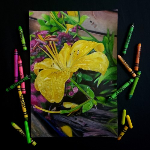
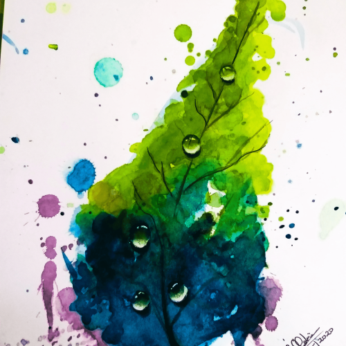
The leaf painted by using Watercolors & Splash Technique. It creates nice combo of colors to a Leaf. Dew Drops on top make em realistic. Dew drops show purest form of nature.
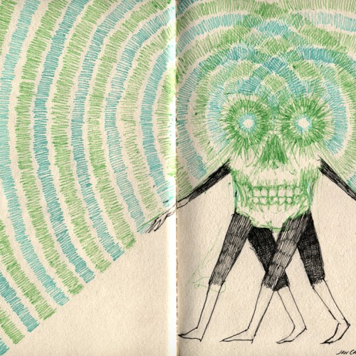
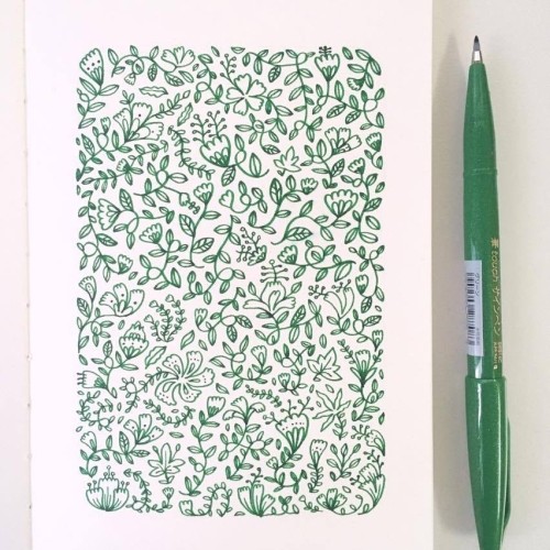
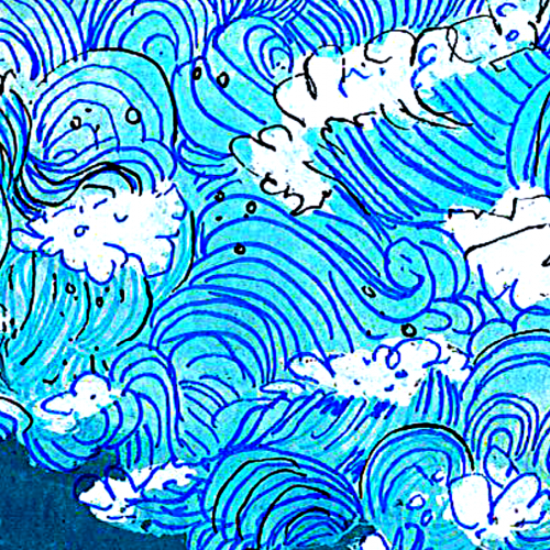
I've been experimenting with colour pallets and line width. Also trying to do LESS - my natural tendency is to add everything so cutting back is quite hard, but I think works better.
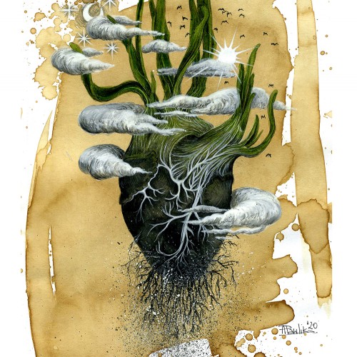
Inspired by nature. Background layer of the pages are covered by Greenpeace's newsletter papers and used mixed technique with acrylic, ecoline and markers.