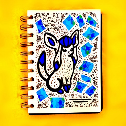
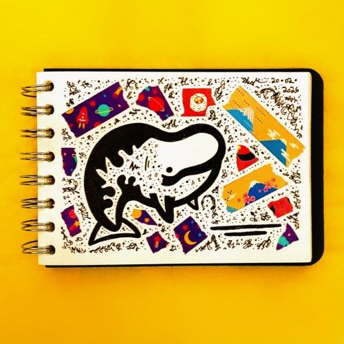
When your creative pals are clearing out Pokemon plushies and know your own collecting habit all too well, hehehe! Needless to say the Glaceon I’ve adopted will be well looked after :-)
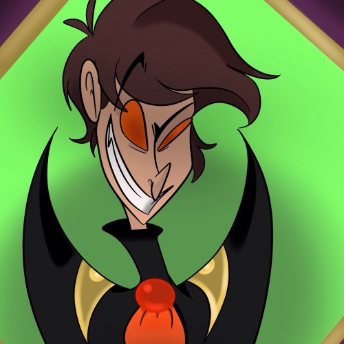
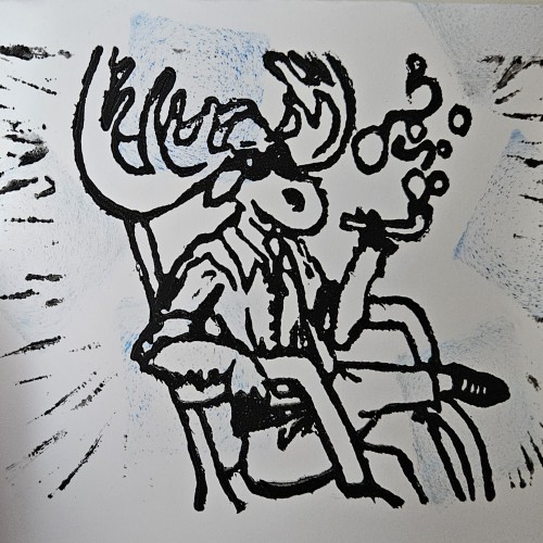
I wanted to draw Ash but without his bat features. Ash takes on bat like features in his orignal concept. I will be keeping those features, because I like how it looks. Every color I used in this picture was used for a reason. I had to do some research, so the colors would reflect is personality and his role he plays within the world in which I created him in.
Colors with purpose:
-Purple
-Green
-Red
-Orange
A LOGO design of the word "Mostafa" written in Arabic Calligraphy using Al Kufi writing style. The design is made via Adobe illustrator initialy to be printed as a laptop sticker.
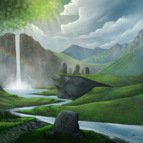
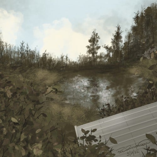
This is my first full landscape project that I painted for a skillshare course. It was frustrating at times but I really enjoyed working through the multiple steps of this painting. I wanted to see what I could do it I pushed myself and I am happy with the final painting. I need to focus some more study on trees in the future, I like how the foreground tree came out, the forest edge was much more difficult. I attached the progess photos of this painting from sketch to final piece
I painted this as my project piece for course on Skillshare: https://skl.sh/2O4p8Gp
Here are my progess photos: https://www.skillshare.com/projects/Sacred-Valley/209235
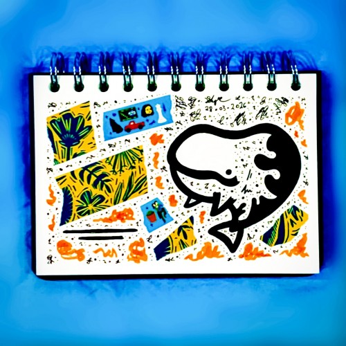
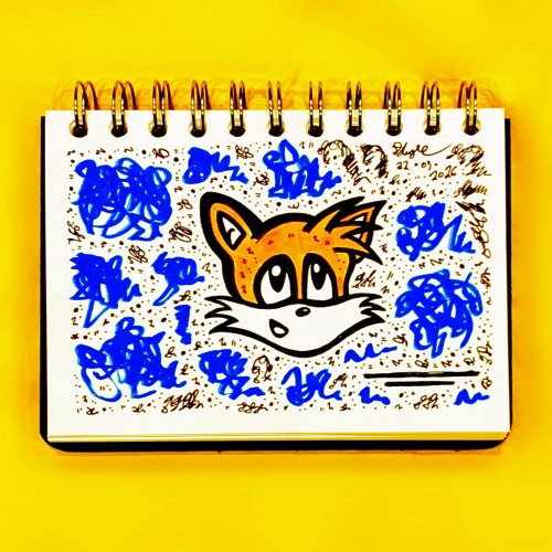
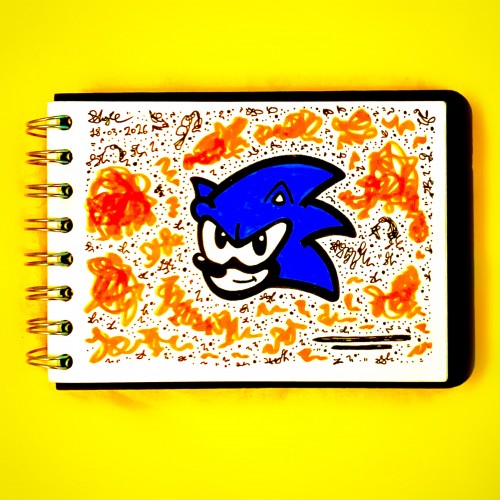
New sketchbook time already? Seems like it!
Kicking off the new volume “Digital Analog Native” with some Tails fan art, because that’s how we do it :-)
Then everything started shrinking. Every piece of furniture became elongated and narrow and disappeared towards the ceiling. There was something crawling under the rag rugs in the hall. It was also narrow and thin and wriggled in the middle, sometimes very quickly and sometimes very slowly.
- Sculptor's Daughter by Tove Jansson
#dailydrawing #tovejansson
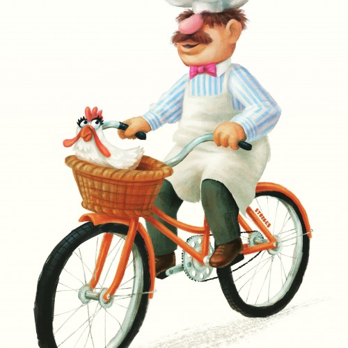
Bork, bork, bork! The Swedish Chef is taking “fast food” to a whole new level—now with 100% more chicken anxiety. Camilla did not sign up for this Tour de Flap, but here we are. Will they reach the kitchen safely, or will this turn into an unscheduled poultry emergency? Stay tuned.
Latest from my Bikes of Amsterdam series
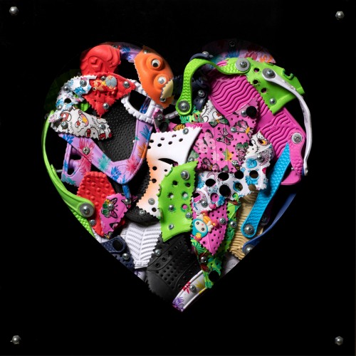
The materials that Meir uses in her works are not of the refined and so she is called an “arte povere” artist. At times she describes her work as someone dealing in alchemy - work develops as in a trial laboratory with different techniques and materials. She says, “ at times the artistic work process is a sort of puzzle demanding the filling in of all the empty squares “.
Some of her work focuses on women, and they incorporate criticism and cultural protest.
Meir has strong opinions about recycling and environmental protection that is represented in her works by use of materials and shapes. In her work she reacts to contemporary art that communicates with the eco system, waste, and she also searches for different worlds. Her works are made up of layers upon colorful layers that when we look at them it becomes clear that the mound of waste she chose is not coincidental. It actually becomes a colorful kaleidoscope of utopia.
Jaffa Meir is a multifaceted, autodidact artist working in painting, sculpture, photography, product design, carpets and furniture, painting on textile, and computer graphics.
The structural composition of some of the works is influenced also by her many years of working in the architects’ office.
Meir also worked in the developing of ideas within the field of ecosystems and recycling for factories such as Coca Cola, and during this process came up with ideas for designing parks and public game spaces using industrial waste products.