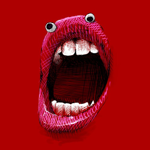
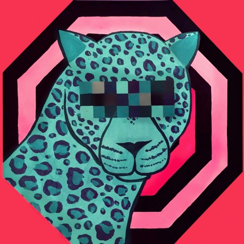
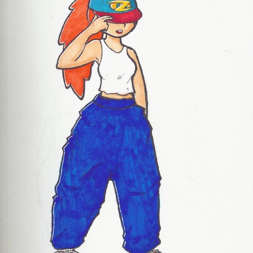
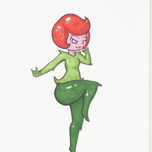
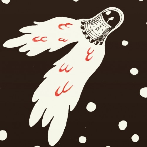
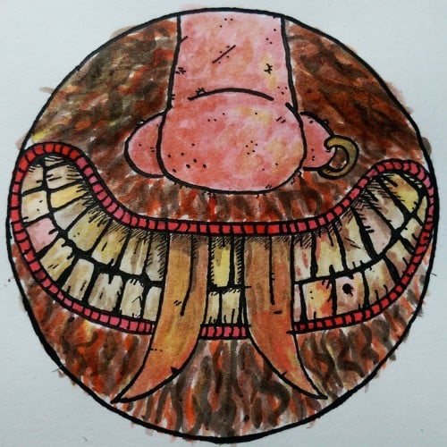
I decided to practice posing with a character that has a certain style. I also wanted to test a design for my artist logo. I will definitely be making a digital version of this character in the near future. Colored with Artify alcohol-based markers, and a white Gellyroll pen for highlights.
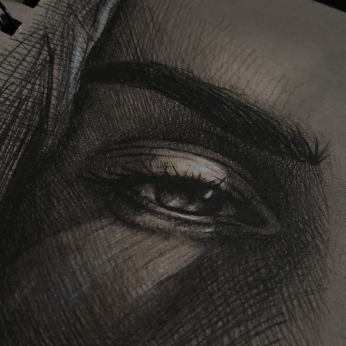
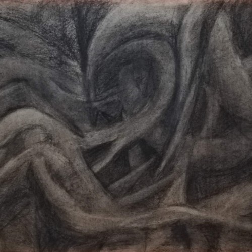
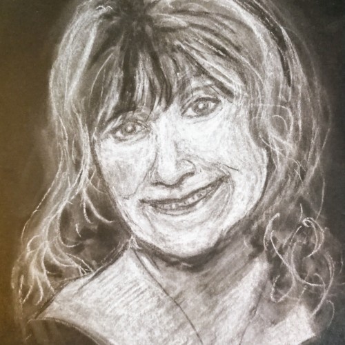
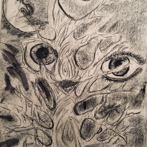
My tribute to my good friend who died earlier this year. Another white pastel on black paper. Not my favourite media but I love the effect of it. I need to practice more as I can't get my head around working on negative lol, erasing to get shadows and filling in to get highlights etc. I used a chunky white stick and a white pastel pencil but detail still eludes me lol. It's a technique I need to refine. It's the second picture of a dead person I've put on, apart from humph, so I'm a cheery little soul aren't I lol? Thanks for looking
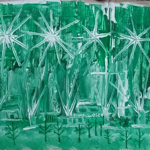
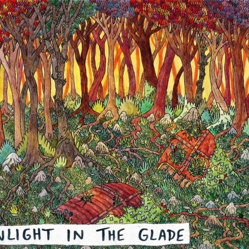
The five part illustration series Don't Lose Yourself. You can lose yourself in many ways; Consumerism, Heartbreak, American Culture, Loneliness, Giving In, Giving Up, Settling. The five part illustration series, “Don’t Lose Yourself” highlights the chaos we don’t notice around or within ourselves when we’re disconnected away from reality. Sinking so deep, we forget our own values or who we are. The collection reminds us to stay within ourselves by showcasing the dangers of what happens when we don’t.
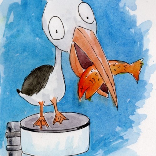
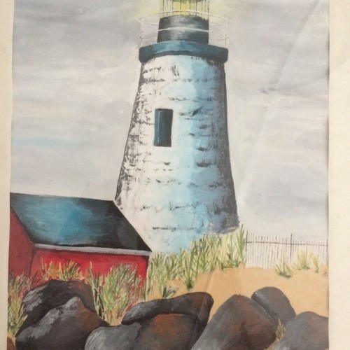
According to our fun daily calendar, April 8th is "Draw a bird day". So I drew my favourite bird (the pelican), perched on a streetlight as we often see them on the bridge over a local lake. Pen and watercolour.
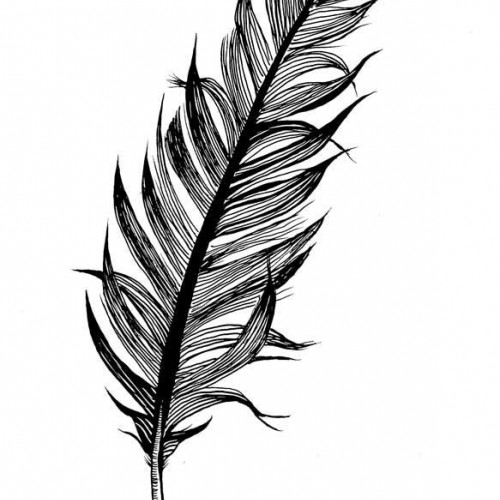
In an attempt to be much more consistent with my drawing practice (and to tackle my insecurities about showing people my drawings) I am hoping that posting some of my sketches online will help keep me accountable. So day 1 sketch, I managed to find a very cheap used college set of Rotring Rapidograph pens online, when they arrived today I was delighted to see that they had NEVER been used! After a bit of a happy dance I got a couple of the pens assembled and started to figure out how they work. This is a quick sketch on tracing paper not that I was tracing anything I just need to invest in better paper with less tooth to be able to use these pens without having ink flow issues.
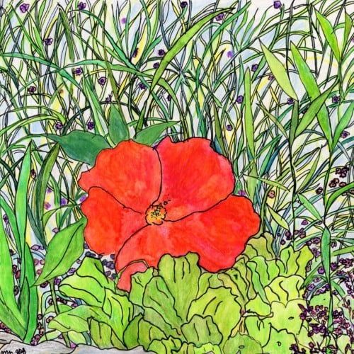
Exploring the opportunities of my only three colors: ultramarine deep (pb29), cadmium yellow medium (py35) and madder lake red light (pr187)
P.s. and my waterbrush too
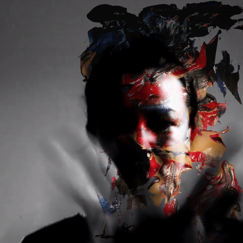
So I wanted to play with lights and shadows with this piece. (sorry I literally could not figure out how to set post it straight and I tried all I could think of, it didn's work out. Please if you have the same problem and you know how to solve it tell me, thank you).
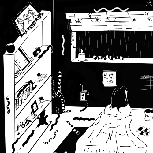
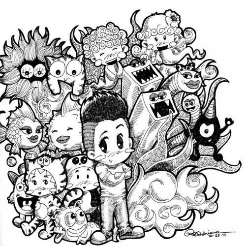
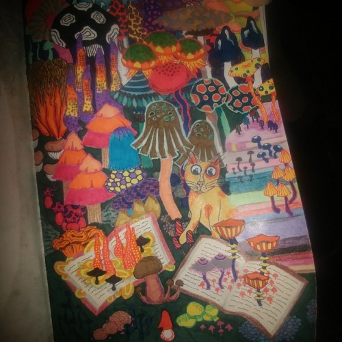
The cat in this doodle is inspired by "The Beast" from a cartoon that ran when I was a kid. The abstract mushrooms are a slight deviation from my usual botanical abstracts.