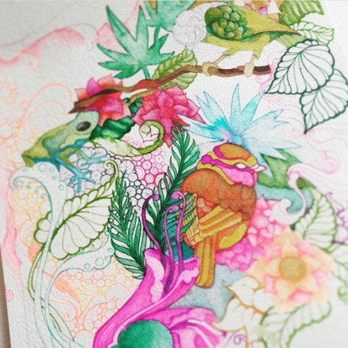
I don't know why I love drawing birds so much, I just do, and it's always small ones like Finches and Canary's...here I added some froggies coz they're fun to paint too...
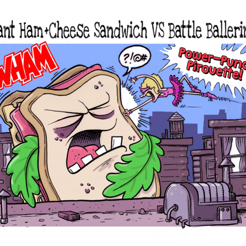
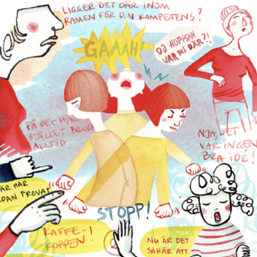
My sister-in-law called me on the phone while playing Giant Sandwich VS Princess Ballerina with my (then) 3-year-old niece, (who I assumed was the Princess Ballerina.) From what I could hear over the phone, my niece was using a "flying fist punch" to devastate the evil "Giant Sammich," (which was later described as a ham and swiss on white with flimsy leaves of lettuce.)
After that call, I imagined what that fight looked like and put it down on paper.
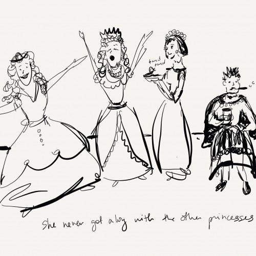
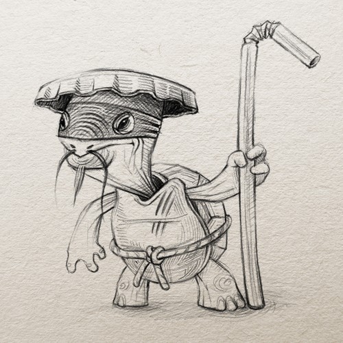
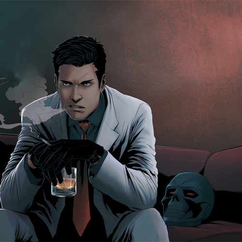
This is a little cartoon I doodled one day. I have it on some of my stuff on Redbubble, Society6, Zazzle, and Threadless, though it doesn't fit well on everything. If you'd like to see it, here's the link that will lead you to all those sites: https://linktr.ee/okhismakingart
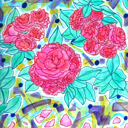
A watercolor painting of Free Spirit roses with an odd, movie theater carpet-like background. It is available as a print on products on Redbubble, Society6, Zazzle, and Threadless. Check out all these sites via this link: https://linktr.ee/okhismakingart
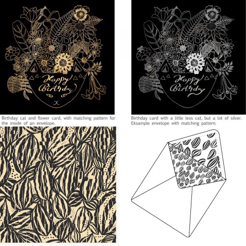
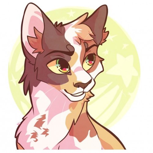
Things people like, cats and flower. Here combined in a gold foil exclusive birthday card. I am trying out different styles for cards with matching patterns. The hope is to sell it and become full time card, placement and surface designer. I just craw all the time and forget about selling. Now I need to get into business and act some more. Do you think it has a chance, and do you even have an idea of where to sell it?
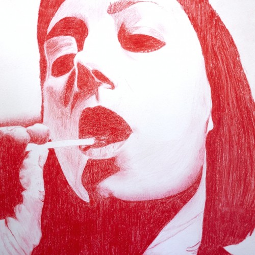
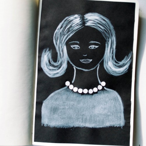
The idea for this portrait came to me when I was looking at a packaging of soap - it was very glossy and it looked like it could look like pearls. As well as the soap packaging, I used white ink mixed with acrylic paint (for opacity) on black paper.
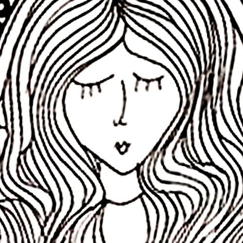
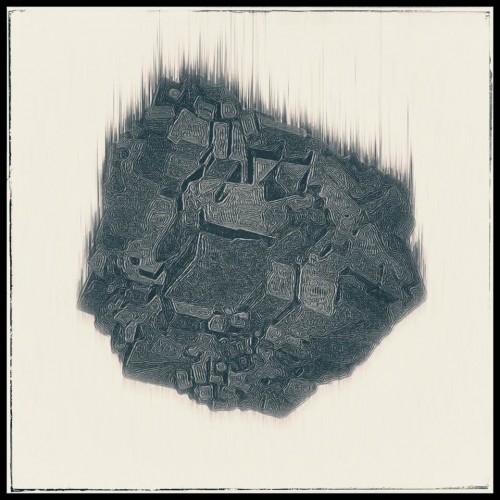
India ink on tissue paper. I had never used ink on this kind of paper before; I really liked the results! There are some folds and wrinkles on the paper that give the pattern some interesting details. The paper is also super absorbing, which plays nicely with the quantities of ink. Since it's very thin, there can easily be overlays between textures. And finally, when trying to use less ink (so that it wouldn't seep through and cause a big dot - the absorbing quality is nice, but it was also somewhat of a challenge!) I used very little ink on the lettering, causing a scratchy, dry look.
Progression drawing 5 of 7. This is an earlier drawing of a how-to video from Emmy Kalia. All credit to her. This one may not seem like a lot of progress from the last upload, but I did manage to lighten up that dark spot on her cheek. Link: https://youtu.be/80ewdDwAVk4
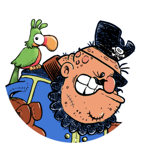
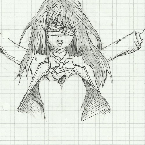
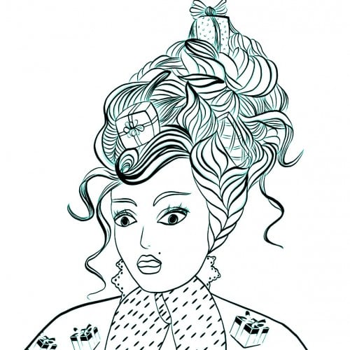
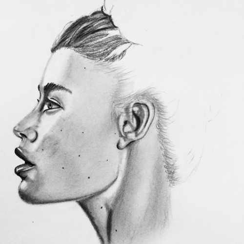
Started as a doodle of a friend then I decided to have fun with it and this is its current state. Drawing on these large papers is kinda intimidating to a beginner artist like me lol. any opinions, questions, or advice would be amazing thanks..