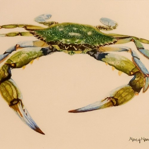
Colored Pencil. Tried photo editing, but for some reason, my blue crab looks green in every photo no matter what I do....so trust me, it's more blue!! LOL
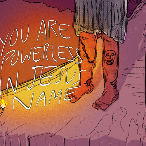
I did this for a Skillshare class. It’s about how giants feel overwhelming but that there is victory in Jesus. I wanted the problem to look impossible and big but show that she knows that God will be enough for her to overcome. It encourages me sometimes to make stuff like this.
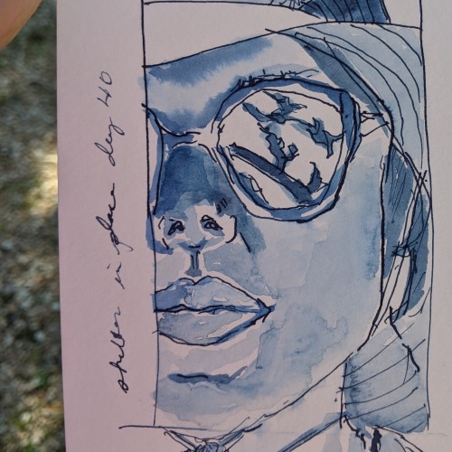
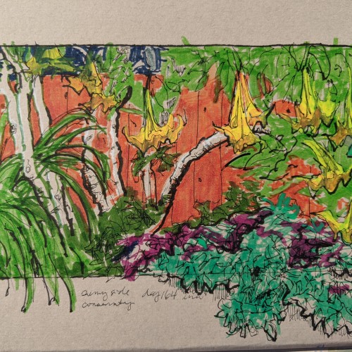
Finally started back on a regular sketch schedule. Once a week on Thursdays, and I really look forward to it. I tried to tone down the orange marker with brown ink, but no luck. It really was a bright and sunny fence, though.
I have been listening to astrophysicist's broadcasts a lot this days. Few I like the most are Joe Rogans's with Neil deGrasse Tyson, Brian Cox, Sean Carroll. They talk about obviously space, extra terrestrial life but also religion, people, psychology. I realised that when you think at cosmos level or at subatomic level, the things we worry about in day to day life feel very less compared to the vastness out there or in us. So I think it is very important to get out of the city, to find clear sky and look at the stars up there. It gives a surprising energy which I don't know how to describe but feels powerful.
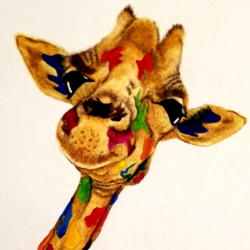
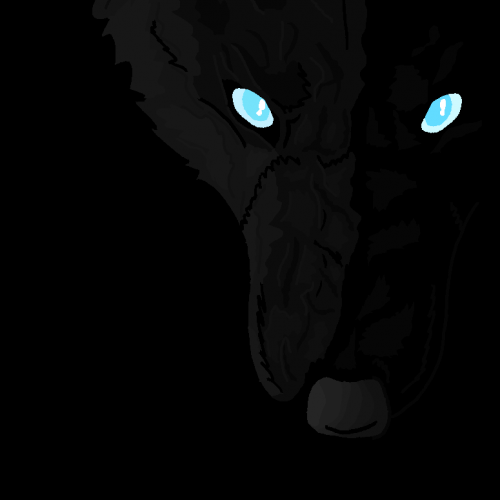
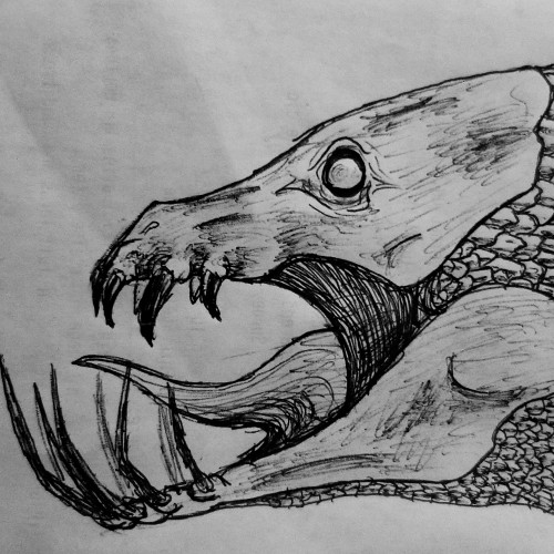
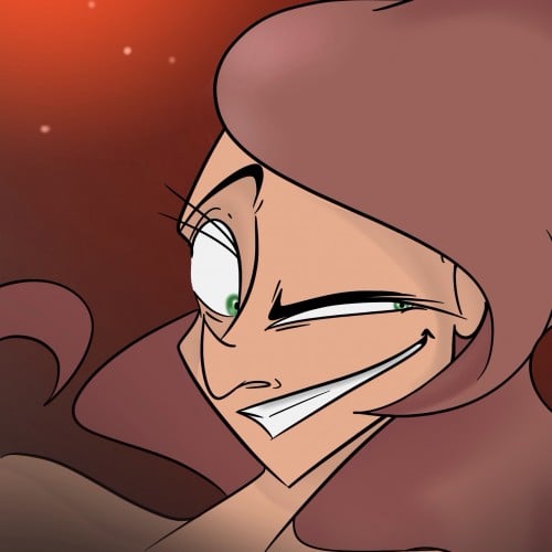
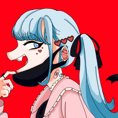
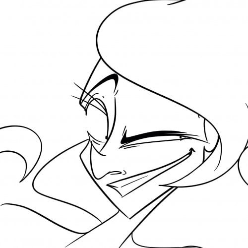
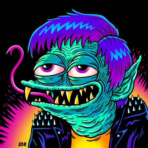
Just trying out a little creature scribble....Looking at this a little closer i can see....i need to work on scales -_- Tell me what you guys think! ....I would greatly appreciate any feedback on my art, comments, tips, etc.
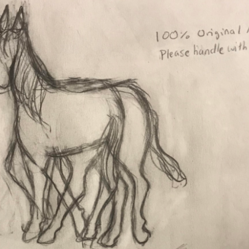
I was inspired by Picasso's idea of multiple perspectives so I thought, well, what if I did that with a horse? I started sketching immediately and I unknowingly drew an optical illusion! Take a look...can you see both of the horses?
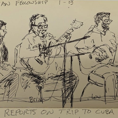
Sunday morning, more than a decade ago.
Music, fellowship, and reports about what God was doing here and there.
Some things are worth remembering. We learn from looking back—
but we must live forward.
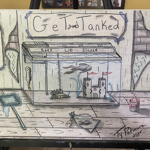
A playful, mixed-media tribute to the aquarium life. This piece captures a slice of a fish's world, complete with a warning to "Keep Lid Closed", miniature castle, forgotten net, and a $75 price tag on a fish. It's a whimsical look at the serious business of pet fish ownership.
An old piece. It was previously very rough, but recent improvements in photo editing skills made it look better and better as time passed. Probably... my impression of a wondrous dream world? Music inspiration: Metrik - Freefall (Ft. Reija Lee)
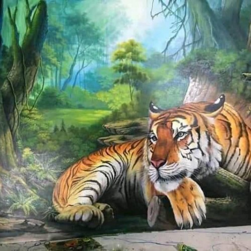
Once, my parents and I visited the zoo, I came here very often because my parents let me go out every weekend, as well as to let them relieve the stress at work. Every time I come, I visit the king of the forest. Its body is also very large, it is short, not as tall as zebras or antelopes, but on the movie channel we see that it can catch those horses. Why so? It is because they are so fast even though they are short that it does not become the tiger's limitation. Its whole body is covered with a beautiful plumage of black and orange, which looks very beautiful. The color scheme on that body is also very delicate. In places like: the neck, inside the legs… there are beautiful white hairs that look like cotton cream that I'm holding.Its fangs are very sharp like large, sharp needles. Every time people feed it, those sharp teeth come out looking really scary. It used those jaws to tear raw meat into pieces. The tiger's paws have very sharp claws, the very paws that help it grab food. I like it because it is a powerful and powerful animal. It is that curiosity that helps me get closer to it and see it in every position. And the weekend comes to see how it grows bigger and stronger.
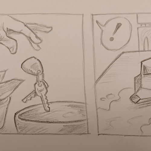
A little while back I started doing little triptych cartoons, something I could have fun with and zip off pretty quickly. Then I expanded them to four panels when it felt necessary. Some people think too deeply about my little toons and are confused about what's happening. I just tell them to look at it more simply, and not to overthink it. Like this one.
I wanted it to look like the chalkboard menus in quirky cafes. I drew the image with a Blackwing pencil, scanned it into Photoshop, inverted, then applied the colors.
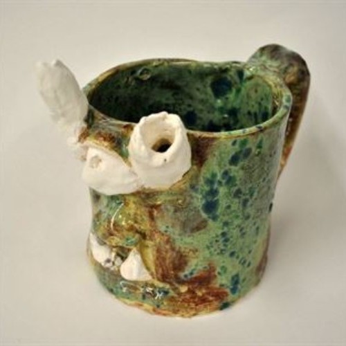
The first stage of clay is slip. Slip is watery clay; it is most often used to "slip and score", which I used to attach the features of the mug to the mug itself.
The second stage of clay is wet. Wet is moist, very plastic clay. Wet is the type of clay I love to use, just because it feels so fresh, and because it is moist enough that I don't have to soften it with water.
The third stage of clay is leather hard. Leather hard is the stage my mug was in after being left on the shelf for twenty-four hours or so. It is easier to cut but very difficult to sculpt.
The fourth stage of clay is greenware. Greenware is completely dry clay that is fragile and breakable. I would say that greenware is an overdose of leather hard for the clay. In other words, leaving clay out for a longer amount of time can turn leather hard clay into greenware.
The fifth stage of clay is bisque. This is the clay after its first firing. If it was grey clay, it is now white in this stage. It is now completely hard and no longer soft in any way. Bisque, luckily, is only one stage away from glaze...
The sixth stage of clay is glaze. This is the final firing and results in a smooth texture and a shiny look. I loved the way my glaze came out. While I was painting the mug, it was more of a ruddy red-brown but when it glazed, it turned out to be this beautiful spotted green.
I always admired those hand-painted signs outside the barbershops, so I made my own. Actually, you look like you need a fresh new hairstyle yourself. I can hook you up