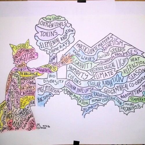
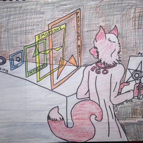
Imagine a bathtub
Full of soaps, salts, and oils
Of many kinds
How they would interact
But some would settle
And some would not mix
The water would be influenced
Reality is full of so many factors
Some of which interact directly
Some of which interact indirectly
Forming many layers
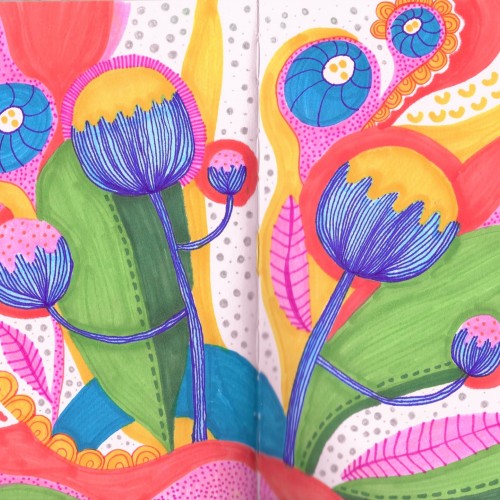
This sketchbook spread features a stylized pattern of colorful poppy flowers. The garden of flowers includes leaves of green, yellow and peach. The flowers are yellow with blue stems. The drawing as a whole has a whimsical and playful feel with a bright color scheme, polka dots and organic squiggle shapes, and blobs of seemingly random colors. Please check out my website ArtsyDrawings.com for more by me, Brianna Eisman. Thank you!
Elias Rosenshaw 10/5/2023
Filtered digital collage of archival ink pen & gel pen on paper, gears (one with acrylic paint), manipulated photography, and digital colours & patterns.
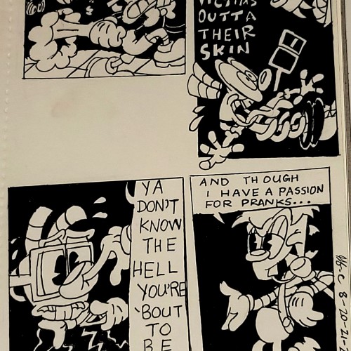
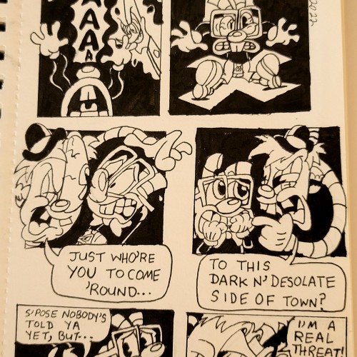
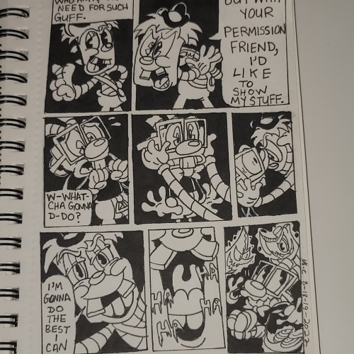
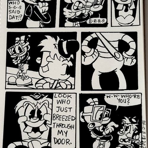
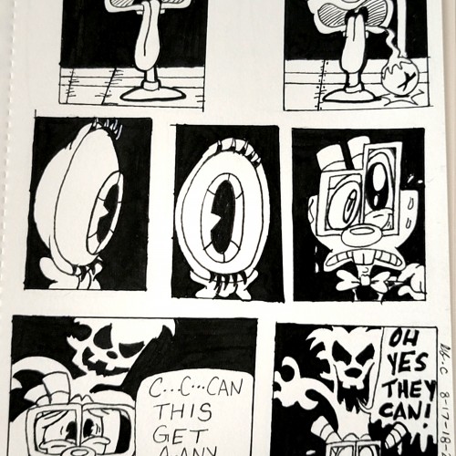
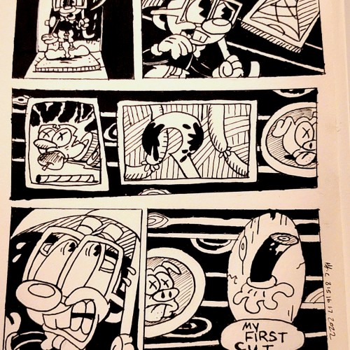
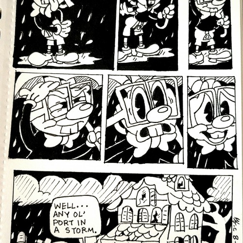
Take note that the "chalice" that had the eye pop out isn't Ms.Chalice. And the giant eyeball's Mugman, cause it freaked him out badly. And is from this episode of "The Shnookums & Meat Funny Cartoon Show", "Night of the Living Shnookums." It can be found here. https://youtu.be/cf1D-cf113c?si=pBIDBpFUrA4ksSuF&t=228
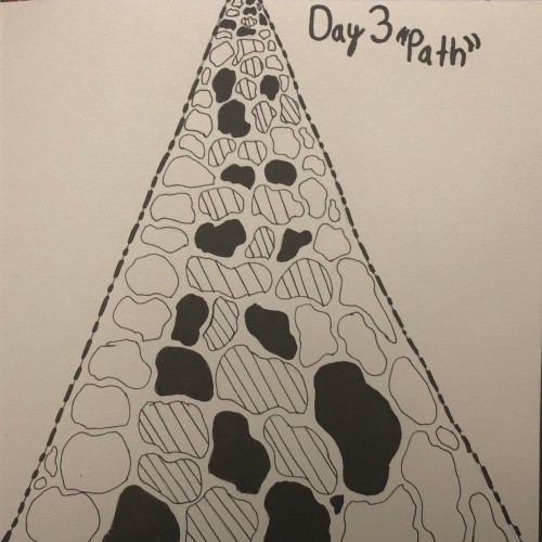
Inktober
Day 3(Path)
Year 2
For this one I was really stuck because there are so many ways to draw the word Path because path has different meanings to it . But I ultimately decided to draw a Stone path after some inspiration on Pintrest
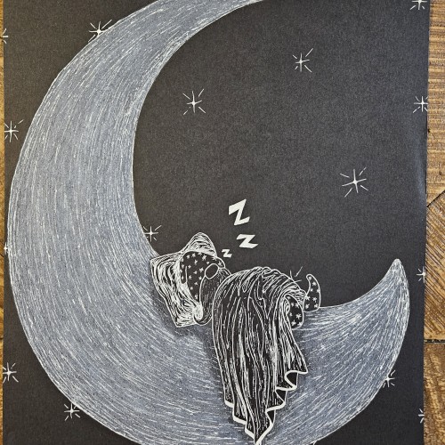
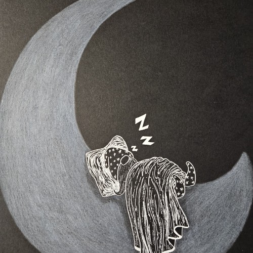
Sandman going to bed after a long nights work of putting others to sleep. As an adult I love sleeping the whole night uninterrupted, thus sandman is my hero. White pencil and gel pen on black paper.
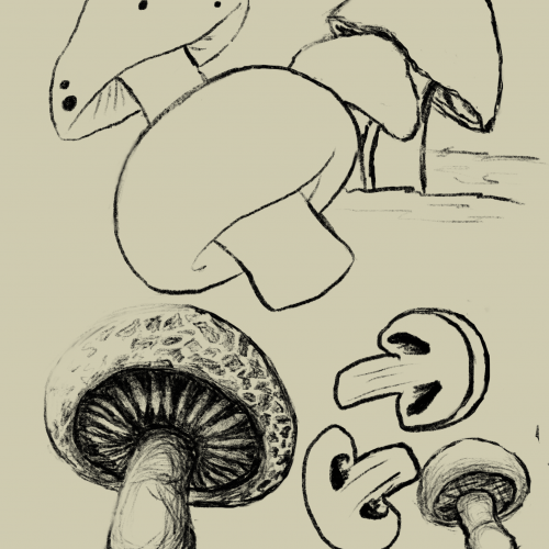
Trying to get back into drawing and figured mushrooms would be a fun and non-intimidating subject to explore. So many varieties and a lot of opportunities to stylize them!
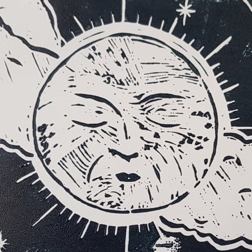
This is based on a couple of lino cut prints, acrylic paint and gold ink. I have rediscovered my love of lino cut printing after many years and hope to do much more of it.
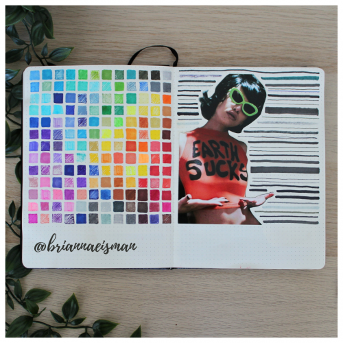
About once a year I set aside a page in my sketchbook, or bullet journal, to do a marker test. I go through every pen I own including Sharpies, highlighters, Bic Permanent Markers, Crayola markers, Stabilo pens, Expo dry erase markers and everything in between. I document the quality and determine whether to keep or toss the utensil. I find it’s easy to collect art materials, especially when you’re like me and switch mediums regularly. It’s important to know that when I reach for a certain pen or marker, it’s going to work the way I want it to. I do keep a page at the back of my sketchbook open for testing mediums, but it’s an important part of the process of creating art to go with the flow and just draw.