Ren and Stimpy fan art - these two were my childhood favorite and influenced my art, as you can probably tell, ha ha. Thanks for the idea, @Rayedrgn :)
Created using pen and ink, this drawing mimics a fine art painting I saw in a museum. I loved the figures and their fluid movements, so I doodled it down in my sketchbook and later inked it in for a refined black and white artwork. Check out more on my website ArtsyDrawings.com!
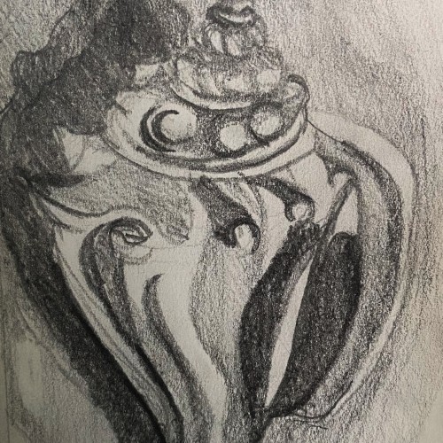
This is a graphite pencil drawing of a conch shell I found on the beach in Florida. I used this sketch as a base for a intaglio print I made. The sketch features the cool textures and forms of the shell in a harsh contrasting light.
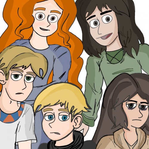
Artwork I did last month,I regret not using extra layers to color it better D:but I could always redraw it.names;Erik,Elvarelyn,Abigail,Bernard and Gerald
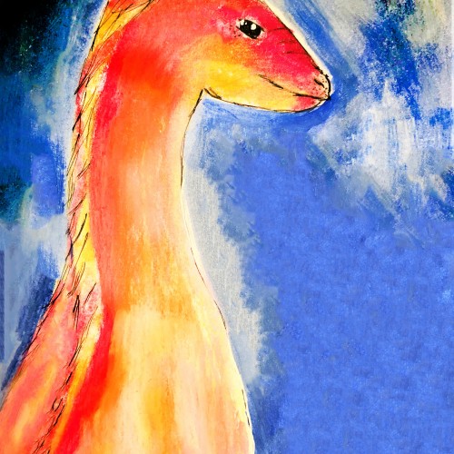
I wanted to draw a crowned animal with a crest on top of its head. Originally , this was colored with colored pencils but I didn't like how it looked so I tried to save it by painting over it with acrylic paint.
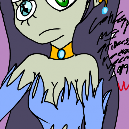
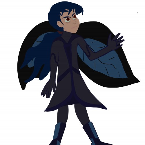
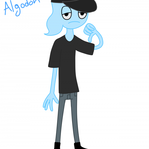
Clemence was supposed to be the only child but to create more conflict I decided to give her a younger teen sister name Calamity,who's blue,figuratively and literally.she's not goth,she just likes wearing black.Calamity,like most teens,has self-esteem issues and has no hope in herself and thinks the future is going to be grim.
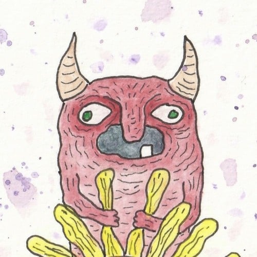
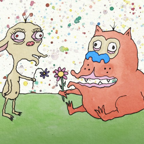
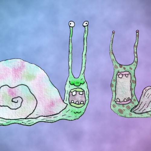
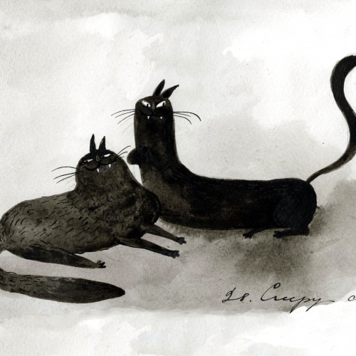
28. Creepy cats.
Prompts are from Janelle Shane generated using the OpenAI net GPT-3.
https://www.instagram.com/p/CVlLft-LUlJ/?utm_source=ig_web_copy_link
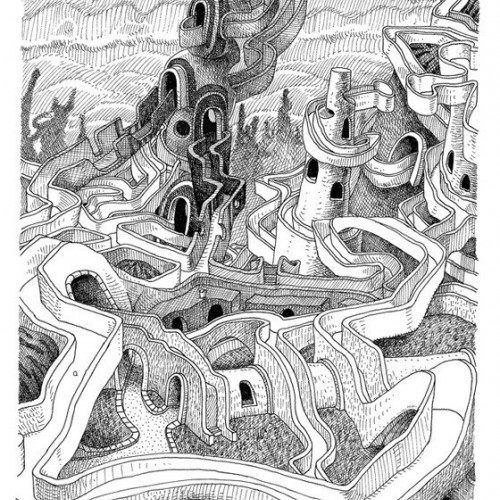
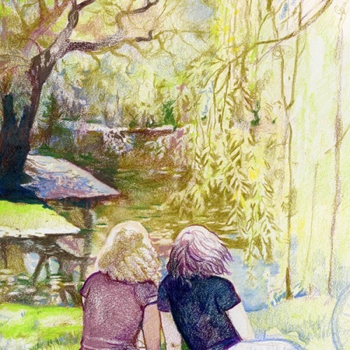
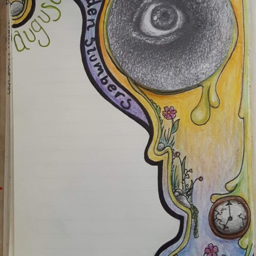
I know this is simpler and a quicker piece, but this is the drawing for my August journal. I started doing these back in March, with each month's drawing being based off a song. This month is "Golden Slumbers" by the Beatles, July was "Tower of Babel" by Elton John. (The pencil sketch eye I previously posted is indeed now in my journal.)
India ink on tissue paper. I had never used ink on this kind of paper before; I really liked the results! There are some folds and wrinkles on the paper that give the pattern some interesting details. The paper is also super absorbing, which plays nicely with the quantities of ink. Since it's very thin, there can easily be overlays between textures. And finally, when trying to use less ink (so that it wouldn't seep through and cause a big dot - the absorbing quality is nice, but it was also somewhat of a challenge!) I used very little ink on the lettering, causing a scratchy, dry look.
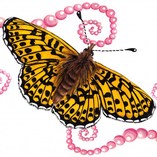
The (i think) 12th and final butterfly for the Literal Butterflies Project. Wow! thats a lotta flutterflies. This one was certainly tedious with such elaborate markings, she wasn't easy! ... That said, none of them were. With such beauty, and intricate wing pattern and design, butterflies are a very difficult subject to work with. But somehow we managed to get through all 12 with some of my hair left! Loved every step of this journey :)
I generally make marks on something every day, but I'm really TRYING to do it purposefully in one single journal at a time. I also have super ADHD, which means I pretty much never go up to my actual studio and usually only use what's out on my desk, because out-of-sight-out-of-mind.