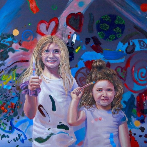
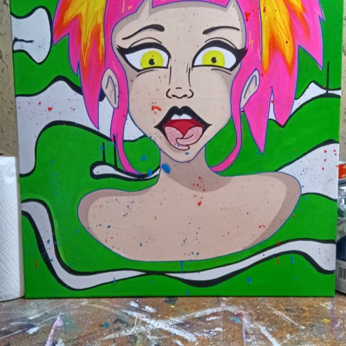
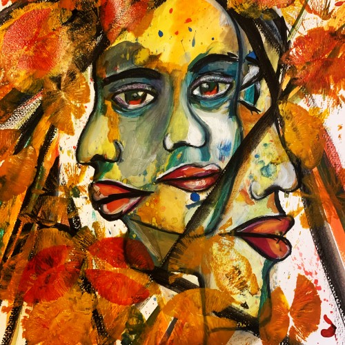
The background of this painting is created by these two girls. I had daughters of a friend paint a canvas and then I painted them into their painting. It could be a commentary on modern art, but it's ore just for fun and makes for a cool image.
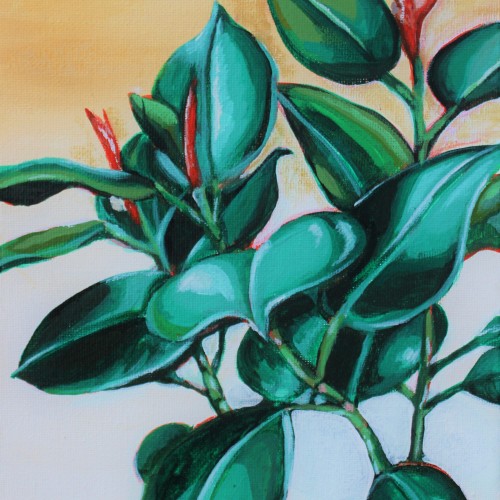
When I moved into my first apartment, I knew I wanted to create my own wall art. So like any Potterhead artist, I binged Harry Potter movies and painted for many hours straight. This painting is part of a three piece set featuring my favorite plants painted on a soft gradient background. This 8”x10” acrylic painting is made on pre-stretched canvas.
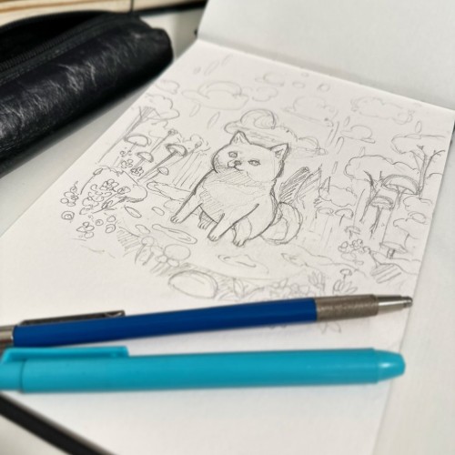
With our adorable Shiba, Kaiju, as my inspiration, I've started working on initial sketches.
The next step is to determine the perfect color palette before beginning the actual painting.
Though I typically prefer to work with oil paints, it's been a considerable time since I last indulged in painting.
So, I've decided to use acrylics this time around. I'm thrilled to start this new painting!
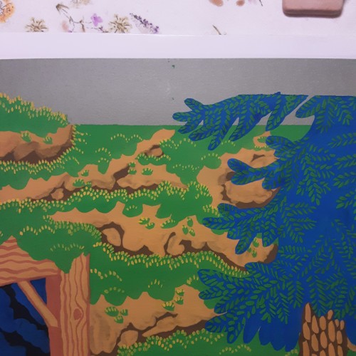
Backgrounds used to be my least favorite part of painting, but now im having fun trying out different textures and patterns. Having a strickt 12 color limit adds to the challenge and makes it feel like a puzzle.
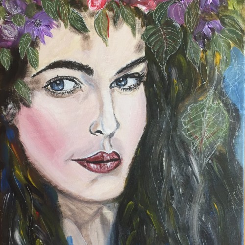
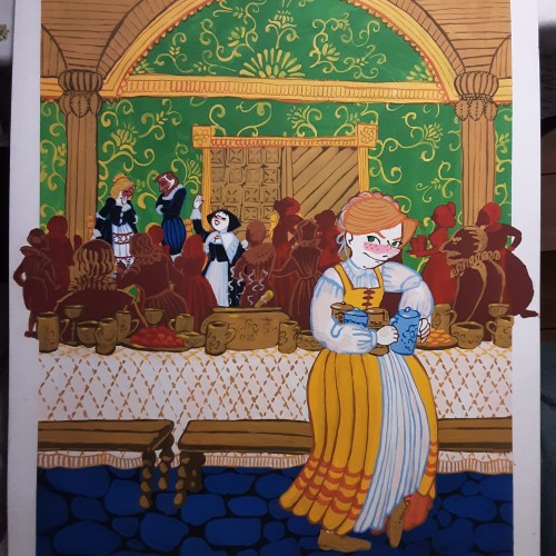
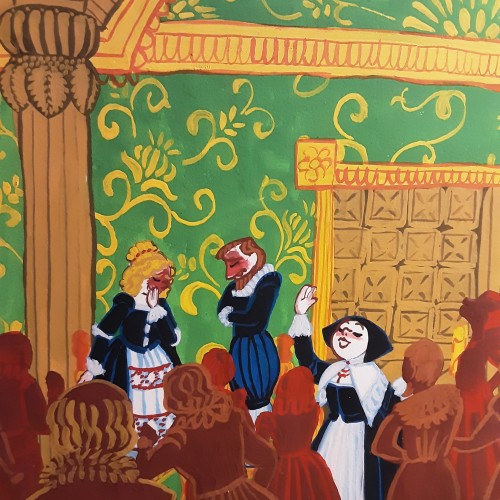
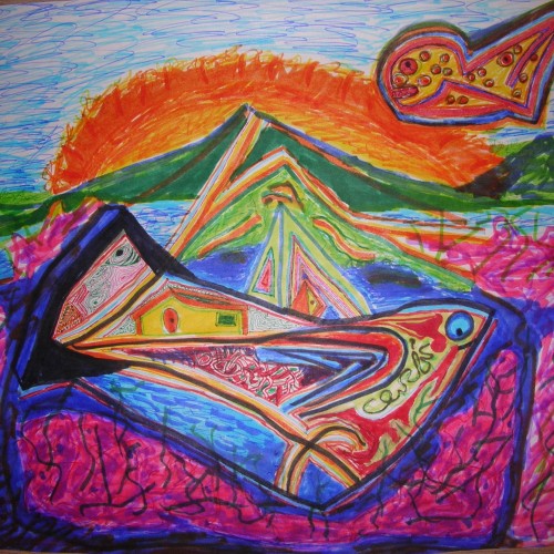
You know when you start a picture, get sick long enough to get out of the flow and it now feels like an never ending project? Im so done with this one, it doesent help how many flaws im gonna spot when i get better, im SO DONE! If anyone wonder about the motive, its about making sure cinderella dont get poisoned before her wedding. All the paintings done in this style is gonna be about keeping cinderella alive.
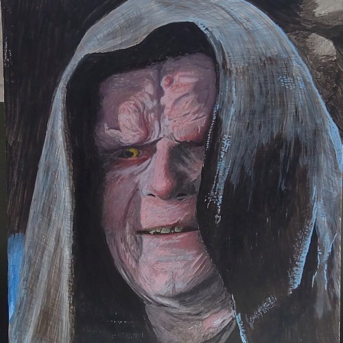
Emperor Palpatine - Egg tempera on panel 9x12. This is my 3rd attempt at egg tempera, and I absolutely love the medium. It is a little tricky to get used too, but it is quite flexible ... despite the textbooks on it that are now over 500 years old.
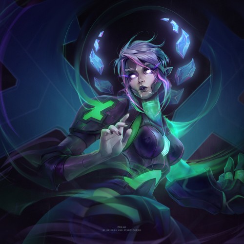
It was a great collaboration with an amazing artist Stumpyfongo back when we were in the Deviantart Collective. The character is Fella, a mascot.
Check out Stumpyfongo's art!!! https://www.artstation.com/stumpyfongo
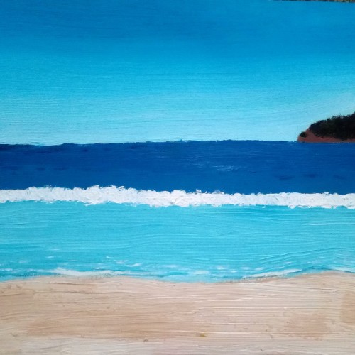
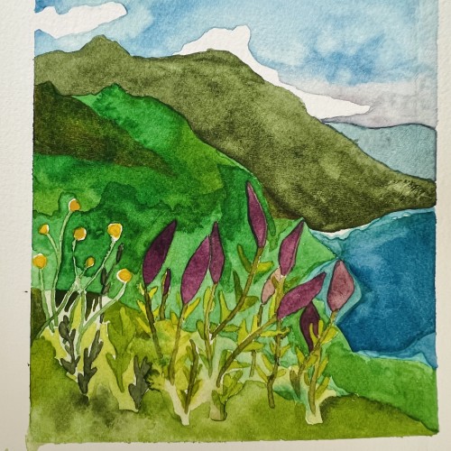
Painting of California coastline. Painted this while I was still learning how to mix watercolors and the amount of water I used etc. but I still liked how this turned out!