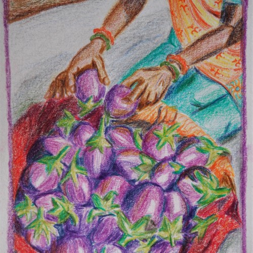
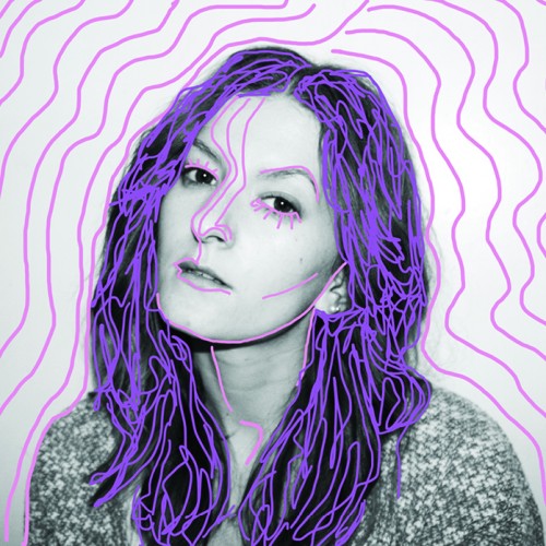
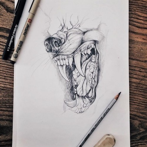
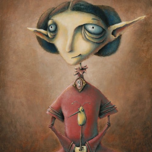
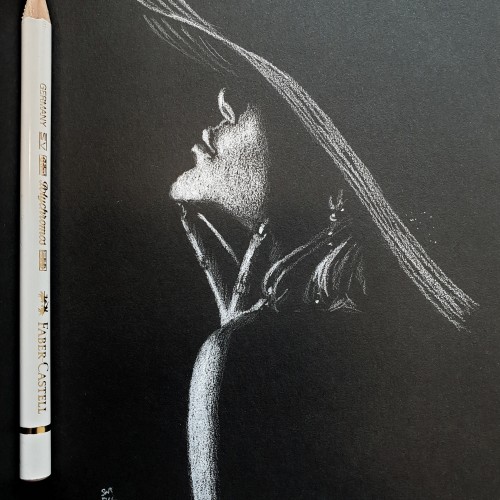
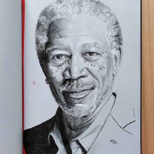
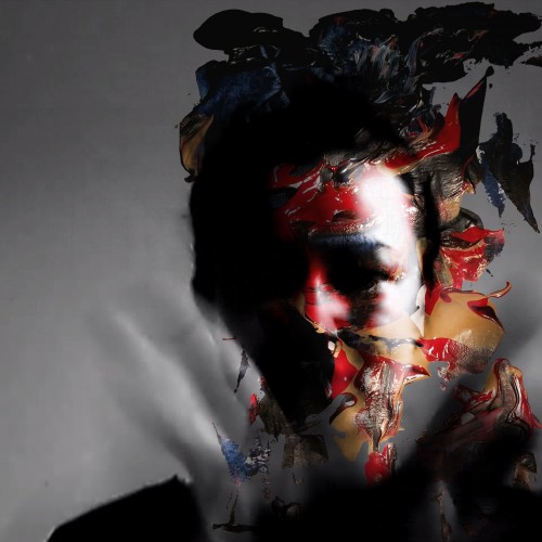
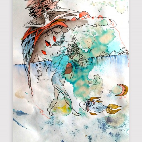
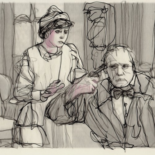
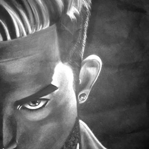
A colour pencil drawing using Derwent Artists pencils on thick cartridge paper. I wanted to show the car speeding down the highway, and so tried to make the tress appear as though they are a blur - Many thanks for looking !
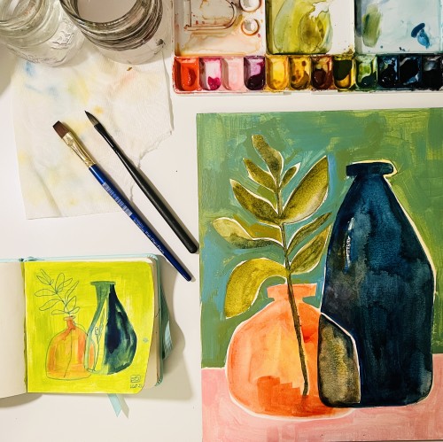
This mixed media piece is what I call a Monday to Monday piece. At the start of each week while working on other pieces I often times have left over paint or want to see how something works out before I put it on the main piece I’m working on so I use a piece of heavy weight paper to test all that on and just keep adding to it through out the week. It also gives me a space to just make whatever I want if I need a break from the main pieces I’m working on.
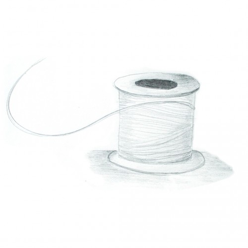
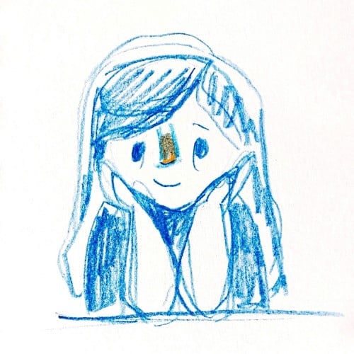
I so enjoyed the inktober and now I am going to do whatever whatever for awhile. I grabbed a sketchbook off my shelf. The paper is thin and rough - bad for ink, but so nice for pencil. Will try to switch the gears now and go with a different feeling.
Let's ouroboros together.
https://www.instagram.com/p/CVvp-ZkrX2I/?utm_source=ig_web_copy_link
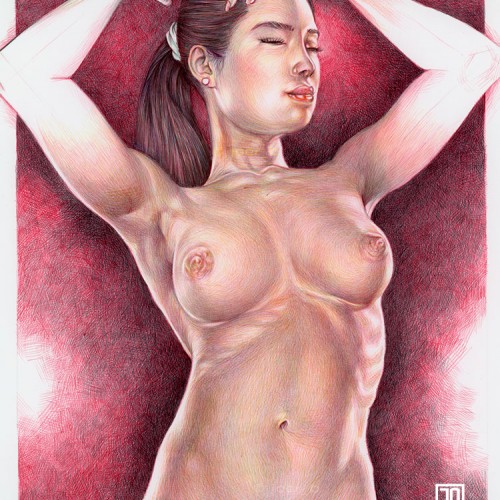
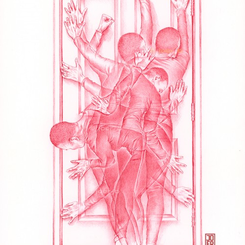
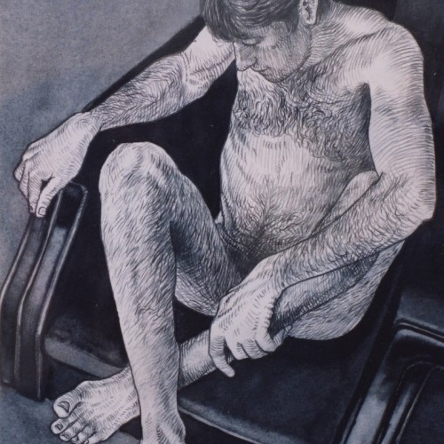
Recent commission: How do women move forward when doors are continually closing in front of them? Doors that were open in the past are now being closed by those who think that you should live your life the way they do even though your life situation is vastly different from theirs. 2022, 13” x 19” Ballpoint Pen on Paper, Digital. Model: AmyM
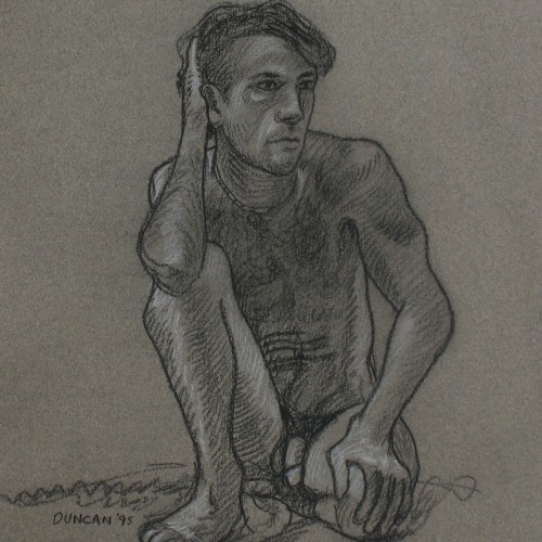
Pastel pencil study of the intertwined hands of the Ambrogio Borghi sculpture, Chioma di Berenice. Faber Castell pastel pencils, Black and White Generals charcoal pencils on 9” x 12” Strathmore Toned Grey sketchbook paper.
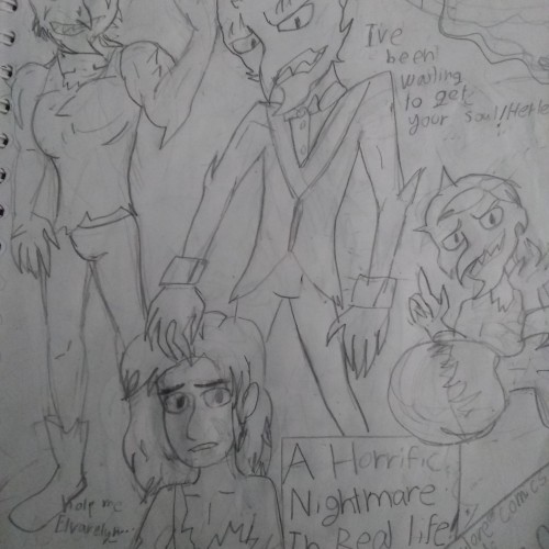
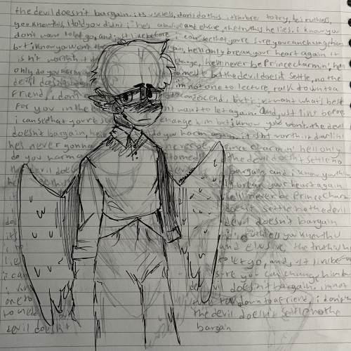
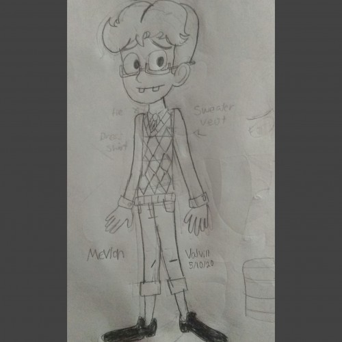
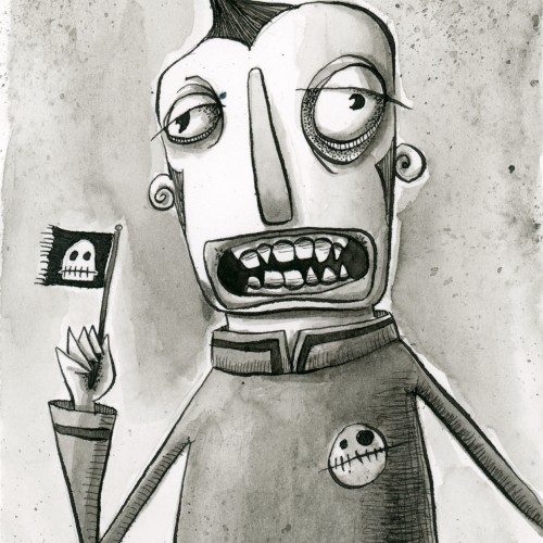
On May I created him,I named this little lad "Mevlon" I'm still working on redesigning his outfit (I'll get rid of the sweater vest lol) I'm not too keen on drawing my OC's on paper but I guess it came out half decent?
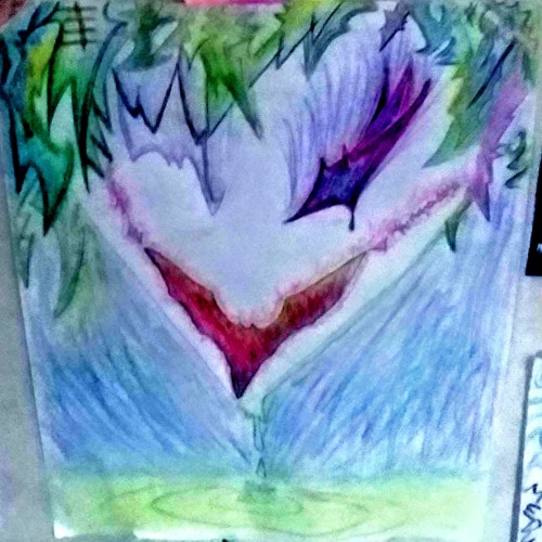
I used Batarang shapes to make the mouth and hair and eyes. Let me know what you think, or just don't. but, hey, sometimes negative feedback is the only fuel i need for my fires.
India ink on tissue paper. I had never used ink on this kind of paper before; I really liked the results! There are some folds and wrinkles on the paper that give the pattern some interesting details. The paper is also super absorbing, which plays nicely with the quantities of ink. Since it's very thin, there can easily be overlays between textures. And finally, when trying to use less ink (so that it wouldn't seep through and cause a big dot - the absorbing quality is nice, but it was also somewhat of a challenge!) I used very little ink on the lettering, causing a scratchy, dry look.
This started as a line drawing based on a photo of peonies in the garden. It’s drawn with three different pens: Micron 005, Micron 03 and Faber Castell Pitt superfine (0.3) on 11x14 Strathmore Bristol Vellum. The paper isn’t terribly tolerant of wet media, so I played around with tinting it in Photoshop because I wasn't sure how it would go. But I liked it in color enough to chance painting the drawing with the nice and bright Dr Ph Martin Hydrus watercolors. It's photographed it on my drafting table with my glasses for scale. The lamp has a daylight bulb, so I think the color (at least where the light is more prominent) is fairly true.
Done 2017 with lead pencil AND USED DIGITAL TO MAKE IT BLUE AND GAVE BORDERS on11 x17 bristol paper. If you are interested in purchasing this artwork for $80 and also I do private commissions. Leave a comment or contact me at jungmeister4@yahoo.com (Shipping fee to ship the original artwork will apply)
My art book is available to purchase. To purchase my art book hit the link.
https://www.artwanted.com/artist.cfm?ArtID=115637&Tab=Books&CPID=1133