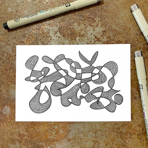
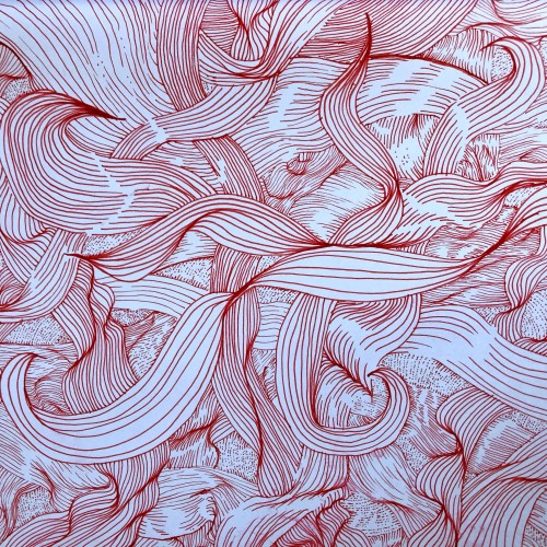
“Whirlwind 1”, an original drawing. Micron pens on archival paper. Size: 4” x 6”. Title, signature and date in the back of the drawing. This drawing is the 1st in a series of drawings that were posted over a period of 100 days. The original post date on this drawing was September 1, 2020.
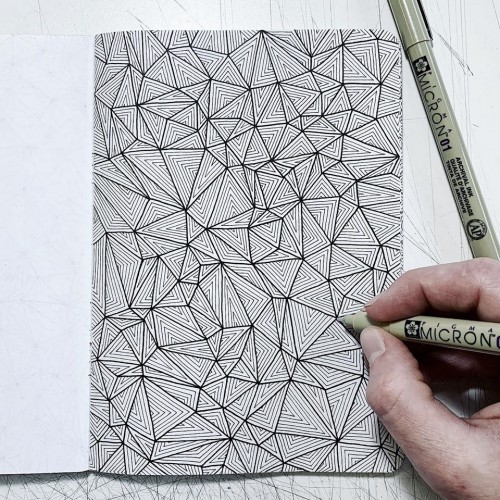
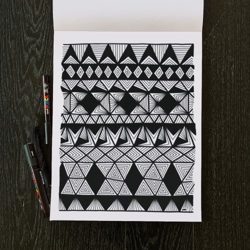
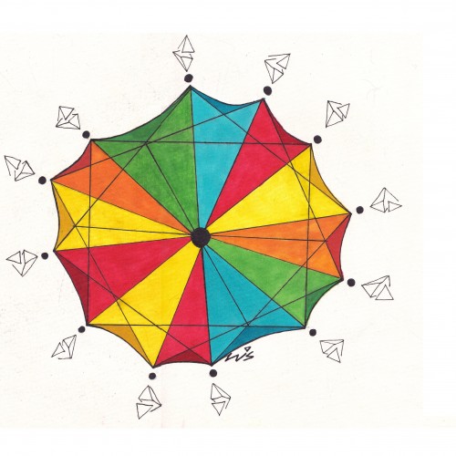
This sketchbook is all about triangle patterns! Each page starts with a base layer of connecting triangles. From there, I fill in different patterns on each page, challenging myself to come up with new ideas for each page.
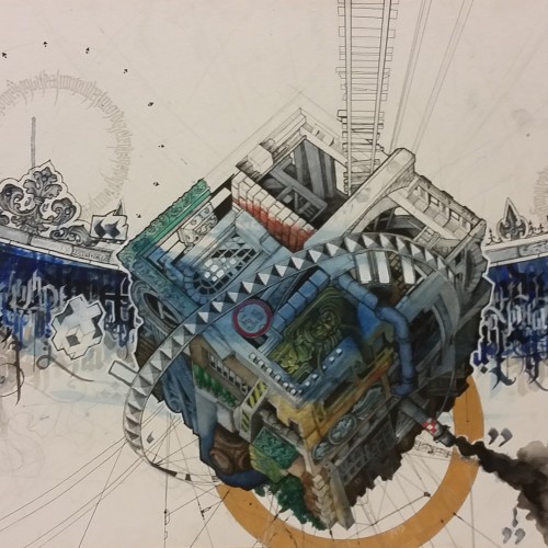
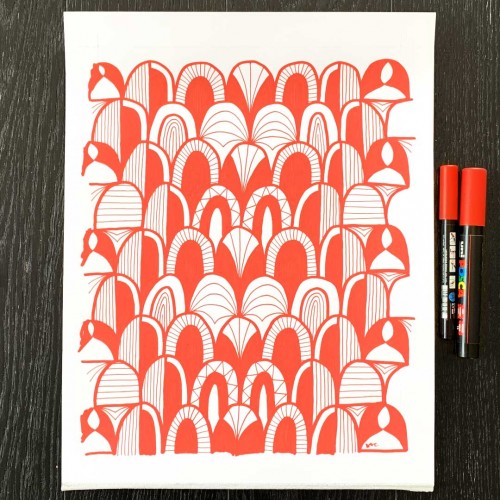
A cartographic representation of the experience of moving to a new city in a foreign land. This work, dubbed as 'Introspectionism', provides the viewer with a snapshot over time of the inner workings of the process of the strange becoming slowly more familiar and the foreign becoming Home.
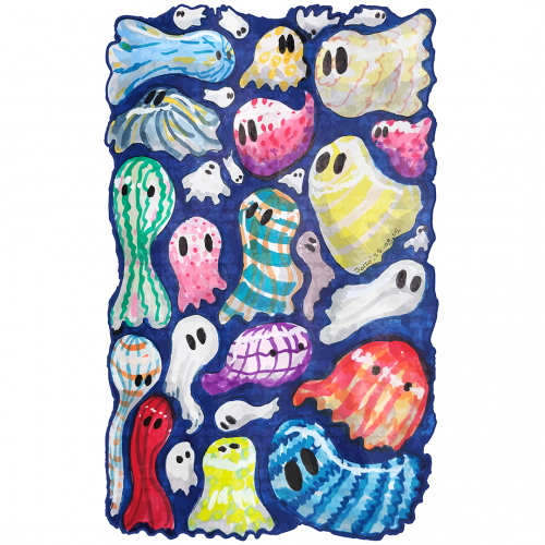
Howcome ghosts only wear white sheets? A group of whimsical, colorful ghosts fills the space, Each figure is unique, featuring different patterns and hues that provide a playful and vibrant contrast. The overall effect is lively and imaginative, evoking a sense of fun and mystery.