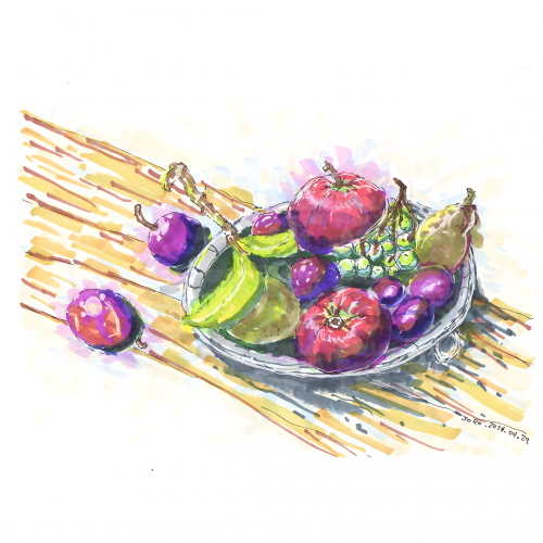
A vibrant piece of art depicts a fruit arrangement still life with various colorful fruits such as grapes, pomegranates, and figs resting on a plate. The background is a wash of warm yellow and earth tones, highlighting the freshness and diversity of the fruits.
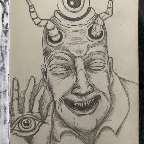
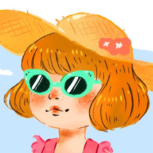
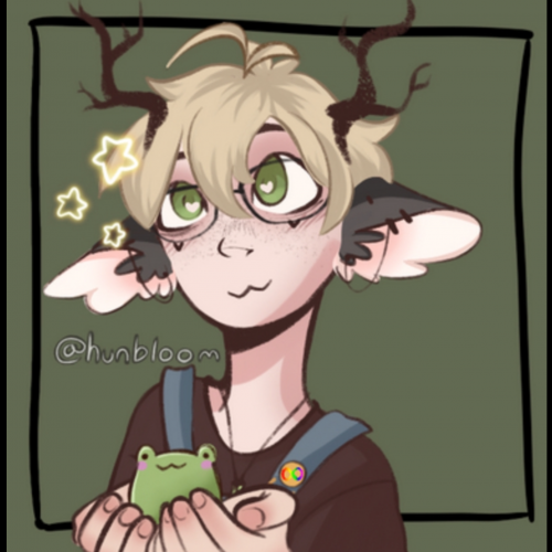
I got Procreate a bit ago and it took me too long to figure it out and learn how to work with it. I was so used to my old program that starting all over got pretty discouraging. I finally finished my first procreate portrait! There are a few things I’m not happy about but I’m not sure how to fix them. Any ideas and advice are super welcome!!!
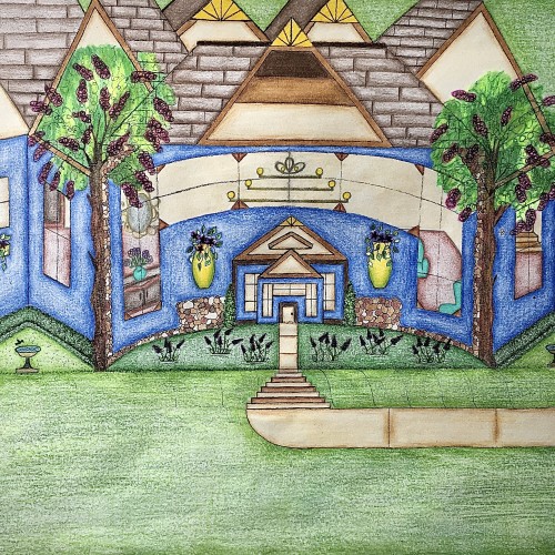
I designed this house. It has a really pretty blue exterior, and it has a slight curve to it that gives it a more warm and inviting feel. I like how the walkway kind of curves into the stairs and transitions back into the walkway before arriving at the front door. I like that there’s plenty of yard space with some really nice landscaping. The birds can even come and get a birdbath. I thought that was really cute. I used the multicolored stones to add detail for a more distinguished look. The hedges are neatly cut in a square and follows along side of the house. Looking through those gorgeous windows you can see the house is fully furnished. There are some really pretty chandeliers in there that adds character. There’s a stairway that leads to another level of the house as well. I love how there’s a touch of yellow that highlights the points on the rooftop. Furthermore, the swing in the backyard adds an inviting feel to the scenery. Also, it’s a nice place to sit and enjoy the view.
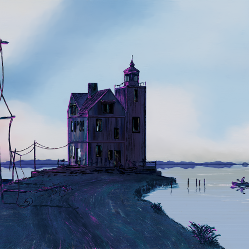
I was going for a surreal and moody feeling—dystopian, sort of not. Per usual, my inspirations are pretty noticeable. I am starting to get more comfortable being stylized. I am trying to put emotion in my landscapes. I used Rebelle 6
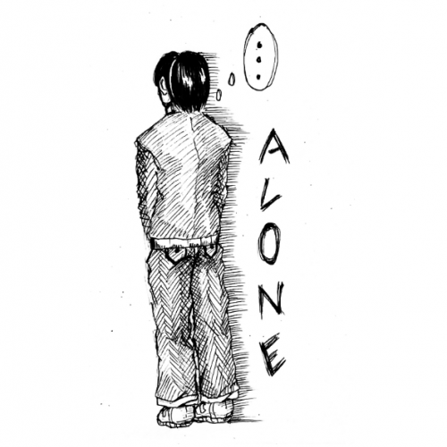
After a long day, it's pretty exciting to go home. Especially in the company of my closest friends, promising each other that tomorrow will be a better day.
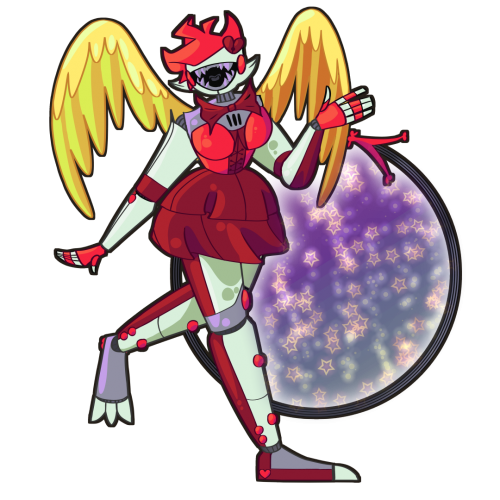
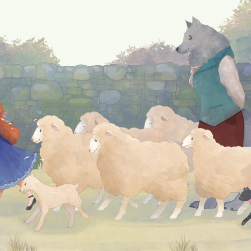
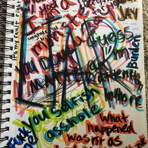
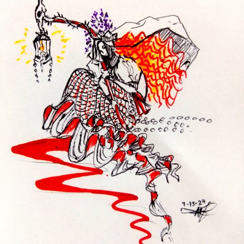
Hello. My name is Jenna. As a child, I grew up in an abusive household, where my dad would do some pretty messed up things, as well as gaslight me. My dad has been out of the picture for a while, but I still have a lot of feelings and trauma left over from him. I wanted to represent what being gaslit, felt like to me. Now without further ado, my impression of gaslighting.
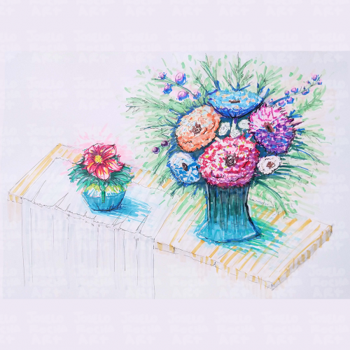
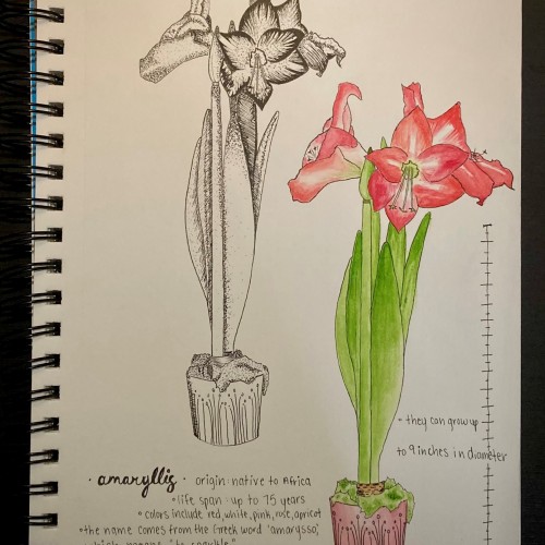
this was just a fun little doodle I did of a pretty plant I saw. it was absolutely stunning and the bright salmon/rose/red flowers just POPPED! this was a nice leisure time doodle to do in between some other projects of mine. I find my happy place sometimes being taking care of my plants, taking pictures of pretty trees and plants, walking around a plant nursery, and now drawing beautiful plants I see.
my favorite fact I learned about the amaryllis was that is comes from the Greek word amarysso, which means “to sparkle” or “to shine”, as this plant does indeed sparkle and with its magnificent flowers when it blooms.
I enjoyed mixing mediums and doing one as a graphic doodle with my Micron pens and the other with watercolors - it was a good study for me seeing the detail come to life by lines/dots and then come to life by colors/shadowing colors.
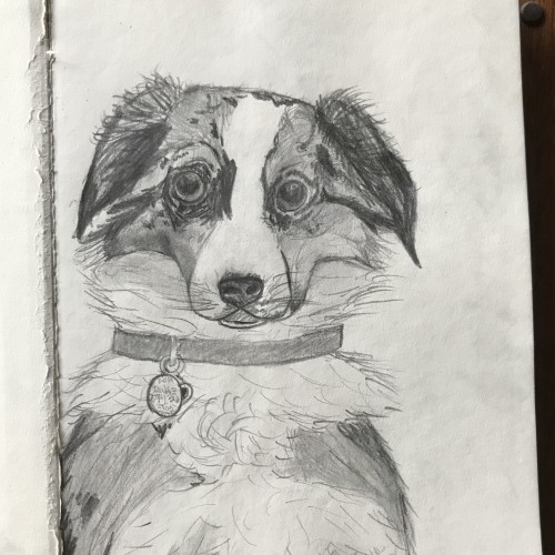
This is my crazy, wild, and extroverted Australian Shepherd. Her name is Tasi. I have found myself pretty busy during the quarantine and haven’t done much art. Hopefully I can find a schedule and upload more frequently.
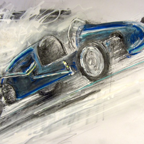
This is an old Formula 3 race car built by Joseph Potts ltd, Lanarkshire, in 1952. They have it in the National Museum of Scotland, where I drew this a couple of weeks ago as a part of Urban Sketchers meetup (as it’s too cold to go outside yet). This is pretty mixed media: pencil, watercolour pencil, white gouache and some acrylic markers. Drawn on spot.
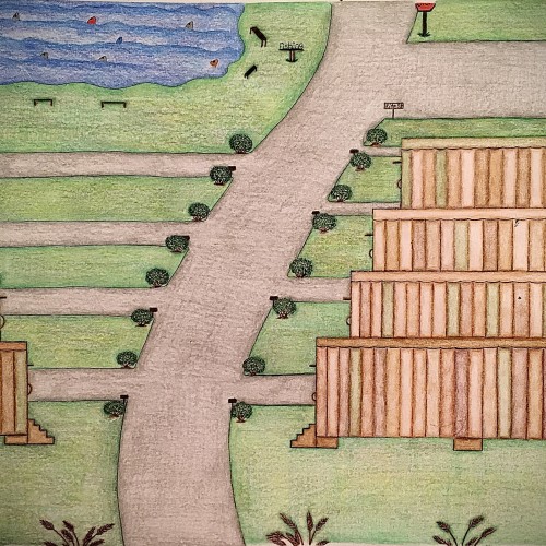
I designed these multicolored trailers using different shades of color only in a different pattern for each trailer. I felt like this color scheme would give the trailers a uniform look yet their own distinct look. The roads look freshly paved with small shrubbery on the corners of the entry ways of the driveways. There are some pretty brown steps that leads to a door on each trailers. Also, as you can see the trailers have been topped off with the same flat style roof only with a different solid color which is one of the colors used on the sides of the trailers. There’s a fishing area with plenty of fish in it as well as places to sit. There’s even a place to use the restroom close by the fishing area so you can continue to enjoy your day catching fish with minimal interruption. This trailer park has a fresh look to it. It has a warm, inviting feel to it and is perfect for living a more simple lifestyle.
A Bob Ross inspired painting, for the Digital Painting Studio challenge, I know composition is a bit off, but I'm still pretty satisfied with the end result, and sometimes, you just have to let go of the image and work on something else...
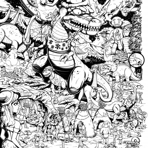
#25 Christmas Art Contest - I'm pretty sure I drew this in 2023 if I'm not mistaken. It was for a Christmas art contest at magma.com and drawn directly on their website using an iPad pro. And well, although I met all the requirements I didn't place in the top four. The rules stated that we had to pair up with another member from the website art community to draw a Christmas themed picture relating to anything from our childhood. What you see is only half the picture. My project-partner Andy added his portion to the collaboration, but I removed his pen strokes just for my website. That's why on the right side of the picture the Christmas tree and edge appear unfinished.
This image is huge, like 5000 pixels. This website will resize the image losing details, but if you would like to zoom-in to a higher resolution, try this link to get a closer look. Safe link to mega-upload file storage:
https://mega.nz/file/vqoXGIgD#bx6hdvKVKX8__hfBAYEVtp49NESS26w4iudrlM-oI_4
Inktober, day 2: "Wisp". Brush pens and posca markers on coloured A4. This is inspired by the wisps in Ultima rpgs that I used to play as a wee bairn. That’s where I learned the word "wisp". In fact, it’s pretty much the only association I still have. ;)
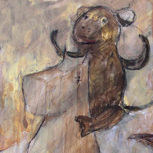
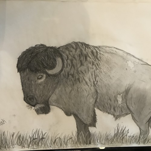
Finally done. For my first Bison, I’d say it’s pretty good. I didn’t really bother with the background or foreground, as you can see. I’d love any suggestions for other projects!