We often have the habit of hearing something or seeing something and then believing that we understand what we just witnessed. This latter sentiment is not always the case.
Thoughts, ideas, concepts, philosophies - simple, great, complicated, deep: they all present challenges to our faculties of perception. We struggle to understand one another, often without considering these challenges though they are certainly there. We also struggle to communicate those things to others, and sometimes even to ourselves.
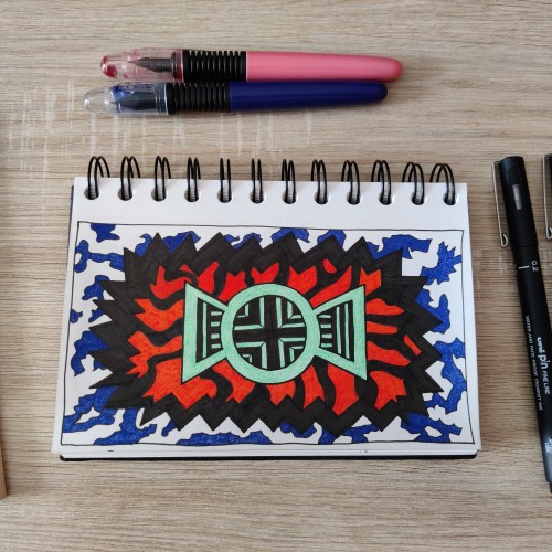
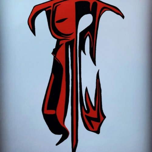
Drawing done on A6 sketch paper 90 g/m2 using Uni pin fineliners, pen ink and green crayon. Started drawing pointy corners and areas to fill later and along the way I got inspired to do something similar to the ring of Green Lantern from DC. A friend of mine said the drawing makes her think of energy and fury.
This painting was done with the Tuscan style in mind. The Tuscan style favors a rustic look. To me this never goes out of style because it’s as if the new and the old have found a common medium and have agreed to blend so well. There’s plenty of green, beautiful grass. The windows are complimented by the various colors of flowers that are perfectly placed below them. I love how there’s a table set outside of the building with a string of lights (even more beautiful at night) for people to enjoy the scenery as they eat some tasty, authentic Italian cuisines. There’s a group of people walking past the wall of yellow flowers and vines on the way to the inside of the building. In this scene, the ladies are wearing some long, beautiful dresses with gentlemen by their side to accompany them. This gives the impression that this group is out to have a good time. The white birds tops it off in this painting by giving it an inviting feel...”a moment to remember” feeling.
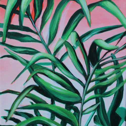
I love the versatility of acrylic paint. You can change the consistency by adding water or acrylic mediums. These additions enable artists to create transparent glazes or thick impasto textures. The fast-drying nature of acrylics makes it easier to correct mistakes or make alterations during the painting process. This painting is part of a three piece set featuring my favorite plants painted on a soft gradient background.
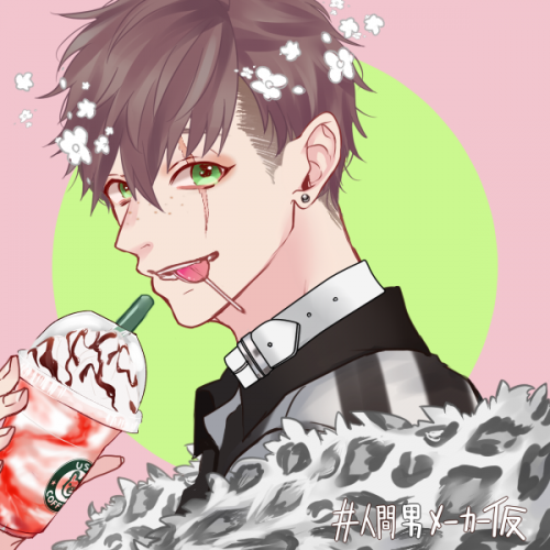
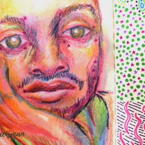
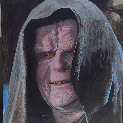
This portrait was created using mixed media like colored pencils, markers, and ink. The portrait features the face of a man resting in his hand, and staring dead-eyed at the viewer. I used non local color techniques to create depth and form using colors not typically found in the human face, like blues and violets for shadows and yellows and oranges or highlights. Parts of his face include small pink stars which originally faded from the previous page, but I really like the look it gives, they almost look like celestial freckles.
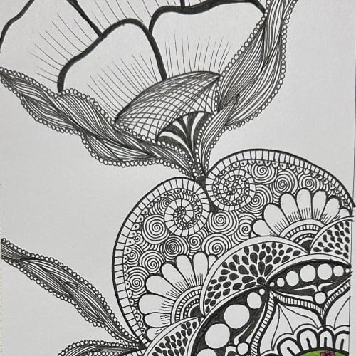
I wanted to try a drawing that uses a monochromatic color palette. I found the process to be very enjoyable. It can feel limiting at times, working with only one color of varying shades. Specifically when choosing the amount of shades you're working with. It's also a nice alternative when I can't think of a color scheme that uses different colors.
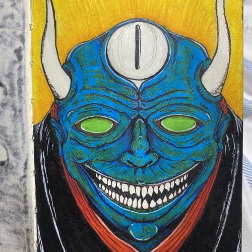
Dreaming of that face again, its bright and blue and shimmering. Grinning wide, and comforting me with its three warm and wild eyes — tool - third eye (#embracingnightmares)
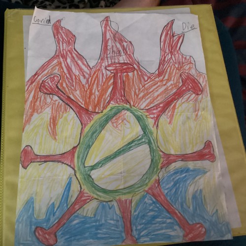
This is a picture I did during quarantine. It shows my hatred for online school and other stuff that happened in 2021 because of Covid-19. Zoom calls were the absolute worst.
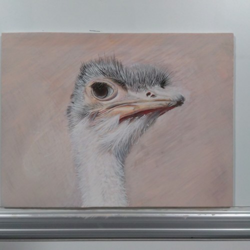
This is my first attempt at traditional egg tempera painting. The panel is a Masonite board from Michaels, but I need to use true gesso because the egg tempera will not adhere to acrylic gesso. Some of my favorite artists used egg tempera. Andrew Wyeth, Robert Vickrey, and Colin Fraser are all masters of this ancient and archival medium. I have been self studying this technique for months and I was very excited to start experiencing the medium. Egg tempera is like layering stained glass on top of stained glass. the painter can expect a luminous glow to take shape as the colors blend visually through the layers of paint - assisted by the chalk of the true gesso. Egg tempera has been described as the closest painting technique to drawing, hence my draw to this medium.
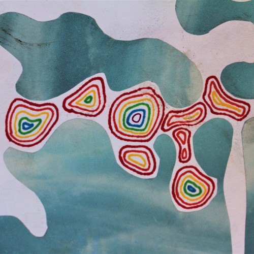
Embark on a journey through the mesmerizing world of our colorful rainbow artwork doodle drawing. This captivating creation is a vibrant symphony of hues that come together in harmonious chaos.
Every stroke of the pen is a burst of energy, every line a dance of colors that evoke emotions and spark imagination. From the rich reds that symbolize passion to the serene blues that whisper tranquility, each shade tells a story.
This artwork is a celebration of diversity, a reminder that beauty thrives in differences. It's a reminder of the positivity that radiates when we embrace the spectrum of life. The meticulous detailing and intricate patterns invite you to explore every nook and cranny, discovering hidden gems with each gaze.
Hang this masterpiece in your space, infuse your surroundings with its dynamic spirit. Let the vivid colors breathe life into your world, a testament to the joyful, vibrant, and kaleidoscopic nature of existence.
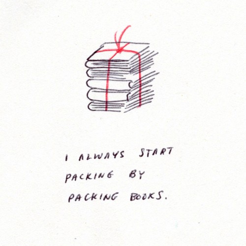
I always start packing by packing my books. For larger ones I love using twine.
Moving soon. So tiring!
https://www.instagram.com/p/Cvpt_F0udl8/?utm_source=ig_web_copy_link&igshid=MzRlODBiNWFlZA==
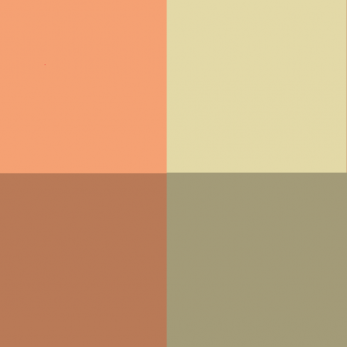
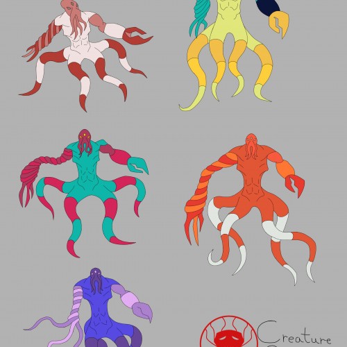
I was trying out different color palettes to see which one I preferred. The top palettes are based off the mimic octopus and the blue-ringed octopus, respectively. The rest aren't inspired by anything, I just thought the colors looked nice.