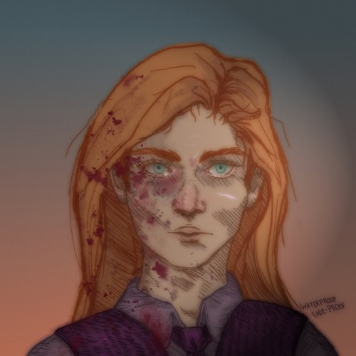
If i was real youd see me cry
If i was real youd watch me die
If i was real youd spit in my eye
If i was real youd know a lie
If i was real youd know my name
If i was real id bring you shame
If i was real id show you pain
If i was real id drive you insane
But im not real
Im just a name
Meet me in the dark
Meet me in the light
Ill crawl inside your skin
Eager for a bite
Ill coil around your thoughts
Let me stay
Together we can obsess
Over every shade of grey
Deny my existence
Dont say my name
I dont love you
Make no mistake
Im not here for salvation
Im here for the pain
Embrace me my child
Nightmares
My name
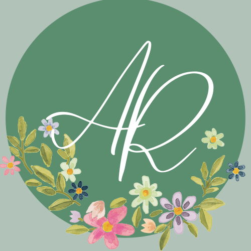
#embracingnightmares
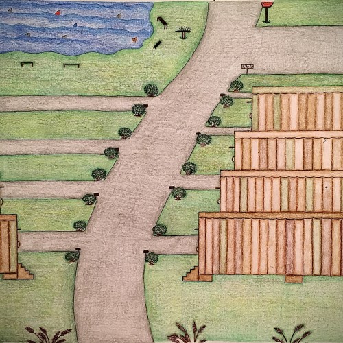
I designed these multicolored trailers using different shades of color only in a different pattern for each trailer. I felt like this color scheme would give the trailers a uniform look yet their own distinct look. The roads look freshly paved with small shrubbery on the corners of the entry ways of the driveways. There are some pretty brown steps that leads to a door on each trailers. Also, as you can see the trailers have been topped off with the same flat style roof only with a different solid color which is one of the colors used on the sides of the trailers. There’s a fishing area with plenty of fish in it as well as places to sit. There’s even a place to use the restroom close by the fishing area so you can continue to enjoy your day catching fish with minimal interruption. This trailer park has a fresh look to it. It has a warm, inviting feel to it and is perfect for living a more simple lifestyle.
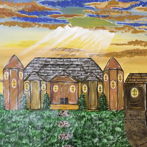
The idea was to create a nice scene of the sun shining down on a house. The skies are showing off shades of blue, and brown, and yellow. I love the rustic style and I feel like I accomplished that look in this painting.
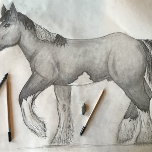
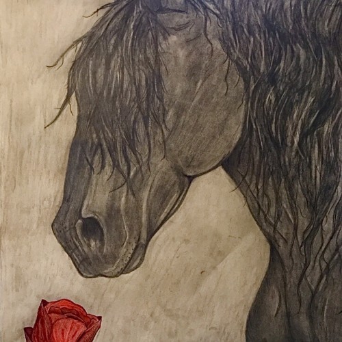
This was my big project this weekend, my first attempt at a large full body horse. The picture was requested by a horse lover like myself and I can’t wait to give it to her. Done in pencil on an 18x24in sketch pad.
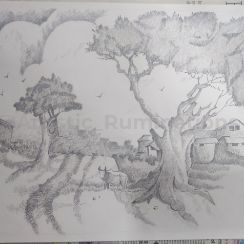
In this captivating cross-hatched pencil shading, a tranquil village scene comes to life. The intricate strokes create a harmonious blend of light and shadow, showcasing the serene beauty of rural life. Thatched roofs, winding pathways, and towering trees are meticulously detailed, inviting viewers to step into the peaceful simplicity of village existence. The gentle interplay of shades and textures evokes a sense of nostalgia and calm, capturing the essence of a timeless village story.
This is the finished drawing. It took me about 6 hours over the course of two days. I decided to just lightly shade the background so my finger prints didn’t show so much. I was afraid that going darker would make the horse blend in too much. I’m happy with how it turned out! Done in charcoal, marker, colored pencil, and pencils.
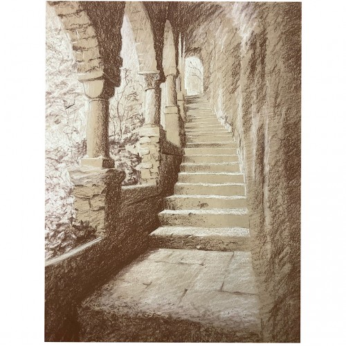
White and sanguine conte pencils on toned paper. These ruins captured my drawing itch with the quality of the light filtering brilliantly through the tangled growth outside, and the open shade within. At a metaphorical level, the image is about the sense of having a laborious path set in stone for me by custom, convention, and culture, while way is wide open to the chaotic fertility of nature, should I choose to follow my own feet and heart.
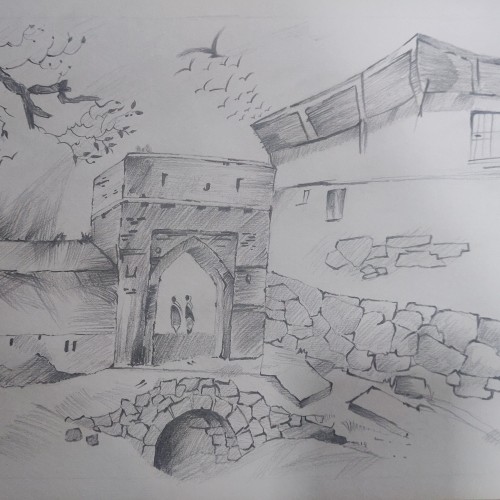
Draped in delicate pencil strokes, this artwork elegantly portrays a historic city gate, standing as a timeless sentry to myriad untold stories. Each shaded contour brings forth the intricate details of the gate's architecture, echoing the urban landscape of a bygone era. The deft use of monochrome evokes a nostalgic journey through the annals of time, where every shadow and highlight adds to the depth and texture of this piece. This mesmerizing blend of artistry and history invites viewers to step into the past and embrace the serene splendor of the city's storied gateway.
YOU'RE MY DEADLY DEADLY NIGHTSHADE
OH ATROPA
BELLADONNA
THEY SAY YOU ARE
DEATH INCARNATE
AND I SHOULD STAY
FAR AWAY
- Blackbriar - Deadly Nightshade
I did a thingy for my mutual. Her name is Belladonna and she is DC OC. ;)
As I was drawing, I noticed how genius her design is. Her "villain" costume looks like the petals of a belladonna, her blonde hair and light skin like anthers (I belive that's how they called), her freckles like pollen. I don't know if it's inrentional, but it's amaizing!
I can't draw clothes yet
And hands
And everything
Spare me!
It's also my first time drawing flowers :D
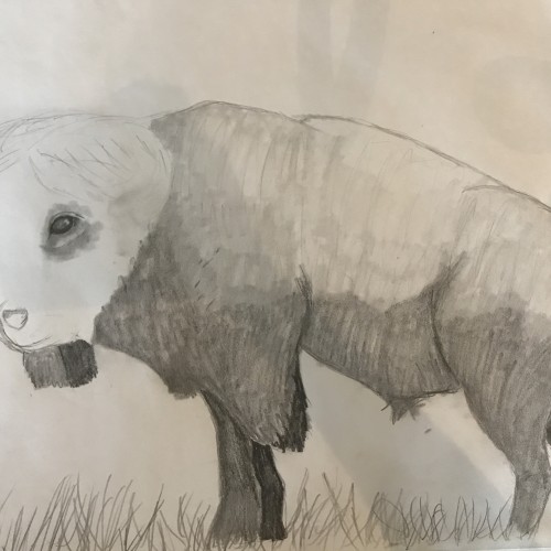
This is my latest project as of March 15th. It was a request from my cousin. It is based off his original photograph. As you can see, i’m just putting the base shade on it. I’ll have to add the details of the fur after the shading is dark enough
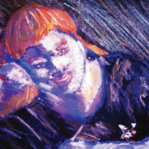
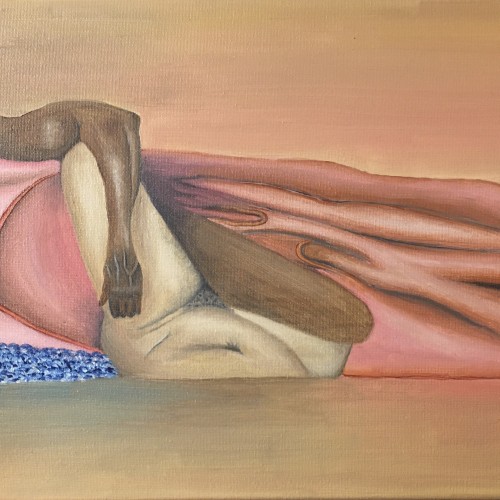
This is an oil painting of an African American couple. They’re sharing an intimate moment with each other. Some maybe would say that they’re the epitome of “Black Love”. His skin is dark tones as compared to her lighter shade. The two skin tones wrapped together in sheets gives life to what I call “The Happy Couple”.
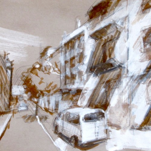
Another Catalonia themed Google street view urban sketch. I tried to take the light and shade thing further ;) This time I did take note of the exact location: 2 Carrer Sant Carles, Lleida.
I played with some different rendering techniques in my digital lineart/with some diagonal shading in the shadows in addition to my usual cell shading. I used the same colour as the hair /skin/ clothing in for my lineart on a 'multiply' layer then duplicated that layer and added a blur/reduced the opacity for its copy to soften the look of the lines.
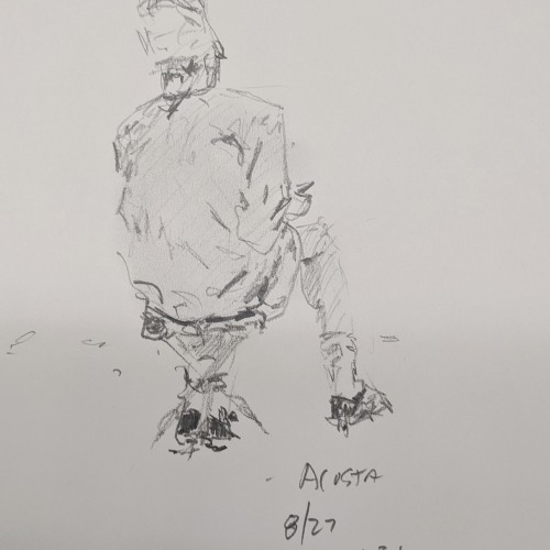
#28 - A collection of ballpoint pen sketches drawn on printer paper & scanned. This is what my lines look like when I'm not using a stabilizer in digital software to get the nicest clean lines. I tried to separate my scanned lines from the various shades of off-white that the scanner picked up. I adjusted the brightness and contrast levels in photoshop but I'm not very knowledgeable on how to achieve the best results.
This was the best sketchbook I ever owned. It appeared mysteriously and within a year, was gone to the wind. These are the back pages where I was exploring different water and alcohol marker brushes and ballpoint on the amazing vellum-like paper.
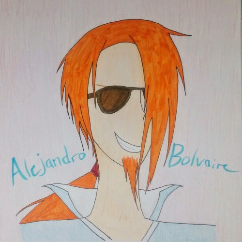
This is a drawing of a random popstar I made up. His name is Alejandro Bolvaire and he has the voice of Danny Gokey. XD (Danny Gokey is awesome -- give him a listen sometime) Anyway, Alejandro here is mostly crayon, but his hair and shades are colored with brush pens. He has an ink pen outline. Thank you for checking him out! *picture was edited for clarity*