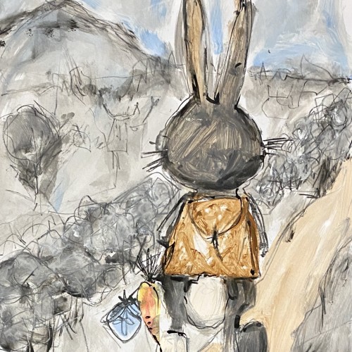
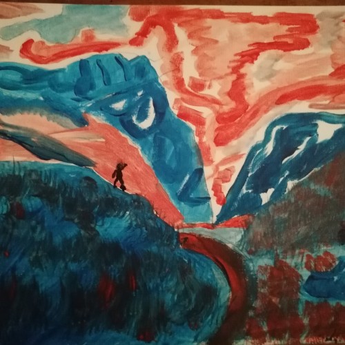
Inspired by a little rabbit I've seen from the car one morning. While I was driving, the little bunny was hopping along the countryside. I was a a very peaceful and happy scene, the little guy living in its own little world, of which I only could get this one quick glimpse. All the other details remain to imagination..... Acrylics and ink on paper, 60x42 cm
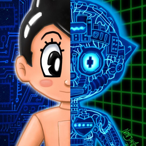
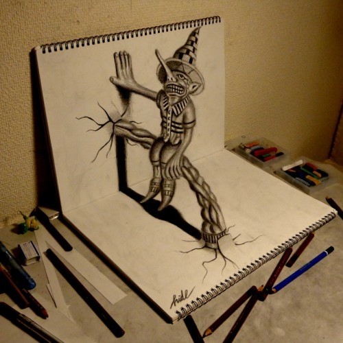
It's anime's most favorite son. You can see, in case you did not know, that he is a robot!
The robot side was fun to draw. I based it on some reference but made up a lot and stylized everything quite a bit.
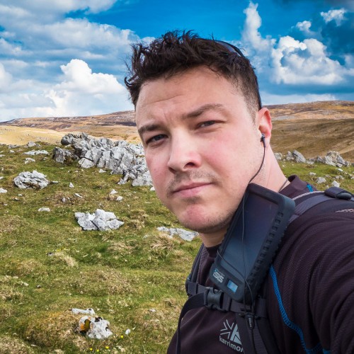
It's crazy to think that we've been in a pandemic for a year or to think we could ever get used to this new way of life. March 13th, 2020 was the day everything stopped for me: it was the last day I went to school and the last day I went to gymnastics for 5 months. The promise of two weeks' time, something I somewhat desperately held onto. Going into this, no one knew what to expect, it was the first time many of us saw life as we know it stop. Quarantine has definitely taught me a lot emotionally, mentally, and how to reach out and work through (and what bad panic attacks feel like :) ). I think it also goes without saying that I got through most of this because of the people around me, and I can't say enough how grateful I am to be surrounded by such amazing people. So, here I am. Life is still pretty rocky, but it's a process. Thank you to everyone who's been along for the ride so far ❤
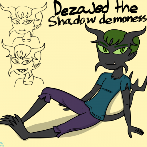
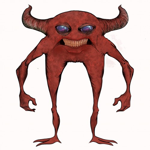
Another OC redesign along with a new name,she still looks somewhat like her old design except now she has short hair instead of poofy long hair,green eyes,different horns,two lower fangs instead of one and lastly the sharp horns on each side of her face.she also doesn't have a hourglass body shape anymore (I don't want two female characters having the same body type)She is a good friend of Tenebris,they often challenge each other and have fights to see which who is stronger than each other,she is athletic,loud mouthed and mischevious and she is skilled in flying unlike Tenebris.
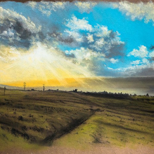
I first bought some cheap soft pastels back in 2018 and did a couple of sketches. I bought a nice set of Rembrandt pastels a few months later — didn't use them. I bought some pastel pads, none if which seemed right. September 2020, I bought a couple more sets of bargain pastels and tried a couple of pieces — no good, still couldn't bring myself to use them. Jess bought me pastel pencils for Christmas — I was too scared to use them. I even bought a pad of Pastelmat which is supposed to be THE paper to use for pastel paintings in January. I was too scared to use that as well!
FINALLY, after a few unsuccessful attempts at working with watercolour (brush issues), I cast aside my fear and thought I'd mess around with pastels. Some time later, and this was the result. I've finally broken through my pastel fear-barrier.
I've got to say, I love soft pastels and I'm excited about doing more pieces in this medium.
Trying my hand at some character design with the intention of eventually modeling it. Only the front view so far. Still have some painting to do to get rid of the rather "designy" black ink outline. Then on to the side view, then to POLYS!
I started messing about with line and wash. I really enjoyed the speed and looseness of working on this piece. In hindsight, I'm wondering if it would be worth working on a larger, more considered version as there is quite a lot of nice texture that is missing here. Pen & watercolour on watercolour paper (4x6").
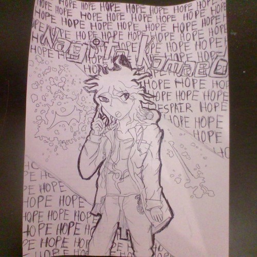
I decided to try and do an this one entirely out of pen, without first using pencil..... Which didn't turn out so well considering that I'm terrible at spacing letters. So I am aware his name is missing an a at the end. I will try to upload more frequently and try to figure out how to do digital art, I was having a problem with my images being smaller than 500x500, if you know how you could help me that would be much appreciated.
My first venture into artist grade colouring pencils - and I'm smitten! I never thought I could achieve such boldness and blendability with them! I'm still getting used to them and will think about choosing smoother paper with less tooth next time. The texture and weight was more for the water-based gouache along with alcohol inks (which are very unforgiving to even primed heavy paper!). Apologies for the unevenness of lighting between the 2 sides of paper; will correct that when I'm making proper image files.
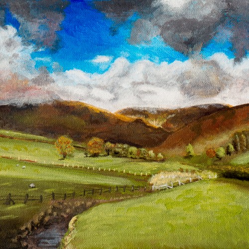
One of my early oils from 2017. I was still getting used to the medium. I liked how the oils worked well for the misty distant hills, and I used glazing for the first time on the clouds.
I got a pack of loose watercolour paper from eBay in 2018. The side this was painted on had a really strange pitted texture on it. I thought it might be interesting but I didn't like the way the paint gathered in the pits. I just use it for sketching and testing colours these days.
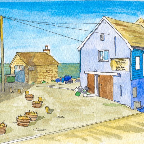
New Quay is a quaint little seaside town on the Ceredigion coast. This was my second attempt at pen and wash in 2018 and it totally bombed. I'm not sure there's anything I like about this - the colours, the linework, the lack of texture. Nah! Definitely worth trying again at some point.
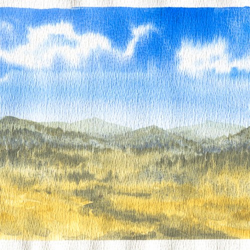
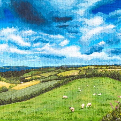
The reference for this painting was a quick snap I took at the roadside on a trip up to Angelsey. Didn't really manage to capture the scale or the atmosphere.
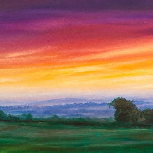
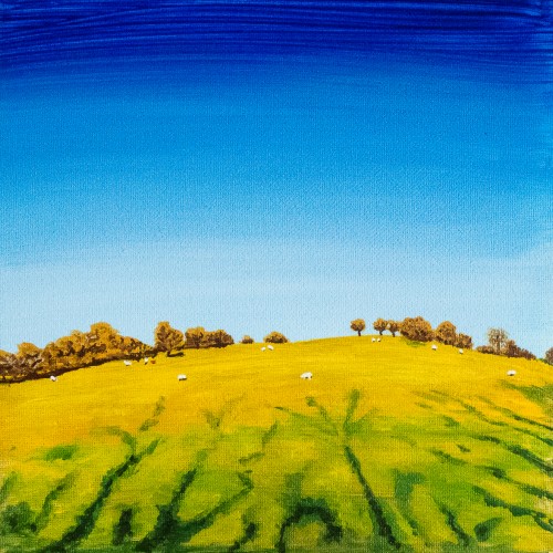
I know it looks a little sunny, but the reference photo for this one was a winter shot. It's the countryside in the hills surrounding Carreg Cennen castle, Carmarthenshire, Wales
In 2017, I had a short run of finishing acrylic paintings after not painting for many years. Here I was pushing towards a more realistic style despite the very cheap and thin paints.
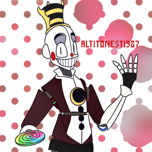
A recolored version of Jester I like to call "CM Jester", or even just Henry. Drawn with FireAlpaca. I've previously uploaded a full-body picture of regular Jester, but I'd still consider this a different upload. You should go check it out... ;)
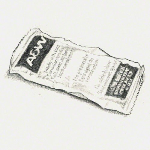
Thirty-five minute sketch of a petrified A&W ketchup packet I found inside my fridge. This thing is the rock-hard evidence of my frequently poor late night diet choices.
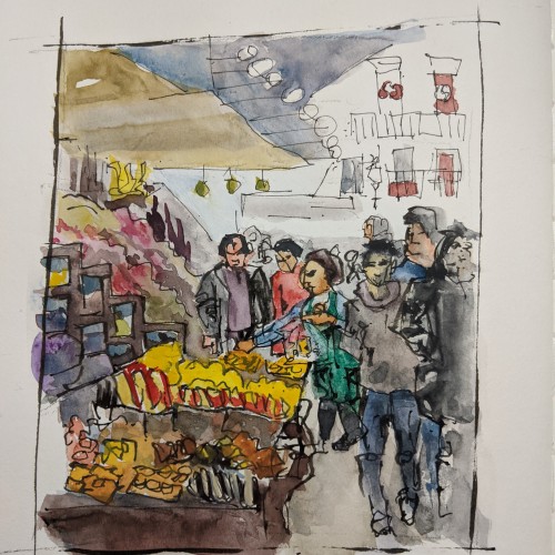
Class assignment: draw a crowd with layers and overlapping. I took this class because it is my artist heart's desire to capture people in real life action. We did learn a technique for that, but we did it from video. It was so stressful, and I'm considering practicing that 10 min a day for Lent. This one was a compilation from photos my teacher provided. What are your tips for capturing people in action? For me, the challenge was deciding what the action was. I kept changing the action as I saw it because it is SO FAST. I felt like I couldn't "see" fast enough.
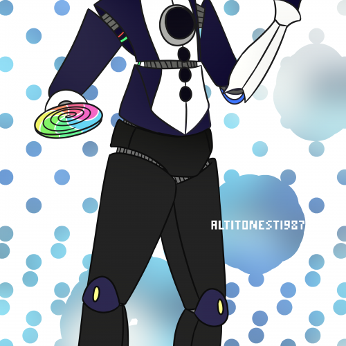
I've finally redrawn my profile picture! Except, my actual profile picture will be magenta instead of blue. This design still isn't canon, but I haven't found the motivation to redraw the entirety of the Ringmaster's crew. My last attempt was with the advanced version of Elizabeth, and the unfinhed Preistor, but they take so long to make --- and that's why Preistor goes unfinished. The reason they take so long is because I also sculpt the endo inside of them, in which the 2.5 versions didn't have an endo, and the joints and such were put in after I had drawn ths shell. Drawn with FireAlpaca.
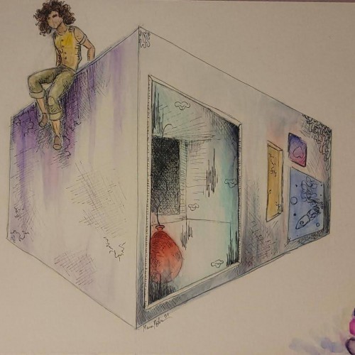
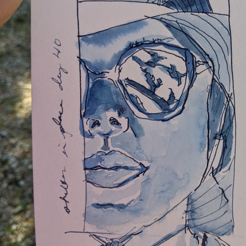
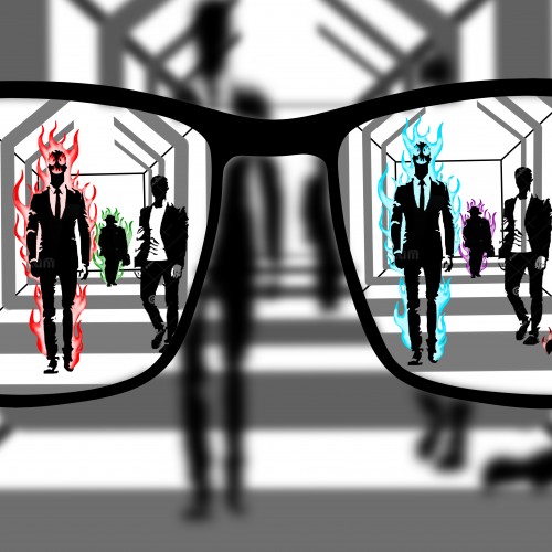
The drawing contrasts what an individual see's and what the general public see's when viewing a particular topic. outside the frame of the glasses everything is plain black and white and has no important information that grabs your attention but inside the frame of the persons glasses there's a personalized idea or version of each person in the corridor. the drawing gives off the idea of seeing the world through another's eyes and using glasses as the medium to display that.