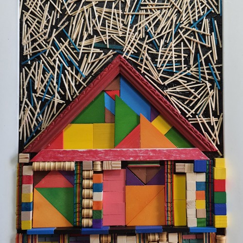
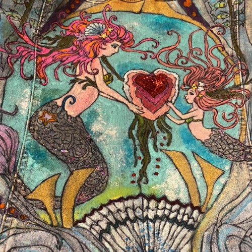
The materials that Meir uses in her works are not of the refined and so she is called an “arte povere” artist. At times she describes her work as someone dealing in alchemy - work develops as in a trial laboratory with different techniques and materials. She says, “ at times the artistic work process is a sort of puzzle demanding the filling in of all the empty squares “.
Some of her work focuses on women, and they incorporate criticism and cultural protest.
Meir has strong opinions about recycling and environmental protection that is represented in her works by use of materials and shapes. In her work she reacts to contemporary art that communicates with the eco system, waste, and she also searches for different worlds. Her works are made up of layers upon colorful layers that when we look at them it becomes clear that the mound of waste she chose is not coincidental. It actually becomes a colorful kaleidoscope of utopia.
Jaffa Meir is a multifaceted, autodidact artist working in painting, sculpture, photography, product design, carpets and furniture, painting on textile, and computer graphics.
The structural composition of some of the works is influenced also by her many years of working in the architects’ office.
Meir also worked in the developing of ideas within the field of ecosystems and recycling for factories such as Coca Cola, and during this process came up with ideas for designing parks and public game spaces using industrial waste products.
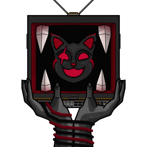
Farmalytica is a brand-new company in the field of agriculture which aims for utilizing technology in the field to achieve the sustainability of land resources. Here is the lOGO design for this brand, I hope you like it...
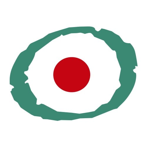
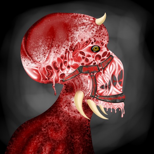
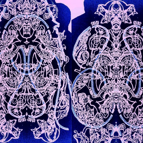
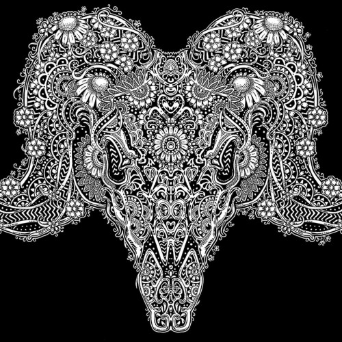
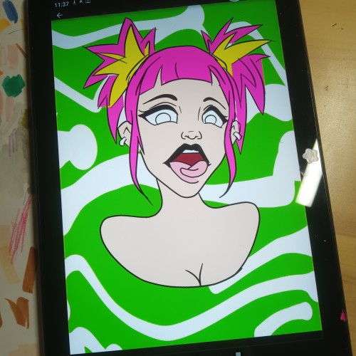
I spent 4 days working on this drawing using nothing but my laptops trackpad. I took inspiration from drips of paint and then stretched them apart to span between where bones should be.
The eye contour area was designed that way in order for it to stretch and collapse almost the same as how muscles contract and relax.
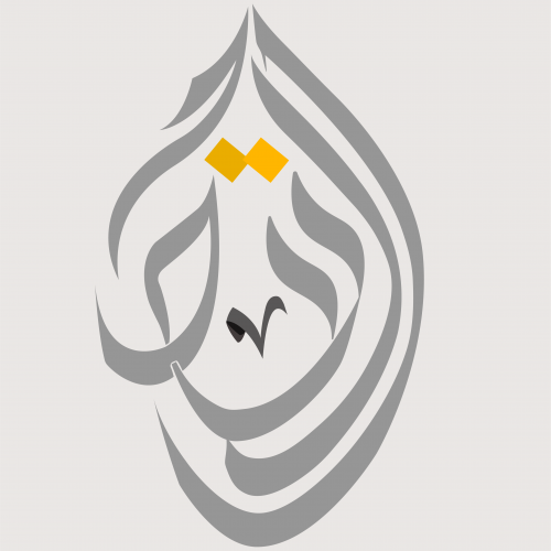
This time I designed a logo using a special style of Arabic calligraphy called "Al-Diwani". This style is distinguished by its flexibility and beauty. Besides its capability to represent and any shape that I want using any words; so I can illustrate and draw anything using this style.
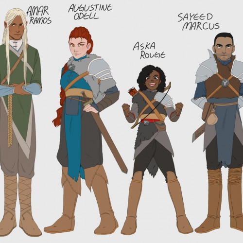
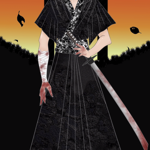
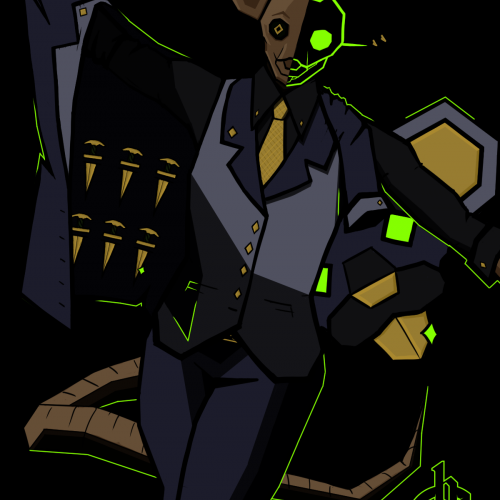
Original characters for a story which might never see the day of light. Amar and Aska belongs to me, Augustine and Sayeed belongs to my Hubby. We call them the Ass quartet or The triple As A-S. Augustine would be the main character, Amar her foil/lancer, and Aska and Sayeed would be supporting characters. I'm still practising communicating though character and setting design, so I will probably re-design them about 100 times more before they will ever be done.
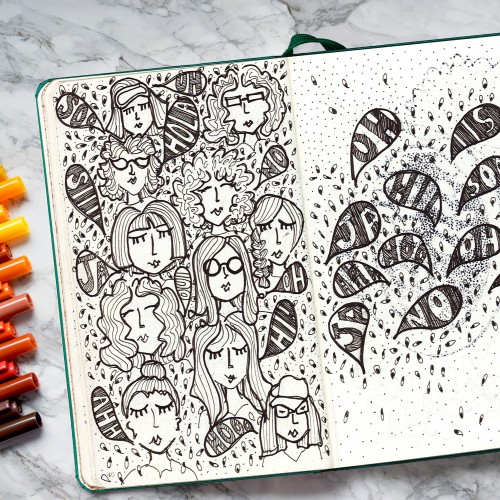
My next posts will be the pages of my sketchbooks one by one. I’m starting with sketchbook A which is my most recent one. Each sketchbook drawing will have the “SB” on the title, and they will be posted in order for your enjoyment.
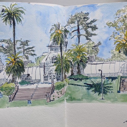
We took the Tuesday after Memorial Day off and rode bikes into GG Park. We found a mostly empty patch of green to picnic and play across from the Conservatory of Flowers. Our social distancing signs are blue with four white arrows pushing four people apart. Every time I look at them, I think, what if people think the length of those arrows is actually 6 feet? What do yours look like?
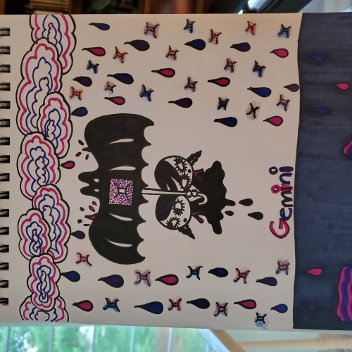
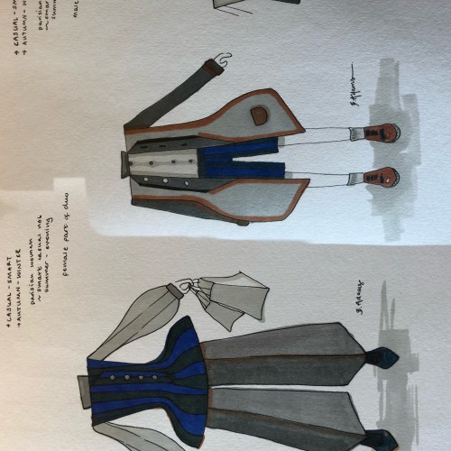
Some fashion Sketches today - they go as a pair together, so that’s why they’re are edited into the same pic ( cos i don’t have doodleaddicts pro lmaoo). If you are interested, I used winter and newton Promarkers, and a waterproof permanent 0.5 black pen to outline! leave a comment to let me know if you like it!!
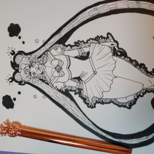
Well i made this on my English class. And i like it. I'ts my first post here so "Hello!". This sailor moon is from the TV show "Sailor moon". The design of sailor moon wasn't created by me. I ONLY did a fanart with a faber Castle pen!
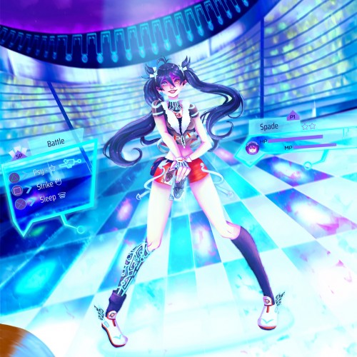
"Spade - Magic Card Tournament" ♠️ ✨
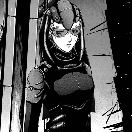
Character design for a videogame idea based on a futuristic world in which there is an artificial magical card tournament held every decade. The main character, Spade wants to bring peace to her world by winning the tournament and being granted one wish.
One of a series of illustrations done for a book of poetry. The poetry was in Dutch so I have no idea what the poems are about! However the designer, the late Baer Cornet liked my work!!
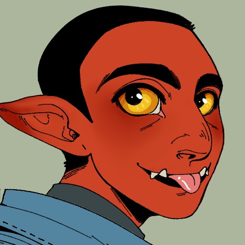
Don Cutter (Full name Cookie Cutter) relishes in making their last name self evident. [This was done as a trade for a friend!!!! At present, she has no socials for me to link to, but I will update this if that ever changes!!!! (P.S. the name is *unofficial* but I am campaigning hard for her to canonize it!!!!)] P.P.S. this is the first image I am uploading of my (admittedly rather limited) backlog/body of work, so expect more updates in the near future [followed by a WHOLE lot of nothing for a while (I work SLOW ;-;)]!!!!