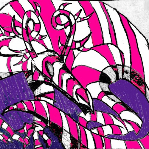
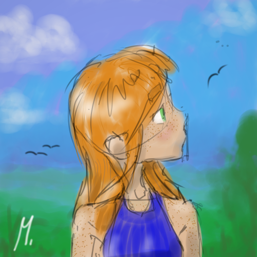
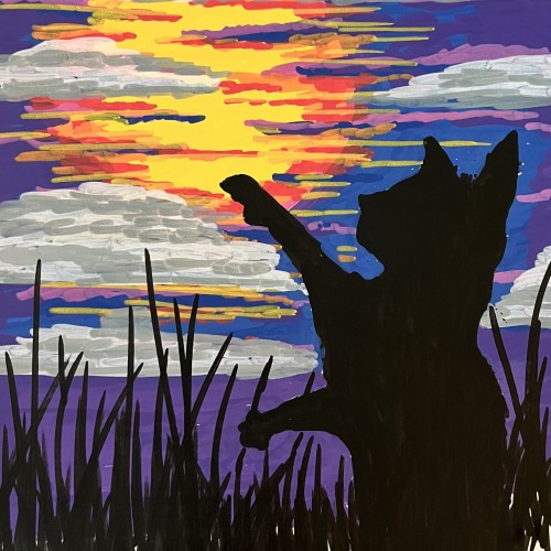
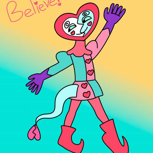
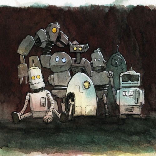
Welcome to Nornwan, Untitled Heroes!!! What brings you here today? Escape from reality? Sweet! Me too! This is an illustration of her majesty the queen. She has no name that we simpler lifeforms can pronounce. She has lived long, and ever watched over the land of Sucrosia, (the land of candy). Not all dragons that come to the land of Nornwan are peaceful and life-loving creatures, nay, some are wicked beasts, they oft seek the utter destruction of the peoples! How very fortunate we are, indeed, to be blessed by the Candied Lady.
we are #untitledheroes
https://www.youtube.com/channel/UCKXBKF6a2BWVDy_SgMvk8GQ?view_as=subscriber
Long story short I needed a title, and prior to that my phone opted to have some sort of techno-stroke earlier in the day, and I took inspiration from this. So, yeah...
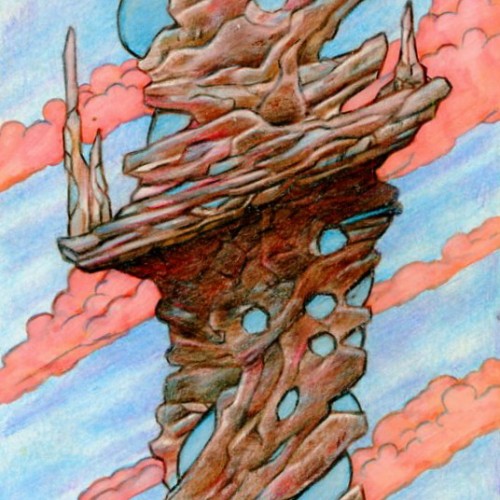
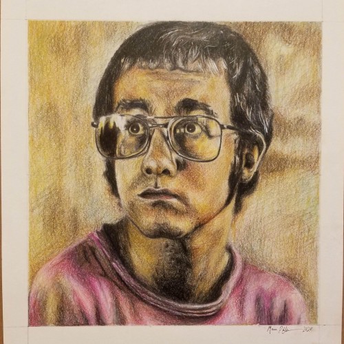
Jung here. Done 2022 with color pencils on 51/2 x10 3/4 bristol. Original art is up for sale $32 (shipping fee will apply) USD email me and open for private commissions as well jungmeister4@yahoo.com Also I have my 2023 Wall calendar up for sale $19.95 with my artworks through Artwanted.com art community website. Click or copy / paste the link below and would be appreciated if you can support me on the calendar https://www.artwanted.com/artist.cfm?ArtID=115637&Tab=Calendar
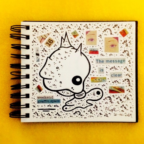
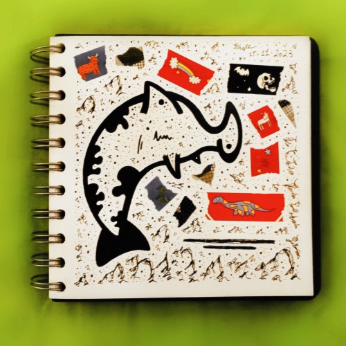
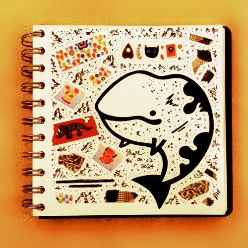
I made a mess! And it makes me happy! Because I finally 'did' something after what seems like a too-long period of very little art. This is a 'no pressure' piece, playing with shapes, colours, just making marks, doodles, and just allowing things to emerge. Brilliantly therapeutic.
India ink on tissue paper. I had never used ink on this kind of paper before; I really liked the results! There are some folds and wrinkles on the paper that give the pattern some interesting details. The paper is also super absorbing, which plays nicely with the quantities of ink. Since it's very thin, there can easily be overlays between textures. And finally, when trying to use less ink (so that it wouldn't seep through and cause a big dot - the absorbing quality is nice, but it was also somewhat of a challenge!) I used very little ink on the lettering, causing a scratchy, dry look.
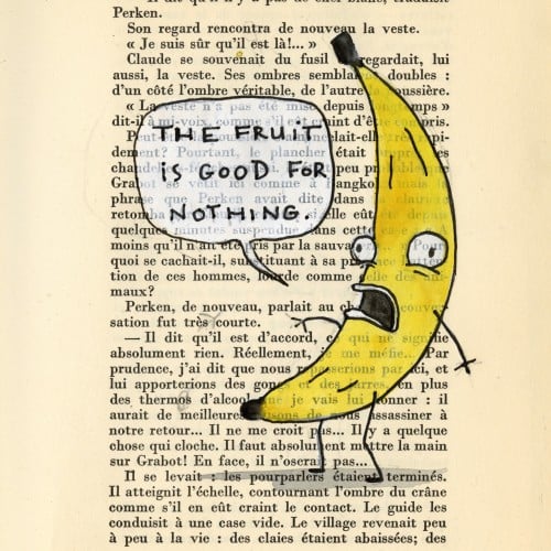
The fruit is good for nothing.
 frúcta não vôs ôu lhe serve.
"English as She is Spoke" by Jose da Fonseca and Pedro Carolina.
I adore "Rejected" cartoon by Don Hertzfeldt. I am sure you have all seen it, but if not, look it up. And thank me later. Unless you hate it. Then thank me anyway for broadening your taste.
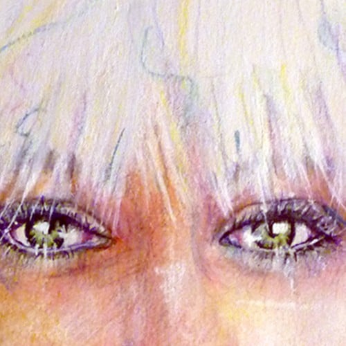
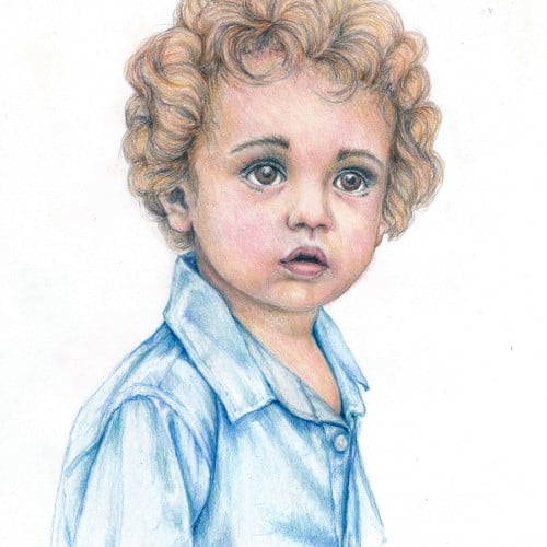
Playing with colored pencils this week. This is very loosely based on a photo....changed hair, eyes, and skin tones to suit my mood. Vintage Conte a Paris Criterium, Prismacolor Verithin, and Tombow Irojiten pencils.
So I've been looking into other programs tailored to illustrators and I came across Krita. It's free, easy to use and I LOVE the intuitive pen pressure and natural smoothness
I have thought of a design already,a wisecracking,fun loving marionette imp who loves dancing and singing and playing tricks.he helps Aldo become a better gymnast and also helps him with his self esteem issues. I was going to give him horns then I thought not all imps have them I might remove his tail too.inspiration for his face https://www.1stdibs.com/furniture/wall-decorations/wall-mounted-sculptures/italian-modern-venetian-handmade-ceramic-white-carnival-mask-italy/id-f_26511762/ Costume inspiration https://sccnola.com/wp-content/uploads/2014/06/femalejester.jpg
Beginning.
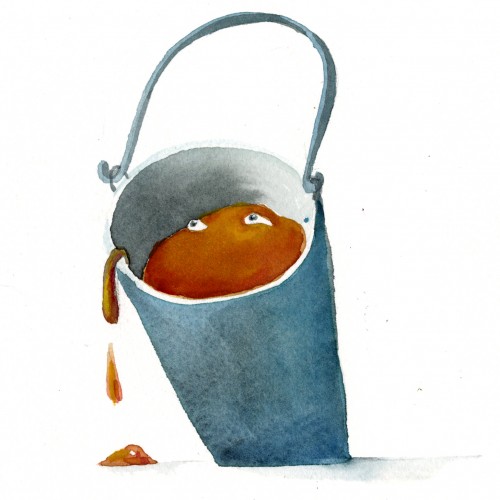
It was so very hot today. The sun beat down on Martin's head like on a drum.
The rest of the adventure will have to be continued in a bucket, Martin decided.
https://www.instagram.com/p/CP52NzeBJ4y/?utm_source=ig_web_copy_link
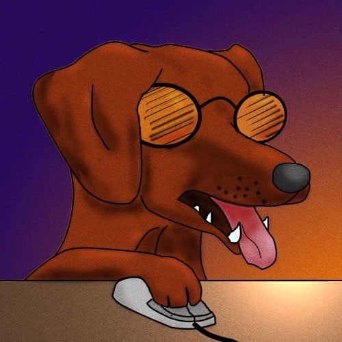
I am pleased to present to you the finished Elton drawing. (I finished it today while listening to my new albums; shout out to my mom for the birthday gift.) Does the drawing look exactly like the photo? No, it doesn't, and I can easily pick out all the mistakes I made. At the same time, I'm happy with it for what it is, and I loved drawing it. Anyway, feedback is very welcome, let me know what you guys think and what I can improve on.
An excercise in negative painting with my set of bister inks. I wasn't completely happy with the results - the bister ink was not as transparent as i expected it to be.
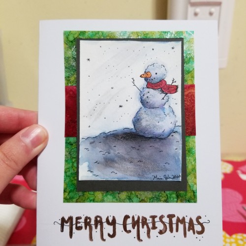
I know this isn't an elaborate piece and I know I've posted different cards before, but I just wanted to wish everyone a merry Christmas and happy holidays! I hope everyone is doing well and can enjoy the time left in 2020. Thank you for being so supportive of my art, and for sharing some of the most incredible art I've ever seen!
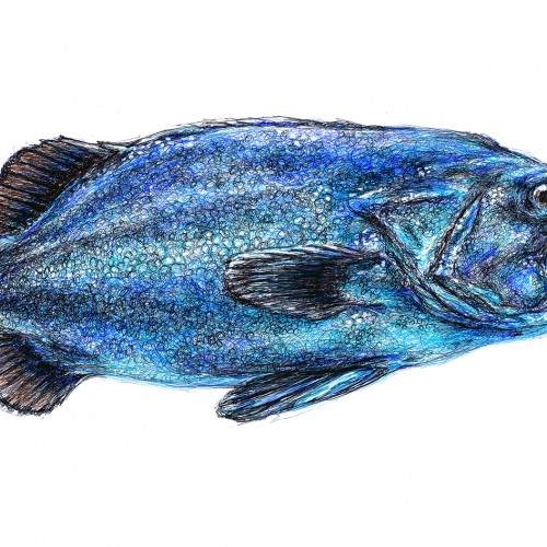
I was looking at what Pixabay might offer as inspiration, and found this fish. Perfect for a ballpoint pen drawing. The incompleted drawing in the second photo was taken before the final "glaze" of little scribbles of turquoise pen across almost the whole surface. It was a happy accident that made for a shimmery, iridescent fishy quality.
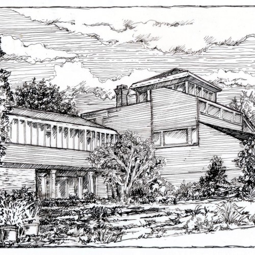
Architectural subjects are not my penchant....but this is a pen line drawing of our house which I did a few weeks ago near the beginning of the "stay at home" phase of our lives. Seemed a fitting subject. Just a couple of micron pens on a smooth surfaced paper.