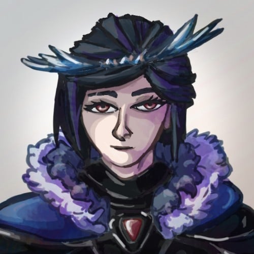
The materials that Meir uses in her works are not of the refined and so she is called an “arte povere” artist. At times she describes her work as someone dealing in alchemy - work develops as in a trial laboratory with different techniques and materials. She says, “ at times the artistic work process is a sort of puzzle demanding the filling in of all the empty squares “.
Some of her work focuses on women, and they incorporate criticism and cultural protest.
Meir has strong opinions about recycling and environmental protection that is represented in her works by use of materials and shapes. In her work she reacts to contemporary art that communicates with the eco system, waste, and she also searches for different worlds. Her works are made up of layers upon colorful layers that when we look at them it becomes clear that the mound of waste she chose is not coincidental. It actually becomes a colorful kaleidoscope of utopia.
Jaffa Meir is a multifaceted, autodidact artist working in painting, sculpture, photography, product design, carpets and furniture, painting on textile, and computer graphics.
The structural composition of some of the works is influenced also by her many years of working in the architects’ office.
Meir also worked in the developing of ideas within the field of ecosystems and recycling for factories such as Coca Cola, and during this process came up with ideas for designing parks and public game spaces using industrial waste products.
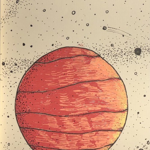
Crosshatching was used to build up the shadows. It's probably my favourite drawing technique. Works best with pen and ink. This is the cover image for one of my children's picture books.
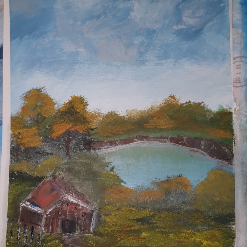
I'm playing a lot with the background texture. I'm discovering the power of brushes from Krita Software.
I fell in love with the gouache texture effect.
I like the silhouettes in this illustration, but the leaves could be better. I need to find a good brush for drawing leaves faster and with ease.
Or maybe I should try some other techniques?
Have a creative time!
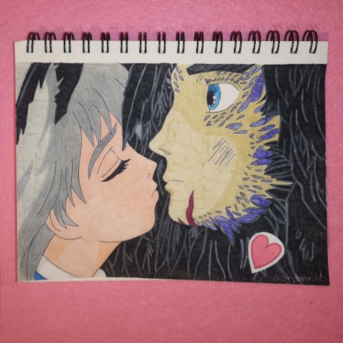
Colorful drawing of a scene of Studio Ghibli's film "Howl's Moving Castle", Sophie and Howl's kissing
Reference: screenshot of the movie scene
Techniques: brush pens on regular paper
I've started an experimental phase of my art journey. It's a challenging time for me. I try to draw and paint using different techniques, brushes, and color palettes.
I'm on the way to exploring my artistic voice.
I hope it'll be a great time to share my thought and emotions about this.
The 1st thought I can say is:
I need to be an explorer as often as possible. It allows me to look inside myself. It allows me to get to know myself better. It's very motivating.
Lois's last book: "The style of Loish. Finding an artistic voice." is just AMAZING! It's:
- inspiring,
- full of tips on how to start searching own style,
- full of Lois's thoughts and experiences on her way to finding the artistic voice.
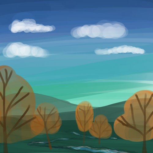
So I wanted to try something new in my digital art journey. I experimented with new techniques. I tried to use a brush type that gives a transparency effect.
I chose one picture from Loish's book as a reference.
And here it is - a colorful landscape.
Thank you, Lois, for creating and sharing your phenomenal and inspiring art!
Colorful drawing of Mumei, character from the anime "Kabaneri of the Iron Fortress".
Reference: official character design
Techniques: brush pens on regular paper
I rarely add colors to my drawings but am dabbling in unfamiliar territory with the Krita app. I am enjoying the ability to add textures as well. For me, it is similar to drawing left handed. This is the same drawing with a different technique.
Creep illustration of the girl and her stranger soul. I have drawn it with mixed media techniques, traditional and digital. You can check my art product here : https://www.redbubble.com/people/misahiraysa/shop?asc=u&ref=account-nav-dropdown
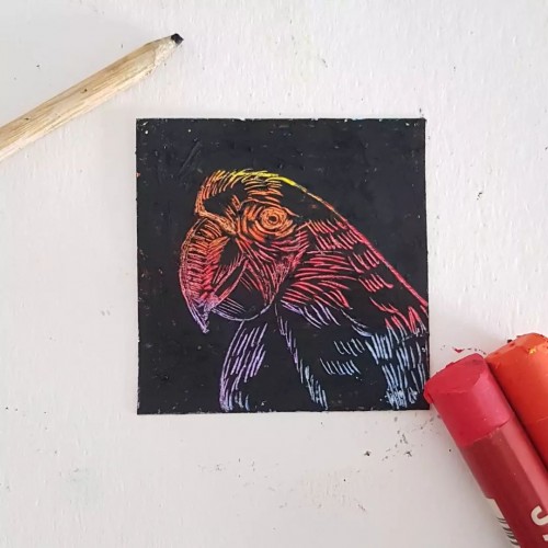
This was done with oil pastels in a technique known as Sgrafitto, as part of a 100 day challenge on Instagram. I scratched the black paint off with a chop stick. Worked like a treat, so I'm planning a bigger piece with that technique.
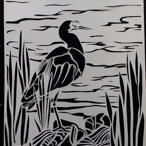
Tried some papercutting. I made a stencil then copied it and put over some collage. I need to work on my gluing technique and probably try out some different paper, but glad I kept the original stencil.
Seemingly trapped indoors and inside your head indefinitely, the possibility of living a normal life after COVID seems like a fevered dream. Still one of my favourite drawings from 2020 and a technique breakthrough. Ballpoint Pen on Archival 8.5" x 11" paper
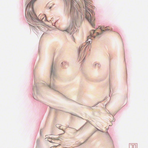
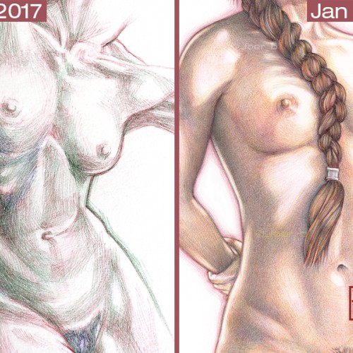
Meadhbh standing while clasping her forearm. Two drawing details along with two in-progress scans of my technique: red Bic pen layer first, then green layer and finally the yellow ink layer. Bic4 Ballpoint Pen on Archival 9” x 12” paper. Model: Meadhbh (Maeve).
I’m often asked about my Bic pen drawings and how I do them. It starts with a good foundational drawing, the ballpoint pen part is just trying to colour within the lines. I try to do my best to explain the process, but the best way to show my progress is by posting my efforts to master pen drawings over the span of 3 or so years. I have been doodling/drawing with ballpoint pens as far back as I can remember - they were cheap, readily available and always lying around the house. It wasn’t until I was bored during a particularly long team meeting-conference call (around 2016-17) that I started to think about the possibilities of ballpoint pens as serious portrait illustration tools. My first experiments with full colour ink portrait drawings were rather crude, but that’s the point of learning new techniques—as long as the curiosity and the love of drawing is there, you can transfer that skill and passion into any medium. Remember, the most exquisite drawings and paintings you see didn’t materialise fully formed, they started out as failed experiments. Failure after failure after failure. It’s important to remember this when you get discouraged (I've failed spectacularly over the years). The only difference between the accomplished artist and the beginner is hundreds of hours of practice. Talent can only get you so far. It’s the hard work that you do behind the scenes that makes your work look effortless. Keep doodling. Keep learning. Stay curious.
I played with some different rendering techniques in my digital lineart/with some diagonal shading in the shadows in addition to my usual cell shading. I used the same colour as the hair /skin/ clothing in for my lineart on a 'multiply' layer then duplicated that layer and added a blur/reduced the opacity for its copy to soften the look of the lines.
Spent some time last week trying to work through a new digital painting/colouring technique . It needs some more work and I haven't decided if I like It yet or not. One of the images turned out blander but the original skin tone was very orange I did like the brush textures a lot better on the orange skin but the lighting feels better on the purple-toned image.