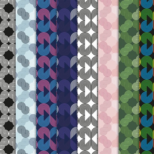
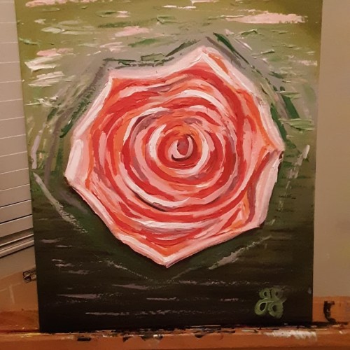
During this Quarantine I have had so much fun exploring what else I can create. Using this opportunity I am creating patterns & textures and trying to sell them on a few websites.
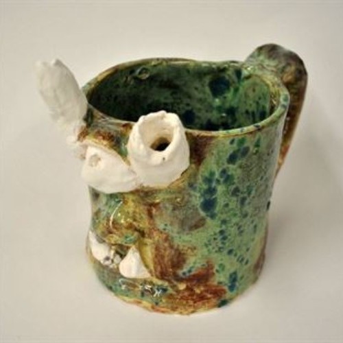
The first stage of clay is slip. Slip is watery clay; it is most often used to "slip and score", which I used to attach the features of the mug to the mug itself.
The second stage of clay is wet. Wet is moist, very plastic clay. Wet is the type of clay I love to use, just because it feels so fresh, and because it is moist enough that I don't have to soften it with water.
The third stage of clay is leather hard. Leather hard is the stage my mug was in after being left on the shelf for twenty-four hours or so. It is easier to cut but very difficult to sculpt.
The fourth stage of clay is greenware. Greenware is completely dry clay that is fragile and breakable. I would say that greenware is an overdose of leather hard for the clay. In other words, leaving clay out for a longer amount of time can turn leather hard clay into greenware.
The fifth stage of clay is bisque. This is the clay after its first firing. If it was grey clay, it is now white in this stage. It is now completely hard and no longer soft in any way. Bisque, luckily, is only one stage away from glaze...
The sixth stage of clay is glaze. This is the final firing and results in a smooth texture and a shiny look. I loved the way my glaze came out. While I was painting the mug, it was more of a ruddy red-brown but when it glazed, it turned out to be this beautiful spotted green.
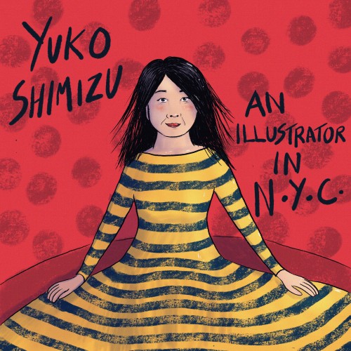
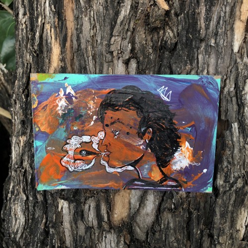
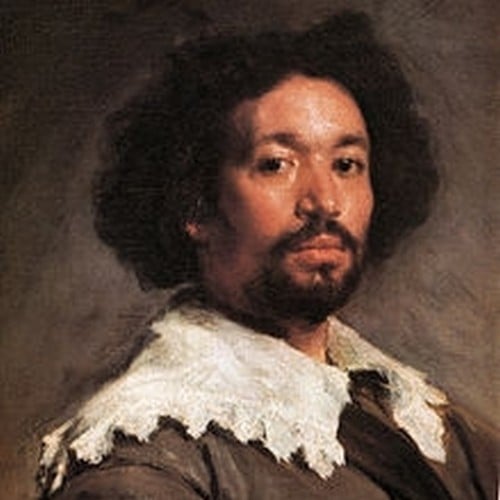
Here's a portrait of Yuko Shimizu that I'm working on for an IlloStories project (check the group out on Facebook).
I took her pose from one of her photographs, then used colours, patterns and textures that were inspired by her artworks.
This could be a front page for a book about her, or maybe a page for when her story reaches this point!
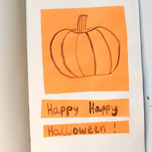
For the last day of Inktober, I drew a pumpkin with black india ink on orange paper. I had never done an Inktober challenge before, and I really liked it! I'm definitely doing it next year, too. I got very good ideas for new projects, I played with different textures and colours, and I used a calligraphic pen to draw, which I had never done before and which I loved.
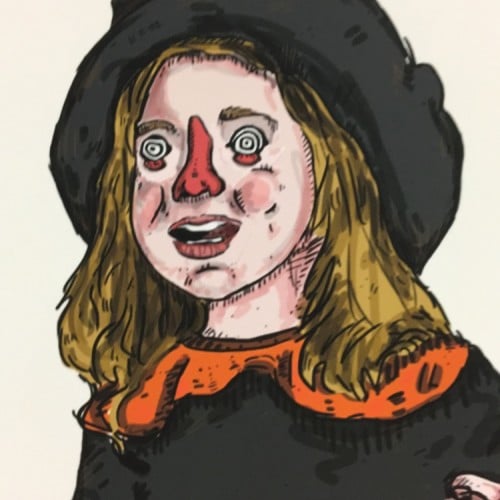
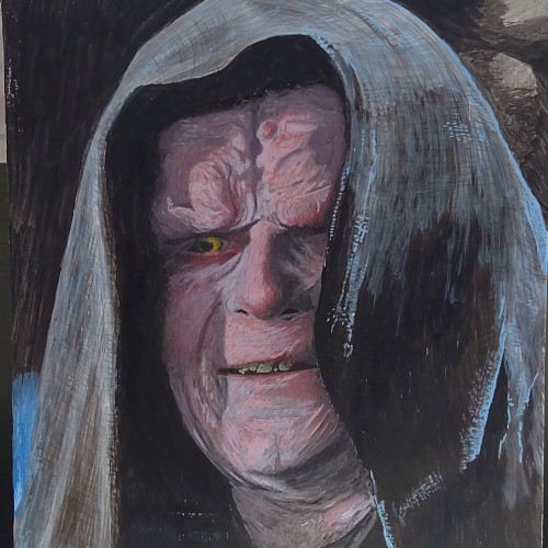
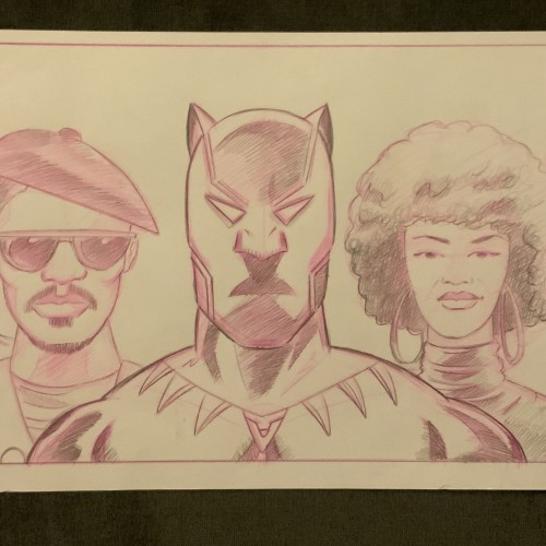
Face Paint Model Portrait Fanart by Oz Galeano
Instagram:
https://www.instagram.com/arte_ozgaleano/
Buy your custom Portrait:
https://www.fiverr.com/s/6WzyVL
Donations:
https://www.paypal.com/paypalme/ozgaleano
Youtube:
https://www.youtube.com/@OzGaleano/videos
Patreon:
https://www.patreon.com/Ozgaleano
Shop:
https://www.inprnt.com/gallery/ozgaleano/
TIK TOK:
https://www.tiktok.com/@oz_galeano
Behance:
https://www.behance.net/ozgaleano
Because of the texture the sketchbook's paper, I couldn't use my regular mediums of choice. I decided to give crayons another go. It's a rather old piece (older than the other ones I've posted here) so not giving this a watermark.
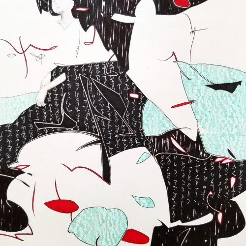
Whether the script in the background is an actual sutra is not the concern, even if it is, would it be readable to most? I question the use of lines in Calligraphy. Without the recognition of the exact words or meaning, can we still appreciate the quality and skills involved? Armed with a Chinese writing foundation, I adapted the use of the eight strokes (the basis of construction to Chinese character). The `writings’ resembles Chinese/Japanese writings but in fact, they are not. I needed a texture. With language as a symbol of culture, by visually adapting these kind of lines endears us to the image.
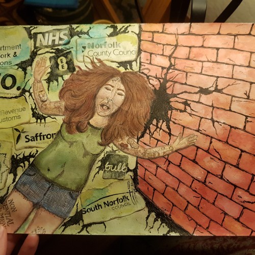
I created this piece in response to the ongoing mistakes and let downs from the organisations who should be protecting and taking care of people. I still have a couple of tweaks to do, but it is basically finished. I used flour and water paste to add texture to the brickwork and to attach the logos.
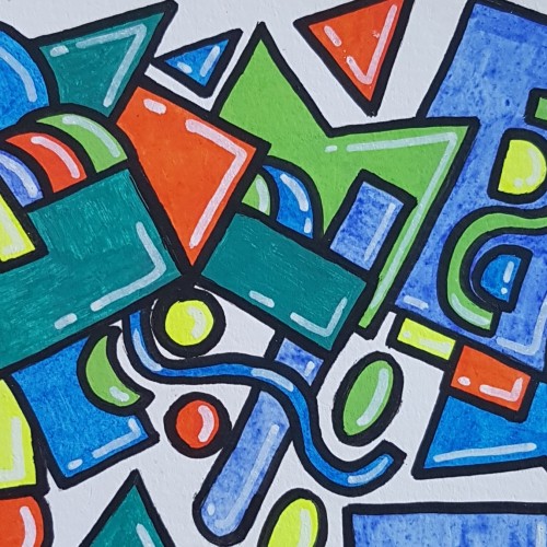
This was my first try using paint pens. Played around with shapes to get used to the texture of the paint and how it feels to use the pens. Done in a watercolour sketchbook.
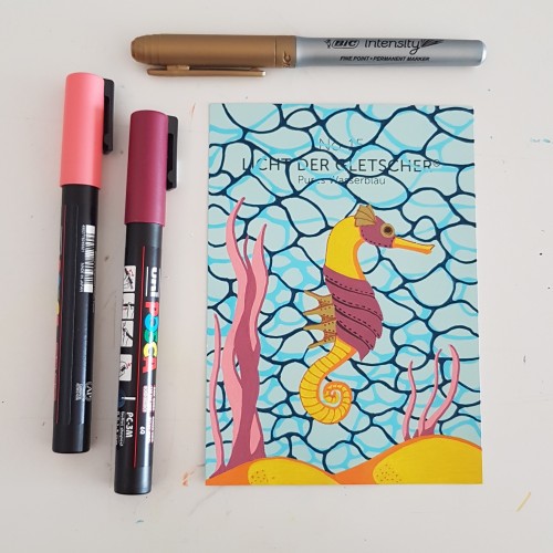
I did the water texture according to a tutorial by James Chapman, found on Instagram. The steampunk seahorse was an idea from a lady I am following on Instagram as well (look for @carrieisartsy) This piece is done on a paint chip card with poscapens, a gold marker and fineliners.
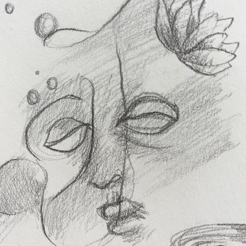
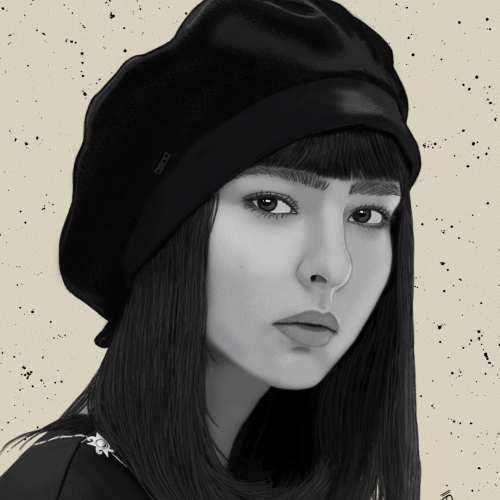
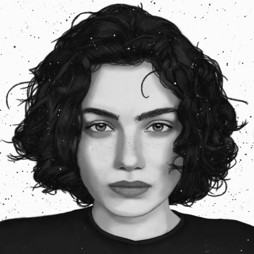
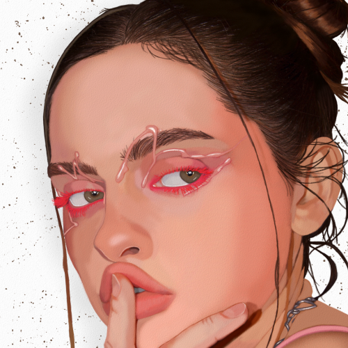
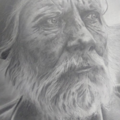
I really enjoyed drawing this. This is where I really explored using my kneadable eraser to create texture in the skin. I still learning how to draw hair.