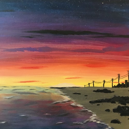
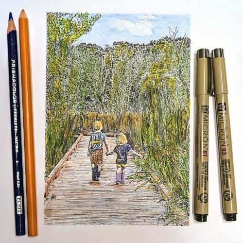
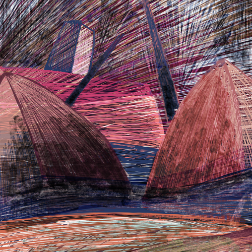
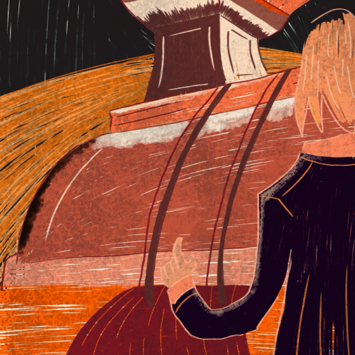
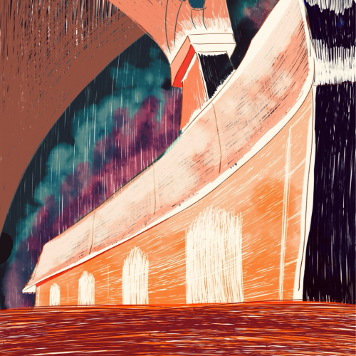
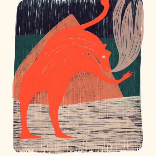
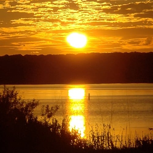
I feel like my landscapes have very traditional colors so i tried to make these look bright and exaggerated but still hold the same base color. Let me know what you think.
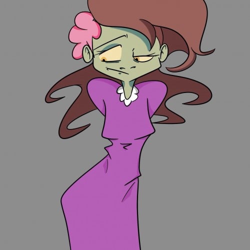
So I'm calling this part 2 of the cover concept since I need to do the background as well. But I'm still pondering that, I just wanted to put an update on here.
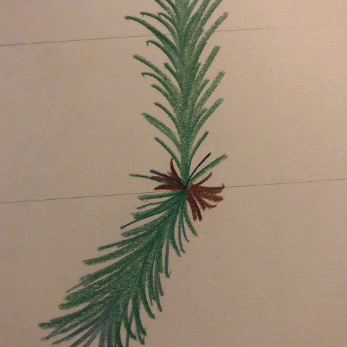
I’m working for the next four days so i wont be so creative but I’ll definitely have something. Today before work I decided to draw the evergreen trees since its winter
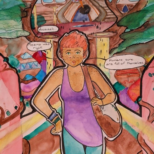
had to paint light through trees in watercolor. The pattern on the chair was a pain in the butt, but I think it came out ok. Winsor & Newton professional watercolors on Blick premier cold press 140lb watercolor block. This is the first time I've used Blick Watercolor paper. It held up well, but the painting came out kind of light (not sure if the paper had anything to do with that, though). At any rate, I bought a bunch of it, so I guess that's what I'm using!
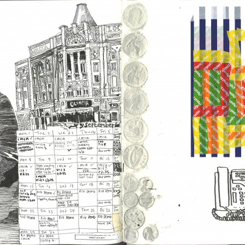
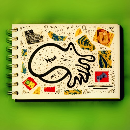
Even with the wheel well and truly turning for the Beltane Fire Festival again, there’s still time for me to start a new sketchbook! Introducing “It Is What It Was” :-)