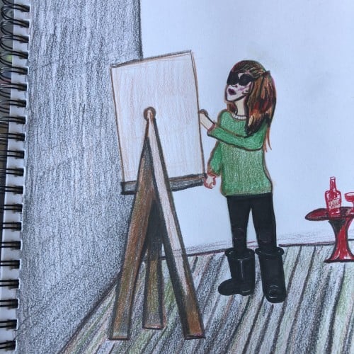
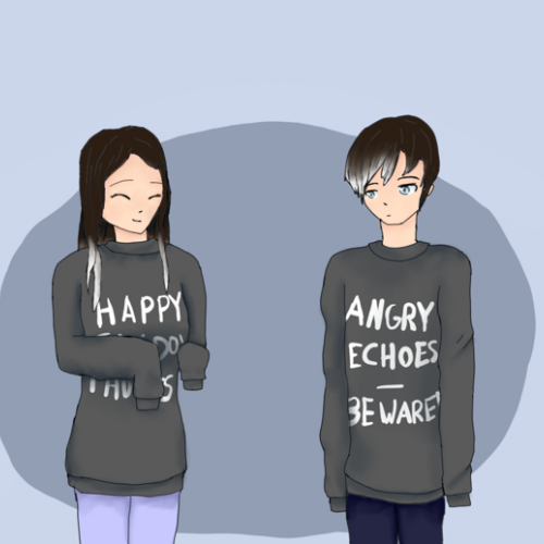
I had to improvise a bit. I found myself rummaging for colored pencils so I drew my outfit today with the ones I had. Notice that I am painting because I’m out of pencils. My oversized sweatshirt is really a periwinkle blue.
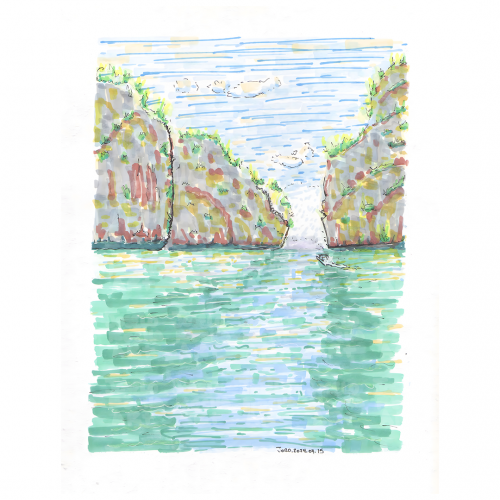
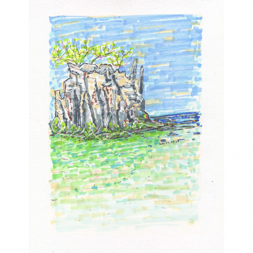
An illustration of a Thailand coastal scene is depicted with loose, expressive strokes, showcasing a rocky outcrop and the meeting of land and sea under a blue sky. Sparse vegetation sits atop the rocks, adding touches of green to the predominantly blue, green and beige tones.
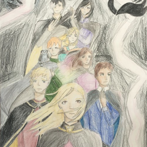
This was probably one of the first pieces I have done where I used a reference photo for inspiration. I usually just use them for anatomy and perspective, but this time I stuck to the basic idea of the photo. (I still changed a lot tho, haha)
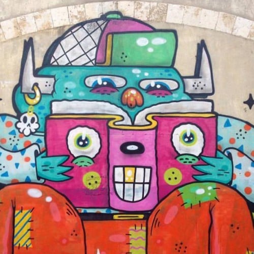
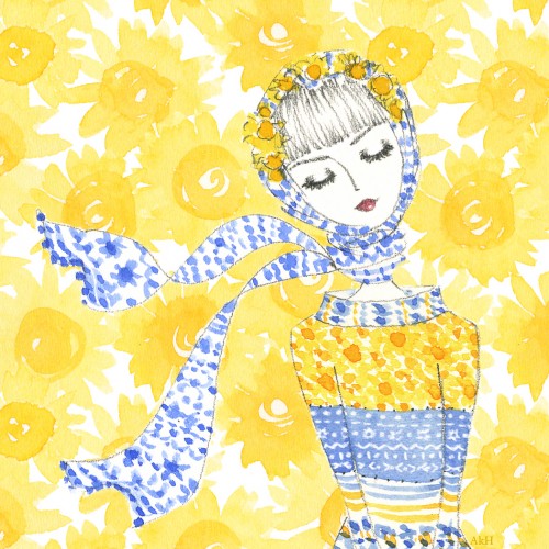
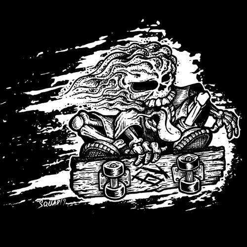
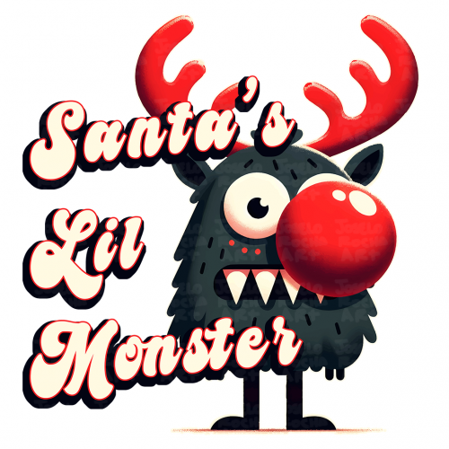
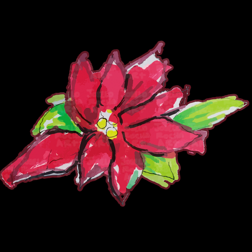
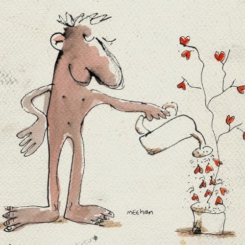
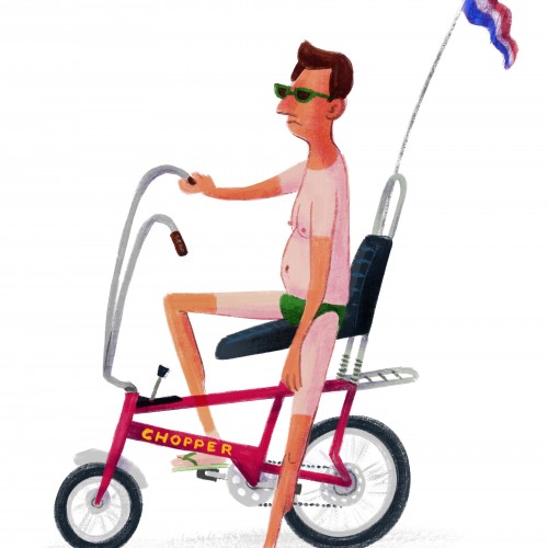
This design is from a series used for postcards, A4 prints, bags, tshirts etc https://davidmeehanart.blogspot.com/p/y.html David Meehan Art = Good art at reasonable price
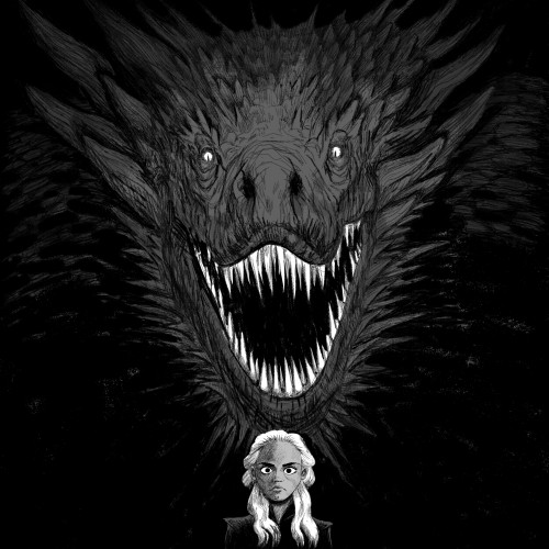
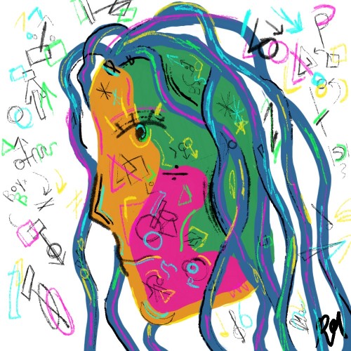
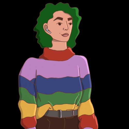
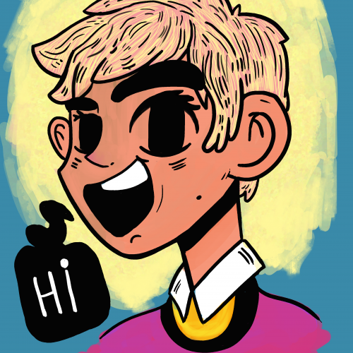
This artwork was supposed to be a self portrait but it quickly turned into a more charming, awesome stylized portrait (not mine, obviously). This piece has a color scheme similar to midnight gospel and katana zero (video game), I have added the blue and pink color shades to make it a little bit interesting. To make things better, it would be very helpful if you could share your feedback or comment with me. Thanks. . . . . . .
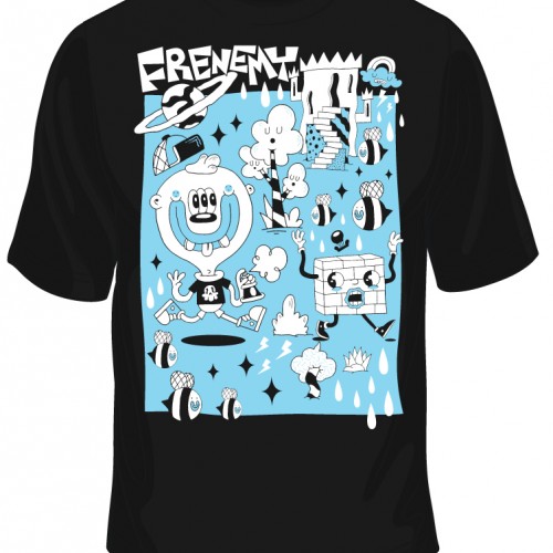
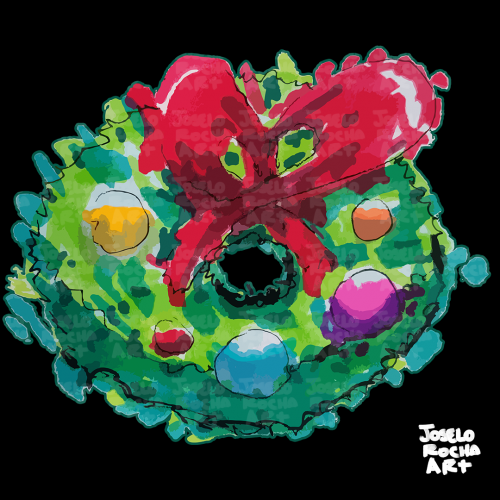
This design is from a series used for postcards, A4 prints, bags, tshirts etc https://davidmeehanart.blogspot.com/p/y.html David Meehan Art = Good art at reasonable price