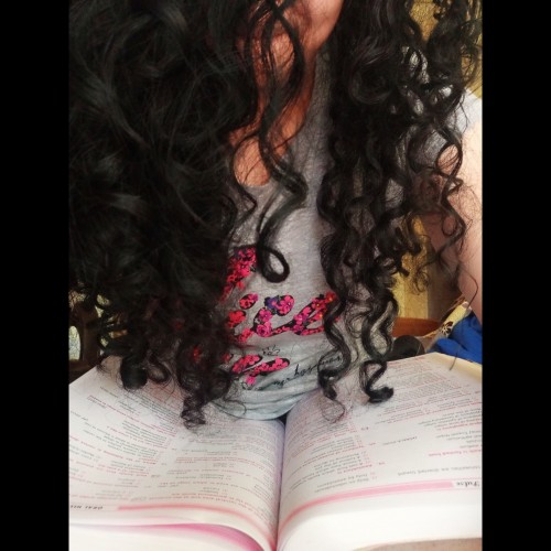
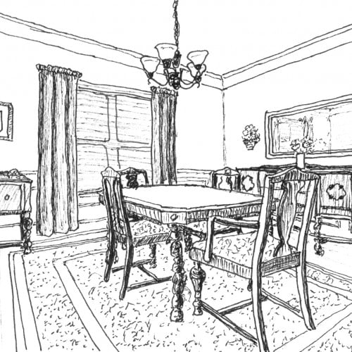
Our Dining Room is my favorite room in the house. Every family meal we eat at home happens there - breakfast, lunch, and dinner. Meal times are our sacred family time to share our day, our thoughts, our struggles, our successes, etc. We do have a breakfast area. But aside from homework, projects, or reading the newspaper, the breakfast area doesn't get much use unless needed for overflow from the dining room when we have visitors.
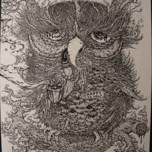
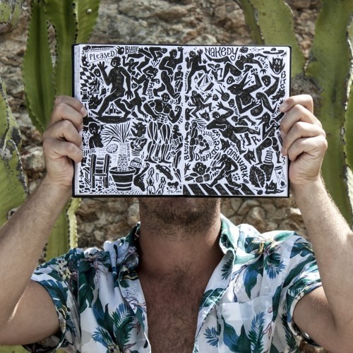
India ink on tissue paper. I had never used ink on this kind of paper before; I really liked the results! There are some folds and wrinkles on the paper that give the pattern some interesting details. The paper is also super absorbing, which plays nicely with the quantities of ink. Since it's very thin, there can easily be overlays between textures. And finally, when trying to use less ink (so that it wouldn't seep through and cause a big dot - the absorbing quality is nice, but it was also somewhat of a challenge!) I used very little ink on the lettering, causing a scratchy, dry look.
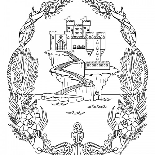
Don’t get caught here unawares… I don’t suggest you take the stairs. The treasure that this castle keeps, deep beneath the water sleeps. But if you’re patient with the tides, there’s another path it hides. Quickly now! Find the door! and hurry back onto the shore. For the moon, she will not wait to turn the tide and flood the gate. Don’t get caught here unawares… I don’t suggest you take the stairs.
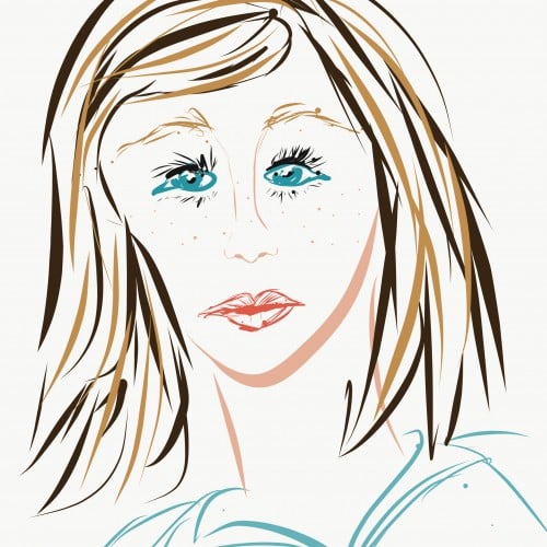
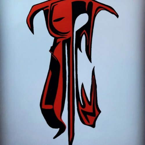
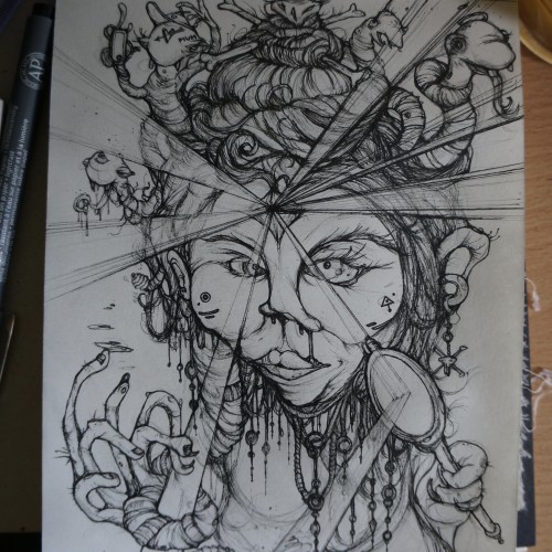
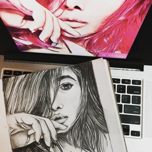
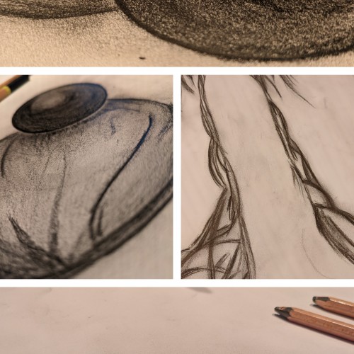
i feel to much focus is put on faces being to aesthetically perfect, or perfection in the media approach to what thats perceived to be. i enjoyed drawing a more imperfect edge to it and the use of the light beams was a cool thing to draw. the meaning was a look at self -adulation and the clamour for attention through various social platforms, being valentines day as well i feel to many people fall into that trap what promotes nothing more than a money making event. this helped form the title of "seduce her" using a medusa as a subject matter.
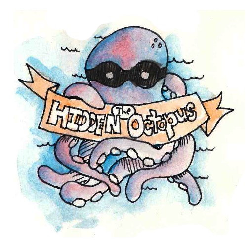
I've started a series in my sketchbook...actually, it's a series inside of a series. The series started as an idea I called "The Hidden Octopus". It's an Instagram account where I post quirky little ideas I draw with my Sharpie and the watercolor it to make it pretty. Then I thought I'd start a series inside of that where I do Song Lyrics that I really like. This is one of the first in that series.
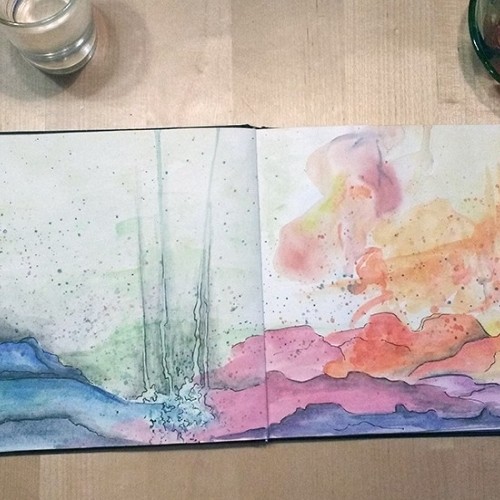
From Sketch to Final Water Coloring Stages, this is a spread from Tide Day! A lot goes into making a good composition, taking into account the center of the image where the binding is, and how to play with size and negative space. One of my favorite things to do is explore contrasting expressions between characters and highlight their emotions through physical stances and expressions. This was a tough challenge with the lack of limbs and the watery context, but Pearl's stubbornness and attitude shines through!
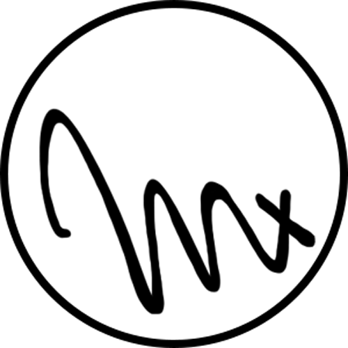
There is something about different faces.
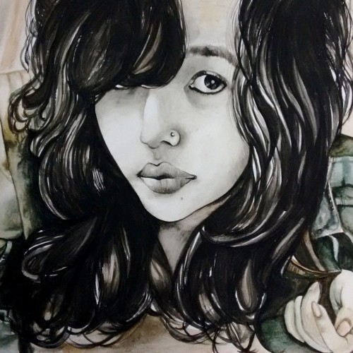
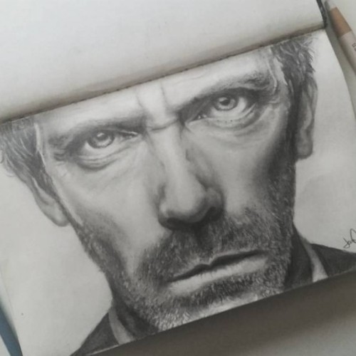
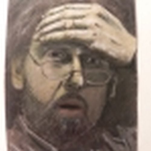
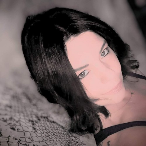
A woman's face is her work of fiction. Got inspired by one of my friends photo and thought of putting it on paper.
Pencil on Paper.
When I read the first book of the "Outlander"-Series by Diana Gabaldon, I was really inspired by the idea of travelling in time through places like Stonhenge. This is what it looks like in my head.
Something very different(ish) for me… a touch of life drawing! It’s been near enough eight years since I last had a go at this sort of thing. Pleased to see I’m not too bad at it… definitely giving it another go when I can :-)
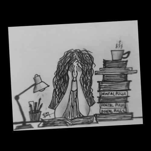
I've burned through 6 weeks straight of non-stop drawing. I think it means I'm healing up from a painful relationship I needed to end. Sometimes we attract someone due to a perceived chemistry. Then one day we wake up and realize that chemistry is acid and this isn't actually love. This is a distortion. And I don't need to walk through this pain anymore. I've actually grown enough to recognize that being alone, without pain, is a thousand times better than being with someone who refuses to recognize their behavior. Some people have no idea that words can do much more damage than a weapon. Words can kill. If you can't control your tongue, then don't speak. Make this a rule for your life if you care for someone.
4 year old Henry engaged fully with thick applications of watercolor and oil pastels. He said it was a stormy sea with a small boat. This was at the onset of the pandemic, when we were all a bit uncertain and confined to our homes. I was reminded of an insight by Kierkegaard written in the early 1800s: “When the sailor is out on the sea and everything is changing around him, as the waves are continually being born and dying, he does not stare into the depths of these, since they vary. He looks up at the stars. And why? Because they are faithful – as they stand now, they stood for the patriarchs, and will stand for coming generations. By what means then does he conquer changing conditions? Through the eternal: By means of the eternal, one can conquer the future, because the eternal is the foundation of the future.”
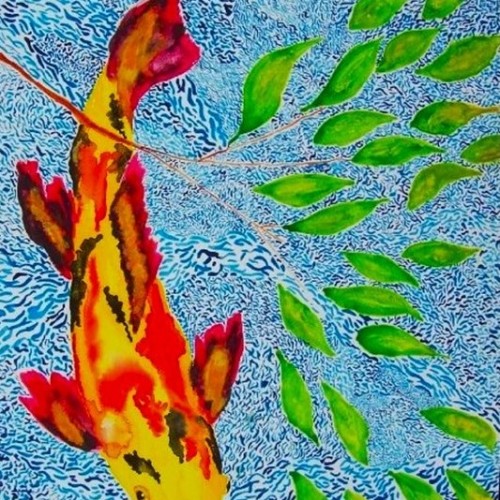
I call this work Lost Koi because I painted it in the 1990s. Gave the original to a friend who was terminally ill and thought I would never see it again. Then I found it on a old computer. I had to work a lot with the image. I hope it loads.
I got a little emotional when I heard the Lahaina banyan tree would make it through the Maui fire. I found a reference and painted a watercolor of the new growth. I come from a Navy family and was born in Hawaii. Let me know if I got the transparency and shading right or if it is aesthetically pleasing.
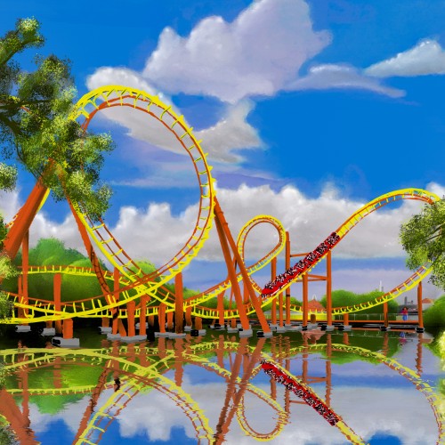
Ive always thought Goudrix is an aesthetically pleasing roller coaster, regardless of how it might feel when you ride it. I love roller coasters and design layouts in No Limits 2, but I've never composed one. This is my attempt using oil brushes in Rebelle. I wanted it to have a traditional vibe. This is not AI, nor is any part of this AI.