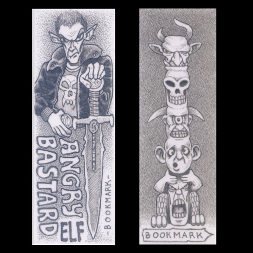
(0.18 Technical Pen on 130mm x 35mm card) I did these with a tech pen I was cleaning, deciding to make use of the ink that was diluted within it. The pieces of card were off-cuts, so I was making the best of everything there. They're not too bad for what they are and make decent enough bookmarks.
Inktober
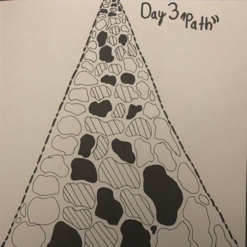
Day 3(Path)
Year 2
For this one I was really stuck because there are so many ways to draw the word Path because path has different meanings to it . But I ultimately decided to draw a Stone path after some inspiration on Pintrest
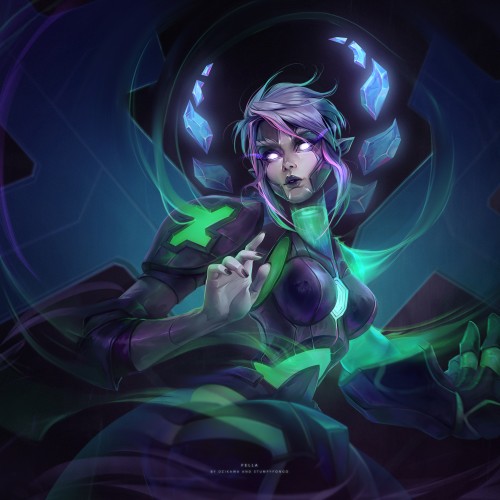
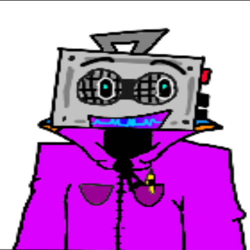
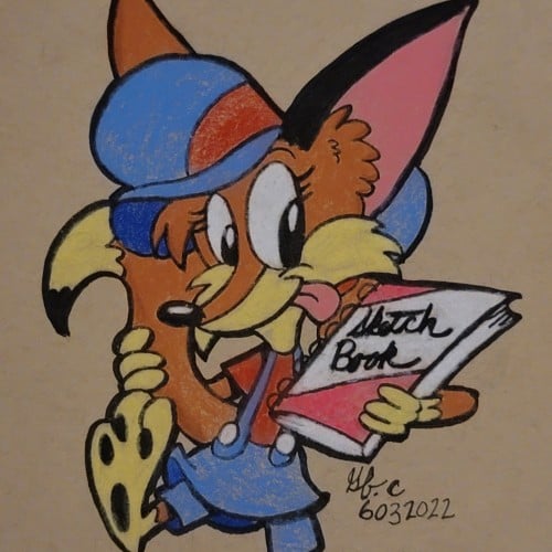
It was a great collaboration with an amazing artist Stumpyfongo back when we were in the Deviantart Collective. The character is Fella, a mascot.
Check out Stumpyfongo's art!!! https://www.artstation.com/stumpyfongo
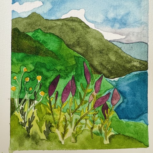
Painting of California coastline. Painted this while I was still learning how to mix watercolors and the amount of water I used etc. but I still liked how this turned out!
This painting was done with the Tuscan style in mind. The Tuscan style favors a rustic look. To me this never goes out of style because it’s as if the new and the old have found a common medium and have agreed to blend so well. There’s plenty of green, beautiful grass. The windows are complimented by the various colors of flowers that are perfectly placed below them. I love how there’s a table set outside of the building with a string of lights (even more beautiful at night) for people to enjoy the scenery as they eat some tasty, authentic Italian cuisines. There’s a group of people walking past the wall of yellow flowers and vines on the way to the inside of the building. In this scene, the ladies are wearing some long, beautiful dresses with gentlemen by their side to accompany them. This gives the impression that this group is out to have a good time. The white birds tops it off in this painting by giving it an inviting feel...”a moment to remember” feeling.
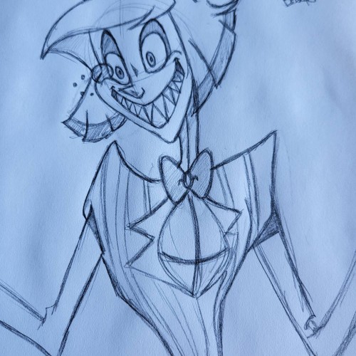
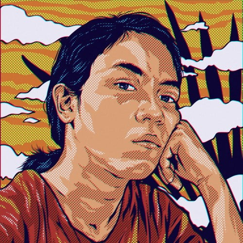
This was a sketch I did the other day. I'm currently working on the digital version. I always sketch all my images before I move to the digital versions. This is my favorite character from Hazbin Hotel.
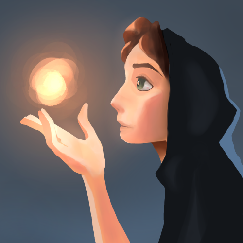
A painting I just finished to work on lighting, inspired by a painting done by SamDoesArts. This one was especially fun because I haven’t worked with layer effects for lighting in a little while and liked the way this turned out.
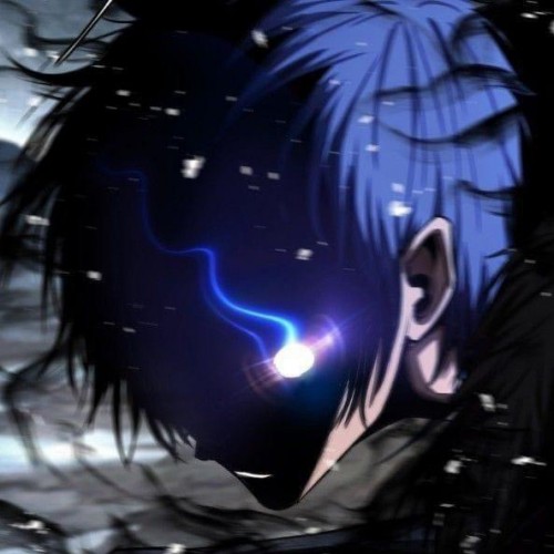
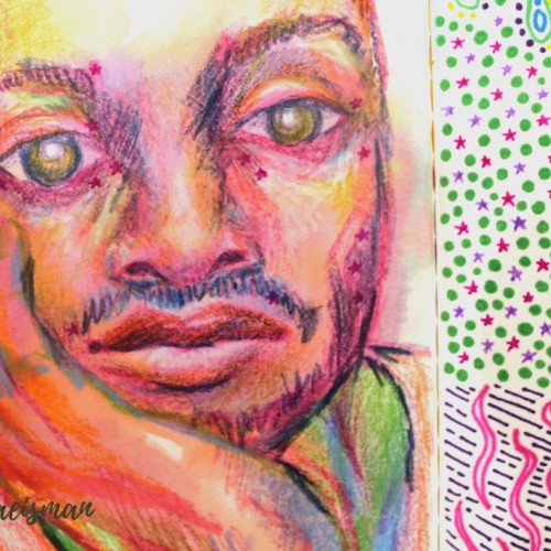
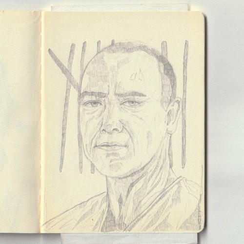
This portrait was created using mixed media like colored pencils, markers, and ink. The portrait features the face of a man resting in his hand, and staring dead-eyed at the viewer. I used non local color techniques to create depth and form using colors not typically found in the human face, like blues and violets for shadows and yellows and oranges or highlights. Parts of his face include small pink stars which originally faded from the previous page, but I really like the look it gives, they almost look like celestial freckles.
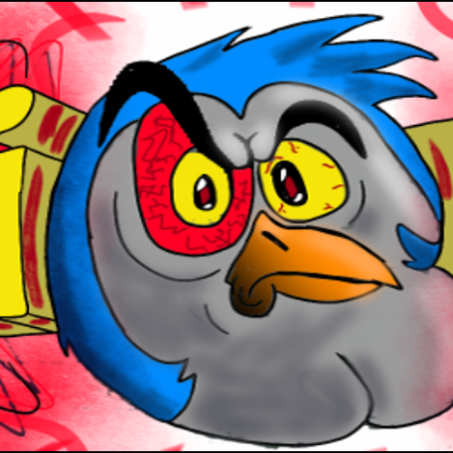
This is a piece of art that I've just done for a friend. Don't try to ask me what it is exactly, because I have crazy friends. he drew a poorly sketched character on a piece of paper, which I doodled over as a layer, so I didn't have much to work with. I was mainly experimenting with Sketchbook's tools, so that's why its kind of all over the place. God gave me the gift of art.....and I'm creating angry bird knock-offs. :]
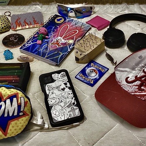
I was having some creator’s block, so instead of a collage of drawing (you know, besides my phone case being a collage of doodles), I made a collage of objects from my room that I thought described my personality. Comment what kind of personality I have and what object(s) makes you think that!
Some things I saw and drew but didn't share. A friendly dog who wanted to say hello, a bride and a groom on the way to the wedding waiting for the train (she wore plastic slides and had her high heels in the bag), a lost cicada, a book (Sula by Toni Morison was absolutely amazing). Oh and also using dry ice to make dramatic seltzer.
It was unclear whether there were flames or what was going on tbh. It appears that she sits on a horse with a smile. There may be others in her party. Be warned.
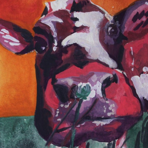
This colorful painting was created using gouache paint to give an illustrative design feel. The subject is a cow painted using non-local colors like pink and violet, contrasting the orange sky background. I love the small clover flower the cow appears to be smelling in the foreground of this piece. For more in my gallery, please visit ArtsyDrawings.com!
A pencil and watercolour study, inspired by Scott Christian Sava's "60 days of studying the masters" on Youtube. This was intimidating from start to finish, by far the most complex drawing I've ever done! It took me almost a week to get the drawing right, but the painting was done in a day. In between were many days of feeling overwhelmed, lost, and then afraid of messing it up. But I got there in the end and I think I pushed myself to a new skill and confidence level. Good thing too, I've got 58 more studies to do!
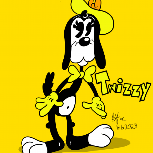
While doodling, I was thinking of my characters Dipsy Diddle, Peggy Bark, Chubbsly and Markley and imagined another dog character to the group. Ladies, gents and cartoon lovers alike. Meet Twizzle "Twizzy" the Basset Blood Hound.
This is my first attempt at traditional egg tempera painting. The panel is a Masonite board from Michaels, but I need to use true gesso because the egg tempera will not adhere to acrylic gesso. Some of my favorite artists used egg tempera. Andrew Wyeth, Robert Vickrey, and Colin Fraser are all masters of this ancient and archival medium. I have been self studying this technique for months and I was very excited to start experiencing the medium. Egg tempera is like layering stained glass on top of stained glass. the painter can expect a luminous glow to take shape as the colors blend visually through the layers of paint - assisted by the chalk of the true gesso. Egg tempera has been described as the closest painting technique to drawing, hence my draw to this medium.
done 2023 2.5 x 3.5 card blanks with color pencils.
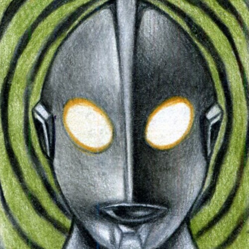
I had done this piece for RRparks company as sketch card for Ultraman series 3
This was very first one i drew for RRparks co. to start off.
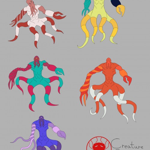
I was trying out different color palettes to see which one I preferred. The top palettes are based off the mimic octopus and the blue-ringed octopus, respectively. The rest aren't inspired by anything, I just thought the colors looked nice.
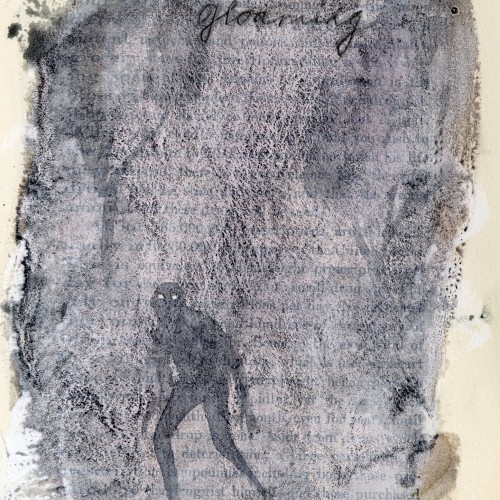
Favorite words.
Gloaming.
Dusk.
For some reason, makes me think of the opening to Jabberwocky by Lewis Carroll
’Twas brillig, and the slithy toves
Did gyre and gimble in the wabe:
All mimsy were the borogoves,
And the mome raths outgrabe.
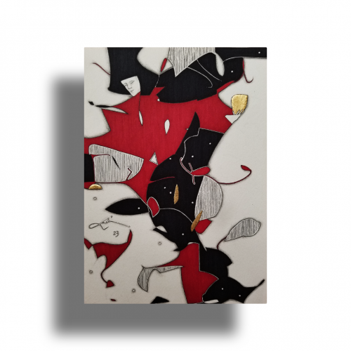
This picture, among my many others, was created by following the doodle lines made in a minute. The figure and composition was FOUND from the loops in between... without alterations. https://youtu.be/xOa42BwxOx4
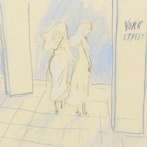
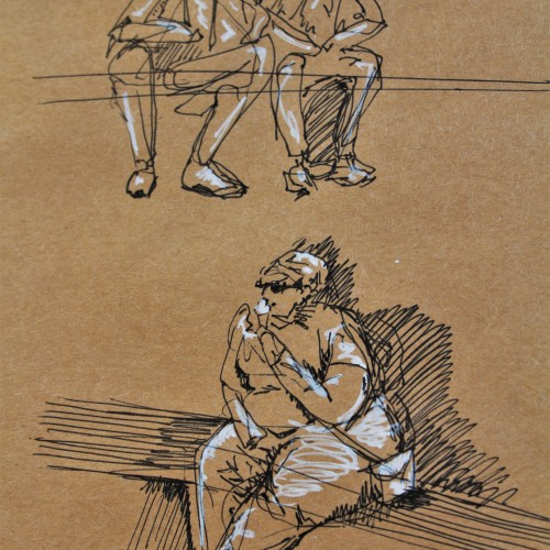
These are some gesture drawing sketches I did in ink with white pen highlights on brown paper. I was in Europe and sitting around a fountain watching people go about their lives. This was a really fun figure study and I think people make for great works of art.