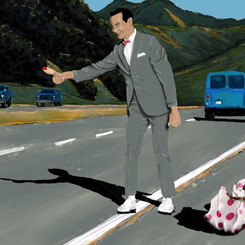
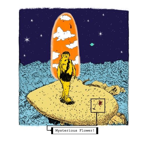
Rest in Power, Paul Reubens. I watched a lot of Pee-wee Herman as a young kid. As an adult, Paul Reuben's collection of erotic gay art made him interesting to me but misunderstood by many people. Any way you take him, he was funny and made many people laugh. I painted a scene from Pee-wee's Big Adventure, a classic Pee-wee movie from 1985. I love the California scenery and am happy with how the landscape turned out.
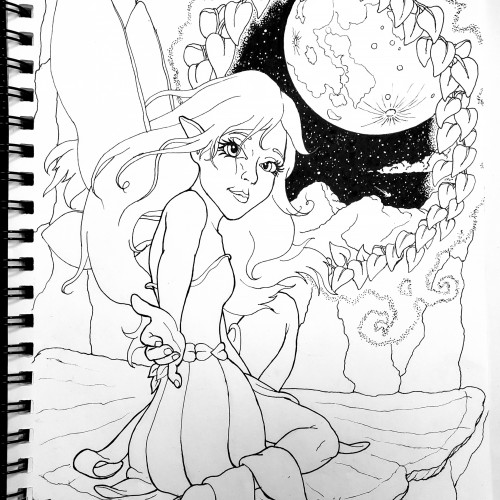
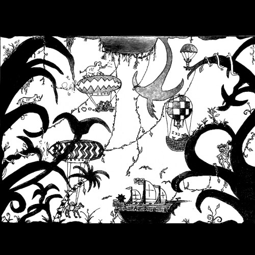
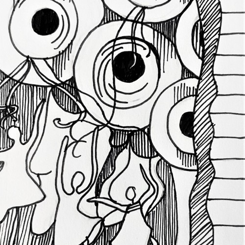
Created using pen and ink, this drawing mimics a fine art painting I saw in a museum. I loved the figures and their fluid movements, so I doodled it down in my sketchbook and later inked it in for a refined black and white artwork. Check out more on my website ArtsyDrawings.com!
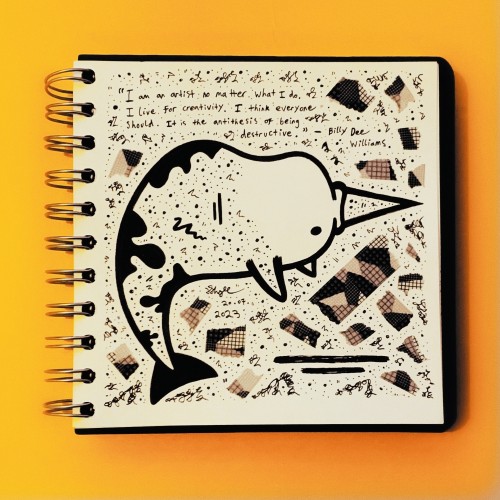
Favorite words.
Aghast.
The gall of some people, I tell you!!!
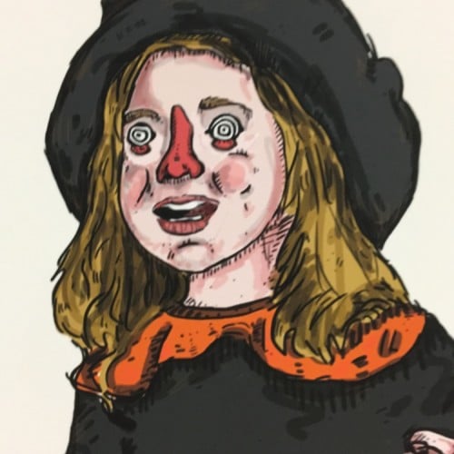
https://www.instagram.com/p/CvM7ZVgg1V9/?utm_source=ig_web_copy_link&igshid=MzRlODBiNWFlZA==
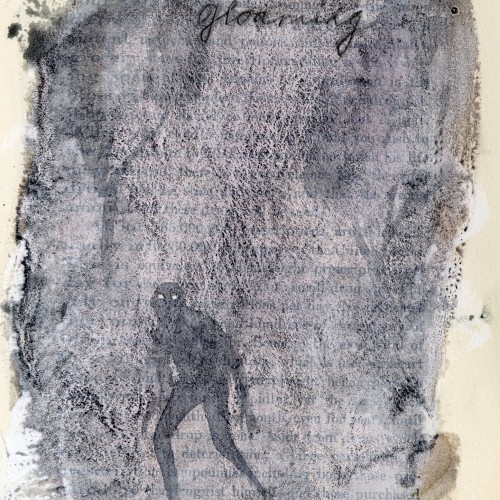
Favorite words.
Gloaming.
Dusk.
For some reason, makes me think of the opening to Jabberwocky by Lewis Carroll
’Twas brillig, and the slithy toves
Did gyre and gimble in the wabe:
All mimsy were the borogoves,
And the mome raths outgrabe.
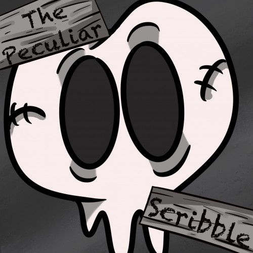
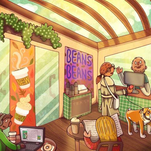
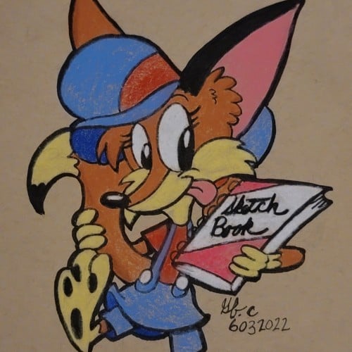
This is a new logo I created for my Webtoon, The Peculiar Scribble. It is about Scribble and his adventures in a place called, The Realm. Scribble is a heartwarming comic that is suitable for all ages. If you would like to read more below is the link to the comic: https://www.webtoons.com/en/challenge/the-pecuilar-scribble/list?title_no=866623
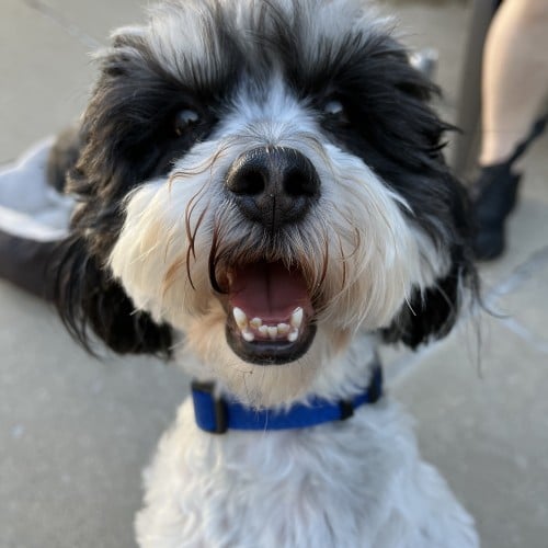
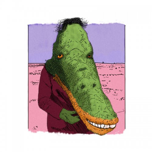
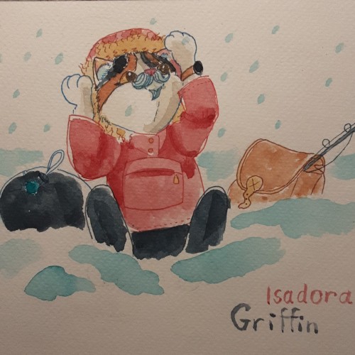
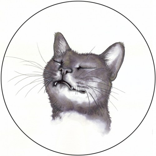
After a week of influensa and a diet of lozenges and potato twisters, i needed to do a quick drawing to keep in practise. Wtprompt on instagram suggested an animal portrait with a moustache, so here it is!
This picture, among my many others, was created by following the doodle lines made in a minute. The figure and composition was FOUND from the loops in between... without alterations. https://youtu.be/xOa42BwxOx4
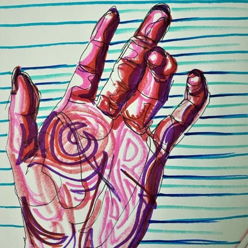
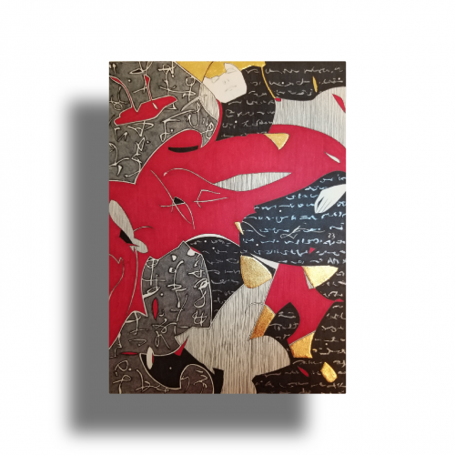
Pop art ink drawing in red, pink, and violet hues. The subject is the palm of a hand and curled fingers. The background has blue, green, and turquoise stripes contrasting the colors of the hand. This artistic drawing style uses non local color to create form in the palm hand drawing.
The idea is to show a figure crossing over two ` scripts’ with a bilingual suggestion. By standing in between worlds, we see opposing viewpoints.
Many artists have incorporated typography as symbols in their paintings since the 60s, but no one has attempted to approach lines in this `written’ manner. How different it is are the two writing styles of the East and the West; one with angular lines while the other in a smooth flow! This work juxtaposes the symbolism of cultures – script. At the same time, it questions the need to grasp the full meaning of the script to appreciate the aesthetic flow of calligraphic lines.