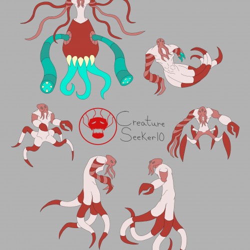
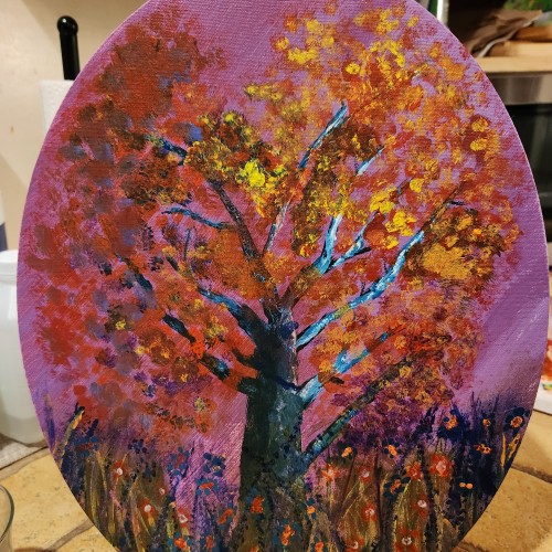
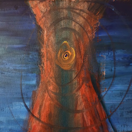
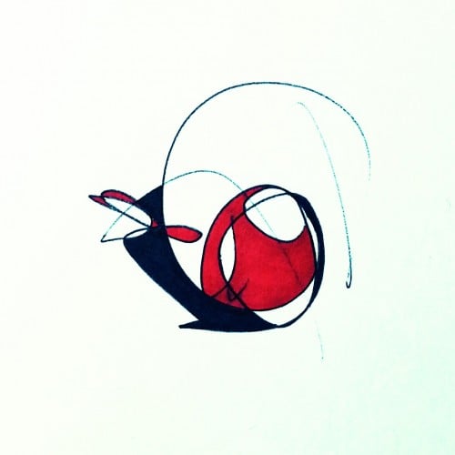
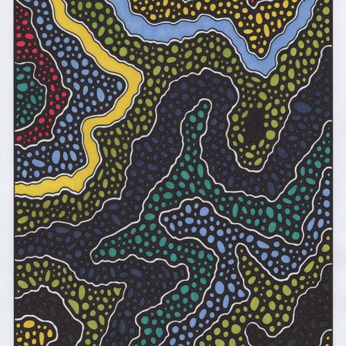
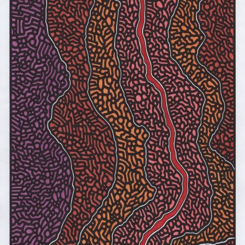
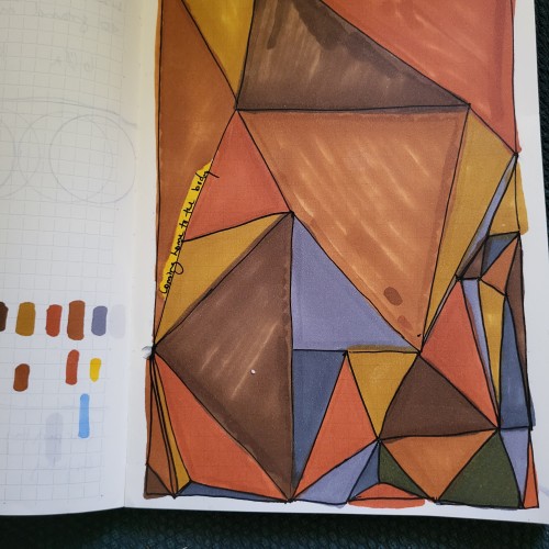
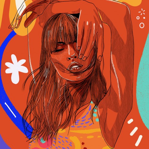
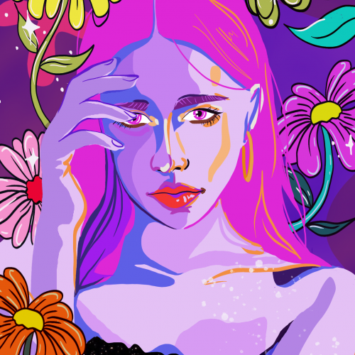
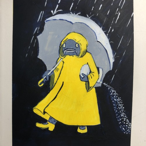
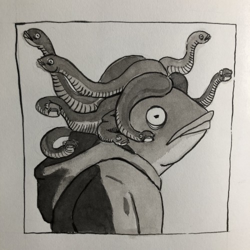
I decided to go with the mimic octopus color palette as the main one. The colors compliment each other nicely, and it doesn't look too busy as a result.
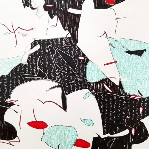
Whether the script in the background is an actual sutra is not the concern, even if it is, would it be readable to most? I question the use of lines in Calligraphy. Without the recognition of the exact words or meaning, can we still appreciate the quality and skills involved? Armed with a Chinese writing foundation, I adapted the use of the eight strokes (the basis of construction to Chinese character). The `writings’ resembles Chinese/Japanese writings but in fact, they are not. I needed a texture. With language as a symbol of culture, by visually adapting these kind of lines endears us to the image.
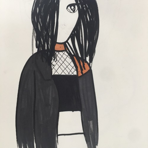
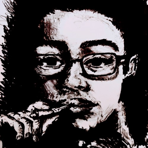
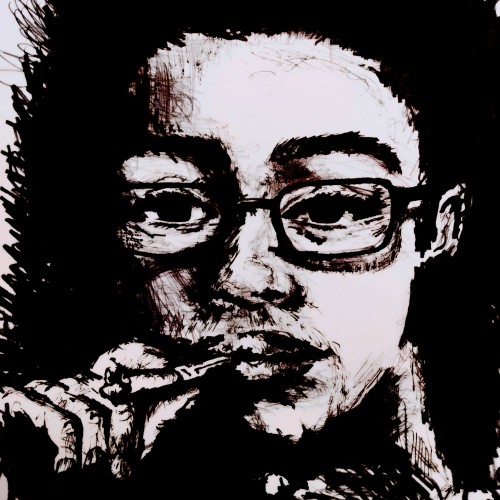
The above anime portrait is of my mentor from the ADPList Design community. I illustrated this to show my sign of respect as she is dedicated towards her mentee's well-being.
"Avoidance: As the old saying goes, prevention is better than cure. One of the most effective ways to manage stress is to avoid it in the first place. This means identifying potential stressors and taking steps to eliminate or minimize them."