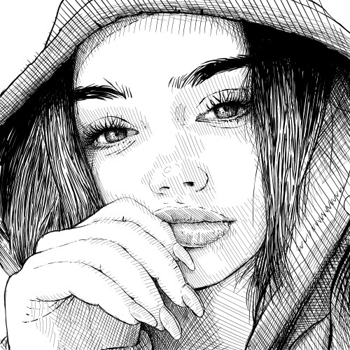
Rebelle 6 by Escape Motions is out. It's a blast! Pigmented blending, watercolor granulation, nanopixel dimensions, new transformation options. Really enjoying it. (Drew this in it.)
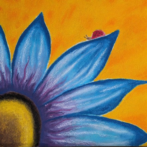
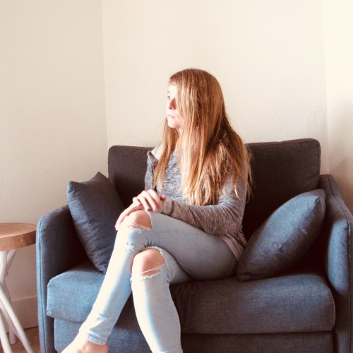
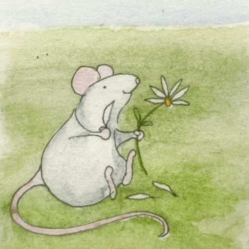
I want the composition to be thoughtful but on the sad side. My skill practice was brush strokes and blending (but not overdoing the blending) as I try to figure out how I stylize as an artist. Still working in the realm of realism and proportions as I am a newbie, but wanna flex into stylization a bit more. I did this through Rebelle 5, which is absolutely amazing, IMO.
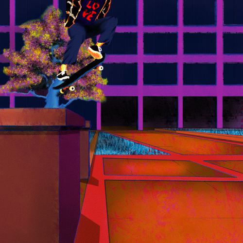
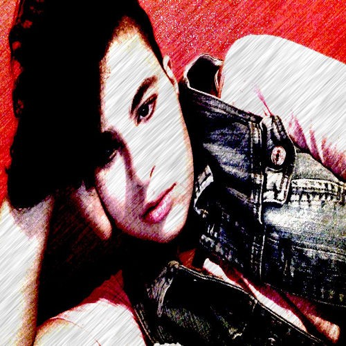
Yet another senseless lynching that has me here with a broken heart. Like my other paintings on this subject, I wanted to focus on life. Tyre was dynamic and energetic, so I wanted to paint him soring. I also wanted to paint him defiant in the face of his oppressors. He was a skater, and they are no strangers to defiance. Thankfully, I found some excellent references to help me with the composition. Aesthetically, I wanted the comp to be modern, colorful, and hopefully impactful. I went for a pop art, illustration, and false-color vibe and minimized blending and refining layer edges. I painted this in Rebelle 6 and Photoshop. Much respect.
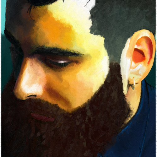
Before I got into digital painting, I was putting together digital collages. I love digital collages, but most of them are a bit too literal/pop art for me. No diss on pop art; I create a lot in that style. But, I wanted to make a smoother, more blended collage for my profile pic.
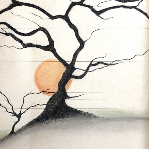
18x24 watercolor paper, technical pen and probably pastel pencil or just regular pencil blended with a q-tip. This was done for a friend who owned a wine and spirits shop, so I guess it's a vine. Or a tree. Whichever....
My first venture into artist grade colouring pencils - and I'm smitten! I never thought I could achieve such boldness and blendability with them! I'm still getting used to them and will think about choosing smoother paper with less tooth next time. The texture and weight was more for the water-based gouache along with alcohol inks (which are very unforgiving to even primed heavy paper!). Apologies for the unevenness of lighting between the 2 sides of paper; will correct that when I'm making proper image files.
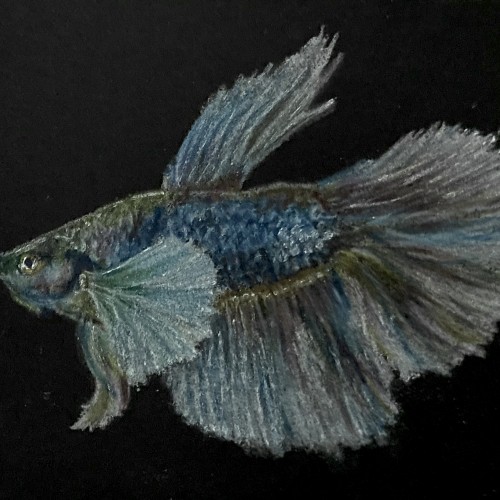
More ballpoint pen experiments. This was trying to "blend" colors, using ball point pens in a similar way to colored pencils. I found Layering evenly to be pretty difficult, esp with the pens blotching and very very limited burnishing. The interesting thing is that the paper doesn't seem to get "tired" the way it does with pencils. This is just cheap printer card stock.
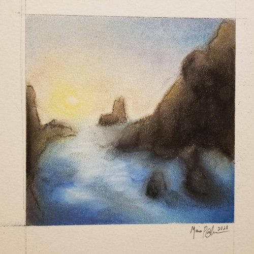
Pastels...I've never been a huge fan of working with them, mainly because I can never seem to get them to blend or move the way I want. I think this turned out okay; it's not the worst it could've been...not the best. It was fun to try, considering the fact that I rarely try new mediums, and it got my mind off everything I've been worrying about. Anyway, enjoy.
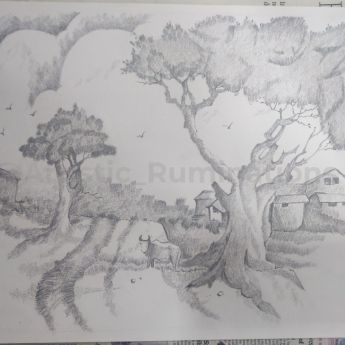
In this captivating cross-hatched pencil shading, a tranquil village scene comes to life. The intricate strokes create a harmonious blend of light and shadow, showcasing the serene beauty of rural life. Thatched roofs, winding pathways, and towering trees are meticulously detailed, inviting viewers to step into the peaceful simplicity of village existence. The gentle interplay of shades and textures evokes a sense of nostalgia and calm, capturing the essence of a timeless village story.
Two possibilities exist : either we are alone in the universe or we are not. Both are equally terrifying.
~ Arthur C. Clarke
.
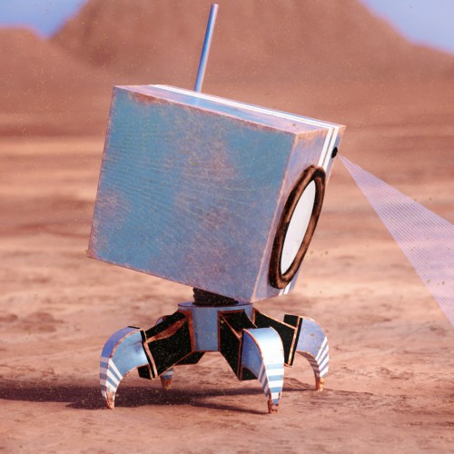
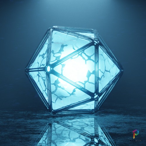
Sci-Fi orb created in @blender.official
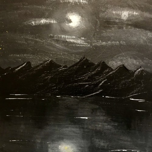
This was originally supposed to be a swamp landscape, but I got frustrated with the colors not blending, etc. I painted the whole canvas black and ended up with this
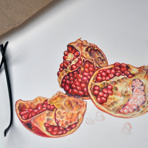
Colored pencil drawing of pomegranates "in progress." Prismacolor and Verithin pencils with some fine lines done with Tombow Irojiten pencils. I like the harder colored pencils for fine detail, but the blending of high wax and oil pencils can't be beat for blending.
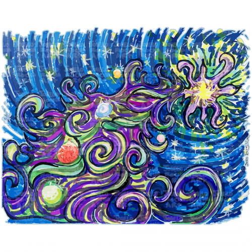
A colorful and dynamic scene depicts a Cosmic Christmas Tree with swirling galaxies and stars against a dark background. The vibrant colors blend together to create an impression of movement and energy in space.
Giving it a go with artist colored pencils for the first time. Finding it challenging to keep a point on the pencils and anyway to recover if what should have been a white area gets too much color? Do most colored pencil artists use solvents to blend?
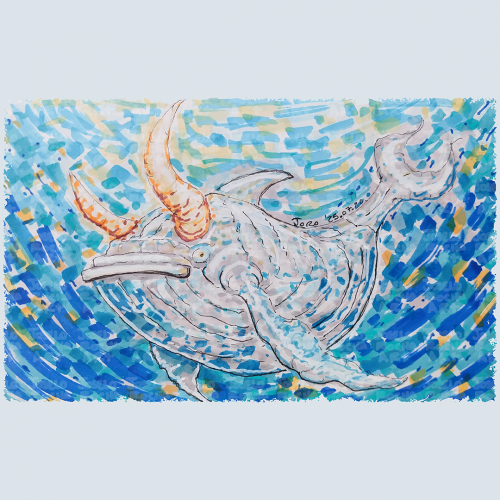
A fantastical bullwhale creature with a mix of whale and bull features glides through a vibrant, swirling, blue and orange hues body of water. The colors blend in a mosaic style, enhancing the creature's mythical presence with a composition that creates a sense of movement and depth, capturing an imaginative underwater scene.
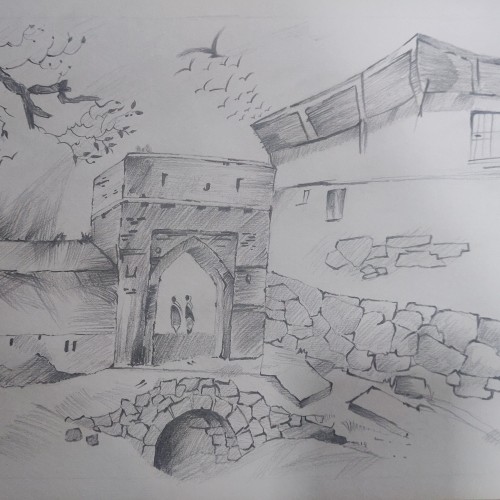
Draped in delicate pencil strokes, this artwork elegantly portrays a historic city gate, standing as a timeless sentry to myriad untold stories. Each shaded contour brings forth the intricate details of the gate's architecture, echoing the urban landscape of a bygone era. The deft use of monochrome evokes a nostalgic journey through the annals of time, where every shadow and highlight adds to the depth and texture of this piece. This mesmerizing blend of artistry and history invites viewers to step into the past and embrace the serene splendor of the city's storied gateway.
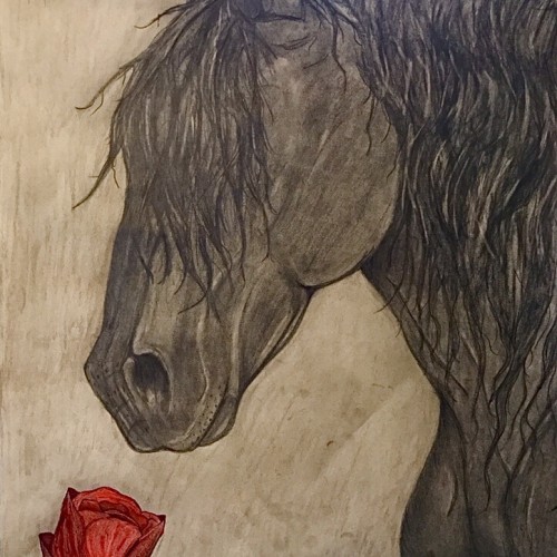
This is the finished drawing. It took me about 6 hours over the course of two days. I decided to just lightly shade the background so my finger prints didn’t show so much. I was afraid that going darker would make the horse blend in too much. I’m happy with how it turned out! Done in charcoal, marker, colored pencil, and pencils.
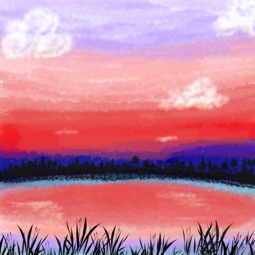
Trying to make sharp shadows without having everything blend toghether. My goal is to convey the warm, pinkish sunlight on the first day of spring, and light is not something i have given enough care to earlier. Removing colors from a photography is an effective way to get an idea of how sharp shadows actually are!