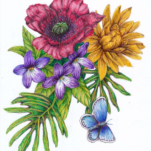
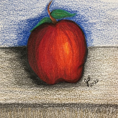
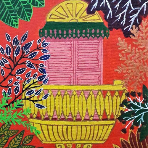
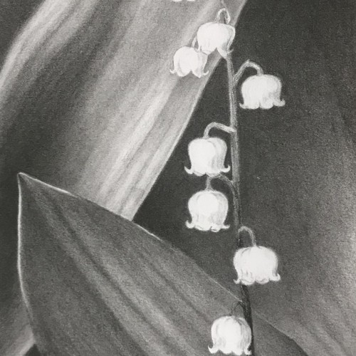
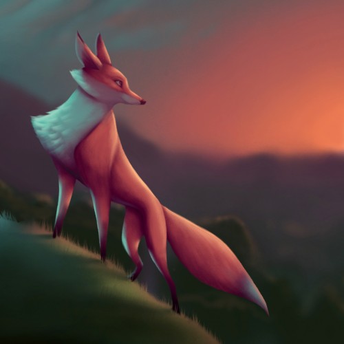
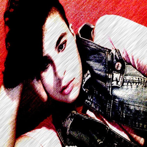
My first venture into artist grade colouring pencils - and I'm smitten! I never thought I could achieve such boldness and blendability with them! I'm still getting used to them and will think about choosing smoother paper with less tooth next time. The texture and weight was more for the water-based gouache along with alcohol inks (which are very unforgiving to even primed heavy paper!). Apologies for the unevenness of lighting between the 2 sides of paper; will correct that when I'm making proper image files.
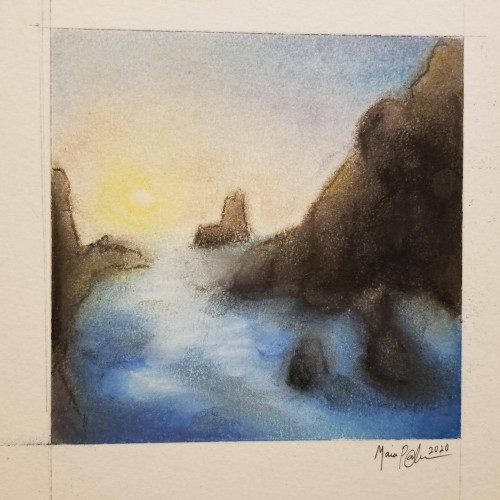
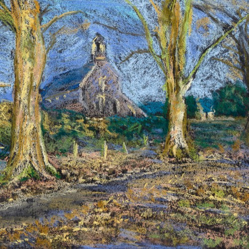
Pastels...I've never been a huge fan of working with them, mainly because I can never seem to get them to blend or move the way I want. I think this turned out okay; it's not the worst it could've been...not the best. It was fun to try, considering the fact that I rarely try new mediums, and it got my mind off everything I've been worrying about. Anyway, enjoy.
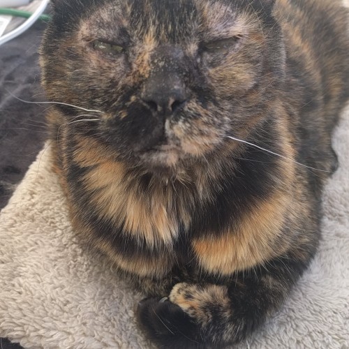
First. I need advice on blending in IbisPaint. Thanks! And second. This is my friend who is so awesome. Everyday they put a smile on my face. I attempted blending. It didn’t work very well but it’s okay. Please send advice.
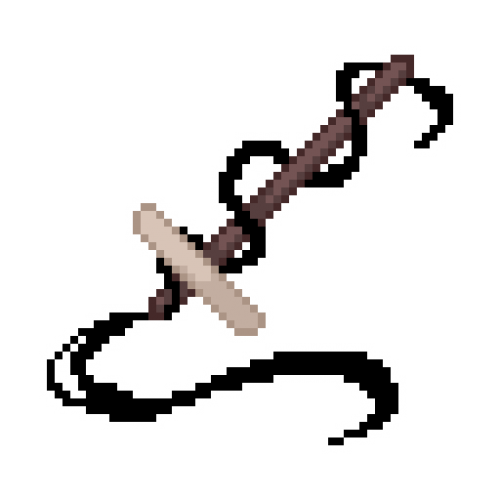
More ballpoint pen experiments. This was trying to "blend" colors, using ball point pens in a similar way to colored pencils. I found Layering evenly to be pretty difficult, esp with the pens blotching and very very limited burnishing. The interesting thing is that the paper doesn't seem to get "tired" the way it does with pencils. This is just cheap printer card stock.
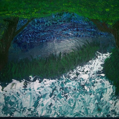
Its funny because this was my first painting and looked very different. Just a bunch of green and a little sky blue blended in that looked like nothing to me. I ultimately gave up on it but revisited it about 2-3 weeks later and turned it into a night sky with rushing water flowing through two trees into a forest. I used a palette knife for most of it which was new for me as well ^^ hope you like. Debating on touching it up a bit...
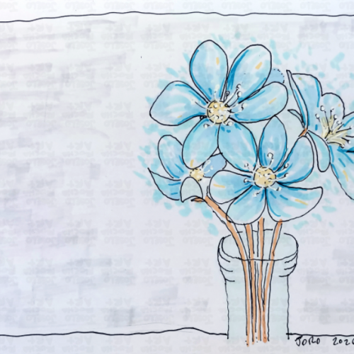
A delicate, hand-drawn study of the Blue Liverflower (Hepatica), capturing the first signs of spring. This design features breezy blue petals, energetic linework, and a minimalist vase, blending a classic botanical feel with a modern, sketchy illustrative style. Perfect for those who love the quiet beauty of forest wildflowers and cottagecore-inspired art.
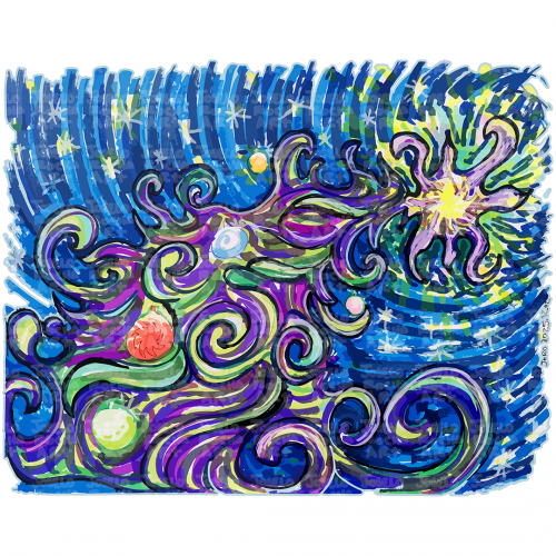
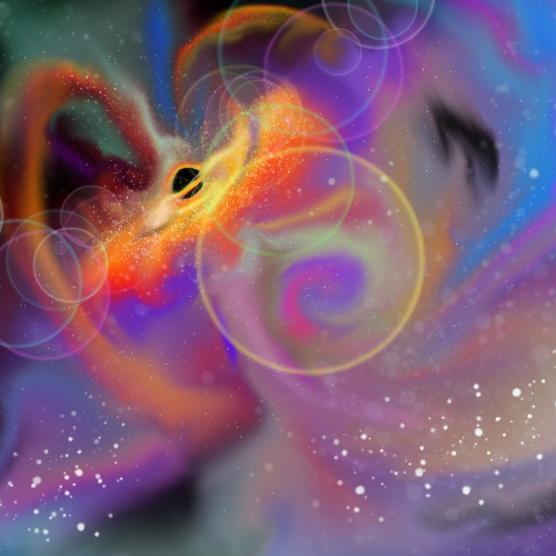
A colorful and dynamic scene depicts a Cosmic Christmas Tree with swirling galaxies and stars against a dark background. The vibrant colors blend together to create an impression of movement and energy in space.
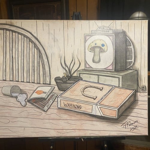
"Nowhere Fast" is a compelling still life that blends mundane domesticity with surreal, slightly ominous undertones. The scene is anchored by a wooden table where a spilled glass, a pack of matches, and an ashtray with a smoldering cigarette suggest a moment of interrupted pause or quiet, long-term stagnation. Dominating the foreground is an oversized, weathered cigarette carton boldly labeled "WARNING", its subtle but unsettling presence hinting at a consumption that leads nowhere.
In the background, a vintage RCA television set displays a stylized amanita mushroom, a recurring symbolic motif that adds a layer of psychedelia and altered perception to the otherwise drab setting. The earthy, muted color palette and soft lighting create a feeling of weary introspection, capturing a sense of being perpetually stuck in a cycle. The piece masterfully uses everyday objects to explore themes of vice, time, and the quiet, slow march toward an uncertain destination.
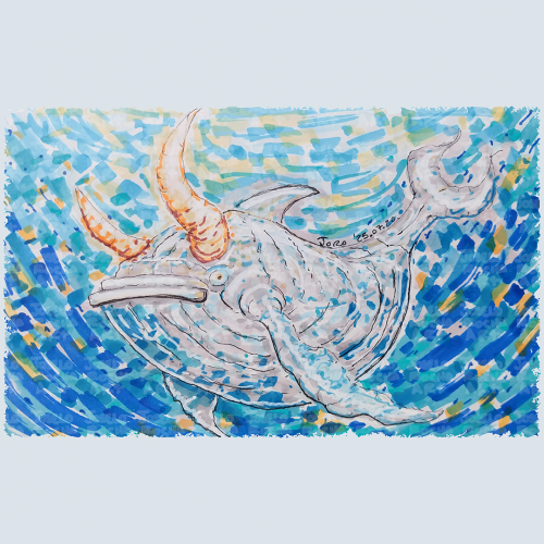
A fantastical bullwhale creature with a mix of whale and bull features glides through a vibrant, swirling, blue and orange hues body of water. The colors blend in a mosaic style, enhancing the creature's mythical presence with a composition that creates a sense of movement and depth, capturing an imaginative underwater scene.
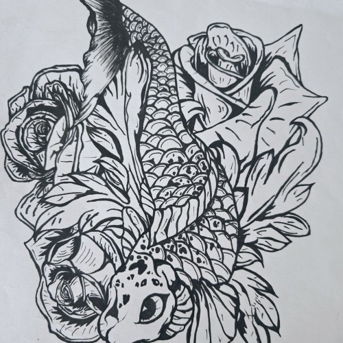
"Pisces Koi" is a bold and intricate black-and-white ink piece that blends symbolism with fluid motion. A koi fish, known for its resilience and transformation, weaves through a bed of blooming roses, creating a contrast between movement and stillness. The fine details in the scales and petals bring depth, making the composition feel alive.
The upward motion of the koi echoes the legend of perseverance—where a koi swimming upstream becomes a dragon—mirroring the Pisces spirit of adaptation and ambition. The roses introduce another layer, possibly symbolizing beauty, personal growth, or challenges that shape us.
This piece captures a sense of quiet strength and fluidity, speaking to those drawn to themes of transformation, water energy, and the balance between struggle and grace.
The form of Martial Arts introduced by Bruce Lee embraces `being formless’ as a central idea. Sharing this belief, my works do not start with an intention of what to make, but rather the process is to follow-through to what the works wish to become. In Jeet Kun To, the practice is to `be water’, to react and to blend. Instead of following the artist’s desire to direct the brush, I enhance, without an intention to change or render. The composition dropped from elsewhere as a message and is polished to shine.
In late 2018, after some time not doing any artwork, I really wanted to get back into it. I fancied doing something different and invested in some soft pastels. This was my first go with them and it was a hell of a learning curve about how they adhere to the paper, and how they blend. I'm not really sure the pastels I was using were soft enough for the look I wanted, but I like how loose this one turned out.
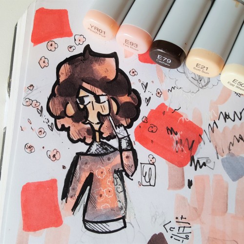
This is a drawing I did not too long ago, I think the pink and brown were blended nicely together in the piece. I use Copic markers, Microns, gel pens, and Ohuhu markers. I really enjoyed the theme of this character, (cherry blossoms) I think I was able to show the colors nicely together in the artwork.
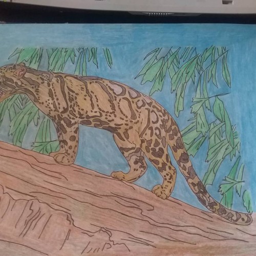
Cloud leopard i finish doing, it took me 5 hours to do, i used few different types of colouring pencils for this drawing, and baby oil for blending the colours,
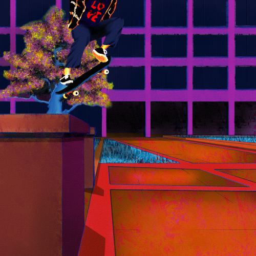
Yet another senseless lynching that has me here with a broken heart. Like my other paintings on this subject, I wanted to focus on life. Tyre was dynamic and energetic, so I wanted to paint him soring. I also wanted to paint him defiant in the face of his oppressors. He was a skater, and they are no strangers to defiance. Thankfully, I found some excellent references to help me with the composition. Aesthetically, I wanted the comp to be modern, colorful, and hopefully impactful. I went for a pop art, illustration, and false-color vibe and minimized blending and refining layer edges. I painted this in Rebelle 6 and Photoshop. Much respect.