I wanted it to look like the chalkboard menus in quirky cafes. I drew the image with a Blackwing pencil, scanned it into Photoshop, inverted, then applied the colors.
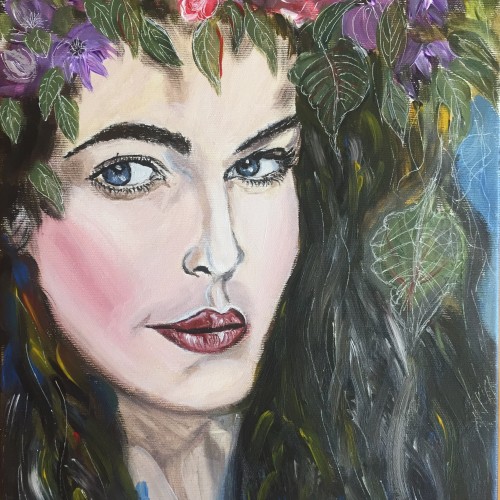
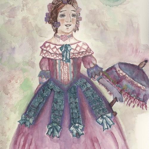
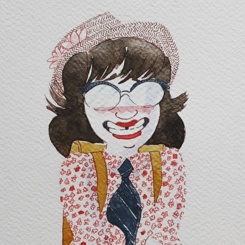
This creation of mine is Adeline. She is from Paris,France in the year 1838. Made with watercolors (Jazperstardust, Rublev,Daniel Smith, etc...) and a bit of pencil (just the outline). Made her on my new Arches watercolor paper.
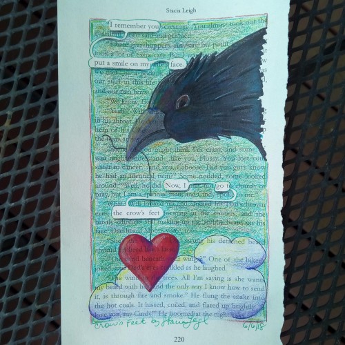
"I remember you put a smile on my face. Now I got the crow's feet." ~ A blackout poem from a recycled page of Burnout, an Young Adult adventure/romance story.
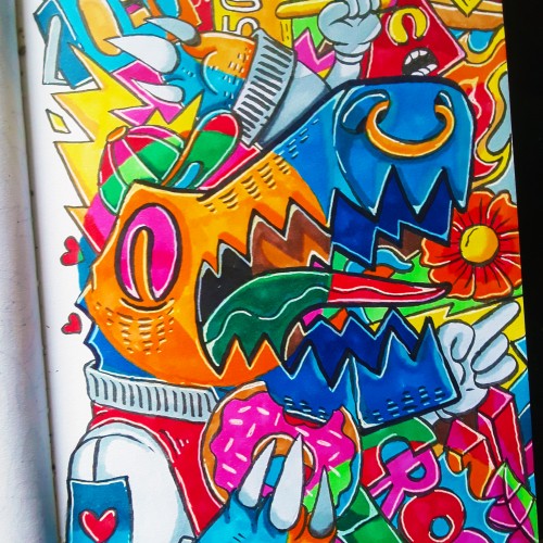
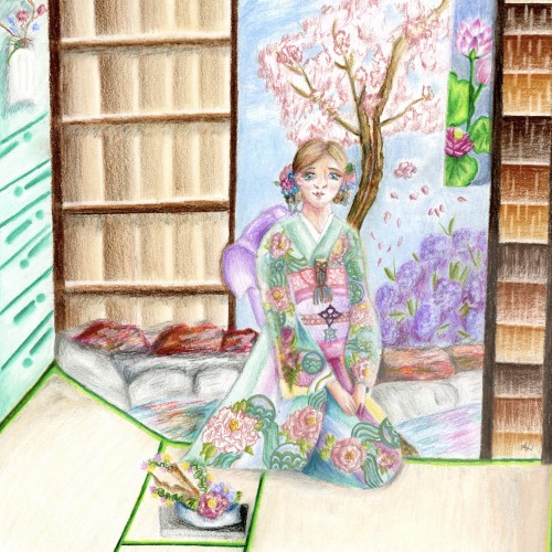
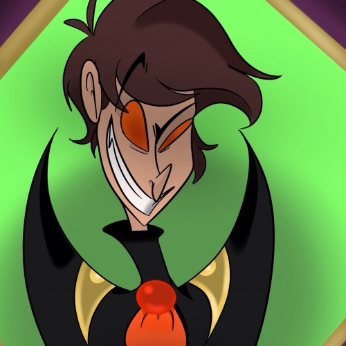
I wanted to draw Ash but without his bat features. Ash takes on bat like features in his orignal concept. I will be keeping those features, because I like how it looks. Every color I used in this picture was used for a reason. I had to do some research, so the colors would reflect is personality and his role he plays within the world in which I created him in.
Colors with purpose:
-Purple
-Green
-Red
-Orange
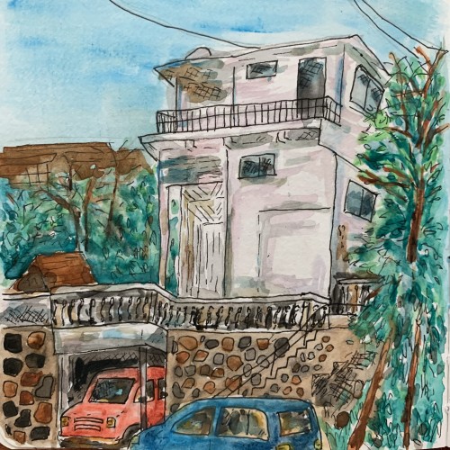
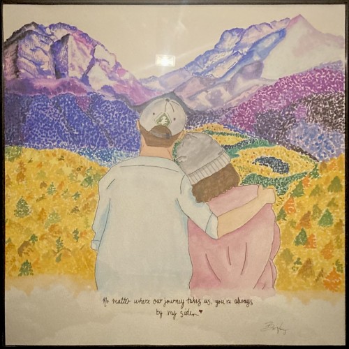
this was a sweet gift I did for Christmas for my mom & dad - they love traveling and Telluride, CO, has become their second home! my mom loves Aspen trees and the mountains, found it only fitting they be included in this collaged painting I did for them. I used gouache paint for all landscape and watercolors for my parents. It was fun combining the two paint types and my first attempt using gouache paint - I loved it!
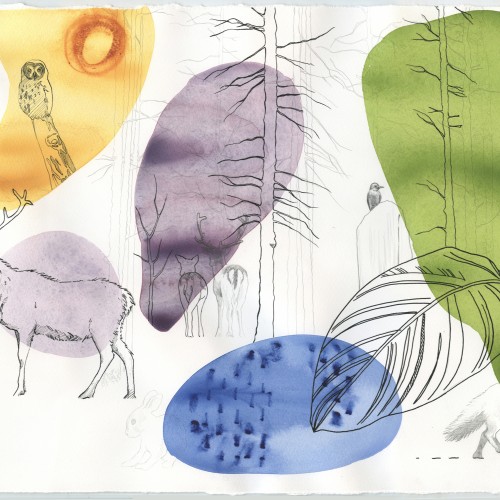
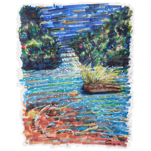
A vibrant scene depicts bright blue water flowing through a lush, green landscape, with a small waterfall cascading down the center. The surroundings include dense foliage and a floating patch of grass in the water.
Trying to make sharp shadows without having everything blend toghether. My goal is to convey the warm, pinkish sunlight on the first day of spring, and light is not something i have given enough care to earlier. Removing colors from a photography is an effective way to get an idea of how sharp shadows actually are!